INTRODUCTION TO FOREX CHARTING
This part of the course is going to give you a brief overview of the three primary types of charts that you will run across in your Forex trading journey. The chart type that I use, and that my members use, is candlestick charts, I feel forex candlestick charts do the best job at showing the price dynamics in a market, since their design helps you to visualize the “force”, or lack thereof, that a particular price movement exhibited. So, let’s go over the three main types of charts that you will likely see as you trade the markets:
Line charts
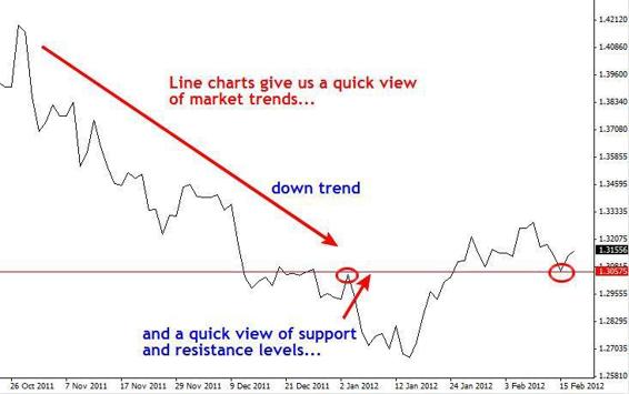
Line charts are good at giving you a quick view of overall market trend as well as support and resistance levels. They are not really practical to trade off of because you can’t see the individual price bars, but if you want to see the trend of the market in a clear manner, you should check out the line charts of your favorite markets from time to time.
Line charts are made by connecting a line from the high price of one period to the high price of the next, low to low, open to open, or close to close. By far, line charts that show a connection from one closing price to the next are the most useful and the most widely used; this is because the closing price of a market is deemed the most important, since it determines who won the battle between the bulls and the bears for that time period. Let’s look at an example of a daily line chart of the EURUSD:

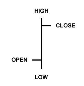
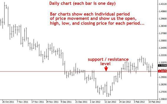
Bar chartsA bar chart shows us a price bar for each period of time. So if you are looking at a daily chart you will see a price bar for each day, a 4 hour chart will show you one price bar for each 4 hour period of time…etc. An individual price bar gives us four pieces of information that we can use to help us make our trading decisions: The open, high, low, and close, you will sometimes see bar charts called OHLC charts (open, high, low, close charts), here’s an example of one price bar:

Here’s an example of the same EURUSD chart we used for the line chart example but as a bar chart:

Candlestick charts
Candlestick charts show the same information as a bar chart but in a graphical format that is more fun to look at. Candlestick charts indicate the high and low of the given time period just as bar charts do, with a vertical line.
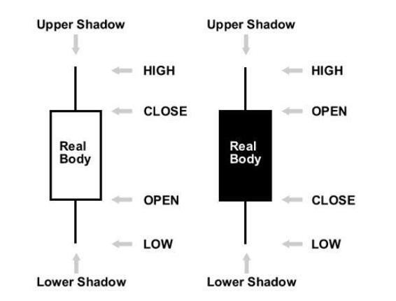
The top vertical line is called the upper shadow while the bottom vertical line is called the lower shadow; you might also see the upper and lower shadows referred to as “wicks”. The main difference lies in how candlestick charts display the opening and closing price.
The large block in the middle of the candlestick indicates the range between the opening and closing price. Traditionally this block is called the “real body”.Generally if the real body is filled in, or darker in color the currency closed lower than it opened, and if the real body is left unfilled, or usually a lighter color, the currency closed higher than it opened. For example, if the real body is white or another light color, the top of the real body likely indicates the close price and the bottom of the real body indicates the open price.
If the real body is black or another dark color, the top of the real body likely indicates the open price and the bottom indicates the close price (I used the word “likely” since you can make the real body whatever color you want). This will all become clear with an illustration:

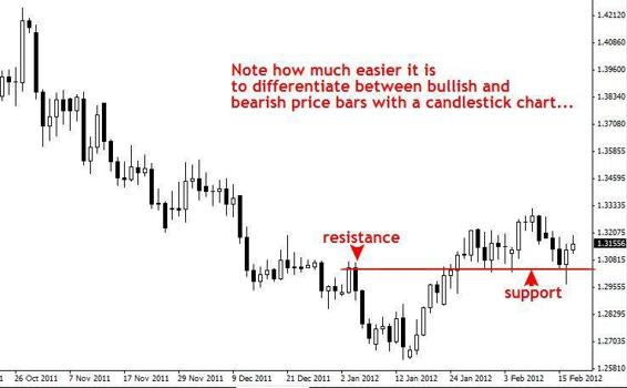
Now, here’s the same EURUSD daily chart that I showed you in line and bar form, as a candlestick chart. Note that I have made the candles black and white, you can pick whatever colors you want, just make sure they are friendly to your eye but also that they convey bullish and bearishness to you.
Bullish candles are the white ones (close higher than open) and bearish candles are the black ones (close lower than open):

Candlestick charts are the most popular of all three major chart forms, and as such, they are the type you will see most often as you trade, and they are also the type I recommend you use when you learn and trade with price action strategies.
Article by Nial Fuller and sourced from learntotradethemarket.com


