Leading by example
Two of the best examples for persuasive design are Amazon.com and Booking.com. Take the Today’s Deals section in Amazon. One of the main reasons it’s been hugely successful is the strategic use of the persuasion, emotion, trust approach. ‘Ends in...’ end of sale notifications and ‘... Claimed’ notifications, representing the number of people who have purchased an item from a flash sale, create respectively emotion - the fear of missing out; and persuasion - implying scarcity increases demand.
Trust is inspired by allowing customers to add their own reviews of products they have purchased.
Amazon.com

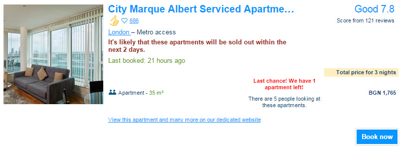
Booking.com
Booking.com’s approach is highly successful as well. Most of the elements on their site are a combination of persuasion, emotion, and trust. Again they allow customers to write reviews and rate their experiences. They have ‘Latest booking ...’ notifications, showing the time since the last booking was made, they display the number of people who are currently looking at a specific hotel, and ‘This hotel is likely to sell out soon’ notifications when the number of available rooms is in short supply.

The end result for both of these behemoth websites, is that their visitors end up making a decision more quickly and more confidently.
To conform with all of these best practice marketing techniques we created the Conversion triggers feature. It allows you to create automated notifications on your registration form and increase your sales considerably.

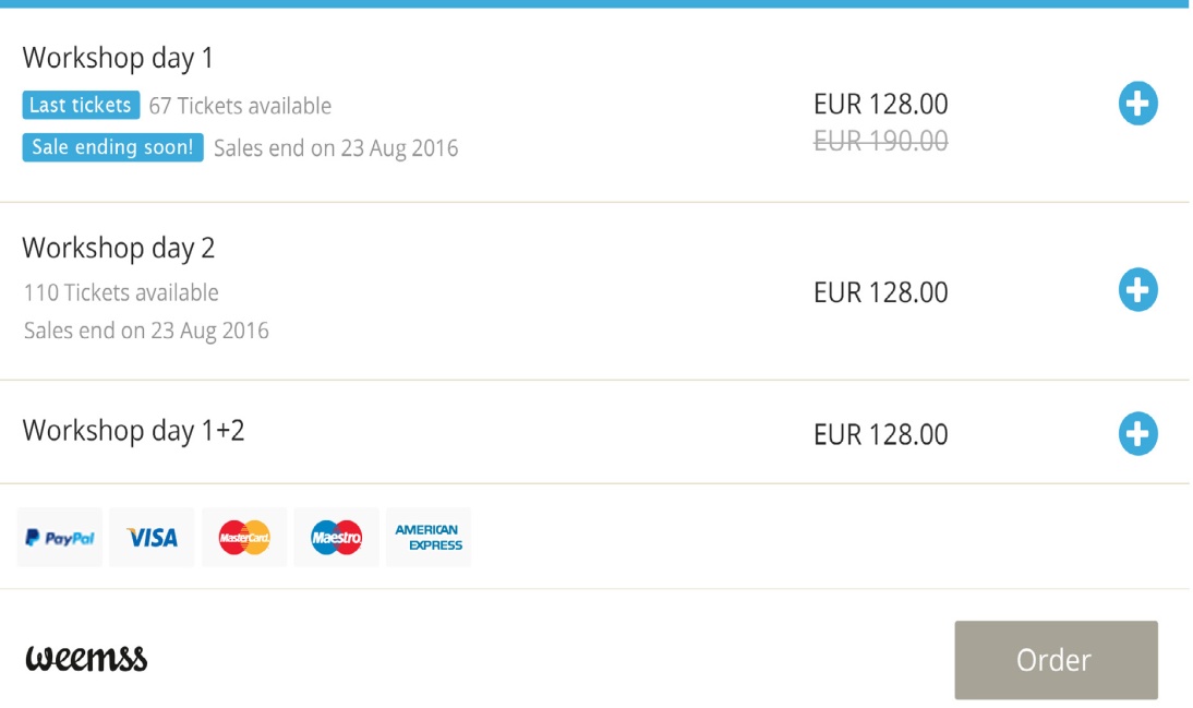
‘Last tickets’ notification
Display a notification about the number of remaining tickets available. By showing that your tickets are in limited supply you essentially increase the demand. This is always a strong persuasion element and is particularly effective when combined with a good promotional sale offer - we’re going to touch on the subject of these Special offers in part 3 of this chapter.
‘Sale ending soon!’ notification
The fear of missing out is a common driver of action for marketers and advertisers. Marking the approaching end of the ticket sale on your registration form uses the element of emotion. Time running out creates urgency and leads to increased ticket sales.
‘Last order made’ notification
Provide social proof. Show the time since the most recent registration was made. Potential participants feel more at ease knowing that someone else has already registered for your event. It generates the element of trust and raises the chance the next person will register as well.
Crossing the price
Another very popular method for improving conversions is the crossed price. It is widely recognized that the visitor often responds to better value. Once again Amazon and Booking.com are a good reference on how this is utilized to great effect. They put the current price right next to the crossed out original price. This allows the potential buyer to easily compare the old price and the new price. In line with this, when creating your ticket categories, Weemss let’s you put an accent on your value propositions, by adding a crossed out price on your registration form for each category.


What’s a special offer exactly? Basically it’s any kind of sales promotion - discounts, coupons, freebies, prizes, etc. Special offers help attract new customers, retain previous event participants, and in many cases help counteract the competition, thus increasing the number of registrations for your event.
What Makes an Offer ‘Special’
What makes a sale promotion ‘special’ is that delicate balance, where both your organization and the potential customer benefit from an actual purchase. There are 4 main aspects of a Special offer you need to consider:
1. Define a goal for your special offer. What do you want to achieve with your special offer? Normally you’d want to acquire new customers, reward your existing customers, or simply increase your event revenue. Once you define the goal you’re ready to decide on how to meet it.
2. Calculate its profitability - as stated above you need to give good value, but without sacrificing profitability margins. This is probably the most important part of creating the special offer. It requires some calculations on your side to make sure the offer is healthy for your event revenue.
3. Make it attractive - when we say attractive we don’t mean flashy ‘SALE’ signs, although as we already said in the previous part of this chapter, they do help. Your customers will always know a good value offer when they see it. And they will always know a bad one! Your special offers should never be in the latter category. If you have doubts that your offer isn’t attractive - it probably is not good enough. Either rethink it or don’t make it at all. Just don’t make it too attractive to the point where it becomes unprofitable!
4. Give it some exclusivity - a special offer works best when it has an element of exclusivity. This is achieved by limiting your offer in one way or another - making it a timed offer, setting a maximum number of times it can be used, seasonal sales, returning customer promo codes, etc. Exclusivity is always good!
Addressing these 4 aspects properly is key to making a great Special offer. There are a number of ways you can utilize special offers for your event registration process so that it benefits not only the paying customer, but also your revenue.


