Web Authoring Rules
Okay, now you know something about the planning stage of a web project. It's not over yet. Before you touch fingers to keypad, you also need to add the design planning to the mix. Once you have a clear idea of the website purpose, target audience, nature of the content and a breakdown into categories, you have the core information to help you create a design concept. In this chapter we'll chat about the various considerations that go into translating the website needs into solid website design.
The first, main, and most important thing to remember is that websites are useless if they do not serve the audience they are intended to attract. If the visitors can't or won't use the website, the client's communications plan and the web author's design fails. Websites must be planned, designed, and produced with the visitor/customer as the first priority. This is known as User-Centered or Customer-Centered design.
Web Visitor Needs
Web visitors have pretty simple needs when they visit a website:
• Solve a problem.
• Get information fast to solve a problem.
• Buy something quickly and safely to resolve a need.
• Do something fun to relax their stress (like games).
• Make something happen quickly so they can move on.
• Get accurate information when they need to research/make a rapid decision.
Visitors do not need:
• Anxiety
• Stress
• Headaches
• Ear-splitting sounds
• Flashing or jumping content
• Distracting interruptions
• Irrelevant time wasting
• Dangerous or insecure transactions
• Tiny print that smacks of legalese
• Too many choices
• Unclear choices
• Wrong choices
• Misleading choices
Keep in mind the core of the Hippocratic Oath: do no harm.
Intuitive Websites
There is a terrific book, called Don’t Make Me Think by Steve Krug, which offers excel- lent and detailed information about designing intuitive websites. The title states it all: when a visitor comes to a website, they need to easily intuit what to do to find information and take action.
First, you need to recognize that how we think people use websites is different than how they actually use them. While we may have loads of important content and images to il- lustrate, the visitor isn't going to read every single thing. They aren't interested in perfect text, being ushered from one important point to the next, or in reaching the conclusions we hope they will reach from reading everything thoroughly. They won't try every ex- ample, or examine every image, and make choose to ignore nice charts, graphs, and other important supplements to the content.
Axiom #2: The website experience is all about the visitor, not you or the client. It is the visitor that the website exists to communicate with – see Axiom #1.
Think about how you are using this book, and how you use a basic search engine results page, or Amazon.com, or your favorite news website. Visitors scan and get hooked by the items that make them think they will get the info they came for. They usually ignore much of the page, find whatever link looks like it will solve their problems, and click.
In addition, visitors can and do come into the website from every possible direction. Your website contact info may be linked from someone else's site, your sitemap maybe reached from a mention in a review, or your product page may be linked to by some other website's review section. You can't control where visitors will land on your web- site, and you need all elements of your overall design to account for this. Then they look for whatever looks like the first reasonable option and go there. If they are not sure, they will muddle through, and if they can't get exactly where they want in 2-4 easy and clear clicks, they will leave. Bye-bye!
Axiom #3: The visitor will almost never, ever start where you want or expect them to on the website. See Axiom #2.
Here's your competition for a visitor's attention:
• Alternate websites they already use and are familiar with – why muddle through yours?
• Too many available choices of links just to get to you – competitor and semi-related links in the search engine results.
• Too much overstimulation from other website colors, effects, and hooks – makes your terrific design blur with the rest.
• Too many bookmarks to other pages they may also review – if they bookmark you as part of fact-finding research, they might forget why when they come back.
• Too little time to solve their information and action needs – visitors come during breaks, lunch, when they need a fast solution, while they are watching TV, and while getting phone and text interruptions.
A web author has a lot to consider just to design an effective, and attractive, and easy-to-use, and memorable, and relevant, and problem-solving, and. . . you get the picture?
Web Design Concepts
The common expectations of website presentation is constantly evolving, especially as technology, monitor size, mobile device needs, and download speeds develop. Design essentials to consider include:
• Clear website identification: You need to clearly identify, on every page, just what website this is. This can include the logo, title, consistent graphic identifier, etc.
• Clear page identification: The visitor needs to know what actual web page in the site s/he is on, so you need to clearly identify every page's name/purpose with some kind of heading.
• Clear section identification: A web page may cover more than one concept, or have more than one article, information box, or choice the visitor can make. If the content contains more than one topic or section, you need to clearly identify the sections with subheadings.
• Simple and self-explanatory navigation: Visitors should be able to determine right away where the navigation options might lead and be able to choose the one they need.
• White space: White space refers to the open space on a page where there is a visual break from blocks of text, images, etc. White space is important because the visitor's eyes get strained if things are too crowded together. They also lose their ability to get key decision-making information when everything looks squashed together and too busy.
• Alignment: Content can be left, right, or center-aligned. Choosing a generally consistent alignment is important since it allows for white space, is easier for the eye to follow, and looks tidy and put-together in a way that mixing alignments don't.
• Think in “blocks”: Much of design is about knowing how to direct attention. Block out the navigation area, the identification area, the sub areas for text and image content, the footer area, etc. Make things easy to scan.
Design for Scanning
Don't make your visitors think. They are usually busy, in a hurry, and are not going to read any more than they have to in order to act or make a decision. Make any readable items very, very easy to see and read.
• Visitors scan, they don’t read. Give them the key info in scannable bits, like subheaders and bulleted lists.
• Break up information. Use subheaders, and occasional sub subheaders. Use a back-to-top anchor when needed. Use a sidebar for nice but not critical information.
• Place critical information and navigation above the scroll / on the first screen. Think of a web page like the first side of a folded newspaper. A visitor looks at, and makes fast decisions, based on what they see at the top of the page before they have to scroll down. Do not put critical information below the first screen because the visitor will likely miss or ignore it.
• Basic scanning methods. Visitors scan, they don't read. One common scanning method is the Z-method, when a visitor scans top left-to-right, diagonally down to the lower left, and then lower left-to-right. Another way is the F-method, when a visitor scans top left-to-right, darts to middle left-to-right, then darts down to lower left.
• Make sure the visitor has control over their use of the site. Give them what they need without fuss and they will keep at it.
Enhance Readability
Even though visitors scan and choose, sometimes they do need to read to get more de- tailed information. Make it easy on them and effective for the message being delivered.
• Font size: The font size is often one of the least-considered things in a website. In order to get as much priority information above-the-fold, a designer may sacrifice readability by using a small size of text. Recognize that priority information is not useful if the visitor can't easily read it. Too large of text, particularly for para- graphs, can instead look like the website has nothing to say. Choose the font size that best suits your primary audience demographic and the message.
• Font color: Font color is also important for readability. When you use a light background, you need a dark font, and vice versa. If you choose a font of fairly equal intensity to the background color, they either blend together or shout out in a blur of unreadable color. Mixing several font colors can be confusing, while using only one can be boring and keep you from punctuating important points.
A good rule of thumb is to choose a good base font color, like black or dark grey on white background, and use a secondary color in your palette for a couple of the heading styles, and perhaps another contrasty color in your palette for a third heading style.
• Font emphasis: You can and should judiciously use text bolding and italics when needed. The various HTML head tags build bold into the font display, and you can punctuate the occasional word or phrase as needed. Stay away from underlining anything (except links) because underlines make a visitor think the text is a link and because underlining text is not HTML standards compliant.
• Text positioning: You should format your text areas in ways that break up a solid block of same-sized text. Using headlines and subheads to break subject matter into smaller chunks is helpful. You can also use HTML indents, lists, line spacing, and more.
• Issues: Keep in mind that many viewers have some level of color blindness, which affects what they see. As long as your contrast is good, and you carefully use font emphasis, you can make this a minimal issue. For instance, it is tempting to use red as an alert color, but if a visitor cannot see red, s/he will not know there is an alert unless the colored word is also bold, and unless you do not bold a lot of other words.
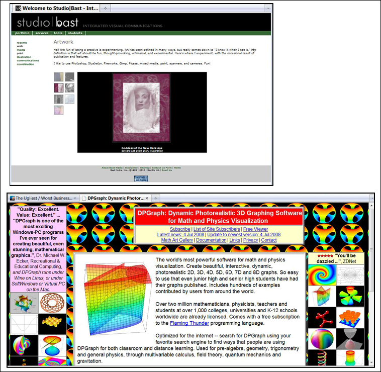
Clean layout vs. Cluttered layout
Opposite page: 3 Layout Examples