4.5 Condensed Table
Add .table-condensed to make tables more compact by cutting cell padding in half.
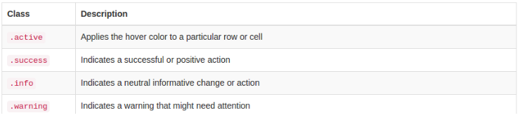
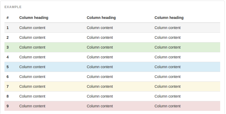
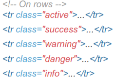
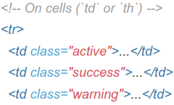
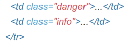
4.6 Contextual Classes
Use contextual classes to color table rows or individual cells.
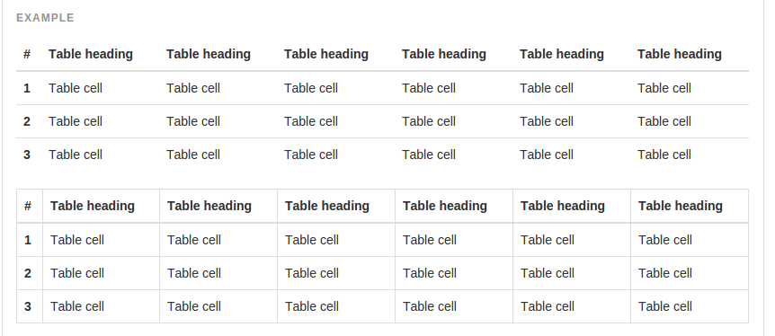
4.7 Responsive Tables
Create responsive tables by wrapping any .table in .table-responsive to make them scroll horizontally on small devices (under 768px). When viewing on anything larger than 768px wide, you will not see any difference in these tables.
 Responsive tables make use of overflow-y: hidden, which clips off any content that goes beyond the bottom or top edges of the table. In particular, this can clip off dropdown menus and other third-party widgets.
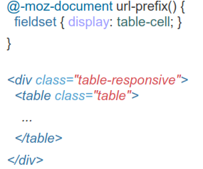
Firefox has some awkward fieldset styling involving width that interferes with the responsive table. This cannot be overriden without a Firefox-specific hack that bootstrap don't provide in package