Chapter 11 Input Groups
11.1 Input Groups
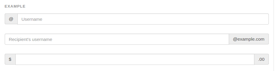
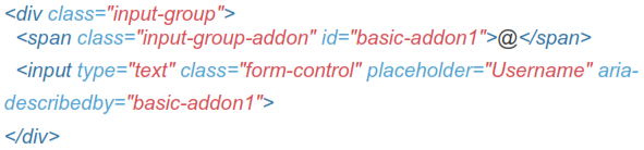
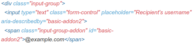
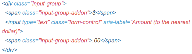
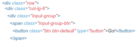
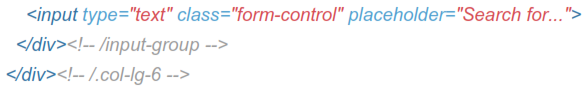
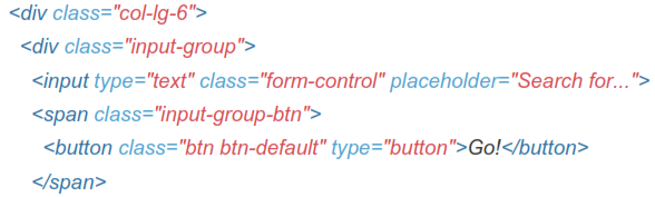
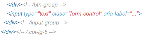
Extend form controls by adding text or buttons before, after, or on both sides of any text-based <input>. Use .input-group with an .input-group-addon to prepend or append elements to a single .form-control.
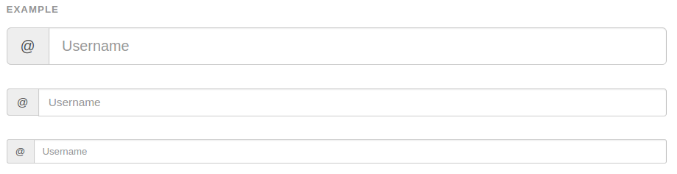
Example
Place one add-on or button on either side of an input. You may also place one on both sides of an input.
 Bootstrap do not support multiple form-controls in a single input group.

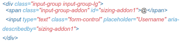
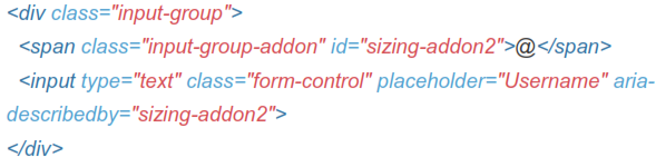
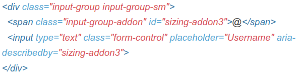
11.2 Sizing
Add the relative form sizing classes to the .input-group itself and contents within will automatically resize-no need for repeating the form control size classes on each element.
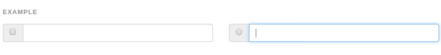
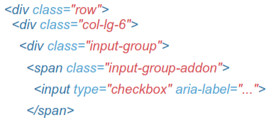
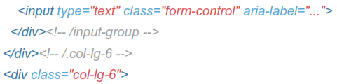
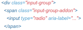
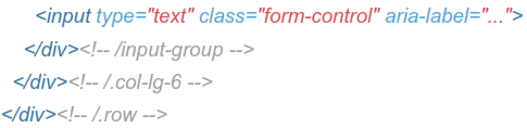
11.3 Checkbox And Radio Addon
Place any checkbox or radio option within an input group's addon instead of text.
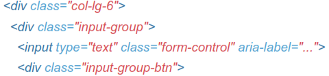
11.4 Button Addons
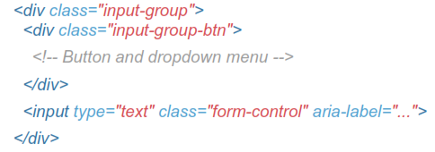
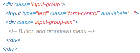
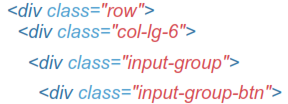
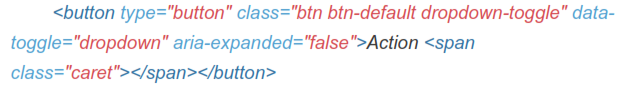
Buttons in input groups are a bit different and require one extra level of nesting. Instead of .input-group-addon, you'll need to use.input-group-btn to wrap the buttons. This is required due to default browser styles that cannot be overridden.

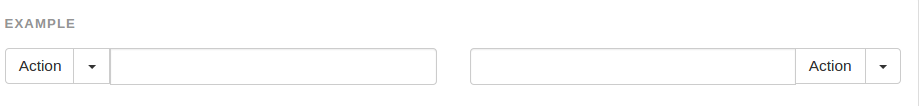
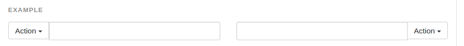
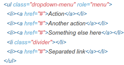
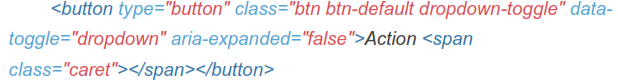
11.5 Buttons With Dropdowns

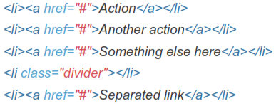
11.6 Segmented Dropdown Buttons