2.3 Offsetting columns
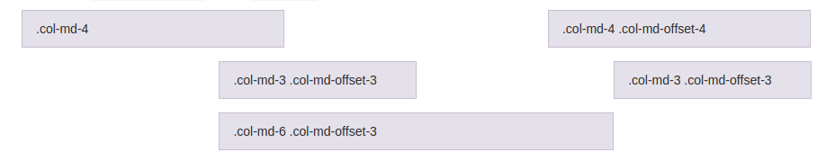
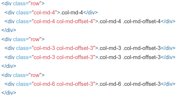
Move columns to the right using .col-md-offset-* classes. These classes increase the left margin of a column by * columns. For example, .col-md- offset-4 moves .col-md-4 over four columns.
2.4 Nesting Columns
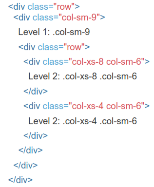
To nest your content with the default grid, add a new .row and set of .col-sm-* columns within an existing .col-sm-* column. Nested rows should include a set of columns that add up to 12 or fewer (it is not required that you use all 12
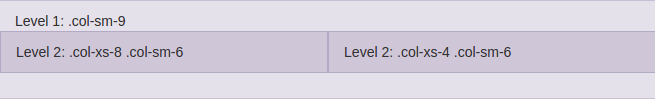
available columns).
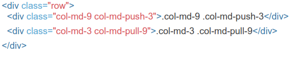
2.5 Column Ordering
Easily change the order of our built-in grid columns with .col-md-push-* and .col-md-pull-* modifier classes.