Technical analysis is appointed to analyze market movement (the movement of prices, volumes and open interests) using the information obtained for a past time. Mainly, it is the chart study of past behavior of currencies prices in order to forecast their future performance. It is one of the most significant tools available for the forecasting of financial markets. Such analysis has been an increasingly utilized forecasting tool over the last two centuries.
The main strength of technical analysis is the flexibility with regard to the underlying instrument, regarding the markets and regarding the time frame. A trader who deals several currencies but specializes in one may easily apply the same technical expertise to trading another currency. A trader who specializes in spot trading can make a smooth transition to dealing currency futures by using chart studies, because the same technical principles apply over and over again, regardless of the market. Finally, different players have different trading styles, objectives, and time frames.
Technical analysis is easy to compute what is important while the technical services are becoming increasingly sophisticated and reasonably priced.
Prior to this historic open market intervention, technical analysis provided ample selling signals.Price
The Fundamental Principles of Technical Analysis are based on the Dow
Theory with the following main thesis:
1. The price is a comprehensive reflection of all the market forces. At
any given time, all market information and forces are reflected in the currency
prices.2. Price movements are historically repetitive.
3. Price movements are trend followers.
4. The market has three trends: primary, secondary, and minor. The primary trend has three phases: accumulation, run-up/run-down, and distribution. In the accumulation phase the shrewdest traders enter new positions. In the run-up/run-down phase, the majority of the market finally "sees" the move and jumps on the bandwagon. Finally, in the distribution phase, the keenest traders take their profits and close their positions while the general trading interest slows down in an overshooting market. The secondary trend is a correction to the primary trend and may retrace onethird, one-half or two-thirds from the primary trend.
5. Volume must confirm the trend.
6. Trends exist until their reversals are confirmed. Figure 5.1. shows example of reversals in a bearish currency market. The buying signals occur at points A and B when the currency exceeds the previous highs.
 Figure 5.1. A reversal of bearish currency
Cycles of currency price change are the propensity for events to repeat themselves at roughly the same time and are an important ground to justify the Dow Theory.
Cycle identification is a powerful tool that can be used in both the long and the short term. The longer the term, the more significance a cycle has. Figure 5.2. shows a series of three cycles. The top of the cycle (C) is called the crest and the bottom (T) is known as trough. Analysts measure cycles from trough to trough.
Cycles are gauged in terms of amplitude, period, and phase. The amplitude shows the height of the cycle, the period shows the length of the cycle, the phase shows the location of a wave trough.
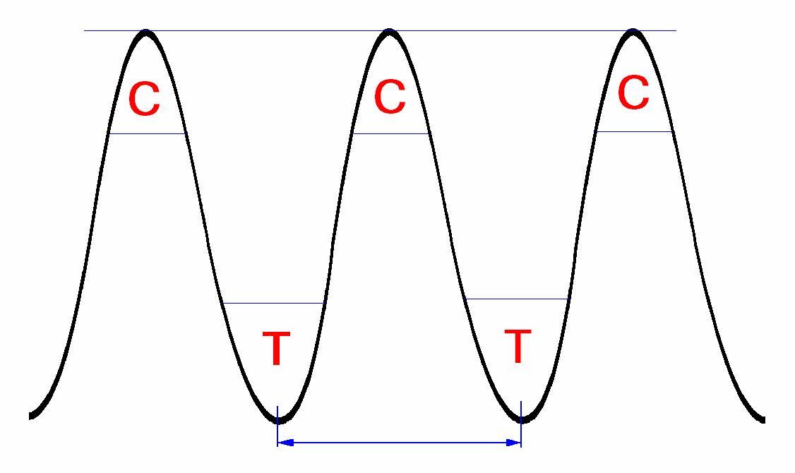 Figure 5.2. The structure of cycles
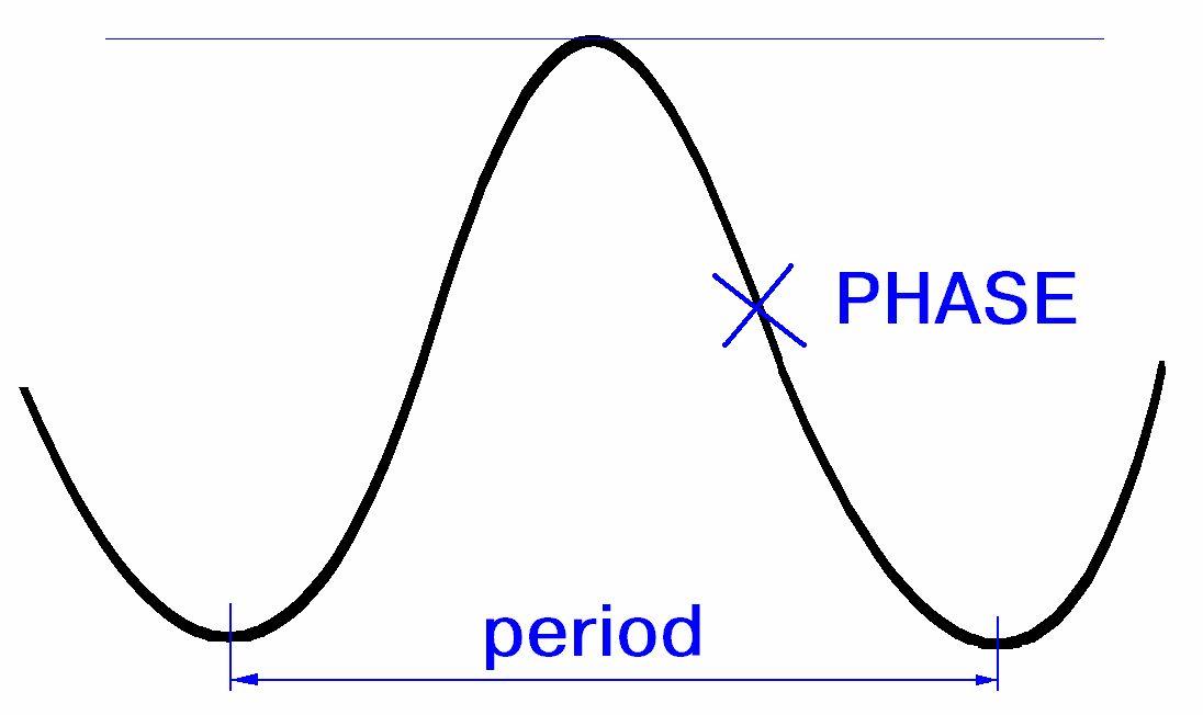 Figure 5.3. The two gauging measures of a cycle: period and phase.
Volume and Open Interest
Volume consists of the total amount of currency traded within a period of time, usually one day. For example, by year 2000, the total foreign currency daily trading volume was $1.4 trillion. But traders are naturally more interested in the volume of specific instruments for specific trading periods, because large trading volume suggests that there is interest and liquidity in a certain market, and low volume warns the trader to veer away from that market.
The risks of a low-volume market are usually very difficult to quantify or hedge. In addition, certain chart formations require heavy trading volume for successful development. An example is the head-and-shoulder formation. Therefore, despite its obvious importance, volume is not easy to quantify in all foreign exchange markets.
One method to estimate volume is to extrapolate the figures from the futures market. Another is "feeling" the size of volume based on the number of calls on the dealing systems or phones, and the "noise" from the brokers' market.
Open interest is the total exposure, or outstanding position, in a certain instrument. The same problems that affect volume are also present here. As it was already mentioned, figures for volume and open interest are available for currency futures. If you have access to printed or electronic charts on futures, you will be able to see these numbers plotted at the bottom of the futures charts.
Volume and open interest figures are available from different sources, although one day late such as the newswires (Bridge Information Systems, Reuters, Bloomberg), newspapers (the Wall Street Journal, the Journal of Commerce), Weekly printed charts (Commodity Perspective, Commodity Trend Service).
Line Chart
The line chart is the original type of chart. In order to plot it, a line connects single prices for a selected time period. The most popular line chart is the daily chart. Although any point in the day can be plotted, most traders focus on the closing price, which they perceive as the most important. (See Figure 5.4.) But an immediate problem with the daily line chart is the fact that it is impossible to see the price activity for the balance of the day.
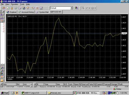 Figure 5.4. An example of the line chart
Line charts are considered for technical analysis because due to the sophistication of current charting services, daily price activity does not need to be lost.
Daily line charts are useful when looking for the big picture or the major trend because, without line charts, intraday activity would be-come an unimportant detail. When plotted over a long stretch of time, such as several years, a line chart is easier to visualize. Also, technical analysis goes well beyond chart formation; in order to execute certain models and techniques, line charts are better suited than any of the other charts.
However the line chart is a continuous chart, and this is a disadvantage because price gaps cannot be charted on a continuous chart.Bar Chart
The bar chart is arguably the most popular type of chart currently in use. It consists of four significant points (See figure 5.5.):
• the high and the low prices, which are united by a vertical bar;
• the opening price, which is marked with a little horizontal line to the
left of the bar;
• the closing price, which is marked with a little horizontal line to the
right of the bar.
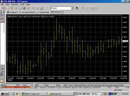 Figure 5.5. An example of the bar chart.
The opening price is not always important for analysis.
Bar charts have the obvious advantage of displaying the currency range for the period selected. The most popular period is daily, followed by weekly. Other periods may be selected as well. An advantage of this chart is that, unlike line charts, the bar chart is able to plot price gaps that are formed in the currency futures market. Although the currency futures market trades around the clock, physically it is open for only about a third of the trading day. (Chicago IMM is open for business 7:20 am to 2 pm CDT.) Therefore, price gaps may occur between two days' price ranges. Incidentally, the bar chart is the chart of choice among currency futures traders.
Candlestick Chart
The candlestick chart is closely related to the bar chart. It also consists of four major prices: high, low, open, and close. (See Figure 5.6.) In addition to the common readings, the candlestick chart has a set of particular interpretations. It is also easier to view.
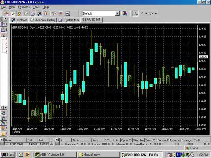 Figure 5.6. An example of the candlestick chart
The opening and closing prices form the body (jittai) of the candlestick. To indicate that the opening was lower than the closing, the body of the bar is left blank. In its original form, the body was colored red. Current standard electronic displays allow you to keep it blank or select a color of your choice. If the currency closes below its opening, the body is filled. In its original form, the body was colored black, but the electronic displays allow you to keep it filled or to select a color of your choice.
The intraday (or weekly) direction on a candlestick chart can be traced by means of two "shadows": the upper shadow (uwakage) and the lower shadow (shitakage).
Just as with a bar chart, the candlestick chart is unable to trace every price movement during a day's activity.The trend shows a pending direction of the market movement.
A trend may be:
1. Upward (See Figure 5.7.)
2. Downward (See Figure 5.8.)
3. Sideways, also known as a "flat market" or "trendless" (See Figure 5.9.)
Because the markets do not move in a straight line in any direction, but rather in zigzags, it is the direction of these peaks and troughs that creates the market trend. In addition to direction, trends are also classified by time frame: major or long-term trends, secondary or medium-term trends, and near-term or short-term trends. Any number of secondary and near-term trends may occur within a major trend. The time frames for each class vary widely. The Dow Theory suggests a one-year length for a major trend. Currently, for a major trend, the market expects a time span of over one year. Secondary trends should last for a matter of months, and short-term trends for a matter of weeks.
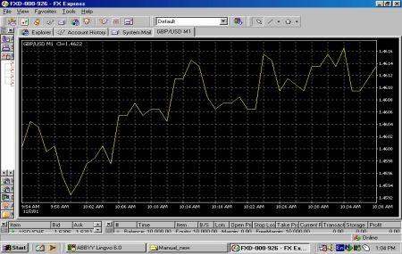 Figure 5.7. An example of the up trend
 Figure 5.8. An example of the down trend
 Figure 5.9. An example of the sideways trend
Percentage Retracement
Foreign currencies, like all the other financial instruments, do not move straight up or down, even in the healthiest of trends. Traders watch several percentage retracements, in search of price objectives.
There are three typical percentage retracements:
1. Charles Dow developed the traditional percentage retracements which are 1/3, 1/2, and 2/3; or 33 percent, 50 percent, and 66 percent. A retracement past 66 percent is considered to be a trend failure.
2. The Fibonacci ratios. These ratios are 0.382, 0.50, and 0.618, or approximately 38 percent, 50 percent, and 62 percent.
3. The Gann percentages attach importance to the one-eighth breakdowns.
The Trendline
A trendline is the natural development in tracking a trend. It simply consists of a straight line connecting the significant highs (peaks) or the significant lows (troughs.) Following in the tracks of the trend directions, the trendlines may be classified as:
1. Rising trendlines. (See Figure 5.10.)
2. Declining trendlines. (See Figure 5.11.)
3. Sideways trendlines. (See Figure 5.12.)
To draw a trendline only two points are necessary and the third one is the contact point confirmation. The currency maintains its general direction and velocity. A trendline exists until it is broken as a result of a significal move of the price up or down. Hence, even after confirmation, the breakout is still likely to be followed by a period of consolidation It is relatively rare for a trendline to suddenly reverse its direction. If a consolidation period does indeed occur, the longer it lasts, the steeper the following rally will be. Breakouts from up trendlines tend to test the strength of the former support line, now turned into a resistance line.
A price filter of 3 percents serves usually to test the validity of the breakout.
 Figure 5.10. Example of a rising trendline.
 Figure 5.11. An example of the declining trendline.
 Figure 5.12. An example of the sideways trendline
The trendline and a line drawn along the opposite edge of the trend pattern about to be parallel to the trendline form the trade channel (See Figure 5.13.). Then the both lines are known as the channel lines.
Lines of Support and Resistance
The upper and bottom borders of a trade channel (See Figure 5.14.) forme lines of support and resistance. The peaks represent the price levels at which the selling pressure exceeds the buying pressure are known as resistance levels. The troughs, on the other hand, represent the levels at which the selling pressure succumbs to the buying pressure. They are called support levels. The longer the prices bounce off the support and resistance levels, the more significant the trend becomes. Trading volume is also very important, especially at the critical support and resistance levels. When the currency bounces off these levels under heavy volume, the significance of the trend increases. The importance of support and resistance levels goes beyond their original functions. If these levels are convincingly penetrated, they tend to turn into just the opposite. A firm support level, once it is penetrated on heavy volume, will likely turn into a strong resistance level. Conversely, a strong resistance turns into a firm support after being penetrated.
 Figure 5.13. An example of the trade channel
 Figure 5.14. Example of the support turned into resistance
Chart formations are generally sorted on the basis of their significance to the current trend of the underlying currency. Formations signaling the end of the trend are known as reversal patterns. Conversely, chart formations that confirm that the underlying currency trend is intact are called continuation patterns.
The most significant trend reversal patterns are:
1. Head-and-shoulders and inverse head-and-shoulders.
2. Double tops and double bottoms.
3. Triple tops and triple bottoms.
Head-And-Shoulders
The head-and-shoulders pattern is one of the most reliable and wellknown chart formations. It consists of three consecutive rallies. The first and third rallies—the shoulders—have about the same height, and the middle one—the head—is the highest. All three rallies are based on the same support line (or on the resistance line in the case of the reversed head-and-shoulders formation), known as the neckline.
Prior to point A, the neckline was a resistance line (see Figure 5.15.). Once the resistance line was broken, it turned into a significant support line. The price bounced off it twice, at points B and C. The neckline was eventually broken in point D, under heavy volume, and the trend reversal was confirmed. As the significant support line was broken, a retracement could be expected to retest the neckline (E), now a resistance line again. If the resistance line held, the price was expected to eventually decline to around level F, which was the price target of the head-and-shoulders formation. The target was approximately equal in amplitude to the distance between the top of the head and the neckline. The price target was measured from point D, where the neckline was broken. (See the dotted lines).
Signals Generated by the Head-and-shoulders Pattern
The head-and-shoulders formation provides excellent information: 1. The support line. This is based on points B and C.
2. The resistance line. After giving in at point D, the market may
retest the neckline at point E.
3. The price direction. If the neckline holds the buying pressure at
point E, then the formation provides information regarding the price direction:
diametrically opposed to the direction of the head-and-shoulders (bearish). 4. The price target. This is provided by the confirmation of the
formation (by breaking through the neckline under heavy trading volume).
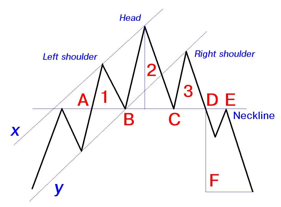 Figure 5.15. Diagram of a typical head-and-shoulders pattern
One of the main requirements of the successful development of this formation is that the breakout through the neckline occurs under heavy market volume. A breakout on light volume is a strong warning that it is a false breakout and will trigger a sharp backlash in the currency price. The time frame for this chart formation's evolution is anywhere from several weeks to several months. The intraday chart formations are not reliable. The longer the formation time is, the more significance should be attached to this pattern. The target is unlikely to be reached in a very short time frame. Whereas there is no immediate suggestion regarding the length of target reaching time, common sense would link it to the duration of development of the chart pattern.
It is reasonable to emphasize the importance of measuring the target from the point where the neckline was broken. There is a tendency among new technicians to measure the target price not only from under the neckline but also from the middle of the formation. This may happen as they measure the height of the head. Most head-and-shoulders formations, of course, look different from that in Figure 5.16. Prices fluctuate enough to forego any possibility of a clean-looking chart line. Also, the neckline is seldom a perfectly horizontal line.
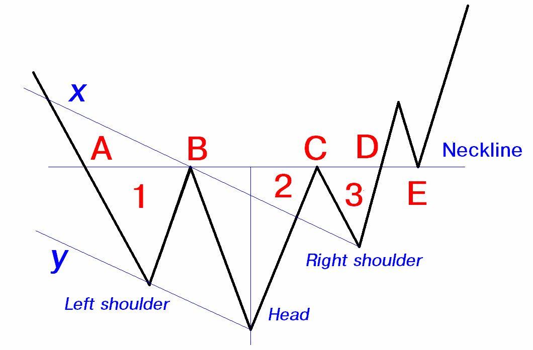 Figure 5.16. Diagram of a typical inverse head-and-shoulders pattern
Inverse Head-And-Shoulders
The inverse head-and-shoulders formation is a mirror image of the previous pattern. Therefore, you can apply the same characteristics, potential problems, signals, and trader's point of view from the preceding presentation. The underlying currency broke out of the downtrend ranged by the xx'-yy' channel. The currency retested the previous resistance line (the rally number 3), now turned into a support line. Among the three consecutive rallies, the shoulders (1 and 3) have approximately the same height, and the head is the lowest. Prior to point A, the neckline was a support line. Once this line was broken, it turned into a significant resistance line. The price bounced off the neckline twice, at points and C. The neckline was eventually broken at point D, under heavy volume. As the significant resistance line was broken, a retracement could be expected to retest the neckline (E), now a support line again. If it held, the price was expected to eventually rise to around level F, which is the price target of the head-and-shoulders formation.
The price objective is approximately equal in amplitude to the distance between the top of the head and the neckline, and is measured from the breakout point D.
Double Top
Another very reliable and common trend reversal chart formation is the double top. As the name clearly and succinctly describes, this pattern consists of two tops (peaks) of approximately equal heights. (See Figure 5.17.). A parallel line is drawn against a resistance line that connects the two tops. We should think of this line as identical to the head-and-shoulders' neckline. As a resistance line, it is broken at point A. It turns into a strong support for price level at C, but eventually fails at point E. The support line turns into a strong resistance line, which holds the market backlash at point F. The price objective is at level G, which is the average height of the double top formation, measured from point E.
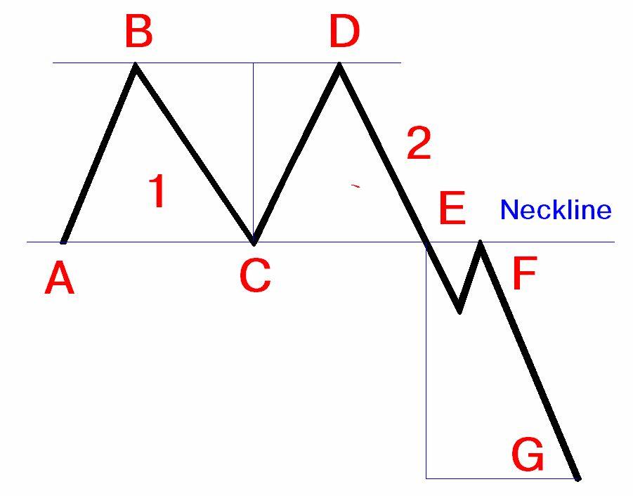 Figure 5.17. Diagram of a typical double-top formation
Signals Provided by the Double Top Formation
The double top formation provides information on:
1. The support line, set between points A and E.
2. The resistance line, set between points and D.
3. The price direction. If the neckline holds the buying pressure at
4. The price target, provided by the confirmation of the formation (by breaking through the neckline under heavy trading volume).
Exactly as in the case of the head-and-shoulders pattern, a vital requirement for the successful completion of the double-top formation is that the breakout through the neckline occurs under heavy market volume. Again, please remember that gauging volume in traditional ways is only possible in the currency futures market. Therefore, the trader must estimate the size of the cash market volume by extrapolating from
The currency futures' volume and the trading "noise." A breakout on light volume is a strong case for a false breakout, which would trigger a sharp backlash in the currency price. The time frame for this chart formation's evolution is anywhere from several weeks to several months. The intraday chart formations are less reliable. There is a strong correlation between the length of time to develop the pattern and the significance of the formation.
The target is unlikely to be reached in a very short time frame. There is no direct suggestion regarding the length of target reaching time; but foreign exchange common sense links it to the duration of development.
It is important to measure the target from the point where the neckline was broken. Avoid the trap of measuring the target price from the middle of the formation under the neckline. This may happen as you measure the average height of the formation.
Double Bottom
The double bottom formation is a mirror image of the previous pattern. (See Figure 5.18.). Therefore, one may apply the same characteristics, potential problems, signals, and trader's point of view from the preceding presentation.
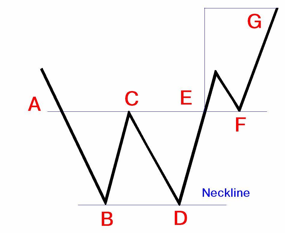 Figure 5.18. Diagram of a typical double-bottom formation
The bottoms have about the same amplitude. A parallel line (the neckline) is drawn against the line connecting the two bottoms (B and D.) As a support line, it is broken at point A. It turns into a strong resistance for price level at C, but eventually fails at point E. The resistance line turns into a strong support line, which holds the market backlash at point F. The price objective is at level G, which is the average height of the bottoms, measured from point E. (See the dotted lines).
Triple Top And Triple Bottom
The triple top is a hybrid of the head-and-shoulders and double-top trend reversal formations. (See Figure 5.19.) Conversely, the triple bottom is a hybrid of the inverse head-and-shoulders and double-bottom formations. (See Figure 5.20.) Consequently, they have the same characteristics, potential problems, signals, and trader's point of view as the double top or double bottom, respectively.
As shown in Figure 5.19., in a typical triple-top formation, the tops have about the same height. A parallel line (the neckline) is drawn against the line connecting the three tops (B, D, and F.) As a resistance line, the neckline is broken at point A. It turns into a strong support for price levels at ! and E, but eventually fails at point G. The support line turns into a strong resistance line, which holds the market backlash at point H. The price objective is at level I, which is the average height of the three tops formation, as measured from point D (see the dotted lines).
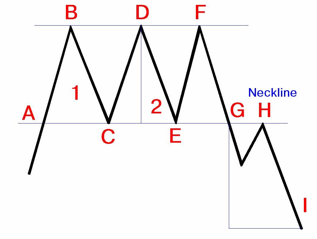 Figure 5.19. Diagram of a triple-top formation
As a double top, the formation fails at point E. The price moves up steeply toward point F. The resistance line is holding once more and the price drops sharply again toward point G. At this level, the market pressure is able to penetrate the support line. After a possible retest of the neckline, the prices drop further, to eventually reach the price objective.
The opposite is true for the triple bottom
As shown in Figure 5.19., in a triple-bottom formation, the bottoms have about the same amplitude. A parallel line (the neckline) is drawn against the line connecting the three bottoms (B, D, and F.) As a support line, the neckline is broken at point A. It turns into a strong resistance for price levels at ! and E, but eventually fails at point G. The resistance line turns into a strong support line, which holds the market backlash at point H. The price objective is at level I, which is the average length of the triple-bottom formation, as measured from point D (see the dotted lines).
Rounded Top and Bottom Formations
The rounded top and bottom, also known as saucers consist of a very slow and gradual change in the direction of the market. These patterns reflect the indecision of the market at the end of a trend. The trading activity is slow. It is impossible to know when the formation is indeed completed, and not for a lack of trying. Like any other consolidation pattern, the longer it takes to complete, the higher the likelihood of a sharp price move in the new direction.
Diamond Formation
The diamond formation tends to occur at the top of the trend. The price activity may be outlined by a shape resembling a diamond (see Figure 5.21.). The increase and decrease in trading volume closely mimic the combination of divergent and convergent support and resistance lines. Upon breakout, volume picks up substantially. The price target is the height of the diamond, measured from the breakout point.
The head-and-shoulders, the double top and bottom and the triple top and bottom, due to their significance in trend reversals, are generally known as major reversal patterns.
Figure 5.21. A scheme of a diamond reversal formationTechnical analysis provides charts that reinforce the current trends. These chart formations are known as continuation patterns. They consist of fairly short consolidation periods. The breakouts occur in the same direction as the original trend.
The most important continuation patterns are:
1. Flags
2. Pennants
3. Triangles
4. Wedges
5. Rectangles
Flag formation
The flag formation provides signals for direction and price objective. This formation represents a brief consolidation period within a solid and steep upward or downward trend. The consolidation itself is bordered by a support line and a resistance line, which are parallel to each other or very mildly converging, making it look like a flag (parallelogram) and tends to be sloped in the opposite direction from the slope of the original trend, or is simply flat. The previous sharp trend is resembles a flagpole.
If the original trend is going down, the formation is called a bearish flag. (See Figure 5.22.) As Figure 5.22. shows, the original trend is sharply down. The flagpole is measured between