A portal (or Web portal) presents information from diverse sources in a unified way. A Web site that offers a broad array of resources and services, such as e-mail, forums, search engines, online shopping are referred to as portal. The first portals grow out of online services, such as AOL, and provided access to the Web, but by now most of the traditional search engines have transformed themselves into Web portals to attract and keep a larger audience. Apart from the basic search engine feature, these portals often offer services such as e-mail, news, stock prices, information, and entertainment.
Portals provide a way for enterprises, research and other communities to generate a consistent look and feel with access control and procedures for multiple applications, which otherwise would have been different entities altogether. In a research environment a portal integrates online scientific services into single Web environment which can be accessed and managed from a standard Web browser. The most remarkable benefit of portals is that they simplify the interaction of users with distributed systems and with each other, because a single tool – the browser – and a standard and widely accepted network protocol – HTTP – can be used through all communications.
After the proliferation of Web browsers in the mid-1990s many companies tried to build or acquire a portal, to have a piece of the Internet market. The Web portal gained special attention because it was, for many users, the starting point of their Web browser. Similarly, but a bit later, research communities recognized the value of Web portals in integrating various services into coherent, customizable environments. Research collaborations began developing portals in the late 1990. These environments can be broadly categorized as horizontal portals, which cover many areas, and vertical portals, which are focused on one functional area. Horizontal research portals often provide services that are independent from any scientific discipline and represent generic functionalities that are common across disciplines. Vertical portals target specific group of researchers that are involved in the same experiment or work within the same scientific field.
In the simplest form a scientific portal is a collection of links to external Web pages and Web services that are scattered on the Internet and aimed to serve scientists with similar interest. These portals often include search engines that are customized for the interest of the user community, e.g. for publications, job positions, news from a scientific domain. Various research communities, ranging from mathematics to art and humanities, all have their own portals, sometimes even multiple portals localized for different geographical regions and languages.
For researchers who perform massive simulations on distributed computing systems, portals mean Web environments that make computing resources and services accessible via Web browsers. Such portals are typically referred to as Grid portals, or science gateways. Grid portals are Web interfaces that are integrated with PC, cluster or supercomputer based computing resources. These environments very often include high level services that are not included in the underlying infrastructure, they are implemented on the portal server instead. Such services can be brokers, load balancers, data replica services, data mirroring and indexing components. All these services together with the front-end portal provide an integrated solution that enables e-scientists to deal with various aspects of data-intensive research. Usage scenarios in such portals often involve the generation and storing of research data, analysis of massive datasets, drawing scientific conclusions and sharing all these entities with colleagues or with the general public. Scientists of these portals tend to organize their frequently used steps of simulations into reusable components, called workflows. Workflows provide repeatable, traceable experiments and improve both the productivity and quality of research.
Hardware resources, software services, applications and workflows that are made accessible through Grid portals are typically provided by multiple independent organizations and are managed by different administrators. Portals connect to these distributed entities in a service oriented fashion, namely through well defined interfaces that expose the functionality of each shared component. For the sake of scalability and fault tolerance these services are accessed by the portal through some catalogues. A typical difficulty of portal design is how to integrate the content from the dynamic services of the catalog into a user friendly view that is ergonomic, provides coherent information, and at the same time flexible and easily customizable for different user preferences.
In the early years of Grid computing the portal systems were implemented using various different programming approaches and languages. Despite Grid solutions have much simplified since those early years, developers of science gateways must still know relatively high number of technologies. Portal operators must closely follow the evolution of Grid middleware services, because updates on the portal are required when the Grid middleware is changed. While enterprise portals also demand regular updates due to changes in the back-end systems, the technological evolution in Grid computing is more rapid than in business environments. As grid portals shield users away from middleware evolution, they are very often the only way for scientists to stay connected with Grids over longer period of time.
There are a few other technical difficulties that are specific to Grid portals. The issue of how to map the security model of Grid systems to the security model of the “Web” is one of these. While Web portals identify and authenticate users with account-password pairs, Grids and other sorts of distributed computing environments use certificates. Certificates enable users to authenticate only once in a distributed system and perform complex operations without being asked for account details over and over again (e.g. in every stage of the orchestration of a workflow). By certificates the users can delegate their access rights to workflow managers, brokers, catalogs and other services that perform activities on their behalf. Grid portals typically translate username-password pairs to certificates by either through certificate repositories (such as MyProxy), or by importing certificates from Web browsers.
From the technological perspective a portal is a dynamic Web page that consists of pluggable modules, called portlets. These portlets run in a portlet container. The container performs basic functionalities such as management of system resources and authenticating users, while portlets generate the actual Web interface. Portal developers realized that reusability of portlets is a key to the customizability of portals, and the interoperability of portlets across different container platforms in an important step towards this. Around 2001 the Java Specification Request (JSR) 168 emerged as a standard that allows portal developers, administrators and consumers to integrate standards-based portals and portlets across a variety of portal containers. Most of current science gateways are built from JSR-168 compliant portlets and provide easily customizable and reusable solutions for various purposes.
The usefulness of Grid portal technologies for computational science has been established by the number of portals being developed in Europe, the United States and Asia. In Europe the most relevant portal developer consortiums have gathered around the Enabling Grids for E-sciencE project (EGEE) and its national Grid counterparts. Some of these portals provide tools that are independent from scientific disciplines, others emphasize solutions that specific communities are familiar with and can utilize efficiently.
P-GRADE Portal provides facilities to create and execute computational simulations on cluster based Grids. Various user communities of the EGEE Grid and several European national Grids apply P-GRADE Portal as a graphical front-end to manage workflow applications on their infrastructures. While P-GRADE Portal is primarily a generic environment, it can be customized to any scientific domain by generating application specific portals from it that grants access only to pre-defined, domain specific workflows and simulations.
The NGS Applications Repository is an open access portal used to describe and list applications and their associated artefacts that are available on the National Grid Service (NGS) of the UK. Applications hosted by the repository are described using middleware agnostic documents, which can be searched for by categories of interest. The repository currently holds over 50 applications from various fields such as bioinformatics, engineering, chemistry, astrophysics or image analysis.
The concept of content aggregation seems to still gain momentum and portal solution will likely continue to evolve significantly over the next few years. The Gartner Group recently predicted to expand on the Business Mashups concept of delivering a variety of information, tools, applications and access points through a single mechanism. Mashups are Web applications that combine data or functionality from two or more sources into a single integrated application. The term mashup implies easy, fast integration, frequently done by access to open programming interfaces and data sources to produce results that were not the original reason for producing the raw source data. An example of a mashup is the use of cartographic data from Google Maps to add location information to real estate data, thereby creating a new and distinct Web service that was not originally provided by either source.
Programmers of Grid and high performance computing portals still often find it hard to bridge between user friendly Web interfaces and low-level services of Grid middleware. Errors and faults sent back from the Grid are often difficult to interpret and deal with automatically, meanwhile it is inevitable that easy to use and autonomous portals are important tools to attract larger user communities to Grids. Grid portals will definitely improve in the near future in this respect.
M. Thomas, J Burruss, L Cinquini, G Fox, D. Gannon, I. Glilbert, G. von Laszewski, K. Jackson, D. Middleton, R. Moore, M. Pierce, B. Plale, A. Rajasekar, R. Regno, E. Roberts, D. Schissel, A. Seth, and W. Schroeder. Grid Portal Architectures for Scientific Applications. Journal of Physics, 16, pp 596-600. 2005.
“Web portal” entry in Wikipedia: http://en.wikipedia.org/wiki/Web_portal, last accessed 06/06/2009
Enabling Grids for E-sciencE project (EGEE): http://www.eu-egee.org/
P. Kacsuk and G. Sipos: Multi-Grid, Multi-User Workflows in the P-GRADE Portal Journal of Grid Computing, Vol. 3, No. 3-4, Springer Publishers, pp. 221-238, 2005.
NGS Job Submission Portal: https://portal.ngs.ac.uk/, last accessed: 06/06/2009
“Mashup” entry in Wikipedia: http://en.wikipedia.org/wiki/Mashup_(web_application_hybrid), last accessed 06/06/2009
Key Concepts
Themes in the science of visualization
Simulation models
Visualization tools – graphs created using Excel and MATLAB
Distributed visualization
Metadata and Paradata for scientific visualization
"We don’t see with our eyes. We see with our brains", Paul Bach-y-Rita.
In the last thirty years computer-based visualization has moved from an informal ad hoc tool designed to create particular results, to becoming a proper science in its own right. Universal generalisations and specifications as well as best practice guidelines are now available. Visualization methods are now being studied as an individual topic within various courses and modules; at all levels from undergraduate to postgraduate. Visualization is now the basis of numerous PhD titles and further research projects and programmes, funded across all the research councils and the infrastructure HE/FE funding agencies. This research and development has created a large toolkit for general use as well as individual methodologies for specialist user data sets, and has helped in understanding the barriers between the computer display and the human visual system. Visualization, it should be emphasised, is as much about gaining investigative insight as it is about enhancing presentations to tell a clearly specified story.
The science of visualization has been split into three themes; information visualization that studies methods for the representation of large-scale collections of often non-numerical information as well as the recommendations for use of graphical techniques to aid in the analysis of data. Scientific visualization, the second theme, was developed from previous often natural and experimental methods of displaying data, which has seen an explosion of users due to the deluge of in-silico experimental data (e.g. supercomputing and high throughput computing results) as well as real experimental capture equipment (e.g. 3D medical scanners, climate sensor data and astrophysical telescopes). Results often mimic reality, for example creating virtual wind-tunnel visualizations, but can be abstract, for example visualizing 6-dimensional tensor components using different geometric shapes (as in Figure 1). Visual analytics is the third theme. This merges both of these fields to focus on the user’s analytical reasoning, which often involves interactive visual interfaces and commonly employs various data-mining techniques as well as combining data across different databases.
This chapter introduces examples within these visualization themes, first providing an overview of simulation models and then specific examples from the creation of graphs using popular tools such as Excel and MATLAB. It then moves on to present the complexities of distributed visualization, as well as the role of adding metadata and paradata.
 (a) | 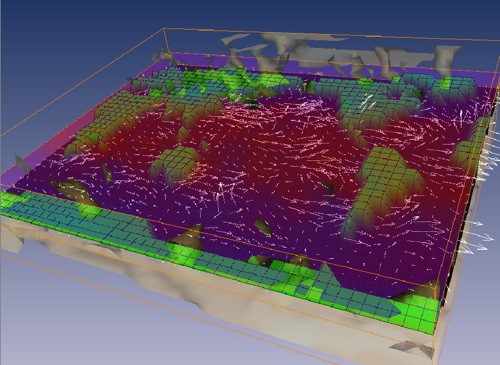 (b) | 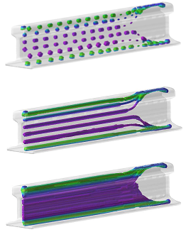 (c) |
Will Schroeder et al. in The Visualisation Toolkit (Schroder et al. 1998) stated “informally visualisation is the transformation of data or information into pictures. Visualisation engages the primal human sensory apparatus, vision, as well as the processing power of the human mind. The result is a simple and effective medium for communicating complex and/or voluminous information.” Based upon using the massive amount of brain power within the human visual system that constitutes about 1/3 of the total brain size, visualizations have been shown to be one of the best and sometimes the only way of conveying a huge amount of data in a short period of time. One of the key reasons for visualization as a specific field to study was the rapid increase in quantity of data being produced by simulations on supercomputers of physical, natural and theoretical problems. This has been termed as the data-deluge problem and frequently has been so large that graphical representations offer the only viable way to assimilate the data.
The simulation models themselves have also been increasing in complexity, involving large numbers of independent and dependent variables whose relationships need to be understood. For example, in climate modelling, we may wish to explore how temperatures, water vapour content, pressure, wind directions and velocities vary within a 3D region, over time and all at once. The process of visualization is therefore concerned with ways to represent the data as well as defining tools for interactively exploring the multidimensional and multi-variant models. One of the early active research areas was to find ways to link this visualization process with interactive control of the simulations themselves, opening up completely new possibilities for interactive exploration and understanding of complex phenomena. Over the years a number of visualization systems have emerged, which provide a framework for this kind of model exploration.
Plenty of literature and course notes are now available but as a simple example, a few rules are presented next on how to create an effective graph. A graph should present a reasonable amount of data, say something about the behaviour of that data and it should avoid giving a false impression of the data. In other words, the graph must communicate something. Tukey (1977) pp 128,157 said “there cannot be too much emphasis on our need to see behaviour. Graphs force us to note the unexpected; nothing could be more important”.
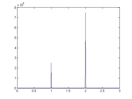
Excel and MATLAB are two of the most popular visualization tools currently used, even though users may not consider them as such. They produce numerous 2D and 3D graphs of different sizes and dimensions but the visualization choices are rarely thought about. Figure 2 shows two views using MATLAB of a simple formulae (y = (x-1)-2 + 3(x-2)-2). Both show the same numerical sampled data but the second, by cropping the y-axis to a limited range [0:50], could be said to present a large amount of extra information highlighting an important area. This process has been termed focus and context zoom interaction.
 (a) | 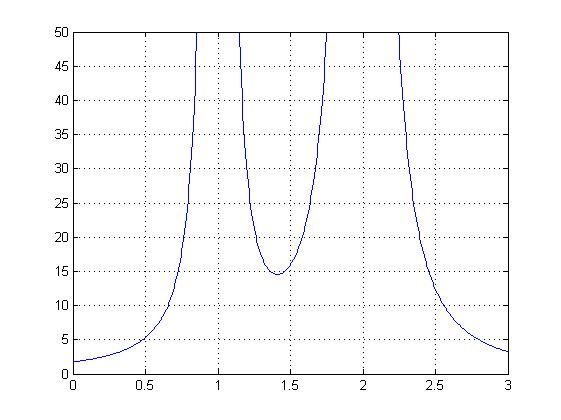 (b) |
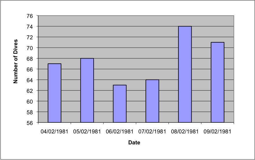
Users make choices about the data to be used and its visualization, and these affect both the quality and the quantity of the information presented. Good visualization requires graphical integrity and there are many standard techniques to help quantify and qualify between different versions. As a short exercise three well used simple objective tests (adapted from Tufte (2001)) are presented here as applied to the data shown in Figure 3.
Objective Test 1: The Lie Factor emphasises the variation in the data which can cause misleading interpretations. The variation in height of the smallest and largest bars in the graph on the left is (74 - 56) / (63 - 56) = 2.57; however, the variation in the data is 74 / 63 = 1.17. These two numbers being different indicate how visually the variations appear more extreme on the left-hand graph.
Objective Test 2: The Data Ink represents the non-erasable items of a graphic and often represents the non-redundant ink. The horizontal grid lines, tick marks and the frame around the graph are all erasable – and can be, within reason, as they may distract more than guide the observer.
Objective Test 3: The Data Density represents the ratio defined as the number of entries in the data matrix divided by the area of the data graphic. In this case by removing frames the data density of the right-hand graph slightly increases.
 (a) | 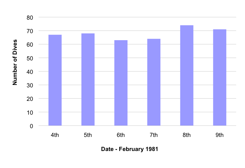 (b) |
It is possible and recommended to try these kinds of tests and many others on any images including those found in national newspapers.
The visualization of large datasets has become a new key bottleneck in applications where validation of results and data acquisition from scientific equipment is required at an early stage. Such validation would allow correctness of methods (such as the set up of a physical experiment) to be determined prior to further spending of computational or imaging machine resources. Datasets can far exceed the capabilities of modern graphics hardware (GPUs) and so visualization systems are turning to parallel compute facilities to render them.
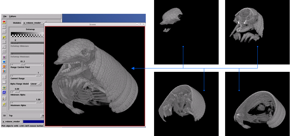
Figure 4 shows a use case of a current system being developed. Here multiple render processes are executed to render small sections of a decomposed dataset (right hand side). In this case the GPU output from each render process is visible; although usually these windows are not visible and only the left hand composite image is shown. However, this conveys the idea of distributed rendering with the final composited image, shown on the left, viewable by the user. This final real-time interactive image can be transmitted across the internet at fast rates (experience is about 15 frames per second across countries), to be displayed within an application window (as shown), within a portal, or within a Virtual Learning or Research Environment. There is no current national based visualization service in the UK; but various test services exist within JISC and research council funded projects, including on the National Grid Service (NGS http://www.ngs.ac.uk/) and two initiatives currently running on the UK national supercomputing service (HECToR http://www.hector.ac.uk/) are leading the way.
Rules can be broken with the addition of appropriate metadata, and this has been known for a long time. The addition of good metadata including all forms of annotations is very important even if it takes time and careful thought. Metadata can include all details describing the source of the data, the methods used to pre-manipulate the data and create the visualization, as well as the contact details of the author, creation date etc. Recently there have been tools developed to help record this process. These include the development of software within e-Science, creating a set of middleware linking computing resources together – adding semant