Building Your Affiliate
Business Empire
In this chapter, I am going to teach you on how to set up a simple site to increase your mailing list, how to write simple, fast and effective promotional email and how to follow-up your subscribers.
To build your affiliate business empire, the biggest asset is the mailing list. The bigger list you have, the more profit you can earn. However, often times most of the marketers had forgotten one important step, which is to send the traffic to their own landing page first.
It is highly recommended that you don’t send traffic straight to the vendor’s page through your affiliate link just like that. If you do so, 96%– 98% of the traffic will be wasted. The vendor will get all the emails while you are gaining nothing more than a few commissions. Why settle for that when you can have more?
If you paid for the traffic, but the vendor’s sales letter doesn’t sell, you lose money! To solve this and make it a win-win for both you and the vendor, you send your traffic to your own landing page to collect their email first.
A landing page is a page to collect the name and email of the visitors. It is straightforward and usually minimal with very little designs. Don’t put any sales letter here. Your call to action should be included in the promotional emails, which I will explain later in this chapter.
The format of a landing page as follows:
1. Headline
2. Sub-headline
3. Graphics of the free report
4. Opt-in form
5. Download button for free report
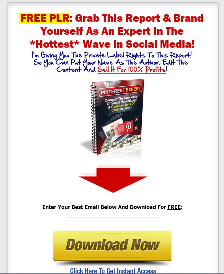
Here is an example of how a landing page should look like:

The headline in your landing page should be either in dark red or black, recommended to use dark red. The headline is usually a call to action teaser to the visitor. There are three common fonts for headline, which are Tahoma, Arial Black and Helvetica.
In this example, the headline is “Grab This Report & Brand Yourself As An Expert In The Hottest Wave In Social Media” in dark red color with a phrase of call to action as well!
Tip: If you have noticed in more detail, the first alphabet in every word is in capital form. This is proven to be easier to read to the visitor, hence increasing the chances of visitors to finish the headline.
It is then followed by the graphics of the product. As you already know that graphics is really important in a website. Put yourself in the shoes of the visitor: Would you like to read a page full of words? Or would you love the website with some visual aids in the middle? I don't need a magic ball to know the answer must be the latter one.
Notice that the next element at the bottom of the graphics is the big red arrow pointed down to the opt-in form. This big red arrow was proven to be eye attracting. The first thing your visitor will be leading to is actually the big arrow, and then they’ll notice the opt-in form to fill in their email address.
Below the red arrow is the most important opt-in form with an orange or yellow button to sign up. This orange and yellow button was proven to be an element that will increase the conversion rate as well.
This is the main purpose of a landing page, the other things are there as a call to action to get the visitors to opt-in their email addresses and grow your mailing list.
When your mailing list is getting bigger, I am not talking about few hundreds here, but few thousands or even more, you’ll need a software to manage your mailing list for you! We call it AutoResponder.
What AutoResponder will do for you is essential. It makes your job easier. With just a few clicks, you can have your email list managed. Here are some basic features that what the AutoResponder can do for you:
1. Autoresponder follow up
2. Email deliverability rate
3. Done for you sign up forms
4. Done for you email newsletters
5. Automatic emails from your blog posts
6. Drag and drop editor
7. Manage subscribers
8. Subscriber segmenting
9. Email marketing tracking
These are the basic features in the software. You can make things automated with the software. The suggested low-cost and effective AutoResponder are GetResponse.com and Aweber.com. With a low-cost of monthly fees, you can get these amazing features.
After the opt-in of email address in the landing page, redirect the traffic to the vendor’s page through your affiliate link. It is very important that you redirect them through your affiliate link. If you do not do this, you will not get the commission even if they purchase the product.
That is the first path you can choose, the second option is to redirect the traffic to your bonus or review page. This is the most recommended method, because you can build up your credibility through the bonuses and review pages you have showed them. Hence, you keep the subscribers with you.
If you are not a trustable source, sooner or later, the subscribers will not follow you anymore and click on the unsubscribe button.

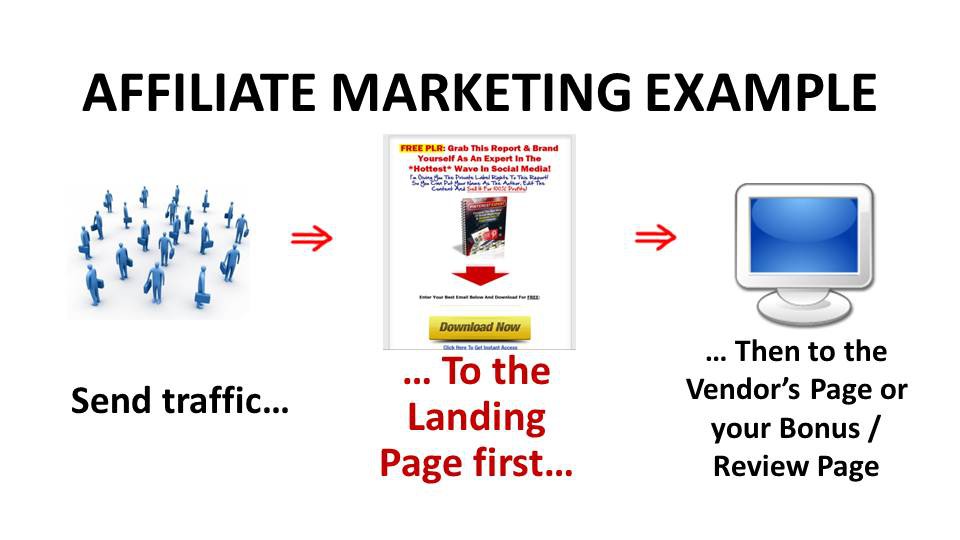
This is how it should be. Step 1 to send the traffic to the landing page first, and then to the vendor’s page or your bonus or review page.
A bonus page is basically an extra page where you give away one or more of your products as a bonus for them in return of their subscription to your newsletters. On the other hand, a review page is where you write reviews about the product you are promoting at that time.
To write a review article on the product, you need to understand and know what the product is all about. You can either get the review access from the vendor or you buy it from the vendor, of course, through your affiliate link, as mention in the Review Writing Technique chapter.
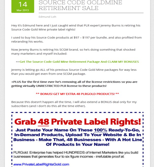
Here is an example of review page prepared for you.

Now, I will reveal to you how to write follow-up emails as promised earlier. There are only two parts in an email, which are the headline and the body. The headline of the email is the subject line that will show up in the subscribers’ mailbox.
Headline indeed is the most vital part, because it decides the fate of your email, whether to be read by subscribers or be deleted without even being read by the subscribers. So, what is the important thing you need to take care of to write a headline that attracts people to open it?
First technique is to use numbers, statistics or scarcity factor. When there is a numbers or statistic that proves you as not a scam, the possibility that people will click on it and check out what’s in it will be higher.
Scarcity factor is like the ‘limited sales’ technique, it is a common marketing technique to cause people feel the sense of urgency to buy this, because it is limited. For instance, a headline with Bonus! Only limits to 50… or something similar. People love “limited edition”. They’d jump into action more quickly.
Second technique is to give a teaser in your headline, remain suspended until they open the email. This is what we call a cliffhanger technique. You do not tell them what the email is about in the subject line. For example, Reasons why I hate MLM… or Is this the last software you ever needed? They will not know what this email is all about until they click to open the email.
Tip: Use sentence case in your headline, it is easier to read this way. Compare these two:
my review for optimizepress
My review for OptimizePress
Which one is easier to read? Of course, the second one.
Tip #2: Keep your subject line within 35-50 characters only. The reason why you need to limit your subject line characters is because 50 characters are the longest the mailbox will show. Anything longer than this will not be shown. So, your subject line will be cut off in the mid-sentence if it were too long.
Here come to the second part of an email – the body. Straightforward and precise is the key for the body. You don’t need to write a long-winded email but there are only one or two important points you need them to know. They might not be able to read the entire email if it is too long.
Don’t waste the opportunities to make a sale because of the long emails. Keep it short within 200-300 words will do. Straight to the point to the “what’s in it for me” and call to action in the email. Insert your URL link to the same site every time after the call to action.
The ideal way in putting URL link will be 3 times in an email – in the beginning, middle and at the end.
Too many times of call to action leaves bad impression to them as well, 3 will be the ideal numbers. The URL can be linked to your affiliate link or bonus or review page. As mentioned, link to the bonus or review page is the most recommended way.
Tip: Keep the body of your email with 55 characters per line. Why? People feel easier to read with the shorter length per line. Imagine you is to read an email from beginning to the other end, will it be easier to read half of the page and move forward to the next line? This is a time-tested method proven to be useful in email marketing.
Now, how often should you send the follow-up emails to your subscribers? My answer to you will be at least 4 follow-up emails with the interval of 1 email per day.
The emails that you are going to send should be as following:
1st day: First Promotional Email
2nd day: Reminder Email
3rd day: Q & A Email
Last day: Last Call Email
Tip: Remember to use AutoResponder to send all these emails to your subscribers. A small cheat to send the emails on the day you want automated, AutoResponder does it all for you!
Tip: Use link tracker or link cloaker to keep track on the people that are clicking on the link in your emails. With this, you can improve your email writing skills by conducting some split test in the elements of your emails.
Change one element at one time and see which one contribute more traffic to the website you’ve linked. No worries on this, it is one of the services in AutoResponder.
What if your link is a complicated long link? People usually will not click into long links with some indecipherable words, because it looks like a virus link. You can simplify your link with YoURLs.org, get more clicks with a much simpler link! The best part is it is free!


