3.1 Linear Regression and Correlation1
3.1.1 Student Learning Objectives
By the end of this chapter, the student should be able to:
• Discuss basic ideas of linear regression and correlation.
• Create and interpret a line of best fit.
• Calculate and interpret the correlation coefficient.
• Calculate and interpret outliers.
3.1.2 Introduction
Professionals often want to know how two or more variables are related. For example, is there a relationship
between the grade on the second math exam a student takes and the grade on the final exam? If there is a
relationship, what is it and how strong is the relationship?
In another example, your income may be determined by your education, your profession, your years of
experience, and your ability. The amount you pay a repair person for labor is often determined by an initial
amount plus an hourly fee. These are all examples in which regression can be used.
The type of data described in the examples is bivariate data - "bi" for two variables. In reality, statisticians
use multivariate data, meaning many variables.
In this chapter, you will be studying the simplest form of regression, "linear regression" with one indepen-
dent variable (x). This involves data that fits a line in two dimensions. You will also study correlation which
measures how strong the relationship is.
3.2 Linear Equations2
Linear regression for two variables is based on a linear equation with one independent variable. It has the
form:
y = a + bx
(3.1)
1This content is available online at <http://cnx.org/content/m17089/1.5/>.
2This content is available online at <http://cnx.org/content/m17086/1.4/>.
103
104
CHAPTER 3. LINEAR REGRESSION AND CORRELATION
where a and b are constant numbers.
x is the independent variable, and y is the dependent variable. Typically, you choose a value to substitute
for the independent variable and then solve for the dependent variable.
Example 3.1
The following examples are linear equations.
y = 3 + 2x
(3.2)
y = −0.01 + 1.2x
(3.3)
The graph of a linear equation of the form y = a + bx is a straight line. Any line that is not vertical can be
described by this equation.
Example 3.2
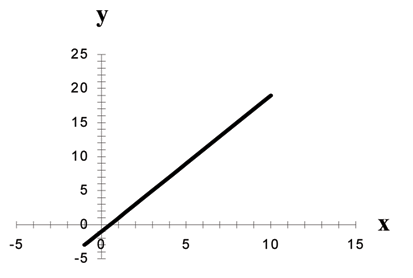
Figure 3.1: Graph of the equation y = −1 + 2x.
Linear equations of this form occur in applications of life sciences, social sciences, psychology, business,
economics, physical sciences, mathematics, and other areas.
Example 3.3
Aaron’s Word Processing Service (AWPS) does word processing. Its rate is $32 per hour plus a
$31.50 one-time charge. The total cost to a customer depends on the number of hours it takes to
do the word processing job.
Problem
Find the equation that expresses the total cost in terms of the number of hours required to finish
the word processing job.
Solution
Let x = the number of hours it takes to get the job done.
Let y = the total cost to the customer.
The $31.50 is a fixed cost. If it takes x hours to complete the job, then (32) (x) is the cost of the
word processing only. The total cost is:
105
y = 31.50 + 32x
3.3 Slope and Y-Intercept of a Linear Equation3
For the linear equation y = a + bx, b = slope and a = y-intercept.
From algebra recall that the slope is a number that describes the steepness of a line and the y-intercept is
the y coordinate of the point (0, a) where the line crosses the y-axis.
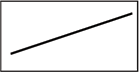
(a)
(b)
(c)
Figure 3.2: Three possible graphs of y = a + bx. (a) If b > 0, the line slopes upward to the right. (b) If
b = 0, the line is horizontal. (c) If b < 0, the line slopes downward to the right.
Example 3.4
Svetlana tutors to make extra money for college. For each tutoring session, she charges a one
time fee of $25 plus $15 per hour of tutoring. A linear equation that expresses the total amount of
money Svetlana earns for each session she tutors is y = 25 + 15x.
Problem
What are the independent and dependent variables? What is the y-intercept and what is the
slope? Interpret them using complete sentences.
Solution
The independent variable (x) is the number of hours Svetlana tutors each session. The dependent
variable (y) is the amount, in dollars, Svetlana earns for each session.
The y-intercept is 25 (a = 25). At the start of the tutoring session, Svetlana charges a one-time fee
of $25 (this is when x = 0). The slope is 15 (b = 15). For each session, Svetlana earns $15 for each
hour she tutors.
3This content is available online at <http://cnx.org/content/m17083/1.5/>.
106
CHAPTER 3. LINEAR REGRESSION AND CORRELATION
3.4 Scatter Plots4
Before we take up the discussion of linear regression and correlation, we need to examine a way to display
the relation between two variables x and y. The most common and easiest way is a scatter plot. The
following example illustrates a scatter plot.
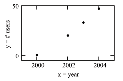
Example 3.5
From an article in the Wall Street Journal : In Europe and Asia, m-commerce is becoming more
popular. M-commerce users have special mobile phones that work like electronic wallets as well as
provide phone and Internet services. Users can do everything from paying for parking to buying
a TV set or soda from a machine to banking to checking sports scores on the Internet. In the next
few years, will there be a relationship between the year and the number of m-commerce users?
Construct a scatter plot. Let x = the year and let y = the number of m-commerce users, in millions.
x (year)
y (# of users)
(b)
2000
0.5
2002
20.0
2003
33.0
2004
47.0
(a)
Figure 3.3:
(a) Table showing the number of m-commerce users (in millions) by year. (b) Scatter plot
showing the number of m-commerce users (in millions) by year.
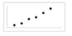
A scatter plot shows the direction and strength of a relationship between the variables. A clear direction
happens when there is either:
• High values of one variable occurring with high values of the other variable or low values of one
variable occurring with low values of the other variable.
• High values of one variable occurring with low values of the other variable.
You can determine the strength of the relationship by looking at the scatter plot and seeing how close the
points are to a line, a power function, an exponential function, or to some other type of function.
When you look at a scatterplot, you want to notice the overall pattern and any deviations from the pattern.
The following scatterplot examples illustrate these concepts.
4This content is available online at <http://cnx.org/content/m17082/1.6/>.
107
(a) Positive Linear Pattern (Strong)
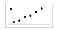
(b) Linear Pattern w/ One Deviation
Figure 3.4
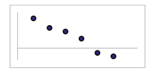
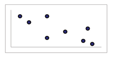
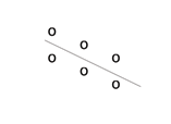
(a) Negative Linear Pattern (Strong)
(b) Negative Linear Pattern (Weak)
Figure 3.5
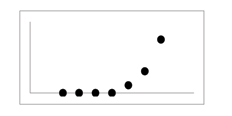
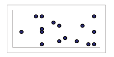
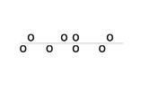
(a) Exponential Growth Pattern
(b) No Pattern
Figure 3.6
In this chapter, we are interested in scatter plots that show a linear pattern. Linear patterns are quite com-
mon. The linear relationship is strong if the points are close to a straight line. If we think that the points
show a linear relationship, we would like to draw a line on the scatter plot. This line can be calculated
through a process called linear regression. However, we only calculate a regression line if one of the vari-
ables helps to explain or predict the other variable. If x is the independent variable and y the dependent
variable, then we can use a regression line to predict y for a given value of x.
108
CHAPTER 3. LINEAR REGRESSION AND CORRELATION
3.5 The Regression Equation5
Data rarely fit a straight line exactly. Usually, you must be satisfied with rough predictions. Typically, you
have a set of data whose scatter plot appears to "fit" a straight line. This is called a Line of Best Fit or Least
Squares Line.
3.5.1 Optional Collaborative Classroom Activity
If you know a person’s pinky (smallest) finger length, do you think you could predict that person’s height?
Collect data from your class (pinky finger length, in inches). The independent variable, x, is pinky finger
length and the dependent variable, y, is height.
For each set of data, plot the points on graph paper. Make your graph big enough and use a ruler. Then
"by eye" draw a line that appears to "fit" the data. For your line, pick two convenient points and use them
to find the slope of the line. Find the y-intercept of the line by extending your lines so they cross the y-axis.
Using the slopes and the y-intercepts, write your equation of "best fit". Do you think everyone will have
the same equation? Why or why not?
Using your equation, what is the predicted height for a pinky length of 2.5 inches?
Example 3.6
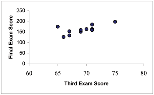
A random sample of 11 statistics students produced the following data where x is the third exam
score, out of 80, and y is the final exam score, out of 200. Can you predict the final exam score of a
random student if you know the third exam score?
5This content is available online at <http://cnx.org/content/m17090/1.14/>.
109
x (third exam score)
y (final exam score)
65
175
67
133
71
185
71
163
66
126
75
198
67
153
70
163
71
159
69
151
69
159
(a)
(b)
Figure 3.7: (a) Table showing the scores on the final exam based on scores from the third exam. (b) Scatter
plot showing the scores on the final exam based on scores from the third exam.
The third exam score, x, is the independent variable and the final exam score, y, is the dependent variable.
We will plot a regression line that best "fits" the data. If each of you were to fit a line "by eye", you would
draw different lines. We can use what is called a least-squares regression line to obtain the best fit line.
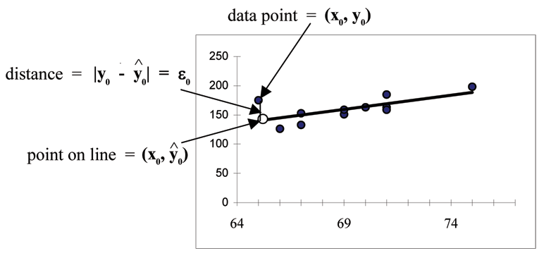
Consider the following diagram. Each point of data is of the the form (x, y)and each point of the line of
^
best fit using least-squares linear regression has the form
x, y .
^
The y is read "y hat" and is the estimated value of y. It is the value of y obtained using the regression line.
It is not generally equal to y from data.
110
CHAPTER 3. LINEAR REGRESSION AND CORRELATION
Figure 3.8
^
The term |y
y
0 −
0| =
0 is called the "error" or residual. It is not an error in the sense of a mistake, but
measures the vertical distance between the actual value of y and the estimated value of y. In other words,
it measures the vertical distance between the actual data point and the predicted point on the line.
If the observed data point lies above the line, the residual is positive, and the line underestimates the
actual data value for y. If the observed data point lies below the line, the residual is negative, and the line
overestimates that actual data value for y.
^
In the diagram above, y
y
0 −
0 =
0 is the residual for the point shown. Here the point lies above the line
and the residual is positive.
= the Greek letter epsilon
^
For each data point, you can calculate the residuals or errors, |y
y
i −
i | =
i for i = 1, 2, 3, ..., 11.
Each is a vertical distance.
For the example about the third exam scores and the final exam scores for the 11 statistics students, there
are 11 data points. Therefore, there are 11 values. If you square each and add, you get
11
(
2
1)2 + ( 2)2 + ... + ( 11)2 = Σ
i = 1
This is called the Sum of Squared Errors (SSE).
Using calculus, you can determine the values of a and b that make the SSE a minimum. When you make
the SSE a minimum, you have determined the points that are on the line of best fit. It turns out that the line
of best fit has the equation:
^
y= a + bx
(3.4)
Σ
where a = y − b · x and b = (x−x)·(y−y) .
Σ(x−x)2
111
x and y are the averages of the x values and the y values, respectively. The best fit line always passes
through the point (x, y).
The slope b can be written as b = r · sy
where s
s
y = the standard deviation of the y values and sx = the
x
standard deviation of the x values. r is the correlation coefficient which is discussed in the next section.
Least Squares Criteria for Best Fit
The process of fitting the best fit line is called linear regression. The idea behind finding the best fit line is
based on the assumption that the data are scattered about a straight line. The criteria for the best fit line is
that the sum of the squared errors (SSE) is minimized, that is made as small as possible. Any other line you
might choose would have a higher SSE than the best fit line. This best fit line is called the least squares
regression line .
NOTE: Computer spreadsheets, statistical software, and many calculators can quickly calculate the
best fit line and create the graphs. The calculations tend to be tedious if done by hand. Instructions
to use the TI-83, TI-83+, and TI-84+ calculators to find the best fit line and create a scatterplot are
shown at the end of this section.
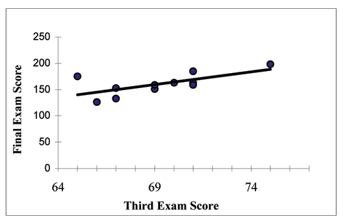
THIRD EXAM vs FINAL EXAM EXAMPLE:
The graph of the line of best fit for the third exam/final exam example is shown below:
Figure 3.9
The least squares regression line (best fit line) for the third exam/final exam example has the equation:
^
y= −173.51 + 4.83x
(3.5)
NOTE:
112
CHAPTER 3. LINEAR REGRESSION AND CORRELATION
Remember, it is always important to plot a scatter diagram first. If the scatter plot indicates that
there is a linear relationship between the variables, then it is reasonable to use a best fit line
to make predictions for y given x within the domain of x-values in the sample data, but not
necessarily for x-values outside that domain.
You could use the line to predict the final exam score for a student who earned a grade of 73 on
the third exam.
You should NOT use the line to predict the final exam score for a student who earned a grade of
50 on the third exam, because 50 is not within the domain of the x-values in the sample data,
which are between 65 and 75.
UNDERSTANDING SLOPE
The slope of the line, b, describes how changes in the variables are related. It is important to interpret
the slope of the line in the context of the situation represented by the data. You should be able to write a
sentence interpreting the slope in plain English.
INTERPRETATION OF THE SLOPE: The slope of the best fit line tells us how the dependent variable (y)
changes for every one unit increase in the independent (x) variable, on average.
THIRD EXAM vs FINAL EXAM EXAMPLE
Slope: The slope of the line is b = 4.83.
Interpretation: For a one point increase in the score on the third exam, the final exam score increases by
4.83 points, on average.
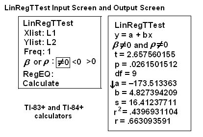
3.5.2 Using the TI-83+ and TI-84+ Calculators
Using the Linear Regression T Test: LinRegTTest
Step 1. In the STAT list editor, enter the X data in list L1 and the Y data in list L2, paired so that the corre-
sponding (x,y) values are next to each other in the lists. (If a particular pair of values is repeated, enter
it as many times as it appears in the data.)
Step 2. On the STAT TESTS menu, scroll down with the cursor to select the LinRegTTest. (Be careful to select
LinRegTTest as some calculators may also have a different item called LinRegTInt.)
Step 3. On the LinRegTTest input screen enter: Xlist: L1 ; Ylist: L2 ; Freq: 1
Step 4. On the next line, at the prompt β or ρ, highlight "= 0" and press ENTER
Step 5. Leave the line for "RegEq:" blank
Step 6. Highlight Calculate and press ENTER.
113
Figure 3.10
The output screen contains a lot of information. For now we will focus on a few items from the output, and
will return later to the other items.
The second line says y=a+bx. Scroll down to find the values a=-173.513, and b=4.8273 ; the equation of the
^
best fit line is y= −173.51 + 4.83x
The two items at the bottom are r2 = .43969 and r=.663. For now, just note where to find these values; we
will discuss them in the next two sections.
Graphing the Scatterplot and Regression Line
Step 1. We are assuming your X data is already entered in list L1 and your Y data is in list L2
Step 2. Press 2nd STATPLOT ENTER to use Plot 1
Step 3. On the input screen for PLOT 1, highlight On and press ENTER
Step 4. For TYPE: highlight the very first icon which is the scatterplot and press ENTER
Step 5. Indicate Xlist: L1 and Ylist: L2
Step 6. For Mark: it does not matter which symbol you highlight.
Step 7. Press the ZOOM key and then the number 9 (for menu item "ZoomStat") ; the calculator will fit the
window to the data
Step 8. To graph the best fit line, press the "Y=" key and type the equation -173.5+4.83X into equation Y1.
(The X key is immediately left of the STAT key). Press ZOOM 9 again to graph it.
Step 9. Optional: If you want to change the viewing window, press the WINDOW key. Enter your desired
window using Xmin, Xmax, Ymin, Ymax
**With contributions from Roberta Bloom
114
CHAPTER 3. LINEAR REGRESSION AND CORRELATION
3.6 Correlation Coefficient and Coefficient of Determination6
3.6.1 The Correlation Coefficient r
Besides looking at the scatter plot and seeing that a line seems reasonable, how can you tell if the line is a
good predictor? Use the correlation coefficient as another indicator (besides the scatterplot) of the strength
of the relationship between x and y.
The correlation coefficient, r, developed by Karl Pearson in the early 1900s, is a numerical measure of the
strength of association between the independent variable x and the dependent variable y.
The correlation coefficient is calculated as
n · Σx · y − (Σx) · (Σy)
r =
(3.6)
n · Σx2 − (Σx)2 · n · Σy2 − (Σy)2
where n = the number of data points.
If you suspect a linear relationship between x and y, then r can measure how strong the linear relationship
is.
What the VALUE of r tells us:
• The value of r is always between -1 and +1: −1 ≤ r ≤ 1.
• The closer the correlation coefficient r is to -1 or 1 (and the further from 0), the stronger the evidence
of a significant linear relationship between x and y; this would indicate that the observed data points
fit more closely to the best fit line. Values of r further from 0 indicate a stronger linear relationship
between x and y. Values of r closer to 0 indicate a weaker linear relationship between x and y.
• If r = 0 there is absolutely no linear relationship between x and y (no linear correlation).
• If r = 1, there is perfect positive correlation. If r = −1, there is perfect negative correlation. In both
these cases, all of the original data points lie on a straight line. Of course, in the real world, this will
not generally happen.
What the SIGN of r tells us
• A positive value of r means that when x increases, y increases and when x decreases, y decreases
(positive correlation).
• A negative value of r means that when x increases, y decreases and when x decreases, y increases
(negative correlation).
• The sign of r is the same as the sign of the slope, b, of the best fit line.
NOTE: Strong correlation does not suggest that x causes y or y causes x. We say "correlation does
not imply causation." For example, every person who learned math in the 17th century is dead.
However, learning math does not necessarily cause death!
6This content is available online at <http://cnx.org/content/m17092/1.11/>.
115
(a) Positive Correlation
(b) Negative Correlation
(c) Zero Correlation
Figure 3.11:
(a) A scatter plot showing data with a positive correlation. 0 < r < 1 (b) A scatter plot
showing data with a negative correlation. −1 < r < 0 (c) A scatter plot showing data with zero correlation.
r=0
The formula for r looks formidable. However, computer spreadsheets, statistical software, and many cal-
culators can quickly calculate r. The correlation coefficient r is the bottom item in the output screens for the
LinRegTTest on the TI-83, TI-83+, or TI-84+ calculator (see previous section for instructions).