By the end of this chapter, the student should be able to:
Display data graphically and interpret graphs: stemplots, histograms and boxplots.
Recognize, describe, and calculate the measures of location of data: quartiles and percentiles.
Recognize, describe, and calculate the measures of the center of data: mean, median, and mode.
Recognize, describe, and calculate the measures of the spread of data: variance, standard deviation, and range.
Once you have collected data, what will you do with it? Data can be described and presented in many different formats. For example, suppose you are interested in buying a house in a particular area. You may have no clue about the house prices, so you might ask your real estate agent to give you a sample data set of prices. Looking at all the prices in the sample often is overwhelming. A better way might be to look at the median price and the variation of prices. The median and variation are just two ways that you will learn to describe data. Your agent might also provide you with a graph of the data.
In this chapter, you will study numerical and graphical ways to describe and display your data. This area of statistics is called "Descriptive Statistics". You will learn to calculate, and even more importantly, to interpret these measurements and graphs.
This module provides a brief introduction into the ways graphs and charts can be used to provide visual representations of data.
A statistical graph is a tool that helps you learn about the shape or distribution of a sample. The graph can be a more effective way of presenting data than a mass of numbers because we can see where data clusters and where there are only a few data values. Newspapers and the Internet use graphs to show trends and to enable readers to compare facts and figures quickly.
Statisticians often graph data first to get a picture of the data. Then, more formal tools may be applied.
Some of the types of graphs that are used to summarize and organize data are the dot plot, the bar chart, the histogram, the stem-and-leaf plot, the frequency polygon (a type of broken line graph), pie charts, and the boxplot. In this chapter, we will briefly look at stem-and-leaf plots, line graphs and bar graphs. Our emphasis will be on histograms and boxplots.
This module introduces the use of stem-and-leaf graphs (stemplots), line graphs and bar graphs for describing a set of data visually.
One simple graph, the stem-and-leaf graph or stem plot, comes from the field of exploratory data analysis.It is a good choice when the data sets are small. To create the plot, divide each observation of data into a stem and a leaf. The leaf consists of a final significant digit. For example, 23 has stem 2 and leaf 3. Four hundred thirty-two (432) has stem 43 and leaf 2. Five thousand four hundred thirty-two (5,432) has stem 543 and leaf 2. The decimal 9.3 has stem 9 and leaf 3. Write the stems in a vertical line from smallest the largest. Draw a vertical line to the right of the stems. Then write the leaves in increasing order next to their corresponding stem.
For Susan Dean's spring pre-calculus class, scores for the first exam were as follows (smallest to largest):
33; 42; 49; 49; 53; 55; 55; 61; 63; 67; 68; 68; 69; 69; 72; 73; 74; 78; 80; 83; 88; 88; 88; 90; 92; 94; 94; 94; 94; 96; 100
| Stem | Leaf |
|---|---|
| 3 | 3 |
| 4 | 299 |
| 5 | 355 |
| 6 | 1378899 |
| 7 | 2348 |
| 8 | 03888 |
| 9 | 0244446 |
| 10 | 0 |
The stem plot shows that most scores fell in the 60s, 70s, 80s, and 90s. Eight out of the 31 scores or approximately 26% of the scores were in the 90's or 100, a fairly high number of As.
The stem plot is a quick way to graph and gives an exact picture of the data. You want to look for an overall pattern and any outliers. An outlier is an observation of data that does not fit the rest of the data. It is sometimes called an extreme value. When you graph an outlier, it will appear not to fit the pattern of the graph. Some outliers are due to mistakes (for example, writing down 50 instead of 500) while others may indicate that something unusual is happening. It takes some background information to explain outliers. In the example above, there were no outliers.
Create a stem plot using the data:
1.1; 1.5; 2.3; 2.5; 2.7; 3.2; 3.3; 3.3; 3.5; 3.8; 4.0; 4.2; 4.5; 4.5; 4.7; 4.8; 5.5; 5.6; 6.5; 6.7; 12.3
The data are the distance (in kilometers) from a home to the nearest supermarket.
Are there any values that might possibly be outliers?
Do the data seem to have any concentration of values?
The leaves are to the right of the decimal.
The value 12.3 may be an outlier. Values appear to concentrate at 3 and 4 kilometers.
| Stem | Leaf |
|---|---|
| 1 | 1 5 |
| 2 | 3 5 7 |
| 3 | 2 3 3 5 8 |
| 4 | 0 2 5 5 7 8 |
| 5 | 5 6 |
| 6 | 5 7 |
| 7 | |
| 8 | |
| 9 | |
| 10 | |
| 11 | |
| 12 | 3 |
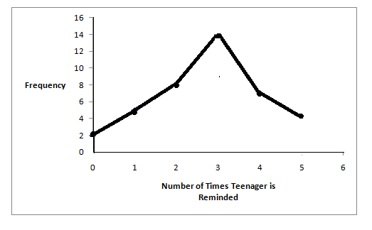
Another type of graph that is useful for specific data values is a line graph. In the particular line graph shown in the example, the x-axis consists of data values and the y-axis consists of frequency points. The frequency points are connected.
In a survey, 40 mothers were asked how many times per week a teenager must be reminded to do his/her chores. The results are shown in the table and the line graph.
| Number of times teenager is reminded | Frequency |
|---|---|
| 0 | 2 |
| 1 | 5 |
| 2 | 8 |
| 3 | 14 |
| 4 | 7 |
| 5 | 4 |
Bar graphs consist of bars that are separated from each other. The bars can be rectangles or they can be rectangular boxes and they can be vertical or horizontal.
The bar graph shown in Example 4 has age groups represented on the x-axis and proportions on the y-axis.
By the end of 2011, in the United States, Facebook had over 146 million users. The table shows three age groups, the number of users in each age group and the proportion (%) of users in each age group. Source: http://www.kenburbary.com/2011/03/facebook-demographics-revisited-2011-statistics-2/
| Age groups | Number of Facebook users | Proportion (%) of Facebook users |
|---|---|---|
| 13 - 25 | 65,082,280 | 45% |
| 26 - 44 | 53,300,200 | 36% |
| 45 - 64 | 27,885,100 | 19% |

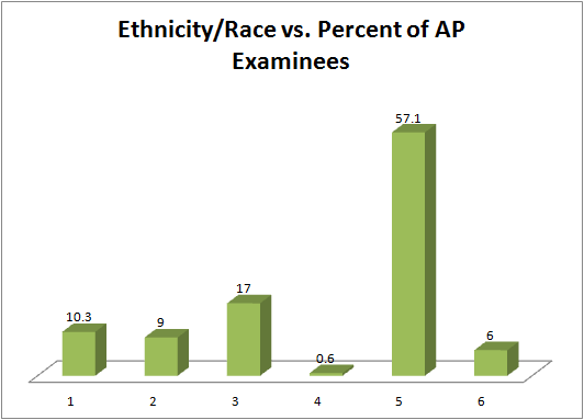
The columns in the table below contain the race/ethnicity of U.S. Public Schools: High School Class of 2011, percentages for the Advanced Placement Examinee Population for that class and percentages for the Overall Student Population. The 3-dimensional graph shows the Race/Ethnicity of U.S. Public Schools (qualitative data) on the x-axis and Advanced Placement Examinee Population percentages on the y-axis. (Source: http://www.collegeboard.com and Source: http://apreport.collegeboard.org/goals-and-findings/promoting-equity)
| Race/Ethnicity | AP Examinee Population | Overall Student Population |
|---|---|---|
| 1 = Asian, Asian American or Pacific Islander | 10.3% | 5.7% |
| 2 = Black or African American | 9.0% | 14.7% |
| 3 = Hispanic or Latino | 17.0% | 17.6% |
| 4 = American Indian or Alaska Native | 0.6% | 1.1% |
| 5 = White | 57.1% | 59.2% |
| 6 = Not reported/other | 6.0% | 1.7% |
Go to Outcomes of Education Figure 22 for an example of a bar graph that shows unemployment rates of persons 25 years and older for 2009.
This book contains instructions for constructing a histogram and a box plot for the TI-83+ and TI-84 calculators. You can find additional instructions for using these calculators on the Texas Instruments (TI) website.
This module provides an overview of Descriptive Statistics: Histogram as a part of Collaborative Statistics collection (col10522) by Barbara Illowsky and Susan Dean.
For most of the work you do in this book, you will use a histogram to display the data. One advantage of a histogram is that it can readily display large data sets. A rule of thumb is to use a histogram when the data set consists of 100 values or more.
A histogram consists of contiguous boxes. It has both a horizontal axis and a vertical axis. The horizontal axis is labeled with what the data represents (for instance, distance from your home to school). The vertical axis is labeled either Frequency or relative frequency. The graph will have the same shape with either label. The histogram (like the stemplot) can give you the shape of the data, the center, and the spread of the data. (The next section tells you how to calculate the center and the spread.)
The relative frequency is equal to the frequency for an observed value of the data divided by the total number of data values in the sample. (In the chapter on Sampling and Data, we defined frequency as the number of times an answer occurs.) If:
f = frequency
n = total number of data values (or the sum of the individual frequencies), and
RF = relative frequency,
then:

For example, if 3 students in Mr. Ahab's English class of 40 students received from 90% to 100%, then,
f
=
3
,
n
=
40
, and

Seven and a half percent of the students received 90% to 100%. Ninety percent to 100 % are quantitative measures.
To construct a histogram, first decide how many bars or intervals, also called classes, represent the data. Many histograms consist of from 5 to 15 bars or classes for clarity. Choose a starting point for the first interval to be less than the smallest data value. A convenient starting point is a lower value carried out to one more decimal place than the value with the most decimal places. For example, if the value with the most decimal places is 6.1 and this is the smallest value, a convenient starting point is 6.05 (6.1 - 0.05 = 6.05). We say that 6.05 has more precision. If the