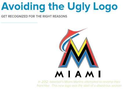
The easiest way to recognize a company and distinguish it from the rest is by its logo. But, when your company has an ugly logo that makes potential consumers want to vomit, you will be recognized for all the wrong reasons. So before you go and click that online ad for designer who will give you a “breathtaking” logo for $5, think about what kind of logo you truly will end up with (hint: it won’t be too short of repulsive) and how that will effect your brand (pretty simple, poorly).
So you have followed the steps from the previous chapters, but your logo is still screaming cheap logo design instead of professional, it’s time to take a minute and look at some of these key points to turn your logo from stomach wrenching to matchless.
Your logo reflects who you are. Stop freaking out about modifying your logo. If your logo is old and dated, then you look old and outdated. If your logo is ugly and irrelevant, then you look ugly and irrelevant. While consumers are critics of your logo they focus more on the feel of your brand they get from it. You want to make sure that feeling is a good one, otherwise it doesn’t matter how great your company/product is; if your mark is bad then the first impression is that your product is just as bad.
Don’t leave your design to an amateur. Your 19 year old daughter took a couple design classes in high school and has a great concept for a design for your new company logo for the low cost of $50, stop yourself right there. That cheap fee is exactly what you’re going to get- cheap. You run a professional business and therefore everything that represents your business should be just as professional (including your logo). Here are some common reasons why your logos can look amateurish:
• You decide to save money by designing the logo quickly yourself
• You have a family friend who knows a little bit of Photoshop and will take care of it
• You give the job to an online company that offers cheap logos
All of the above can result in disastrous outcomes; if your logo looks amateurish, then so will your business.
Woah, scale that down a little. No your logo does not need to be point 85 size font, as long as we can see and read it you are golden. A big logo is like a large egotistical signature; it’s like screaming, HEY LOOK AT ME! I can almost assume none of your clients or customers enjoyed being screamed at, so scale that logo down a tad.
There is no need to scream; when you have a well crafted logo your design will stand for itself instead of having to be shoved down the throats of potential consumers. With a big logo, your company also gives the idea that its full of itself (like that small guy with the big truck), which can translate into being insecure. Let your logo be a badge of honor that is tastefully placed with a sense of balance and proportion.
Go easy on overcrowding. We’re once again getting back to that K.I.S.S. rule, keep it simple, stupid! Just because you own a pet shop doesn’t mean you should be trying to fit every animal you carry into your logo. Busy logos that try to force in concepts look bad, are difficult to replicate and are confusing to the consumer. You can tell the entire story behind your brand with your website, ads and social media; your logo is just one aspect of your overall branding.
Don’t focus on the top trends. Logo trends come and go just as quick as fashion trends and ultimately turn into clichés. A great logo should be designed to be timeless which can be achieved by ignoring the latest design tricks and gimmicks. Being aware as a designer of the latest crazes is important, mainly so you can avoid them at all costs.
Rather than choosing the flavor of the month, think about what is best for the longevity of your brand. A logo turns into a great logo when it is able to surpass all trends in the current and coming years and still stand on its own. Coca Cola is the one of the best examples of this, they haven’t change their logo in forever, but yet still remains prevalent and stylish.
Subliminal messages in your logo. Many of us can recognize a corporate logo from a mile away, but we almost always overlook the subliminal, hidden or simply clever messages they conceal. A brand’s logo is designed to speak to its viewer on more than just one level; therefore many famous logos were created with hidden messages that at first glance you may not catch but if you go back to look you will find the brand message the logo is trying to communicate.


