Mere color, unspoiled by meaning, and unallied with definite form, can speak to the soul in a thousand different ways.
- Oscar Wilde
Our minds are programmed to respond to color; they shape our thoughts and emotions. According to studies, color affects more than just mood; color has the ability to change our buying habits. What?! Yes, a simple color choice can invoke as much as 80% increase in brand recognition which directly links to consumer confidence.
If used effectively, color theory is one of the most important tools a designer can have. Colors are a form of non-verbal communication, but can speak a loud message. Color can instantly set a mood, convey an emotion, invoke a reaction or inspire someone to take action. When we select the correct color palette we are able to tell our brand’s story with a powerful effect.
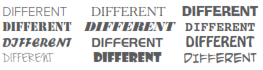
Color is not the only factor that can tell a story in your logo; your choice of typography is just as important to your design. In the Logo Design Workbook, typography is described as “picture of words.” Each typeface can bring out a different meaning. Don’t believe me? Type out the same word 20 times, each time using a different typeface. You will realize that every typeface conveys a different story, some maybe only slightly, others drastically different.
Color, typography and the corporate identity all go hand in hand in your logo. Something as simple as the choice of color or the font you use can change everything your company stands for. So before you go picking colors and choosing a random typeface read through some of these guidelines regarding color and typography.
Colors of the Rainbow
Let’s begin with color; since our minds are programmed to respond to color we receive their subliminal messages which tend to shape our thoughts. As humans, our very survival is hung on the identification of color. We stop our cars for red lights and go on green, we use color indicators for warnings and danger signs. Bottom line: color is crucial to our daily lives. It’s important to use color appropriately and understand the meaning behind the colors we choose.
If a picture is worth a thousand words, a picture with recognizable colors may be worth a million, memorywise. There is a substantial amount of research that proves that color matters and also plays a pivotal role in all our visual experiences. Here are some examples of how different colors are perceived.
RED
An intense color that can summon strong emotions from blood and warfare to love and passion. Red is used in logo designs to grip the viewer’s attention and has been known to raise one’s blood pressure or make people hungry.
BLUE
A calming color that can stir up images of authority, success and security. Most people can say they like at least one shade of blue. The most popular color in logo design, it can be seen extensively in government, medical and Fortune 500 company logos.
GREEN
Green represents life and renewal. It is a restful and soothing color, but can also represent jealousy and inexperience. You can often find it in company logos that are trying to portray themselves as eco-friendly.
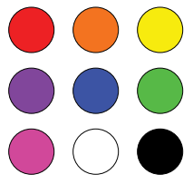

BROWN
Brown indicates nature and utility. Brown is used in logos related to construction and legal due to its simplicity, warmth and neutrality.
BLACK
Black symbolizes menace or evil, popular as an indicator of power. Found in many logos for its boldness, simplicity and sophistication.
IMPORTANCE OF TYPOGRAPHY
Typography is the art of designing and arranging letters in order to create a word. Depending on its weight, width or height, a letter needs to convey a different feeling. For example, a thick serif letter on top of, and right next to another one, will give the sense of claustrophobia and won’t be legible. On the other hand, a thin, serif type, spaced equally, will be more fluid and easy to read.
Steve Jobs knew the power of typography and used it to differentiate Macintosh computers from other competitors by producing a system that printed the same fonts that you saw on the screen. Before Mac computers, fonts were just cryptic codes embedded in text to produce visual results in print. Jobs knew that people were looking for a simple way to communicate and express their feelings. Therefore, Jobs asked Susan Kare to design a bunch of fonts (eg. Chicago, Athens, New York and Geneva) that were legible on the computer as well as print.
Let’s quickly go over two of the most popular typesets.
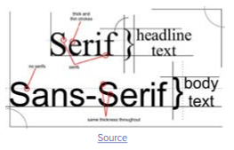
SERIF
Serifs are the small lines tailing from the edges of letters and symbols, separated into distinct units for a typewriter or typesetter. Serif fonts are usually easier to read and are recommended for printed work. Serif makes individual letters more distinctive and easier for our brains to recognize quickly. Serif fonts also evoke emotions like tradition, reliability, comfort and respect.
Common Serif Fonts: Times New Roman, Georgia, Trajan, Garamond
SAN SERIF
Sans-Serif is a typeface that does not have small projecting features called “serifs” at the end of their strokes. Sans Serif is great for online work. With a lower resolution small serif characters are harder to read than the equivalent sans-serif characters because of their more complex shapes. Sans-serif associates with stability, objective, cleanliness and modern.
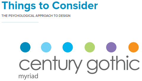
Common San-Serif Fonts: Helvetica, Myriad, Calibri, Futura, Proxima Nova
Serif & Sans-Serif are the two most popular types of fonts, however this doesn’t mean you are restricted to either. Slab serif, script and modern fonts may be suitable choices as well. Like color, each type of font have characteristics that we emotionally connect with.
So the question truly is; how do you design a good typeface for your logo?
With over 45,000 fonts on the market, everyone is asking this question. Typography can be a very complicated topic but understanding some simple concepts and rules can result in solid typography and help make good graphic design great.
Here is a compiled list of things to keep in mind when setting up your next logo with text:
1. measure - Measure the width of your text. If it’s too wide then it makes it harder for readers to visually travel from one line to the next. If it’s too narrow there will be too much movement.
2. plan for Font Size Increase - Don’t forget to ensure your templates will scale properly when you increase your font size. If you style your typography correctly and create a solid layout, this shouldn’t be an issue
3. Use Whitespace Appropriately - Whitespace is the space between elements like bodies of text, columns, etc. this can be broken down to the smaller elements as well. Giving your design enough whitespace is important and very helpful in creating a well balanced design.
4. Consistency and the ability to adapt are key components to successfully create a good typography associated with a brand
There’s a lot that goes into typography and it can make or break a design. It is an art and skill that takes time to master, but it’s one of the most powerful tools that can be utilized in your designs.