How to use Pareto Chart to improve quality
Pareto Chart Definition: it is statistical representation for the frequency of occurrence for specific set of categories or classes, represented by bars where X-Axis is representing the frequency and Y-Axis is representing the categories / classes ( Pareto Chart is special version of Histogram Graph)
How to use it?
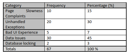
As described in the definition it is representing the frequency of categories, these categories can be your project issues’ categories like Page Slowness, Exceptions, UI Complaints, Data manipulation and Database locking.
There are eight steps to create “Pareto Chart”:-
1- Develop a list of problems, items or causes to be compared: which we mentioned above, but it can be anything you see your project is suffering from.
2- Develop a standard measure for comparing the items: it can be
a. How often it occurs: frequency (our example will use frequency)
b. How long it takes: time
c. How many resources it uses: cost
3- Choose a timeframe for collecting the data: start observing the system in defined timeframe, all collected data must be in this timeframe.
4- Grouping and calculating the weight: Tally, for each item, how often it occurred (or cost or total time it took). Then, add these amounts to determine the grand total for all items. Find the percent of each item in the grand total by taking the sum of the item, dividing it by the grand total and multiplying by 100.
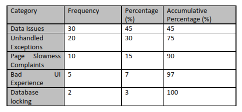
5- Calculate the accumulative Percentages: List the items being compared in decreasing order of the measure of comparison: e.g., the most frequent to the least frequent. The cumulative percent for an item is the sum of that item’s percent of the total and that of all the other items that come before it in the ordering by rank.
6- Draw the chart: List the items on the horizontal axis of a graph from highest to lowest. Label the left vertical axis with the numbers (frequency, time or cost), then label the right vertical axis with the cumulative percentages (the cumulative total should equal 100 percent). Draw in the bars for each item.
7- Draw the line: Draw a line graph of the cumulative percentages. The first point on the line graph should line up with the top of the first bar. Excel offers simple charting tools you can use to make your graphs, or you can do them with paper and pencil.
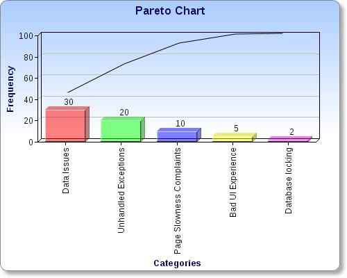
8- Decide the highest frequency categories: Analyze the diagram by identifying those items that appear to account for most of the difficulty. Do this by looking for a clear breakpoint in the line graph, where it starts to level off quickly. If there is not a breakpoint, identify those items that account for 50 percent or more of the effect.
After tackling highest frequency categories you have to repeat above steps from No. 3 to see who much the resolution was effective to reduce the frequency of the issues.
There is one important fact saying resolving 20 % of the causes will resolve 80% of the issues (80/20 rule), Pareto chart is helping you to apply this fact because “Pareto Chart” is focusing on the frequency of issues not in Severity.
Notes (Place Your Notes Here)