Gaps in the technical analysis are named interruptions between close and open prices visualized in bar charts and candlesticks charts. Such a way, an opening outside the previous day's or other
period's range generates a price gap. There are four types of gaps: common, breakaway, runaway, and exhaustion. It is commonly believed that "Gaps must be filled." as a result of the price reversal just after a gap formation. Hence, the time of gap filling may be essentially different for different types of gaps.
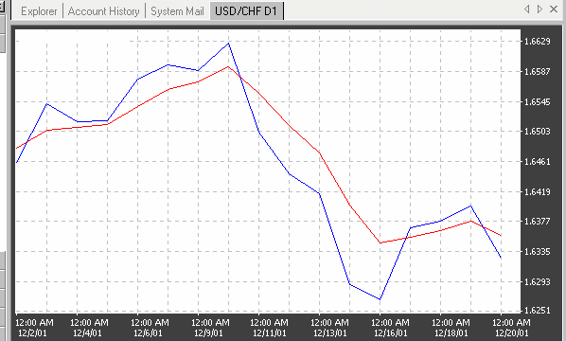
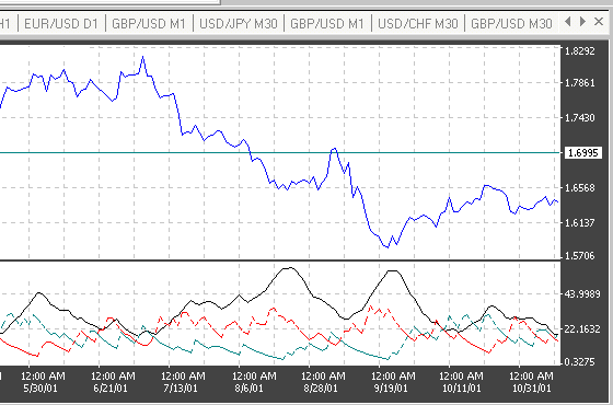
Common Gaps. Common gaps tend to occur in relatively quiet periods or in illiquid markets. Common gaps are as a rule short term that is it may soon close indeed. When gaps occur within regular trading ranges, the word on the street has been that, "Gaps must be filled" . Emerging of a common gap in a rise price chart is a signal buy, in a down price chart – sell. Examples of common gaps are shown on Figures 4.44 and 4.45.
As one can see on these figures, the most gaps on charts were closed indeed in filling time up to 12 hours.
Figure 4.44. Example of common gaps filling in the Japanese yen chart.
.
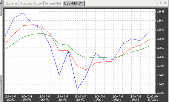
Breakaway Gaps. Breakaway gaps occur at the beginning of a new trend, usually after the break of a consolidation pattern. Breakaway gaps indicate most likely direction of the trend continuation and confirm a potential of the market. Examples of breakaway gaps are shown in the Figures 4.46 and 4.47.
Figure 4.45. Example of common gaps in the Japanese yen chart.
2001 by Royal Forex. All right reserved. www.royalforex.com
47
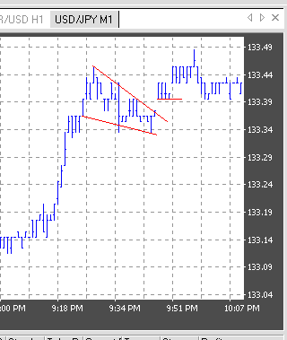
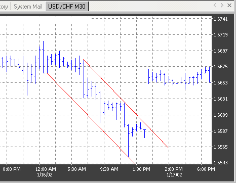
Figure 4.47. Example of a breakaway gap after a bullish wedge in the the Japanese yen chart.
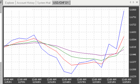
Runaway Gaps. Runaway, or measurement gaps occur within solid trends, which develop fast.
They are known as measurement gaps because they tend to occur about midway through the life of a
trend. Thus, if you measure the total range of the previous trend and extrapolate it from the measurement gap, you can identify the end of the trend and your price objective. Since the velocity of the move should be similar on both sides of the gap, you also have a time frame for the duration of the trend. Examples of those gaps are shown on Figures 4.48 – 4.50.
Figure 4.47. Example of a breakaway gap after a bearish channel in f the Swiss franc chart.
2001 by Royal Forex. All right reserved. www.royalforex.com
48
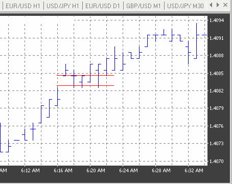
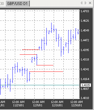
Figure 4.48. Example of a runaway gap in the Pound Sterling chart.
Exhaustion Gaps. Exhaustion gaps may occur at the top or bottom of a formation when trends change direction in an atypically quick manner. Gaps of that kind indicate on the direction of next
movement of the market and reflect a sudden change in the demand-supply ratio. By a relatively slow
reversal of the market you may wait on two exhaustion gaps to left and to right from a consolidation
figure when so called exhaustion island is being formed.
Figure 4.49. Example of a runaway gap in the Pound Sterling chart.
2001 by Royal Forex. All right reserved. www.royalforex.com
49
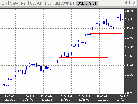
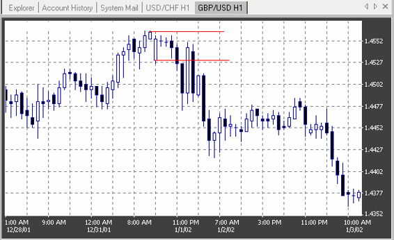
Figure 4.50. Example of a runaway gap in the Japanese Yen chart.
Real examples of an Exhaustion Gap and Exhaustion Island are shown on Figures 4.51 and
4.52.
Figure 4.51. Example of a exhaustion gap in the Pound Sterling chart.
2001 by Royal Forex. All right reserved. www.royalforex.com
50
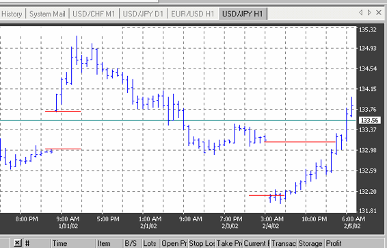
Figure 4.52. Example of an exhaustion island in the Japanese yen chart.
4.7. Mathematical tools for the technical analysis (Technical indicators)
The quantitative, or mathematical tools for the technical analysis called the technical indicators are being obtained as a result of the mathematical processing of prices averaged in time as well as
other characteristics of market movements. They are applied to get signals for an additional
evaluation of trade channels and patterns analysis by means of the indicators charts. The main groups of technical indicators are moving averages and oscillators.
Moving Averages. A moving average is an average price of a certain currency over a certain time interval (in days, hours, minutes etc) during an observation period divided by these time intervals. This averaged price is being determined consequently for each regular interval beginning from the first. A moving average has a smoother line than the underlying currency because statistical ‘noises’ are excluded to provide more convenient visualization of the currency activity. A moving average may be used as a
special indicator or to create an oscillator. The moving average may be based on the midrange level or on a daily average of the high, low, and closing prices. The charts of moving averages are being plotted within same coordinates with an underlying price chart (See Figures 4.53 – 4.56).
In the technical analysis are known the next three types of moving averages:
1. The simple moving average or arithmetic mean (SMA).
2. The linearly weighted moving average (LMA). This type of average assigns more weight to the
more recent closings. This is achieved by multiplying the last day's price by one, and each closer
day by an increasing consecutive number. In our previous example, the fourth day's price is
multiplied by 1, the third by 2, the second by 3, and the last one by 4; then the fourth day's price is deducted. The new sum is divided by 9, which is the sum of its multipliers.
3. The exponentially smoothed moving average (EMA) which provides the best smoothing of data
averaged taking into account the previous price information of the underlying currency.
In Figure 4.53 is shown the difference in reading of different types of moving averages.
Trading signals of moving averages. Trade signals which occur by the use of one moving average is a buy signal by the crossing of the underlying price chart by the moving average chart
2001 by Royal Forex. All right reserved. www.royalforex.com
51
from below up and a sell signal by the crossing of the underlying price chart by the moving average chart from above down (See Figure 4.54).
Figure 4.53. The underlying price chart (blue) and charts of a 9 days moving average (red – SMA, brown – LMA, green
– EMA) in the Swiss franc chart.
Figure 4.54. Trade signals (the underlying price chart – blue line, the moving average chart - red): the first and second crossing – signals buy, the third and forth – sell.
For the technical analysis applied are usually two or three moving averages charts constructed
for different periods – long term, middle term and short term. For example to use two charts a
combination of moving averages for 4 and 9 days and to use three moving averages – for 4, 9 and 18
days may be applied. Other often-applied combinations of three moving averages are 5, 20 and
60days and 7, 21 and 90 days.
A buying signal on a two-moving average combination, for example for 4 and 9 days, occurs
when the shorter term of two consecutive averages (4 days) intersects the longer (9 days) upward. A selling
2001 by Royal Forex. All right reserved. www.royalforex.com
52
signal occurs when the reverse happens, and the longer of two consecutive averages intersects the shorter one downward (See Figure 4.55).
Figure 4.55. Trade signals (from left to right) by the use of two EMA in the Swiss franc chart (the underlying price chart –
blue line, moving averages charts: red – for 4 days, green – for 9 days): the first crossing – buy signal, the second– sell signal
A signal involving three moving averages is generated by a moving averages combination of 4,
9, and 18 days. The buying warning occurs when the 4-day moving average crosses upward both the 9-day and 18-day averages, and the buying signal is confirmed when the 9-day moving average also crosses upward the 18-day average. (See Figure 4.56). The reverse is true for the selling signal.
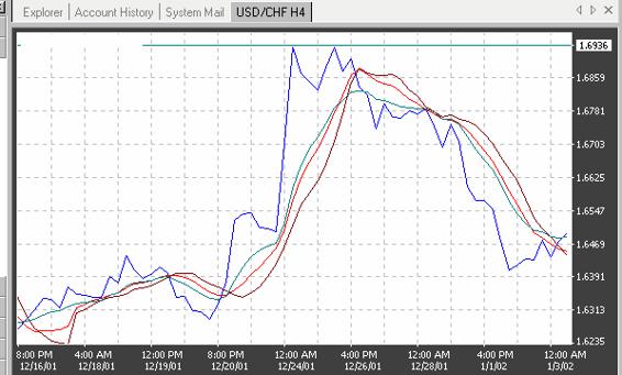
Figure 4.56. Trade signals (from left to right) by the use of three EMA in the Swiss franc chart (the underlying price chart
– blue line, moving averages charts: red – for 4 days, green – for 9 days, brown – for 18 days): the first crossing – buy signal , the second– sell signal.
Envelopes. The envelope model consists of a short-term (perhaps 5-day) closing price based moving average to which you add and subtract a small percentage (2 percent is suggested for foreign currencies). An example for the envelope using the averaging along 14 days intervals is shown on the figure 4.57. The crossing of the underlying chart price by the envelope chart from above down is a buy signal.
2001 by Royal Forex. All right reserved. www.royalforex.com
53
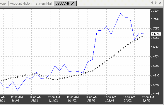
Figure 4.57. The underlying price (blue line) and the Envelop indicator (black lines) in the Swiss franc chart.
Ballinger Bands. The Ballinger bands combine a moving average with the instrument's volatility.
The bands were designed to gauge whether prices are high or low on a relative basis via volatility. The two are plotted two standard deviations above and below a 20-day simple moving average.
The bands look a lot like an expanding and contracting envelope model. When the band
contracts drastically, the signal is that volatility is low and thus likely to expand in the near future. An additional signal is a succession of two top formations, one outside the band followed by one inside. If it occurs above the band, it is a selling signal. When it occurs below the band, it is a buying signal (See Figure 4.58).
Median Price. The Median Price indicator chart is being plotted using arithmetical averages of high and low for a trade period prices. An example of that indicator is shown on Figure 4.59. The
superposition of an underlying price chart with the indicator chart gives a visual representation about the grade and direction of the deviation of close prices from the averaged prices during an
observation interval.
Average True Range. The indicator Average True Range denoted in the USA, as ATR is a grade of the volatility. Minimal and maximal values of the volatility are signals warning about a
possible reversal.
2001 by Royal Forex. All right reserved. www.royalforex.com
54
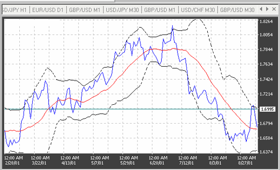
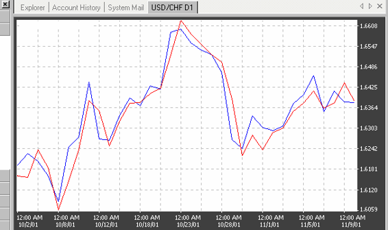
Figure 4.58. The underlying price (blue line), EMA (red line) and the Ballinger Bands indicator (black lines) in the Swiss franc chart.
Figure 4.59. An example of the Median Price indicator (red line) in the Swiss franc chart.
2001 by Royal Forex. All right reserved. www.royalforex.com
55
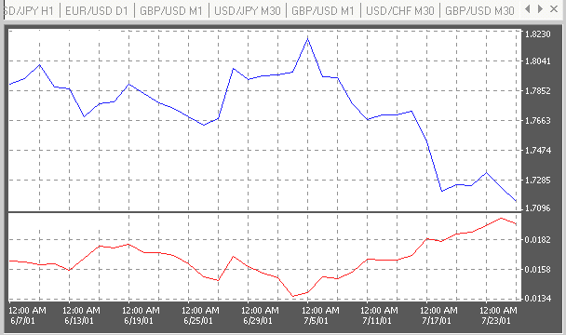
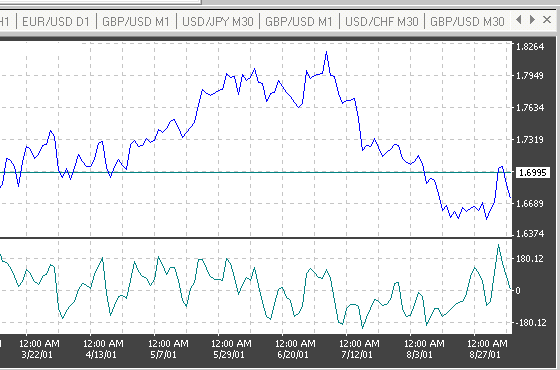
Figure 4.60. An example of the ATR indicator (red line) in the Swiss franc chart.
As it is shown in Figure 4.60 with an example of the ATR indicator for 14 days, declining of
the volatility in the ATR chart till a minimal from all visible values was a prediction of the coming after it bearish price reversal.
Oscillators. Oscillators were designed to provide signals regarding overbought and oversold market conditions. Therefore the signals of oscillators are mostly useful at the extremes of their scales.
Crossing the zero line, when applicable, usually generates direction signals. The major types of oscillators provided by the RoyalForex program are considered below.
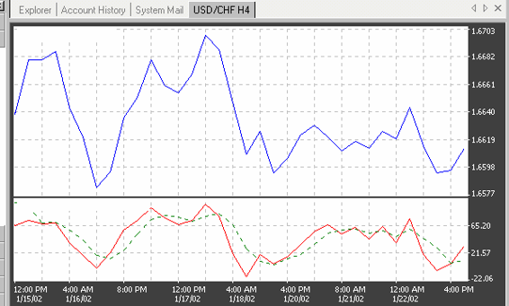
Commodity Channel Index. The commodity channel index ( CCI) consists of the difference between the mean price of the currency and the average of the mean price over a predetermined period of time. A buying signal is generated when the price exceeds the upper (+100) line, and a selling signal occurs when the price dips under the lower (-100). An example of this indicator is shown in Figure 4.61.
As one can see in this Figure, the CCI oscillates around 0 in the interval from -100 till +100. Values CCI>100 tells about an overbought (position sell likes to be rational), a value CCI<100 is a feature of an oversold (position buy likes to be rational).
Figure 4.61. Example of a real CCI indicator chart in the Swiss franc chart.
2001 by Royal Forex. All right reserved. www.royalforex.com
56
Directional Movement Index. The directional movement index (shortly – DMI) provides a signal of a clear trend presence in the market. The line simply rates the price directional movement on a scale of 0
to 100%. The higher the number, the better the trend potential of a movement, and vice versa. An example of the DMI indicator for 14 days is presented in Figure 4.62.
Figure 4.62. Example of a real DMI indicator chart in the Swiss franc chart.
To construct a DMI indicator chart two lines are to be generated which measure the buying
and selling pressure. They are called +DI (that is the positive directional indicator which is shown in Figure 4.62 by the green line) and-DI (that is the positive directional indicator which is shown in
Figure 4.62 by the black line). If +DI line is higher than –DI, a bullish situation exists, otherwise – a bearish as in Figure 4.62. Lines +DI and -DI are a ground to create the third one – so called
directional movement line ( ADX). The latter oscillates in limits from 0 till 50. Values of the ADX
below 20 correspond to the absence of any clear trend in the market. A rise of the ADX above 20 is a
signal warning about the beginning of a trend formation. An ADX line, which was above 40 and is
going to fall down signals about an exhaustion of the trend.
Stochastic. Stochastic generate trading signals before they appear in the price itself. The stochastic concept is based observations that, as the market gets toppish, the closing prices tend to approach the daily highs; whereas in a bottoming market, the closing prices tend to draw near the daily lows.
This oscillator consists of two lines called %K and %D. Visualize %K as the plotted instrument, and
%D as it’s moving average.
The formulas for calculating the stochastic are:
%K = [(CCL -L9)I(H9 -L9)] * 100,
Where
CCL - current closing price;
L 9 - the lowest low of the past 9 trade periods;
H 9 - the highest high of the past 9 trade periods
and
%D=( H3/L3) * 100,
where
2001 by Royal Forex. All right reserved. www.royalforex.com
57
H3 = CCL – L3;
L3 = H3 – L3.
The resulting lines are plotted on a 1 to 100 scale, with overbought and oversold warning signals at
70% and 30%, respectively. The buying (bullish reversal) signals occur under 10%, and conversely the
selling (bearish reversal) signals come into play above 90% after the currency turns. (See Figure 5.67.) In addition to these signals, the oscillator-currency price divergence generates significant signals. A real example of a stochastic oscillator is presented in Figure 4.63.
The intersection of the %D and %K lines generates further trading signals. There are two types of
intersections between the %D and %K lines:
1. The left crossing, when the %K line crosses prior to the peak of the %D line.
2. The right crossing, when the %K line occurs after the peak of the %D line.
Figure 4.63. Example of the stochastic indicator in the Swiss franc chart: red line - % K, green - % D.
Convergence – Divergence of Moving Averages. The moving average convergence-divergence (MACD) oscillator is built on exponentially smoothed moving aver ages. The MACD is a combination
of charts (1) of the difference of two EMA (a short and a long ones) and (2) of “the shortest” EMA
which all are plotted against the zero line. The zero line represents the times the values of the two moving averages are identical. A real example of the MACD indicator is shown in Figure 4.64.
In addition to the signals generated by the averages' intersection with the zero line and by
divergence, additional signals occur as the shorter average line intersects the longer average line. The buying signal is displayed by an upward crossover, and the selling signal by a downward crossover (See Figure 4.64).
Momentum. Momentum is an oscillator designed to measure the rate o