
Are you familiar with the term ‘responsive design’ or as some people like to call it ‘mobile-friendly’ design? It means providing the optimal user experience irrespective of whether the potential customer is using a desktop computer, smartphone, tablet, or whatever mobile device they come up with next.
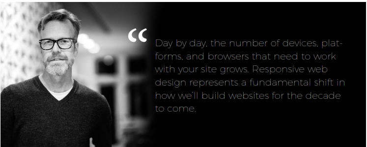
Jeffrey Veen, author of "The Art and Science of Web Design" and ex-leader of Google’s apps UX (User Experience) team
Create Your Event Page With Weemss
Our excellent Event Webpage creator is optimized for maximum effect and helps you make a site for your event in just a few minutes. It’s 100% responsive and looks great across all devices. Registration forms built with the software are also entirely responsive and can even be integrated on your very own site as easily as you would embed a YouTube video. This will enable your visitors to register for your event from any mobile or personal computer device. Remember that interacting with the web on phones and tablets is not the same as on a desktop computer.
WordPress is Your Friend
It’s always best to create your own website. We highly recommend WordPress for that. Apart from paid themes and plugins the service is free, it’s customizable and easy to use. A good many of their free themes are also responsive so you can create a fast and mobile-friendly website for your event at no cost.