Examples: Good Trend Lines vs. Bad Trend Lines
When the price breaks through a strong trend line, it goes further, offering you a great profit potential. You can draw many trend lines in one single chart, but there are several guidelines to choose only the strongest trend lines:
1. Prefer trend lines with more than two touching points.
(Trend lines become stronger the more times they are tested).
2. The touching points should not be too close together.
3. Longer trend lines are stronger than shorter trend lines. Longer trend lines are also seen on the upper time frames, so more traders are aware of them.
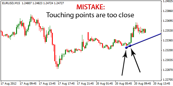
In the example above the touching points are very close together forming an unreliable trend line. There is no other touching point on the rest of the trend line.
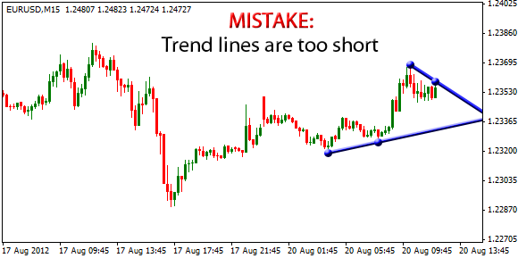
In the next example below, the two touching points are not so close together, but the trend lines are too short. A good trend line should be at least 50 bars long. There exist much better upper and lower trend lines in this chart as shown in the previous page.
Now let's see some good trend lines!
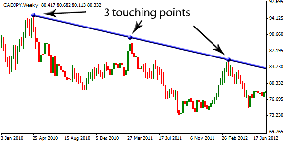
The trend line above has 3 touching points and can be considered as much stronger than trend lines in the previous examples. The points are evenly distributed and the trend line is long enough. All three guidelines are met perfectly.
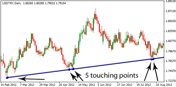
Now this trend line is a monster! It is long enough with 5 touching points. You may notice that there are two groups of two points that are too close together, but this is not a problem as long as the other points meet the guideline. Treat a group of close points as one “big point”.
“Triangles, Flags, Wedges...”
Now that you know how to draw trend lines, you are one step away from discovering the oldest market phenomenon: chart patterns. You are about to learn incredibly reliable price formations that have time and time again provided us with consistent profits.
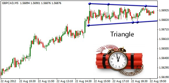
The upper and lower trend lines are forming a triangle as seen in the next chart. As the price is oscillating between the two bounding lines, the buyers and sellers are in tug of war, and eventually the price will break through one of the lines – nobody knows which one! In the next pages you will learn how to participate in this explosive move.
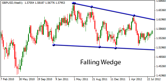
Falling wedge is like triangle, but both trend lines slope down. Recall that the bottom line alone would not be a valid trend line. You begin by drawing the upper trend line and then you complete the wedge or triangle (it depends on which line has more touching points).
One important note: the upper and bottom trend lines must converge so that the price is being squeezed.
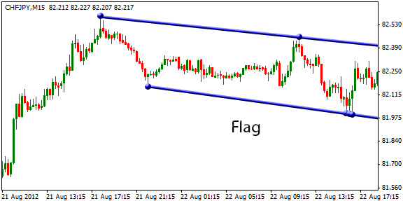
The flag pattern is encompassed by two parallel lines. The price is not squeezed by the trend lines, but it is moving inside the channel formed by the trend lines. Flags are usually seen as the market pauses after a big move before continuing its main trend.
All the presented patterns above are in an uptrend. The uptrend does not need to be perfect, the price before the pattern is just rising. Chart patterns after a downtrend are similar. We will focus only on continuation patterns, that is, buying in an uptrend and selling in a downtrend. You may hear about reversal patterns, but trading against the trend requires a lot of experience. Many banks have crashed and many fortunes were lost because of stubborn traders trying to pick the tops and bottoms. Trend is your friend, so keep it simple!
How to trade chart patterns
Now it's time to reveal the definite strategy to enter an order, place your Stop Loss and take a profit, so you don't need to watch the market and you don't let your emotions control your trading.