Telemedicine at the Federal Communications
Commission (FCC)
The Connect2HealthFCC taskforce is exploring the intersection of broadband, advanced technology and health and further charting the broadband future of health care – serving as an umbrella for all FCC health-oriented activities to help enable a healthier America.
By identifying regulatory barriers, as well as incentives, and building stronger partnerships with public and private stakeholders in the areas of telehealth, mobile applications, and telemedicine, we seek to accelerate the adoption of advanced health care technologies — leveraging broadband and other next-gen communications services, highlighting promising health IT and telemedicine initiatives across the country and abroad, and expediting a vital shift to more ubiquitous, broadband-enabled health care solutions along the entire health and wellness continuum.
Vision: Everyone connected to the people, services and information they need to get well and stay healthy. This will require:
Robust connections
Integrated and seamless care
Empowered and engaged consumers
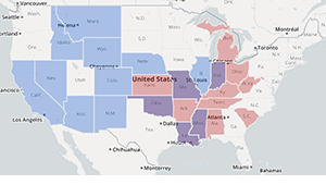
Mapping Broadband Health in America tool allows users to visualize, overlay and analyze broadband and health data at the national, state and county levels. The maps are an interactive experience, enabling detailed study of the intersection between connectivity and health for every county in the United States. The resulting maps can be used by both public and private sectors, and local communities, to identify opportunities and gaps in connectivity and care. Go directly to the mapping tool.
In November 2016, the FCC’s Connect2Health Task Force and the Consumer and Governmental Affairs Bureau’s Office of Intergovernmental Affairs co-hosted a webinar to further explore the potential of the Mapping Broadband Health in America platform for the public sector. This one-hour "deeper dive" webinar was particularly tailored to the needs and interests of state and local government offices and agencies. (https://www.fcc.gov/news-events/events/2016/11/mapping-connected-health-county-county)
The Connect2HealthFCC Task Force’s Mapping Broadband Health in America tool allows users to visualize, overlay and analyze broadband and health data at the national, state and county levels – informing policy prescriptions and investment decisions.
The maps are an interactive experience, showing various pictures of the intersection between connectivity and health for every county in the United States. Users can generate customized maps that show broadband access, adoption and speed alongside various health measures (e.g., obesity, diabetes and physician access) in urban and rural areas.
These maps can be used by both public and private sectors, and local communities, to identify opportunities and gaps in connected care.
You can explore questions like:
Key features of these maps:
Potential benefits and uses:
Data sources:
The broadband data is current as of December 2014 and comes from the Commission’s Form 477 data on residential fixed broadband deployment and residential fixed broadband subscribership. Proportions for broadband access statistics are calculated using 2014 demographic data from GeoLytics, E. Brunswick, NJ. The health data is drawn from the 2015 release of the Robert Wood Johnson Foundation County Health Rankings & Roadmap (which reflects data from the Health Resources and Services Administration, Dartmouth Atlas Project, American Medical Association, Centers for Disease Control and Prevention and other primary sources); and additional demographic data is from the U.S. Census Bureau. Learn more about the data and methodology. (https://www.fcc.gov/reports-research/maps/connect2health/data.html) (https://www.fcc.gov/health/maps/methodology)
Link: https://www.fcc.gov/reports-research/maps/connect2health/background.html
Map Design
To create the data visualizations in the map, we assigned a color-coded value for each broadband variable (yellow to blue) and health metric (yellow to red) in every county and state. In the broadband and health choropleth maps (found under the corresponding tabs), the color of each state or county represents the level of broadband (yellow to blue) or health metric (yellow to red) for that feature.
In addition, the map provides supplemental visual context for each state and county in spider plots, charts and graphs. These features were designed to help users who may be less familiar with the broadband health profile of targeted areas and will facilitate easy comparison between counties.
As an example, the Broadband Health Double Burden Areas sample map shows the power of the mapping tool to identify clusters and potentially convene public-private partnerships, private sector collaborations, and focus policy efforts. The five states in purple —Indiana, Louisiana, Mississippi, Missouri, and Oklahoma— experience incidences of chronic disease above the national average. At the same time, fixed broadband access percentages in rural areas are on average below 50%, and in some cases far below. View these maps for obesity, diabetes, and preventable hospitalizations. This can also be viewed at the county level.
Mapping Broadband Health in America - FAQs
What is the purpose of the map? How will it be used? By whom?
The Mapping Broadband Health in America tool enables data-driven decision making at the intersection of broadband and health. The map was created to visualize key cross-currents in broadband and health data, as a valuable tool for both public and private stakeholders. By allowing users to ask and answer questions about broadband and health in any county in the United States, the tool provides the data to drive broadband health policies and solutions for this critical space.
The mapping tool can be used in a myriad of ways—by federal, state and local agencies and the private sector. It can help inform policy decisions, facilitate interagency coordination, encourage public/private partnerships and investment, and drive innovation—directing resources to areas with overlapping broadband and health needs.
Why did the FCC create the mapping tool?
The Mapping Broadband Health in America tool demonstrates the value proposition of broadband in health and builds on information the Connect2HealthFCC Task Force gathered in our Beyond the Beltway series of events around the country. By allowing users to ask questions about both broadband and health in any county in the United States, the tool provides the data to drive broadband and health policies and solutions for this critical space. By examining the relationship between connectivity and health at a local level, the map can help to identify current issues and develop future solutions to address connectivity gaps and promote positive health outcomes.
How current is the data, on both broadband connectivity and health?
The broadband access and adoption data was extracted from the FCC’s Form 477 dataset and is current as December 2014. The map uses the Version 2 release issued on March 16, 2016. Proportions for broadband access statistics are calculated using 2014 demographic data from GeoLytics, E. Brunswick, NJ. The health data is drawn from the 2015 release of the Robert Wood Johnson Foundation County Health Rankings & Roadmap (which reflects data from the Health Resources and Services Administration, Dartmouth Atlas Project, American Medical Association, Centers for Disease Control and Prevention and other primary sources); and additional demographic data is from the U.S. Census Bureau (2014).
How do I download the complete dataset?
What methodology did the FCC use?
We gathered data from a variety of sources that survey and retain continually updated databases related to broadband and health. After compiling the data, we conducted exploratory data analysis to identify clusters and patterns within and across different variables. Our goal was to be able to translate patterns from the data into a geospatial representation, while offering a positive user experience. We hope that users will investigate their own questions about the state of broadband and health. Learn more about our methodology.
How often will the map be updated?
Our plan is to update the map periodically, as updated data becomes available.
Why is the data at a county level as opposed to a city or neighborhood level?
We focus on counties for several reasons: (1) county level data is available across various health (e.g, diabetes, obesity, preventable hospitalizations) and connectivity benchmarks, allowing apples to apples comparisons; (2) counties are a discrete geographic unit that can potentially drive broadband economies and local health policy (i.e. they are neither too broad such as a state level geography nor too granular such as neighborhood level geography); and (3) counties are the building blocks for publishing many types of data (e.g. economic) and for tracking progress and regional population and economic trends.
What health measures does the map track? Why were these particular health measures selected?
The map includes six health measures. These correspond to several critical population health dimensions based on the model of population health used by RWJF’s County Health Rankings.
According to public health experts, these health measures make up the components of a concept of health and can serve as precursors for other chronic conditions. These measures are regularly followed at the county level by the Centers for Disease Control and by county health departments to track population health over time.
Which aspects of connectivity does the map track?
The tool uses data about residential broadband access (deployment) and Internet adoption (subscribership). Access is correlated to the FCC benchmark speeds of 25 mbps download and 3 mbps upload. Internet adoption measures subscribership at 200 kbps. The tools also displays statistics on download and upload speeds as well as the percentage of population who have access to specified speed tiers.
I’m having trouble using this map. Is there someone who can assist?
The Connect2HealthFCC Task Force welcomes your suggestions and feedback as we continue to develop and refine the Mapping Broadband Health in America tool. Please send questions or comments to engageC2H@fcc.gov, with “Mapping” in the subject line.