Read time: 5 mins
Usability and user experience (UX) are not the same thing: the usability of a product is a crucial part that shapes its UX, and hence it falls under the umbrella of UX. While many might think that usability is solely about the ‘ease of use’ of a product, it’s actually more than that.
The ISO 9421-11 standard on usability describes it as: “The extent to which a product can be used by specified users to achieve specified goals, with effectiveness, efficiency and satisfaction in a specified context of use.” Usability is hence more than just about whether users can perform tasks easily (ease of use); it’s also concerned with user satisfaction—for a website to be usable, it has to be engaging and aesthetically pleasing, too.
Before we delve deeper into what usability entails, addressing the importance of usability is vital. Usability matters because if users cannot achieve their goals efficiently, effectively and in a satisfactory manner, they are likely to seek an alternative solution to reach their goals. Moreover, for websites and apps, alternative solutions are abundant and easy to find. Quite simply: if your product is not usable, its UX will be bad, and users will leave you for your competitors. As designers who are looking to develop products with longevity, we need to ensure that those products are usable; otherwise, we’ll risk losing users to our competitors.
In fact, a 2015 joint research by Huff Industrial Marketing, KoMarketing and BuyerZone on B2B web users showed that 46% of users leave a website because they can’t tell what the company does (i.e., a lack of effective messaging), 44% of users leave due to lack of contact information, and 37% of users leave due to poor design or navigation. This goes to show the potential harm bad usability can bring to your website.
“We tend to be distracted by the voices in our own heads telling us what the design should look like.”
— Michael Bierut, Partner at Pentagram Design
Usability is the outcome of a user-centered design process. That is a process which examines how and why a user will adopt a product and seeks to evaluate that use. That process is an iterative one and seeks to improve following each evaluation cycle continuously.
Whitney Quesenberry, the UX and Usability Expert and former President of the Usability Professional’s Association (UXPA), offers 5 criteria that a product must meet so as to be usable:
Effectiveness is about whether users can complete their goals with a high degree of accuracy. Much of the effectiveness of a product comes from the support provided to users when they work with the product; for example, fixing a credit card field so that it only accepts a valid credit card number entry can reduce data entry errors and help users perform their task correctly. There are many different ways to provide support—the key is to be as informative as possible in a meaningful way to the user.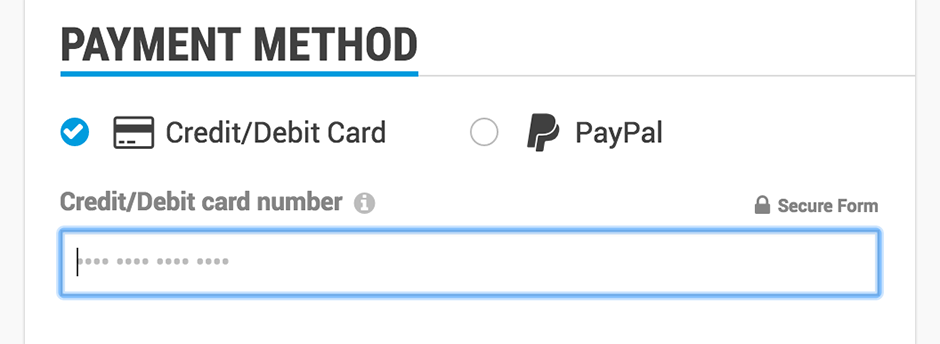
In our payment form, we restrict the number of digits you can enter into the credit card number field so as to reduce data entry errors.
You might also want to examine the language used in your product—the clearer and simpler that language is (ideally 6th-grade level), the more likely that your information will have the right impact on the user. This doesn’t mean dumbing down your language gratuitously so as to patronize your users; it just means keeping an appropriate style that errs on the simpler side for clarity’s sake. Using the right level of technicality—for example, reducing the number of technical coding terms for a design-focused website—also helps make your messages clearer and meaningful to users. Want to know how simple your copy is? Check out Hemingway App, a useful tool that analyzes your text and assesses its readability. If in doubt, keep it simple and direct; unless you’re actually selling a ghost-writing service, you will not win over users with ‘impressive’ prose.
Redundancy in navigation can sometimes be beneficial; if users have multiple paths to their objective, they are more likely to get there. This may reduce the overall efficiency of the process, however. So, always consider the frustration of a user who can’t find the way forward, and strike a balance between that and the ‘overkill’ of several alternatives.
Effectiveness and efficiency have come to be blurred in the mind. They are, however, quite different from a usability perspective. Efficiency is all about speed. How fast can the user get the job done?
You’ll want to examine the number of steps (or indeed clicks/keystrokes) needed to achieve the objective; can they be reduced? This will help develop efficient processes. Clearly labeled navigation buttons with obvious uses will also help, as will the development of meaningful shortcuts (for instance, think about the number of hours you’ve saved using Ctrl+C and Ctrl+V to copy and paste text).
So as to maximize efficiency, you need to examine how your users prefer to work—are they interacting via a smartphone or a desktop computer with a large keyboard and mouse? The two require very different approaches to navigation.
Engagement is a bit of a buzzword, but if you cut through the fluff, you’ll find that engagement occurs when the user finds the product pleasant and gratifying to use. Aesthetics matter here, and it’s why many companies invest a small fortune in graphic design elements—but they’re not the only factors in engagement.
Engagement is not only about looking nice but also about looking right. Proper layouts, readable typography and ease of navigation all come together to deliver the right interaction for the user and make it engaging. Looking nice isn’t everything, as Wikipedia (famous for its ultra-basic design) proves.

Wikipedia’s iconic layout may not win over some aestheticists, but one reason for its success is its readability, thus satisfying curious e-navigators who want to get the lowdown on a subject without being slowed down by art-saturated, scenic ‘detours’.
It seems unlikely that, given the need to gain any degree of sophistication or complexity, you can completely eliminate errors in products; in particular, digital products may be error prone because of the ecosystem in which they dwell—an ecosystem which is beyond the designer’s control.
However, the next best thing is to minimize errors from occurring and to ensure that your users can easily recover from an error and get back to what they are doing. This is what we call ‘error tolerance’.
Promoting error tolerance, according to Whitney Quesenberry, requires:
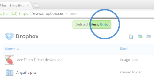
Dropbox has an undo function, in case users accidentally delete items in their folders. This is the sort of safety ledge that catches human nature just in time before users go into panic mode.
If you want a product to be used regularly, then you want users to be able to learn their way around that product easily—to the extent that it comes as second nature when they use it again.
You also need to accommodate ease of learning when releasing new functionality and features; otherwise, a familiar and happy user may quickly become frustrated with your latest release. This is something that tends to happen a lot on social networks; whenever a new set of features is released, they tend to be greeted with howls of outrage from comfortable users. And this is true even when the new features are easy to learn. A classic case occurred in early 2012, when Facebook’s Timeline format became the new standard for user profiles. Although hordes of users bemoaned the change—which to many of them seemed needless—Facebook wisely phased in the introduction so that users had plenty of time to switch over.
The best way to support ease of learning is to design systems that match a user’s existing mental models. A mental model is simply a representation of something in the real world and how it is done from the user’s perspective. It’s why virtual buttons look a lot like real buttons – we know that we push buttons; therefore, we tap virtual ones on touchscreens or mouse-click them. The form elicits the appropriate action in the user, hence making it easy to learn.
When you’re designing for usability, thinking about utility is important, too. While usability is concerned with making functions easy and pleasant to use, utility is about providing functions that users need in the first place.
Only when usability is combined with utility do products become useful to users. A mobile payment app could provide the most usable feature of adding the people around you on Facebook; nevertheless, because most users of that app wouldn’t need that feature, it’s going to be useless to them. All your effort towards building the most user-friendly feature could go to waste if that feature isn’t needed.
Usability is more than just ease of use. You need to ensure designs are efficient, effective, engaging, easy to learn and error tolerant if you want them to succeed. Of course, there are limitations on the value of usability. For example, sometimes you will have to make trade-offs so as to ensure economic viability. However, when there is no such conflict, usability should be the priority. Combining usability with utility will make your offering useful, in theory; all the same, you should pay careful attention to what the users actually need, as opposed to what you think might be an attractive feature for them to enjoy.
Beginner course
We all know that every product or website should be simple and pleasurable to use… but this is easier said than done—designing an effective, efficient, and enjoyable product is unfortunately not achieved by good intentions alone. In our course, The Practical Guide to Usability, you will learn some of the most important concepts, methods, best practices and theories from successful designers in our industry. By immersing yourself in the “how” of designing products with good usability, you’ll come out the other side being able to design products that blend your good intentions with awesome usability, helping you to unlock greater user growth, retention and satisfaction.
“Enjoyed the rigorous of this course and it showed more bridging of ideas and theories than I expected to see which was great.”
— Matthew Worner, Malta
“The whole concept of integrating testing with production, and, in particular, the idea of testing early, is a key insight. Specifically calling out the techniques of agile development, and the use of prototypes, is also good exposure for the methods used in day-to-day product production.”
— David Calabrese, United States
“Amazing experience while taking the course, great learning and wish that I will get to implement all of these in my future projects.”
— Sarang Sudhir Pitale, India