Planning Your Work
A web author's project can be a new website, revision of an existing website, maintenance and updates only of an existing website, and/or expansion of an existing website. This book will look at the web project process from the new website angle, although much of the information provided will be relevant to the other web projects.
Planning for Usability
Planning for usability before you start designing is crucial to creating a successful, easy- to use website. This will include synthesizing the answers to several core questions, your client's needs, some research into the kind of audience you expect to use the site, and cleanly organizing the results. Then you translate those results into an organizational structure for the website (design sitemap), then build the look and feel on top of that.
Core Questions
First, ask the client these questions, which provide the core information about the project. Then summarize the site/client assignment for yourself.
• What is the primary purpose of the website - what does the client want it to do for his/her company?
• Who is going to be the primary visitor (customer) of the website - est. demographics, anticipated customer needs, etc.?
• What are the 2-3 main tasks the visitor is expected to accomplish using this web- site?
• What minimum information must the website provide that will allow the visitor to easily and successfully handle these tasks?
• What limitations are being placed on this web project - by the client, your timeline or resources, customer demographics, etc.?
Client Survey
Set aside enough time to have an interview and/or go over a questionnaire with your client, so you can get a lot of detail about what the client's current status and projected project needs will be. Things you should ask several clarifying questions about include:
• Project logistics
• Project requirements and business needs
• Website audience details
• Concept needs
• Resources needed
Meeting with your client is the best way to discuss these things. Here is a simplified Client Survey I use that might give you some ideas for your own preparation.
Project Preparation
• Who is the client's primary contact and decision maker? Get name, title, email ad- dresses, & phone numbers.
• What is intended launch date for website, and why?
• What is the budget range already established for this project. Can project be divided into phases to accommodate budget / timing constraints?
Project Purpose
• Why does client want/need a web project at this time?
• Is this a new website concept or a redesign of an existing website?
• What is the client's primary business objectives/value proposition with the new materials? Secondary? (Examples include increased sales, marketing/branding awareness, and fewer customer service calls.)
• What is the main business problem the client needs to solve with new materials – what key message must get through?
• What specific areas of current client materials are successful? Why?
• What shortcomings exist with current client materials, and what 3 things should change?
Website Audience
• Who does the client believe is the audience for the website? (general profiling, more than one audience type?)
• What is the primary “action” the website visitor should take? (make a purchase, become a member, search for information)?
• Has audience been considered before selecting the technologies/extras for this website? (Often newest technologies/modules overwhelm audiences when not
needed)
• Has client gathered audience feedback for current materials? If so, how long ago? What is the feedback?
• What are the key reasons why the target audience chooses/should choose the clients products/services over competitors? (cost, service, value)
• Use a few adjectives to describe how the audience should perceive the website. (Examples: prestigious, friendly, corporate, fun, forward thinking, innovative, cut- ting edge.)
Brainstorm Concepts & Needs
• Client should share examples of materials (ads, brochures, publications, etc.) or websites s/he finds compelling.
• What visual elements or content should be utilized from client's current materials or website site (logo, color scheme, navigation, naming conventions, etc).
• Does client have a brand/identity in place? Specific color palettes & fonts to use? Is client open to completely new concepts and colors?
• Will website require specific technologies (Flash, DHTML, JavaScript, Real Audio, e-commerce, database-driven, logins, etc.)? If so, how should they enhance and clarify your audience's experience? Please describe in detail.
Resources
• Does website have / need a domain name? A server to host? Ability to update in- house?
• If this is a website redesign, are there specific tools/languages the client requires be used? (Like Dream weaver, Front Page, VS2005, php, etc.)
• Who will provide the website content (text, logo, images)? Is all the provided content the legal property of the client? (If not, do NOT use)
• Does client need graphics/graphs/charts created by designer, or purchased from stock photo houses? Does client have appropriate approvals / content/image use contracts in place?
• How will client maintain the website?
Based on the client interview/questionnaire, you would summarize the client's needs, expectations, and resources.
Audience Research
Next, do some audience research. In short-term website projects you may need to intuit as much audience information from the client interview as you can, and supplement with general demographic research. When possible, find ways to actually interact with people from the potential audience. Things to consider should include:
• Who is the real target audience?
• What will this audience want/need to make this website work for them?
• What content should be included to best suit the audience?
• What technology will the audience likely have to access/use this website?
• What comprehension/language/visibility issues should you consider for the audience?
• How/where will the audience consume the website - work, home, school, library, wifi, dial-up, palm?
• What would be the simplest and most effective navigation for the audience to find information?
• Based on the client's expectations and audience research, what is the best use of colors, fonts, images, and layout?
• What language and writing style will provide the easiest and most successful use of the website?
Planning Tools
There are a few tools/steps you'll want to include in your planning. These help you sort, clarify, and present the information you collect so you can work from it. You may also need to share some or all of these pieces with the client as you prepare a design, since your client may see needed changes or misconceptions of what you discussed. Correcting problems early will make your web project more cost-effective and polished the first time around.
AIA Table
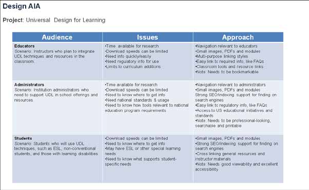
An AIA (audience, issues, and approach) table is a simple way to collect key information about the potential audience(s) you will be serving with the website. Create a grid table, and define the following.
• Audience: What audience will be using the site? Consider at least 2-3 audience types, one of which might well be the client.
• Issues: What issues may there be in reaching these audiences? Consider things like accessibility, age, language, time, steps to expected actions, and so on.
• Approach: How will you approach these issues so you can plan to meet the audience needs?
AIA Table

Visual/Design Sitemap
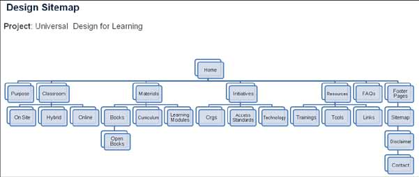
A visual sitemap is a kind of organizational chart that illustrates which website pages will be the primary top-level, second-level, third-level, and utility pages. It can be hand-drawn for your own use, but should be generated with a program for professional/presentation use. You will likely want to show it to your client so s/he can verify you have planned for the needed pages.
Design Sitemap

Wireframes
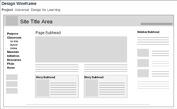
A website wireframe is a basic visual guide used in interface design to suggest the structure of a website and relationships between its pages. A web page wireframe is a similar illustration of the layout of fundamental elements in the interface. Typically, wireframes are completed before any artwork is developed. They should be generated during or after the sitemap step so that you have an accurate idea of the actual pages that will be de- signed and listed in the navigation.
Wireframes allow for the development of variations of a layout to maintain design consistency throughout the site. This is an important part of the initial development stage be- cause it creates user expectations and helps develop familiarity with the site. Wireframes also act as a way to communicate with clients and stakeholders, such as content creators, engineers, and developers.
The simpler the wireframe, the better. This doesn't mean a quickie sketch, since the wire- frame needs to accurately show layout. It means:
• Lay out the general design concept without any distracting colors and styles.
• Stick to all black, white, and grays.
• Use standard fonts only, but no font coloring, styles, or special types.
• Don't insert blocks of text where text will go, but instead black lines to show the text rows.
• To illustrate where images will go, use light gray boxes or simple black outlined boxes.
• Use identifying phrases for main points, like Logo Here, Header, Subheader, Caption.
• Spell out the Navigation links so the client can see what the top-level links will be.
• Add estimated measured widths and heights for key elements.
You should show at least two wireframed pages, especially if you will have differences to the template layout.
• Lay out website placement of banner/ID, navigation, main content, footer
• Show the home/landing page since this is a main concern for the client.
• Show a sample second page.
• If you have differences in a second-level page layout, wireframe one of these too.
• If you have something unique being included in the website, like a gallery, a table listing products, etc., make sure to wireframe those pages too.
• Add small, clear notations of the expected width and height of each web page segment (banner, navigation, content, footer, sidebar, etc.)
• Be accurate and plan for your abilities to actually code the represented website.
Wireframe

Design Comps
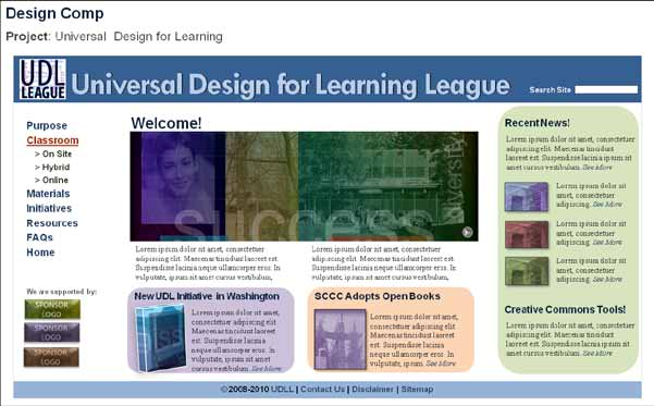
A design comp is a comprehensive layout of the way the website should actually look after it has been coded. The illustration element may incorporate stock photography, clip art, or other found material that gives an idea of what should be visually communicated, before entering any negotiations concerning the rights to use a specific image for the purpose. The comps should be done after you and the client have worked through any issues brought up during wire framing.
Follow your wireframe layout but flesh it out with real text, images, color choices, font styles, and all the visual elements the client needs to okay. Create the comp in an image editing program, or if you are more comfortable, a design publishing program. Just save the final version in a non-editable format like PDF.
• Use the design color palette, selected fonts, lists, tables, etc in your concept.
• Illustrate the real banner segment with the logo and title, the top-level navigation, the main content segment, real appropriately-sized images, and the footer segment.
• Again, include the home page. Create comps for the pages you used in your wire- frames.
• If you do not have real text yet, and likely you won't, use loreipsum filler text,
with the accurate header and subheader names the site will actually use.
• If you do not have the final images, you can use free comps or find/create filler images in the theme and style the site needs.
Remember, these design comps are for the client's approval before you ever start coding the actual site. DO NOT code before doing layout comps, or try to replace the comps stage with code. Comps really are a time and money saver, even if they feel like an extra step. They will help you have the final details nailed down before you start applying code and creating code styles.
Time Management
As you can see, you have a number of things to research, plan, and do before you start the business of the website build. Time management is a critical skill you need to develop right away so that you can manage the web project from one end to the other. You will face short projects, mid-size multi team member projects, and ongoing work. Setting your priorities, learning your limits, and keeping excellent track of your workflow and resources is a must. Here are a few tips:
• Know the drop-dead launch date, and plan to be fully ready to launch at least days before.
Comprehensive (Comp)

Time management tips, continued
• Know and create a calendar for each stage of the web project.
• Set deadlines at every step of the way, and make sure you hold yourself and your client and contacts to them.
• Get your project plan, research, and resources squared away early.
• Consider using a free/inexpensive online project management program to collaborate with your client and vendors and team members you work with. Use some- thing simple and no-brainer, since the tool should help your speed, not slow you down.
• Use your AIA table to solidify the website audience solutions.
• Use your sitemap to determine the number and levels of pages you will author.
• Use your wireframes to create an accurate layout.
• Create fleshed-out comps to guide your coding.
• Determine the project needs versus your capabilities.
• Get help when you can.


