Web Page Basics
Web pages in a cohesive, professional website should have an organized, standardized, and easy to view layout. There are several ways to create a layout, with different navigation, content, and sidebar orientations, but usable and accessible websites have several things in common, and we'll take a look at those.
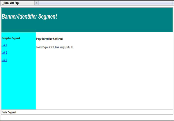
Layout Structure
Study successful websites to get clear on basic website layout patterns. You can see many examples, and you can intuitively tell which ones are easy for you to comprehend and use. Here are a few tips.
• Banner identifier segment: The banner segment is usually used as a website wide identifier segment – where the site's logo, title, or other site identification content goes.
• Primary navigation segment: Should be set in some way above-the-fold so that the visitor sees it immediately and can click on the category links.
• Content segment: The text, and most images related to the text, will fall into the content segment of the web page. This is where the bulk of the website's communication efforts take place, and is also where you will likely place the specific web page identification.
• Footer segment: The footer area of a page includes useful but not critical information, like copyright and email links.
Banner/Identifier Page Segment
The banner segment on a web page is usually used as a website-wide identification area. It is horizontal, occurs at the top of the web page and generally spans the page's full width. This is where the design starts, in terms of where the visitor first looks and the impact the client needs to create right away. It includes the:
• Client's logo or logotype
• Tagline
• Website title
• Other site identification content, like a unifying image or design.
Basic web page layout
Some websites leave much of the banner area empty, with only a logo or website title. Others use the banner area to add extra functionalities, like a site Search input box, a hotlink promotion to something important, a randomly-changing phrase to seem dynamic, etc. Some websites even do away with the top banner altogether, using the upper right or upper left side of the web page to place identifying information above vertical navigation.
Navigation Page Segment
The navigation is critical, and should be prominent, consistent through the entire website, and have excellent contrast and click ability. Your visitor needs all this to reach information elsewhere in the website. If it is at all confusing or misleading, the visitor is likely to leave.
Main Navigation
The link to top-level pages in the site is the main navigation. This could include the Home, About Us, Products, Contact Us, Gallery, and other main areas that directly sup- port the purpose and messaging of the website. Ideally there should be somewhere around 5-8 links, based on you how categorized the content structure of the website. There are several basic formats:
• Standard left navigation: The main (top-level) navigation links are vertical,
down the left side of the page.
• Right navigation: The main navigation links are vertical, and down the right side of the page. Blog sites often do this.
• Top navigation: The main navigation links are horizontal and placed across the top of the page below the banner segment. Sometimes it is placed above the banner segment instead.
• Mixed navigation: Very large websites, with divisions, may use a mixed navigation. The main navigation for the whole organization may be horizontal at the top of the site, and the main navigation for a company's division might be vertical on the left.
• Image maps: Image maps aren't used much for main navigation any more, since a key to design consistency, and ease for the visitor, is to use the same navigation style on every page of the website. However, in some cases a designer has used a large images on the home page, and hyperlinked parts of it to key navigation sections.
• You will also find examples of versatile navigation thinking as you explore other websites for ideas. Just keep usability and easy of choice in mind when you experiment.
Secondary Navigation
Secondary-level navigation is based on the sub pages of the main top-level navigation. For instance, if you selected one of the main navigation links, such as About Us, it should take you to the About Us page. Now, the About Us section of the website might encompass 3 smaller pages, including Contact, Staff Bios, and Reviews. The navigation to these pages from the About Us page would the secondary navigation from the Home page.
Secondary navigation can also appear in many formats - some subtle, some creative, and some not even appearing on the home page. Whichever you choose, it should use colors, fonts, and styling consistent with the rest of the site and with some style relationship to the main navigation. It also should never intrude upon or confuse the visitor from the primary first-level navigation.
• You can build in secondary navigation as horizontal drop downs or vertical slide- outs to the main navigation, or
• Add the secondary “section” navigation as part of the web page identifier/header area.
• Only have the secondary navigation appear on the specific top-level page it is linking from.
Inline links
You can hyperlink text inside paragraphs, address blocks, your footer, and around images. A good rule of thumb is to use inline links carefully, since they can distract the visitor from the scanning and choosing s/he needs to make. At the same time, linking inline can be useful for showing a tooltip or moving to another critical page on your website. It can also be great when you are sharing a list of useful links that the viewer can enjoy. Use your judgment and err on the conservative side.
Link Rot
Link rot (or linkrot) is an informal term for the process by which, either on individual websites or the Internet in general, increasing numbers of links point to web pages, servers or other resources that have become permanently unavailable. The phrase also de- scribes the effects of failing to update out-of-date web pages that clutter search engine results. A link that doesn't work anymore is called a broken link, dead link or dangling link.
You need to keep linkrot in mind when you are designing how our navigation and linking works on your website. The more links you add, the more confusing keeping them straight, and maintaining a low or no-linkrot site you will have. Fortunately, Google and other search engines have some tools to help you keep an eye on this, but being careful and savvy about your linking in the first place is easiest.
Content Page Segment
The text, and most images related to the text, will fall into the content segment of the web page. This is usually most of the center of the page, offset to the right or left by side navigation. It may be broken into two or three columns for sidebars and easier reading. Here you will use a combination of:
• Web page identifier (a heading)
• Subheadings
• Paragraphs, lists, and callouts of text
• Images and captions
• Media embeds and/or links
• Tables of information
• Boxes with content in them
Content layout can include one wide column, two medium columns, three narrow columns, a wide column and a narrower sidebar, and endless other possibilities. Explore the Web for visual ideas.
Image Use
Images are half the fun of a lively and attractive website. You can do all sorts of things with them, but keep a few hints in mind:
• Design clean and tidy alignment for placing images, rather than placing images helter skelter to fill up space.
• Choose images that directly support the purpose of the website and enhance the color palette and the needs of the audience demographic.
• Keep image contrast and coloring in mind as well, so that the images don't distract from the important information and links.
• Add captions when needed to identify the image and/or give credits.
• Make the image sizes consistent, rather than mixing and matching various sizes and shapes, since this looks more professional and easy to scan.
• If you do want a mixed and matched look, consider creating a collaged image and bringing it in at once, rather than trying to place several images in a collage sort of way.
Footer Page Segment
The footer portion of the web page should, like the banner and navigation segments, re- main consistent throughout the full website. It provides a recognizable section where visitors know to look for certain information, like the copyright. It should stand out but not overwhelm any of the rest of the web page layout, since it is a supporting segment. You can include:
• Copyright information
• Client address
• Email contact link
• Link to a contact form
• Link to a legal disclaimer page
• Link to a privacy rights page
• Link to press releases or other media information
• Link to careers and about the company information
• Link to help or FAQs pages
• Link to the website's sitemap
Copyright
Information, logos, and graphics on a Website are protectable under the United States Copyright Act. Copyright status can prevent others from copying and using tangible works of authorship, such as information contained on a Web page. Make sure to add the copyright date on your footer. A typical copyright notice is as follows:
Copyright © 2010 by Your Name. All Rights Reserved.