Tables
The HTML table model allows web authors to arrange data -- text, preformatted text, im- ages, links, forms, form fields, other tables, etc. -- into rows and columns of cells. Tables are block-level elements which are defined with the <table> tag, and can only be used in the body section of web pages. They cannot be placed inside any other block elements except DIVs.
A table is divided into rows (with the <tr> tag), and each row is divided into data cells (with the <td> tag). td stands for “table data,” and holds the content of a data cell. A <td> tag can contain text, links, images, lists, forms, other tables, etc. If you do not specify a border attribute, the table will be displayed without borders.
Table rows may be grouped into a head, foot, and body sections. Authors may also group columns to provide additional structural information. Cells may span multiple rows and columns.
Proper tag nesting is critical to successful tables.
<table>…</table>
Identifies a table. Several attributes are possible in HTML Transitional, but most of these are invalid in HTML Strict and must be replaced with style sheets. The summary attribute is however informally required for accessibility purposes, though its usage is not simple.
<tr>…</tr>
Contains a row of cells in a table.
<th>…</th>
A table header cell; contents are conventionally displayed bold and centered.
<td>…</td>
A table data cell, multiples of which make up the appearance of columns.
<colgroup>…</colgroup>
Specifies a column group in a table.
<col> or <col/>
Specifies a column in a table.
<caption>…</caption>
Specifies a caption for a table.
<thead>…</thead>
Specifies the header part of a table. This section may be repeated by the visitor agent if the table is split across pages (in printing or other paged media).
<tbody>…</tbody>
Specifies a body of data for the table.
<tfoot>…</tfoot>
Specifies the footer part of a table. Like <thead>, this section may be repeated by the visitor agent if the table is split across pages (in printing or other paged media).
Table Uses
Tables are meant to display rows and columns of data, like in a spreadsheet. They can be used for:
• Columns/rows of items like names and addresses
• Layout of product pictures and descriptions
• Minor layout of images in a grid, like thumbnails
• To create a simple background box that expands with content in it.
• Web page segment layout to control the areas of the banner, navigation, content, and footer areas. Note: Using tables for page structure is a good starter guide for new web authors, but should be upgraded to cascading styles layout formats as you gain more experience.
Table Structure
The essential table structure includes a table wrap, a row, and a cell inside the row, all placed in the body section of the web page code. The opening and closing tags work like the other HTML opening and closing tags. Data like text, images, links, lists, etc. can only be placed inside of table cells. You can think of a table like a moon pie.
Table shell
Like HTML tags wrap an entire web page, the table tags wrap the whole table.
<table>Rows and cells here</table>
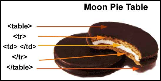
Moon Pie Table
Table rows
The table row is the HTML table element that wraps around table cells. Cells cannot be displayed in a table unless they are nested inside of rows.
<table>
<tr>
Table cells here
</tr>
</table>
Table cells
The table cell is the space in which data, like text and images, can be placed.
<table>
<tr>
<td>I am table cell #1</td>
<td>I am table cell #2</td>
</tr>
</table>
Table Headers
You can use the table header tag to use the default bold and center cell content format to give your table “columns” specific heading styles. This <th> would be used in only the first table row, and the remaining rows would use the <td> tags to present the data in its normal style.
<table>
<tr>
<th>I am table header #1</th>
<th>I am table header #2</th>
</tr>
<tr>
<td>I am table cell #1</td>
<td>I am table cell #2</td>
</tr>
</table>
Expanded Tables
If you are creating complex tables of data for your web page, you will want to expand your table structure by adding the header, body, and footer tags. The <thead> tag is used to group the header content in an HTML table. The tbody element is used to group the body content in an HTML table and the tfoot element is used to group the footer content in an HTML table. Note: <tfoot> must appear before <tbody> within a table, so that a browser can render the foot before receiving all the rows of data.
Table Example
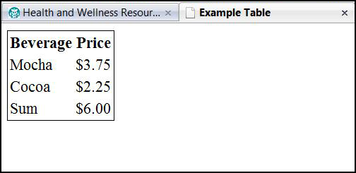
Table Code
<table style=”border:1px black solid;”>
<thead>
<tr>
<th>Beverage</th>
<th>Price</th>
</tr>
</thead>
<tfoot>
<tr>
<td>Sum</td>
<td>$6.00</td>
</tr>
</tfoot>
<tbody>
<tr>
<td>Mocha</td>
<td>$3.75</td>
</tr>
<tr>
<td>Cocoa</td>
<td>$2.25</td>
</tr>
</tbody>
</table>
Table Groups
The <colgroup> tag is used to group columns in a table for formatting, and is useful for applying styles to entire columns, instead of repeating the styles for each cell, for each row. This can be great if you want a different background color for one column, or the data to be right aligned on one column and left aligned in the other. Note that the col- group tags of each “column” need to be specified before the rows of the table.
<table style=”width:100%; border:1px black solid;”>
<colgroup style=”width:30%;”></colgroup>
<colgroup style=”width:70%; color:#ccc;”></colgroup>
<tr>
<th>Beverage</th>
<th>Size</th>
</tr>
<tr>
<td>Mocha</td>
<td>50oz</td>
</tr>
</table>
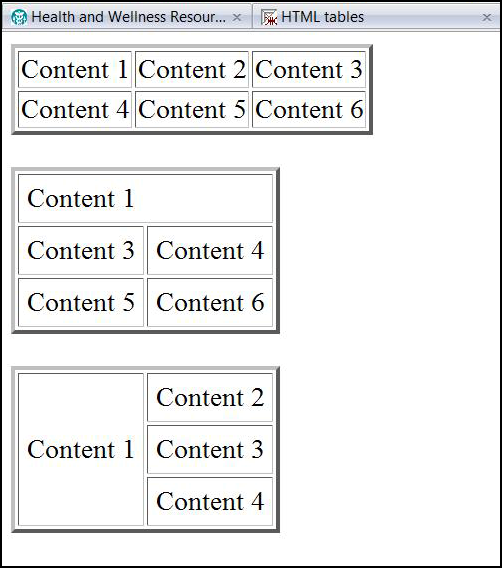
Table Cell and Row Spans
Cells may span several rows or columns. The number of rows or columns spanned by a cell is set by the rowspan and colspan attributes for the TH and TD elements. This can be helpful for tables where your first row acts as a singled header for several columns below it. Or when you want to make a single column span two rows to insert a larger image.
Colspan
The colspan is short for column span, which means coding a table data cell to stretch the length of its own column plus one or more next to it.
When you stretch a column to take the space of two in its own row, you define that it actually takes the place of the second table data cell. This is why you see only two table data cells coded in row one of the table below.
Rowspan
The rowspan is short for row span, in which you code a table data cell to stretch to the height to its own row and one or more below it.
When you stretch a row to take the space of two, you define that it actually takes the place of the following row's table data cell that would visually appear just below it. This is why you see only two table data cells coded in row three of the table below.
In order for you to even tell this is a table in the browser view, we need to add border information to the table shell and the table data cells: style=”border:1px black solid”, etc.
<table style=”border:1px black solid”>
<tr>
<td colspan=”2” style=”border: 1px gray solid;”>I am table row 1 cell 1 stretching 2 columns wide.</td>
<td style=”border: 1px gray solid;”>I am table row 1 cell 2</td>
</tr>
<tr>
<td style=”border: 1px gray solid;”>I am table row 2 cell 1</td>
<td style=”border: 1px gray solid;”>I am table row 2 cell 2</td>
<td rowspan=”2” style=”border: 1px gray solid;”>I am table row 2 cell 3 stretching 2 rows</td>
</tr>
<tr>
<td style=”border: 1px gray solid;”>I am table row 3 cell 1</td>
<td style=”border: 1px gray solid;”>I am table row 3 cell 2</td>
</tr>
</table>
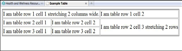
Table with spans
Table Spacing
Tables exist for you to place information inside of them, through putting content inside the table data cells. The default spacing for content in these cells defaults to 0, so your content can look pushed up against the borders of your cells.
The values for adjusting these spacings are auto, %, and length (in terms of pixels).
Padding
The padding is the space between the inside of a cell's border and the content. You can adjust it two ways:
• Padding style: Use a cascading styles rule: style=”padding:2px;” This would affect all of the cell's borders, but you can choose padding-left, padding-top, etc.
• Cellpadding: You would use this as <td cellpadding=”2”>, which the browser will interpret as 2 pixels. Best not to use since it is on its way out to deprecated tag lala land.
Margins
The margin clears an area around an element (outside the border). The margin does not have a background color, and is completely transparent. This is how you adjust this:
• Margin style: Use a cascading styles rule: style=”margin:2px;” This would affect all of the cell's borders, but you can choose margin-left, margin-top, etc.
Spacing
This specifies the space between cells. You can adjust it two ways:
• Spacing style: Use a cascading styles rule: style=”border-spacing:2px;” This
would affect all of the cell's spacing, but you can choose border-spacing-left, etc.
• Cellspacing: You would use this as <td cellspacing=2>, which the browser will interpret as 2 pixels. This is the only version that truly works with collapse-borders to eliminate any border space in a table being used for something like a faux image map.
Table Styling
Tables default to no border and no background color. If you want your table to look tabu- lar on your web page, you need to code it to show borders, colors, widths, etc. You need to do this with inline cascading styles, which we'll explain later in more detail. Here are some basics related to table styling.
Table Position
Table positioning defaults to the top left of the place where you code it, which means it will be set to the left of your page. In a sense, the body tag is the boss of the table as well as everything else inside the body, and you have to tell the body, somewhere before the table, how you want the table to be positioned. Therefore, if you want the table to be positioned in the center of the page, or to the right, you can't tell the table, but something outside of it.
This something is called a division element. While you can't code a table inside block- level items like a paragraph or an image, you can build one inside a <di>. This acts like a wrapper around the table element, so if you code the <div> to do something, it will affect the whole table:
<div style=”text-align:center;”>
<table>Contents of table </table>
</div)
This affects the position of the whole table, not the text inside the table data cells.
Table Horizontal Content Alignment
Items inside of a table – text, images, links, etc., all default to left alignment. Once you have created a table, you have the ability to align the items inside the table. These items cannot be aligned inside the row, which does nothing except act as a placeholder for the table data cells. You can only align contents of a table data cell, regardless of whether they are text, images, lists, media, etc., using the text-align cascading style:
<td style=”text-align:right”>Right-aligned text</td>
Table Content Vertical Alignment
Items inside of a table – text, images, links, etc., all default to a middle vertical alignment. This means that if you have a table with several rows and columns, and the cell in one row has 6 lines of text inside it, the text in each of the other cells in that row will vertically align to the middle of the text in that 6-line cell. Ugh.
Once you have created a table, you have the ability to vertically align the items inside the table. These items also cannot be aligned inside the row - you can only align contents of a table data cell:
<td style=”vertical-align:top”>Top-aligned text</td>
The great news is that you can use the Table Groups discussed above to set these kinds of styling for a whole column of table data cells.
Borders
Tables don't really show up on the screen unless you have borders for them, and the de- fault for HTML is no visible border.
You can set the border that outlines the table and its cells like a grid in the table tag:
<table style=”width:50%; border-style:1px;”>
<tr>
<td>Table cell 1</td>
<td>Table cell 2</td>
</tr>
</table>
You need to add style to your borders using CS rules. These include color, style, width, and collapse. None of the border properties will have any effect unless the border-style property is set
Border-style values:
• none: Defines no border
• dotted: Defines a dotted border
• dashed: Defines a dashed border
• solid: Defines a solid border
• double: Defines two borders. The width of the two borders are the same as the border-width value
• groove: Defines a 3D grooved border. The effect depends on the border-color value
• ridge: Defines a 3D ridged border. The effect depends on the border-color value
• inset: Defines a 3D inset border. The effect depends on the border-color value
• outset: Defines a 3D outset border. The effect depends on the border-color value
Border - Individual sides
This allows you to click and choose of individual sides of a table data cell border will look.
• border-top
• border-right
• border-bottom
• border-left
Border -Collapse
The border-collapse property sets whether the table borders are collapsed into a single border or detached as in standard HTML.
• collapse: Borders are collapsed into a single border when possible (border-spacing and empty-cells properties will be ignored)
• separate: Borders are detached (border-spacing and empty-cells properties will not be ignored). This is default
• inherit: Specifies that the value of the border-collapse property should be inherited from the parent element
Widths
The default width of a table, and therefore the cells that make up the table, is the width of the longest piece of content inside one of the cells. You need to set the width of tables and table cells yourself. Table rows extend the width of the table automatically, and cannot be adjusted.
This table is styled to extend 100% width of the browser window, and the two columns (table data cells) are respectively set to 30% wide and 70% wide. This is a flexible width table.
<table style=”width:100%;”>
<tr>
<td style=”width:30%;”>>Table cell 1</td>
<td style=”width:70%;”>Table cell 2</td>
</tr>
</table>
This table is styled to extend exactly 600 pixels wide, and the two columns (table data cells) are respectively set to 150 pixels wide and 460 pixels wide. This is a fixed width table.
<table style=”width:600px;”>
<tr>
<td style=”width:150px;”>Table cell 1</td>
<td style=”width:450px;”>Table cell 2</td>
</tr>
</table>
Backgrounds
You can change the background inside of a whole table, a row, and/or a cell, using cascading style rules. You have two options:
Background color:
<table style=” background-color:#999;”>
<tr>
<td>Table cell 1</td>
<td style=” background-color:#ccc;”>Table cell 2</td>
</tr>
</table>
Background Image: This requires you to link to an image by coding where its location is.
<table style=”background-image:url(images/tablegrid.gif)”>
<tr>
<td>Table cell 1</td>
<td>Table cell 2</td>
</tr>
</table>
Content in Tables
Now, a few words about the content you put into the tables. Here are a few key things to remember:
• All content – text, images, headers, links, lists, etc. that you want to display inside a table can only go into table data cells - <td></td>
• You do not need to use the <p> tags to place your paragraph text in a table data cell: <td>I am a paragraph</td>
• If you do want to use other text styles inside of table data cells, like the headers and lists, you do need to use their respective tags, or else the built-in bold and heading sizes will not work. <td><h3>I am a Heading 3</h3></td>
• If you place images, links, or any other non-paragraph items in a table data cell, you do need their respective tags.
We'll be learning more about external cascading style sheets, which will alter some of this information, but for now, here we are!
We will also talk about nesting tables (tables inside of tables) in the next chapter. Woohoo!
Try It Out