Page Layout Code – Part 1
We've been learning about HTML elements, attributes, and values in web pages. We've even seen some really basic web pages, but they have been pretty straightforward up-and- down text that looks very little like anything you like looking at on the web. How do we get from here to there?
Small steps, grasshopper.
Seriously, we get to start working toward solid web page builds. One big step is in building web page layout structures, like we discussed eons ago in an earlier chapter. Now that we've covered tables, we'll learn how to use them to set up a straightforward web page layout.
A word about this first. HTML/XHTML has been moving towards as much cascading styling (CS) as possible. Web page layouts are an important part of this movement, and professional web authors focus on as much CS as possible. Despite this, a web author in today's work market is as likely to inherit existing and unstyled work, in content management systems and company sites that are too big and entrenched to redesign from scratch. They will inherit small, low-paying freelance gigs where they get to maintain and update existing websites. And in many of these cases, the site has been built using tables for the site's layout structure.
Our goal in this chapter is to learn a clean, efficient, and well-commented way to build web page layouts using tables, and how to nest other tables inside these page layout tables. The cool thing is that when we get to the transition from table layout to CS division layout, your attention to detail here will help you easily translate your table into the CS <div> format.
Measurements
A key thing the web author needs to decide, when designing a website, is how wide it will be in relation to the open browser window. As you look at examples on the Internet, you will see all sorts of layouts, from flexible full-width to fixed 80% width (like many Wordpress blog layouts).
• Pixel measure results in fixed or static content
• Em measure results in proportional content that is relative to font-size
• Percent measure results in fluid content that shrinks and grows to “fit” display windows
The great thing is that, with tables (and later CS divs) you can mix and match:
• Flexible full-screen width and flexible columns
• Flexible full-screen width and a mix of fixed and flexible columns
• Fixed partial or full-screen width and flexible columns
• Fixed partial or full-screen width and a mix of fixed and flexible columns
Outline Page Structure First
Your wireframes and comps of your planned website should give you an clear idea of what layout you plan to translate into a table structure. You still can benefit from sketching out the table you plan to create and making notes to yourself about the widths, colors, borders, spacings, and other considerations you will build. You can also benefit from penciling in the <td> tags and where your colspans and row spans will be. A sketched table planning diagram helps you stay on track and mark the beginning and end of columns and rows in case your code gets you a bit turned upside down.
Table Layout
Let's look at a common layout for web pages, and translate this info a table format. First, to recap earlier discussion, key items visitors expect to see (in some way) in a web page include:
• Banner/identification segment
• Navigation segment
• Content (text, images, lists, links, etc.) segment
• Footer segment
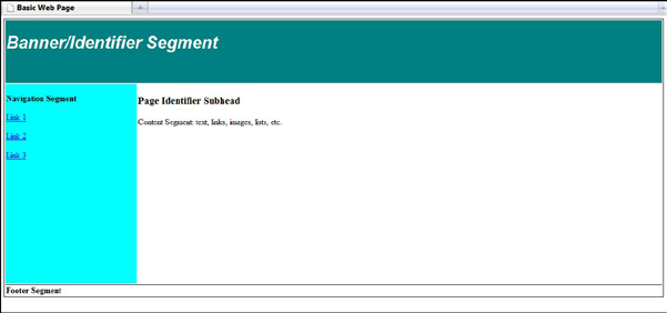
A common layout for a web page that includes these is a left-side navigation page, where you see:
• A page-wide and 1-2 inch high banner segment
• A 2-3 inch left-hand navigation segment
• A several inch wide content segment taking up the middle and right of the browser window
•A page-wide and 1-2 inch high footer segment
How do you translate that into a table layout?
Keeping it simple, we'll look at the main table staples – the TABLE, TR, and TD tags. We will also consider column spans and row spans, if needed. For the proposed design, we really have a simple table which will have 3 rows and 2 columns.
Unstyled Left Navigation Layout Table
<body>
<table>
<tr>
<td colspan=”2”>Banner Segment</td>
</tr>
<tr>
<td>Navigation Segment</td>
<td>Content Segment</td>
</tr>
<tr>
<td colspan=”2”>Footer Segment</td>
</tr>
</table>
</body>
Now, let's start good coding practices by adding commenting to tell ourselves what is going on:
Unstyled and Commented Left Navigation Layout Table
<body>
<!-- Left Navigation Layout Table-->
<table>
<!-- Row 1 – Banner Segment-->
<tr>
<!-- Column 1 – Spans 2 columns, no second TD needed -->
<td colspan=”2”>Banner Segment</td>
</tr>
<!-- Row 2 – Navigation and Content Segments-->
<tr>
<!-- Column 1 – Navigation segment, let’s make 220 pixels wide -->
<td>Navigation Segment</td>
<!-- Column 2 – Content segment, let’s leave at about 80% wide -->
<td>Content Segment</td>
</tr>
<!-- Row 3 – Footer Segment-->
<tr>
<!-- Column 1 – Spans 2 columns, no second TD needed -->
<td colspan=”2”>Footer Segment</td>
</tr>
</table>
</body>
Next, we'll just leave the comments as is, but add basic table width styling. We are not adding a border, because we don't want grid lines in a web page layout. We are setting the vertical alignment of cell contents to top in the table data cells, and giving a flexible table width, and a semi-flexible widths to the 2 columns that make up the navigation and content cells.
Styled and Commented Left Navigation Layout Table
<body>
<!-- Left Navigation Layout Table-->
<table style=”width:100%;”>
<!-- Row 1 – Banner Segment-->
<tr>
<!-- Column 1 – Spans 2 columns, no second TD needed -->
<td colspan=”2” style=”vertical-align:top;”>Banner Segment</td>
</tr>
<!-- Row 2 – Navigation and Content Segments-->
<tr>
<!-- Column 1 – Navigation segment, let’s make 220 pixels wide -->
<td style=”width:220px; vertical-align:top;”>Navigation Segment</td>
<!-- Column 2 – Content segment, let’s leave at about 80% wide -->
<td style=”width:80%; vertical-align:top;”>Content Segment</td>
</tr>
<!-- Row 3 – Footer Segment-->
<tr>
<!-- Column 1 – Spans 2 columns, no second TD needed -->
<td colspan=”2” style=”vertical-align:bottom;”>Footer Segment</td>
</tr>
</table>
</body>
Now, you may be wondering why we have not set any height to any of the cells? If you code this in your text browser, you will see a flattened-looking screen-wide table with no borders. Huh?????
We do not add height to the cells because, for the most part, it is superfluous. Why? Be- cause the height of your layout table will be determined by how much content you have in the longest table data cell. Heights are also not supported in HTML 4.01 Strict and XHTML 1.0.
Consider this: your banner and footer segments may only contain 1-inch high content, and your navigation segment might only look like it has three inches of text or image links. However, the content segment, if it has ten inches of height in text and images, will push the page downward so it becomes longer.
Padding
This attribute specifies the amount of space between the border of the cell and its con- tents. If the value of this attribute is a pixel length, all four margins should be this distance from the contents. If the value of the attribute is a percentage length, the top and bottom margins should be equally separated from the content based on a percentage of the available vertical space, and the left and right margins should be equally separated from the content based on a percentage of the available horizontal space.
Fortunately, the CS padding gives you some control over a table cell's height. After all, what happens if you have a page with about navigation links about four inches high, but content of only three inches, and you'd like your footer to appear at least seven inches down? If you can't set the height, what can you do?
The good news is padding. Much of the time, folks think of padding as helping them push text or images away from the right or left edges of a table cell so they don't look squished against the neighboring cell. However, you can push a cell's padding up or down, when needed. Consider:
Styled Left Navigation Layout Table With Padding-Bottom
<body>
<table style=”width:100%; border:1px black solid;”>
<tr>
<td colspan=”2” style=”vertical-align:top; border:1px gray solid;”>Banner
Segment</td>
</tr>
<tr>
<td style=”width:220px; vertical-align:top; padding-bottom: 400px;
border:1px gray solid;”>Navigation Segment</td>
<td style=”width:80%; vertical-align:top; border:1px gray solid;”>Content Seg- ment</td>
</tr>
<tr>
<td colspan=”2” style=”vertical-align:bottom; border:1px gray solid;”>Footer
Segment</td>
</tr>
</table>
</body>
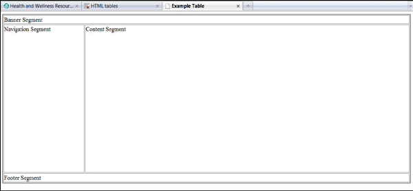
Table with padding
What will happen here is that the <td> making up the navigation segment has added 400px of padding at the bottom of the cell, which pushes it down from the bottom of the text that would make up the navigation links. This, in turn, pushes the height of the con- tent segment cell down by default, so that both have greater height even though they may be mostly empty of content.
Margin
This attribute specifies how much space should be left between the left side of the table and the left-hand side of the leftmost column, the top of the table and the top side of the topmost row, and so on for the right and bottom of the table. The attribute also specifies the amount of space to leave between cells.
In table layout, you may find that using the cascading style margin property will allow you to push cells away from the border of the table.
Tables Inside of Tables – Yes, Nesting!
Accurate and efficient nesting of tables sometimes feels like a world unto itself. Like nesting of other web page elements, nesting table-related tags properly means that when using more than one pair of tags to affect code at the same time, you open and close these pairs in the right order as related to the other pairs.
In the case of tables, if you do not do this and do it well, your whole table for page structuring will look like it exploded all over your screen. The W3C Validator will also make you want to blow up.
A Table Inside a Table
Why would you want to nest a table inside a table? Well, we waited until this chapter on creating a web page layout with a table to help answer that. What happens if, in the con- tent segment of your web page, you need to create a table of, say, books and their prices? You would use a table with two columns and however many rows are needed for your list of books, right?
But wait! You have created your whole web page structure using a table for the structure, like our left-side navigation structure above. And you need your book table inside of it. What now?
Let's look at the unstyled basic structure table code again, with a comment as to where the nested table needs to go:
Unstyled Left Navigation Layout Table
<body>
<table>
<tr>
<td colspan=”2”>Banner Segment</td>
</tr>
<tr>
<td>Navigation Segment</td>
<!-- This Content Segment cell needs a table of books and prices -->
<td>Content Segment</td>
</tr>
<tr>
<td colspan=”2”>Footer Segment</td>
</tr>
</table>
</body>
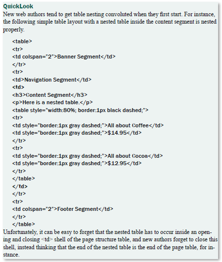
The simple key is to create a new table inside of that existing content segment <td>:
Styled Left Navigation Layout Table With Nested Table
<body>
<table style=”width:80%; border:1px gray solid;”>
<tr>
<td colspan=”2” style=”border:1px gray solid;”>Banner Segment</td>
</tr>
<tr>
<td style=”width:20%; border:1px gray solid;”>Navigation Segment</td>
<!-- This Content Segment cell needs a table of books and prices -->
<td style=”border:1px gray solid;”><strong>Content Segment</strong> <br
/><br />
<table style=”width:80%; border:1px black dashed;”>
<tr>
<td style=”border:1px gray dashed;”>All about Coffee</td>
<td style=”border:1px gray dashed;”>$14.95</td>
</tr>
<tr>
<td style=”border:1px gray dashed;”>All about Cocoa</td>
<td style=”border:1px gray dashed;”>$12.95</td>
</tr>
</table>
</td>
</tr>
<tr>
<td colspan=”2” style=”border:1px gray solid;”>Footer Segment</td>
</tr>
</table>
</body>
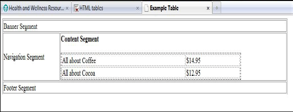
Styled Left Navigation Layout Table With Nested Table
See how the nested table fits right inside the <td>…</td> of the page layout table?
Your real issue will be keeping the <td>…</td> clearly in sight when you are building a long and robust table inside of it – such as when you create a table-structured contact form inside your web page layout table. Here is a tip – use it!!
<td style=”border:1px gray solid;”><strong>Content Segment</strong> <br
/><br />
<!-- @@@@@@ START Nested Table @@@@@ -->
<table style=”width:80%; border:1px black dashed;”>
<tr>
<td style=”border:1px gray dashed;”>All about Coffee</td>
<td style=”border:1px gray dashed;”>$14.95</td>
</tr>
<tr>
<td style=”border:1px gray dashed;”>All about Cocoa</td>
<td style=”border:1px gray dashed;”>$12.95</td>
</tr>
</table>
<!-- @@@@@@ END Nested Table @@@@@@ -->
</td>
What We Learned
A Table-Structured Layout
<!-- This page is produced by YourName-->
<!-- http://yourdomain.com/ -->
<!-- FTP: yourdomain.com/ Login:yourlogin -->
<!-- To validate - http://validator.w3.org/#validate_by_input -->
<!--REQUIRED DOCTYPE INFO FIRST -->
<!doctype html PUBLIC “-//W3C//DTD XHTML 1.0 Transitional//EN"
"http:// www.w3.org/TR/xhtml1/DTD/xhtml1-transitional.dtd”><html xmlns=”http:// www.w3.org/1999/xhtml” xml:lang=”en” lang=”en”> <!-- Opening HTML tag must abut against end of doctype -->
<!--THEN HEAD SECTION -->
<head>
<!-- Required personalized title and meta tags -->
<title>Basic XHTML Table Template Page </title>
<meta http-equiv=”content-type” content=”text/html;charset=utf-8” />
<meta http-equiv=”content-style-type” content=”text/css”>
<meta name=”author” content=”YourName” />
<meta name=”copyright” content=”YourName and/or Company “ />
<meta name=”description” content=”Web design and development, Your- Name.” />
<meta name=”keywords” content=”web design, xhtml, web page, pick some relevant words “ />
</head>
<!--THEN BODY SECTION -->
<body>
<!--PAGE LAYOUT USING TABLE STRUCTURE BEGINS HERE-->
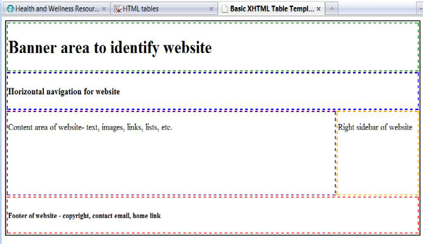
<table style=”width:100%; border:2px black solid;”>
<!-- BEGIN ROW 1 WITH 1 WIDE COLUMN FOR BANNER SECTION -->
<tr>
<td colspan=”2” style=”border:2px green dashed;”><h1>Banner area to iden- tify website</h1></td>
</tr>
<!-- END ROW 1 WITH 1 WIDE COLUMN -->
<!-- BEGIN ROW 2 WITH 2 COLUMNS FOR NAVIGATION AND CONTENT SEC- TIONS-->
<tr>
<!-- Column 1 -->
<td style=”width:20%; vertical-align:top; border:2px blue dashed;”><p>Navigation links of website</p></td>
<!-- Column 2 -->
<td style=”width:80%; vertical-align:top; border:2px purple dashed;”><p>Content area of website- text, images, links, lists, etc.</p></ td>
</tr>
<!-- END ROW 2 WITH 2 COLUMNS -->
<!-- BEGIN ROW 3 WITH 1 WIDE COLUMN FOR FOOTER SECTION -->
<tr>
<td colspan=”2” style=”border:2px red dashed;”>
<h5>Footer of website - copyright, contact email, home link</h5></td>
</tr>
<!-- END ROW 3 WITH 1 WIDE COLUMN -->
</table>
<!--PAGE LAYOUT USING TABLE STRUCTURE ENDS HERE-->
</body>
<!--THEN CLOSING HTML TAG -->
</html>
Table to lay out web page structure
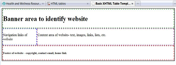
Try it Out