Styling Code, Part 2
We discussed Cascading Styles (CS) earlier, with a focus on inline style rules and embedded head section cascading styles. However, web authors typically link their web page to an external file, called a Cascading Style Sheet (CSS). A CSS can also allow the same web page to be presented in different styles for different rendering methods, such as on- screen, in print, on mobile devices, by voice (when read out by a speech-based browser or screen reader) and on Braille-based, tactile devices.
As a result your future HTML code production should focus on CSS with XHTML. CSS files are easy-to-organize and able to be parsed by every browser with as much uniformity in interpretation as possible. They also allow you to store your styles separately from your XHTML code and to make changes to one file that radiate throughout all pages in your site. Need to change a style? It cascades throughout all the documents that use it.
This book is for beginning web authors, so while I will cover some CSS styling in this and the next chapter, you will benefit from picking up one or more CSS-specific books, like those by Eric Meyer, the Sam’s Teach Yourself books, Peachpit Press’ Visual Quick- Start books, and Sitepoint’s books. Just make sure to look for one or more that offers plenty of examples of the kind of CSS layout and styling that you see as current on the WEB. You can also find excellent resources on the Web, like Smashing Magazine and A List Apart.
Until now, I have been referring to styling as CS – Cascading Styles. However, since CSS (Cascading Style Sheets) is the preferred and professional web authoring method for web page styling, I will now refer to all cascading styling as CSS. I will also swap out CSS with style sheet as needed. Not to confuse you or anything.
Planning Styles With Templates
Essentially, you should plan your styles with your web project's template page, but with CSS your styles would be built in a separate style sheet file instead of inside the template. Your template page would link to the CSS file in the head section, so that as you modify styles in the style sheet, they will show up in your template page. Then, once you are satisfied with your template, you can use it, already linked to the style sheet(s), to build out your entire website.
There are many ways to link style sheets to HTML, each carrying its own advantages and disadvantages. New HTML elements and attributes have been introduced to allow easy incorporation of style sheets into HTML documents. We'll look at the two most commonly used.
Linking to CSS
A CSS file may be linked to an HTML page through the link element in the page's head section.
The type attribute is used to specify a media type - text/css for a Cascading Style Sheet. This allows browsers to ignore style sheet types that they do not support. You also need to configuring your web host server to send text/css as the content-style-type for CSS.
<head>
<meta http-equiv=”content-style-type” content=”text/css”>
<link rel=”style sheet” media=”screen” type=”text/css” title=”Website Screen
Styles” href=”screenstyles.css” />
</head>
Media values include:
• Screen: For presentation on non-paged computer screens.
• Print: For output to a printer.
• Handheld: For presentation on handheld mobile devices.
• Projection: For projected presentations.
• Aural: For speech synthesizers.
• Braille: For presentation on Braille tactile feedback devices.
• TTY: For character cell displays (using a fixed-pitch font).
• TV: For televisions.
• All: For all output devices.
Importing CSS
A style sheet may instead be imported with CSS's @import statement. This statement may be used inside the style element:
<style type=”text/css” media=”screen, projection”>
<!--
@import url(styles/screenstyles.css);
-->
</style>
Local Page Styles
Other CSS rules that apply to only the single page may also be added in the page's style element, but all @import statements must occur at the start of the style sheet. Any rules specified in the page's embedded cascading styles override conflicting rules in the import- ed CSS files. For example, even if one of the imported style sheets contained body back- ground: aqua, and you told your specific page style to make the body background black, the page would have a black background.
<style type=”text/css” media=”screen, projection”>
<!--
@import url(styles/style.css);
-->
body color:#000;”
</style>
CSS Style Sheet
Multiple Style Sheets
The order in which style sheets are imported determines how they cascade. The last imported style sheet has greater impact than earlier ones, so if you list three style sheets, and they have conflicting styles, the style in the last listed sheet would win.
Why would you use multiple style sheets? Several reasons:
• Styles for massive websites can be made more manageable by using style sheets for each major section.
• To modularize major element sections into several small sheets, such as by structure-related elements, text-related, and graphic-related elements.
• To have different style sheets for screen, mobile, and print output.
• To have variations of the same style sheet which allow for different browser interpretations.
<link rel=”style sheet” media=”screen” type=”text/css” title=”Website Screen
Styles” href=”screenstyles.css” />
<link rel=”style sheet” media=”print” type=”text/css” title=” Website Print
Styles” href=”printstyles.css” />
Conditional Style Sheets
In a happy web authoring world, you could use only one style sheet that would make all browsers see your website properly. Unfortunately, older browsers have quirks, Internet Explorer interprets the layout box model differently, and even current browsers still have slight issues with what code they do and do not support. As a result, to get your web page to look correct in multiple browsers, you might have to “hack” by using conditional style sheets.
You can provide an alternative style sheet for the browser which gives your page the most trouble. In this second style sheet, you would adjust the layout measurements and other style quirks as needed. Then, you would tell whichever browser your web page is opened in to apply the default style sheet, unless that browser happens to be the trouble browser. Then it would look for the alternate style sheet:
• Tell the browser which sheet is the default
• Tell the browser that if it is the alternate browser, to use the alternate sheet, else
• Tell the browser that if it is not the alternate browser, to use the default sheet.
One example (you can research variations online):
<link rel=”style sheet” media=”screen” type=”text/css” title=”Website Screen
Styles” href=”screenstyles.css” />
<!--[if IE]> <link rel=”style sheet” media=”screen” type=”text/css” title=”IE Website Screen Styles” href=”ie_screenstyles.css” /> <![endif]-->
<!--[if !IE]> <link rel=”style sheet” media=”screen” type=”text/css”
title=”Website Screen Styles” href=”screenstyles.css” /> <![endif]-->
CSS for Printing
You can use CSS to create amazing websites, but what if someone wants to print out in- formation from the site? Some sites do provide pdfs for folks to print out, but many don't - they just assume folks might print from the screen. In many cases, parts of the screen don't translate well to print - sometimes the sidebars or navigation don't print, or unique color schemes of the site look unreadable.
Knowing how to make a style sheet for printing can be very helpful - especially if you have critical take-away information for a visitor, like a table of contact information, a resume, a list of resources, etc.
First, you need to make a copy of your existing style sheet and give it another name, like printstyles.css. Then you need to make some changes in your print style sheet for it to be effective:
• Select appropriate fonts and font sizes, using points not pixels since points trans- late best for printing.
• Remove background colors and images, and use only colors that print well in black and white - with good contrast.
• Adjust page margins, if needed.
• Set page breaks to keep elements from being divided between 2 printed pages: p {page-break-inside: avoid;}
• Hide items that don't need to be printed, like sidebars, ads, rollover navigation, etc, like #leftnav {display:none}
• Change the display of the links so that theu are readable and do have an underline: a {color:black;}
• Show the URL of the links listed: a:after content:”(“attr(href)”)”;. Unfortunate- ly, this does not work with IE.
Finally, you need to use your <head> section's link to a style sheet to specify that you are linking to a print CSS:
<link rel=”style sheet” media=”print” type=”text/css” title=”Website Print
Styles” href=”printstyles.css” />
CSS for Mobile Apps
You'll need even more extreme CSS clean-up if you want website content to show up on mobile devices like cell phones, PDAs, and other handhelds. The problem is that this is still the early stage of this part of the styling field, so pretty much everything is inconsis- tent. You have two things to consider: miniaturization and mobilization.
• Miniaturization is trying to make an existing style sheet work, just much smaller.
• Mobilization is trying to redesign the spreadsheet so that only essential items are styles/translated, but also small. The idea is to minimize the amount of clicking, scrolling, and download time.
First, you need to make a copy of your existing style sheet and give it another name, like mobilestyles.css. Then you need to make some changes in your mobile style sheet:
• Hide anything extra to minimize kbs downloaded to the phone - speed and low cost is essential.
• Make sure all images on your site have alt text so visitors can turn images off. Keep images very optimized/small.
• Avoid floats, multiple columns, absolute positioning, tables, pop-up windows, and large headers.
• Avoid background images and bad contrast colors.
• Adjust horizontal margins.
• Avoid fixed width design.
• Add more “back to top” links in your xhtml file, but give them a class name like “top”. Then, in your normal style sheet, create the class top display: none; so your computer viewers don't see all the extra back to top links.
• Add border-bottoms between divisions to help visually organize content.
• Center content, and reduce the size of elements like the links.
Then, you need to use your <head> section's link to a style sheet to specify that you are linking to a mobile CSS:
<link rel=”style sheet” media=”handheld” type=”text/css” title=”Website
Mobile Styles” href=”mobilestyles.css” />
Many mobile browsers have implemented the handheld media type, but in different ways:
• Some read only the handheld style sheet.
• Some read only the handheld style sheet if there is one, but default to the screen style sheet otherwise.
• Some read both the handheld style sheet and the screen style sheet.
• Some read only the screen style sheet.
Testing CSS
CSS Validator
If you want to validate your CSS style sheet embedded in the head section of your HTML file, you should first check that the XHTML DAT you use is valid. Then, the W3C has a CSS Validator you can use to check your CSS by URI, by file upload, or by direct input. This works the same way as the W3C Validator for HTML.
CSS Clean-up
You can also use CSS cleanup tools, like CSSTidy, to clean up your style sheet code. These tools do not write your code – you need to build your own expertise on that. They can help catch repetitive styles, conflicts, and potential inheritance problems. This can help minimize the file size of your style sheet, which can help increase your site loading speed and load web pages faster.
Mobile Testing
You can use simulators on Windows system software to see how various small screen de- vices will view your site. Google Openwave Phone Simulator, Nokia simulator, and others from Palm, Blackberry, etc. For Mac, Opera has a View/Small Screen.
Cascading Style Sheets Styling
Style Rules Review
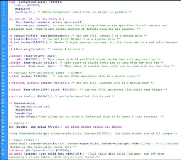
Style rules are the method you use in cascading styles to create a style to apply to your HTML code. Style rules have a standard format plus two basic parts:
• Code style: selector, brackets around property/value pairs, semi-colon concluder for each property/value pairs - p color:#000;
• Selector: Determines which elements are affected - p {color:#000;}
• Declaration: One or more property/value pairs -p {color:#000;}
• ALL rules need to have the property/value paired style info inside brackets p {color:#000;}
• All property/value pairs need a semi colon to ‘finish' it - p {color:#000;}
In addition, you can create more efficient style rules by combining both selectors and property/value pairs, and even by having multiple values for a property:
h1, h3, p font-family: Arial; color:#000;
table align:left; border:1px #000 solid;
Finally, you can (and should) also use comments in your style sheets. There is a special format for this: /* COMMENT TEXT */
Classes and IDs
You can create styles for your page elements, like body, table, <p>, and more. However, what if you want to create a style to use only on some paragraphs, for instance, but don't want to repeatedly type inline style rules for every situation? Easy! CSS lets you create classes and ids that you can style and apply to only specific HTML elements when you want them.
Class Styles: A class is a style you can and will use repeatedly throughout a web page / website. This would be items like special styles for headers, text, tables, images, etc. The class is coded with a period in front of the class name: .selector.
With a class, you style using the standard style rules. To use the styled class, you would code the specific element (like paragrapg tag) to call upon the special class that is inside the stylesheet. For instance, the class intense will turn all text tags using the class to bold.
.intense font-weight: bold;
<p class=”intense”>I am intense text.</p>
ID Styles: An ID is a style that you can only use once in a web page. This you be for once-only special styles like a rollover navigation, a banner element, a footer element, and any division layout items. The ID is coded with a hash mark in fromt of the ID name: #selector.
#headbar
background-color: #000000;
color: #ffffff;
padding: 1em 2%;
<div id=”headbar”>The DIV contents here </div>
It can be tempting to use only classes if you know that you will only use the ID-like item once. However, DO NOT! Follow CSS convention because the ID is commonly recog– nized by other designers and the W3C as being a once-used item, and will be edited that way. Remember, other designers may need to see/adapt your style sheets.
Class/ID Coverage
Full Coverage: If you want a property to work throughout a site, you can set it as a Class or ID. For instance, .red {color:red;} turns all text red that you classify as red – whether paragraph, header, lists, etc.
Specific Coverage: If you want to affect only a specific selector, such as all text in a specific table cell, you would list the selector, then the class or id: td.red colorred; This means that every time you create a new table data cell <td>, the texxt inside will be red.
Here is a more complex example, where an ID has been created called catlinks in order to style a specific type of link on a web page. The catlinks ID can use both selectors and pseudo classes.
#catLinks h5 text-align: left; font-weight: bold;
#catLinks li a:link color:#666; text-decoration: none; font-weight: bold;
#catLinks li a:hover color:#202020; text-decoration: none; font-weight: bold;
#catLinks li a:visited color:#333; text-decoration: none; font-weight: bold;
#catLinks li a:focus, a:active color:#666; text-decoration: none; font-weight:
bold;
Combination Coverage: You can combine multiple classes inside one element:
.gray color:#666;
.intense font-weight:bold;
<p class=”gray intense”>Gray bold text here</p>
Pseudo Classes
A pseudo-class is similar to a class in CSS, but it's not specified explicitly in the markup, like body, paragraph, and table elements are. Some pseudo-classes are also dynamic, and are applied as a result of user interaction with the document (like a form).
A pseudo-class starts with a colon (:). No whitespace may appear between a type selector or universal selector and the colon, nor can whitespace appear after the colon.
Some selectors, like the link <a> tag, have several variations on how it can be styled, de- pending on whether it is active, hover, visited, etc. These can work regardless of browser, and are not case-sensitive.
a:link color:#333; /* unvisited link */
a:visited color:#666; /* visited link */
a:hover color:#000; /* mouse over link */
a:active color:#333; /* selected link */
• a:hover MUST come after a:link and a:visited in the CSS definition in order to be effective!!
• a:active MUST come after a:hover in the CSS definition in order to be effective!!
Pseudo-classes can be combined with CSS classes, and use the element:pseudo style rule syntax.
a.red:visited color:#ff0000;
<a class=”red” href=http://www.google.com” title=”Google”>Google red link</a>
Most of the pseudo class elements are fairly straightforward by targeting elements in different situations and states. Some of them are a little trickier, so in the table below is a list of a few pseudo elements and their intended usage.
• :link - Apply something to an unvisited link
• :visited - Apply something to a visited link
• :active - Apply something to something that's active, for instance a link is active from when you click it until you release.
• :hover - Apply something to what the users hovering over
• :focus - When something is focused it's being used, for instance when a user is typing something into a input field its being focused on
• :first-child - Apply something to the first child of an element
• :lang() - Apply something to an element using a specific language, for instance lang(en) for English. You can then put lang=”en” in an html tag.
• :root - Applies CSS to the root element, i.e. the <html> tag in an html document.
• :target - For instance, if you have a URL like index.html#header, this will allow you to apply CSS to the element with id=”header”
• :enabled - Apply to all currently enabled inputs
• :disabled - Apply to all currently disabled inputs
• :checked - Apply to checked input boxes
• :indeterminate - For radio and check box elements, when they are neither selected or unselected
• :default - Apply to the default element, for instance the default submit button in a form
Pseudo classes can come in handy when trying to increase usability. For instance, :hover can make things besides links react to a users hover, letting them know they can do things with it. They can change color, change image, become larger or bolder, and more.
You can apply styling to your form input areas and textareas that only takes affect when a user has clicked into that area using the :focus pseudo class. For example, you could change the background and border color on those elements so that the visitor knows they are selected.
Graceful Degradation
When a browser doesn't support a class (or any CS), it will fall back on something else. For instance, the fact that older browser don't support rounded corners doesn't mean you can't implement it. It simply means that visitors won't see the rounded corners in older browsers, bu that won't affect your visitors in a site-crippling way.
The same goes for pseudo classes. If you're using an older browser which doesn't support :focus and the user clicks on an input with a focus CSS class, the visitors won't get the focus effect. It doesn't alter the usability of the input field. This means you can implement most pseudo classes on a basic level (as long as they're not being implemented in a way that'll effect the layout of a website) without worrying about altering user experience in older browsers.
CSS Style Rules Order
Creating style sheets is as personal as the designer. However, when you are getting started, think of ways you can keep your code organized so you can easily see, fix, and change it. Style the biggest/most encompassing items first, then narrow down to the smallest. What does this mean?
• First style items that appear throughout your site, over and over, like the body, h1- h6, p, tables, list starters, and basic links.
• Style sub items next, like table rows, link hover, etc.
• Style specific things last, like unnumbered list links that have a hover.
• Use CSS commenting between ‘style areas' to tell yourself what the area is.
Basic styles: body, h1-h6, p
Table styles: table, tr, td, th
Basic links: a:link, a:visited, a:hover, and a:active
Layout items, like div layout styles
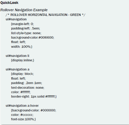
Special navigation formats, like rollovers.
Inheritance
CSS styles inherit values from parent styles, hence the cascading in the style sheet name. This means that if you designate the body text to be black, all text in your whole site will also be black. You can change that by assigning a different color to a specific selector, like gray text for a specific header:
body color:#000;
h3 color:#ccc;
h3.normal font-weight: normal;
This makes the header 3 gray instead of black. Then, the class .normal applied to header 3 makes only the <h3 class=”normal”> turn to normal text rather than the default bold. The remaining header 3s will still be bold, and the non-bolded header 3 inherits the grey color from the h3 {color:#ccc;.}
So, when more than one style rules is applied to a web page element, how do you know which styles will be applied?
• Styles can be inherited from a parent. Some styles, like font family, text-alignment etc., are automatically inherited by child elements from their parent element (i.e. by an element contained inside another one).
• Later styles over-rule earlier styles. If you define a style property, and later define an alternative style property for the same thing, the later definition overrules the earlier one.
• Styles can combine from different sources. If the later styles or style sheets set any of the same properties as the previously-defined ones, they would overwrite the previous styles.
• Styles can apply to elements nested in a particular way. You can define styles to apply to particular kinds of elements nested within (or a child of) other particular kinds of elements. These would only affect the nested items, not other selectors of the same name elsewhere in the page.
Note: Inheritance can get to be a little too much fun and this makes CSS sometimes experimental in nature. In other words, you may find you have to do detective work to track down which style you create that is adversely affecting another style you are building. You'll learn a lot more by trial and error, but here are the basics:
• Inheritance: when all descending styles inherit the style of a parent, like table cells inheriting a align:left from the table selector
• Specificity: when you specifically tell an inherited style to do something different: table align:left; td align:center;
• Location: This rule breaks a tie when inheritance and specificity are duking it out. Rules that appear later have more weight (such as if you apply a style right inside your XHTML code.
• Override: You can also override the whole style system you create by declaring that a particular rule is more important than all the others: td align:center !impor- tant;
• Comment: Use CSS commenting to clearly note what you are doing, and why.
This makes it easier for you to keep track of what styles might be the parent styles that a problem style is inheriting something from.
The Important Keyword
The important keyword makes a declaration take precedence over normal declarations, or those that are not styled with the important keyword. So “p color: #000 ! important;” takes precedence over “p color: #ccc;”. The syntax for an important declaration is property: value ! important;
The relative importance of a rule also depends on its the source: whether it comes from a style sheet specified by the document author, the user or the user agent (browser). The or- der of declarations from least important to most important:
• User agent declarations
• User normal declarations
• Author normal declarations
• Author important declarations
• User important declarations
This keyword can only be used in style sheets and embedded header styles, but not in inline style rules.
CSS Positioning
CSS DIV layout can get really fun when you are trying to position things. We will discuss it more in the next chapter.