Page Layout Code – Part 2
While it's easy to layout a page with a table structure, this is no longer relevant for new sites and many CMS structures, especially as we evolve to HTML5 and CSS3 in the next couple of years. Cascading styles, with the ability to style positioning, sections, columns, and other layout information, replaces table layout with div (division) layout. For us to understand how this works, we need to look at the default model of the layout elements that browsers interpret.
The Box Model
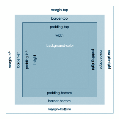
The box model represents the default built-in margin, border, and padding possibilities of all elements - divs, images, paragraphs, links, etc. For instance, the default margins, bor- ders and padding are all 0px, so when you use a <div> element to “wrap” around other elements in your web page, there is no space between the divs edges and the elements be- ing wrapped. Okay, layman's terms, please. . .
Think of an element of a web page, like some paragraph text <p></p>. This paragraph element takes up space on the page, and part of this space includes default spacing around the text inside the paragraph tags. This space, plus the text itself, can be considered a “box”, which is why it is considered a block element rather than an inline element.
The content edge surrounds the rectangle given by the width and height of the paragraph box, which often depends on the element's rendered content (the text inside the paragraph tags). The four content edges define the box's content box.
The padding edge surrounds the box padding. If the padding has 0 width, the padding edge is the same as the content edge. The four padding edges define the box's padding box.
The border edge surrounds the box's border. If the border has 0 width, the border edge is the same as the padding edge. The four border edges define the box's border box.
The margin edge surrounds the box margin. If the margin has 0 width, the margin edge is the same as the border edge. The four margin edges define the box's margin box. Collapsing margins means that adjoining margins (no non-empty content, padding or border areas or clearance separate them) of two or more boxes (which may be next to one an- other or nested) combine to form a single margin. There are margins that do not collapse:
• Horizontal margins never collapse,
• Vertical margins between a floated box and any other box
• Margins of absolutely positioned boxes
• Margins of inline-block elements
• An element that has had clearance applied to it never collapses its top margin with its parent block's bottom margin
Box Model Issues
It's crucial to understand the box model of web layout because different browsers actually have different default interpretations of the box model. Pre-Internet Explorer 6 and any Internet Explorer run in Quirks mode have issues. Internet 6 and later versions also seem to have some difficulties, because Microsoft developers interpreted the defaults of the box model differently than the W3C did.
According to the CSS1 specification, when a width or height is explicitly specified for any block-level element, it should determine only the width or height of the visible element, with the padding, borders, and margins applied afterward. However, Internet Explorer 5 includes the content, padding and borders within a specified width or height, which results in a narrower or shorter rendering of a box.
Box Model
In this example, the style rule would be:
div width: 100px; padding: 10px; border: 5px solid black; margin: 10px;
The top box is the standard - when this element is given a width of 100px, the width affects only the white portion, and the additional padding, border and margin affect the areas you see in gray.
Internet Explorer, however, interprets the width of 100px to be the “width” referred to the area within the outer edges of the black borders, but not including the margins. This has been corrected in IE 8, but the bad news is that web authors still need to design web pag- es that can be accurately viewed in earlier browsers, especially IE6 and 7.
As a result, you may find that pages which lay out properly in Firefox and IE 8 have troubles in IE 7 and earlier. How do you deal with this? Well, with much coffee, cursing, threats to the computer, and patience, you can do a couple of things.
• Create conditional style sheets. One would default to most browsers, and another would be specified for IE6 and older IE browsers, with style differences that affect the box model irregularities. This tends to be the simplest and most easy to main- tain, plus minimizes side effects of CSS hacks and conditional code.
• Use conditional comments in HTML source code, which are conditional state- ments interpreted by Microsoft Internet Explorer. Conditional comments first appeared in Microsoft's Internet Explorer 5 browser and are supported through at least version 8.
• Use of CSS filters or hacks, which are a coding technique used to hide or show CSS markup depending on the browser, version number, or capabilities. Browsers have different interpretations of CSS behavior and different levels of support for the W3C standards. CSS filters are sometimes used to achieve consistent layout appearance in multiple browsers that do not have compatible rendering. Keep in mind that box model hacks have proven unreliable because they rely on bugs in browsers' CSS support that may have been fixed in later versions.
Since a web author's goal is to create and maintain as clean and pure of code as possible, you want to avoid CSS hacks and conditional code as much as possible.
DIV Page Layouts
The table structure for website layout offers much more control than simply designing a page from top to bottom (primeval HTML). However, tables have serious limits for positioning, as anyone who has tried to line up differently-sized elements with any control has experienced. As a result, CSS layout and positioning with div elements (divs), based on accurate box bodel understanding, allows the greatest control and flexibility for designing complex, attractive, and usable web pages.
The use of divs seems abstract at first, since unless you style them with borders they seem invisible. They also can have issues with “pushing off” a column that you style to be at the right but which appears below the other columns – until you understand the box model and how to style the “box” – or block-level – elements, while accounting for changes in their padding, margins, borders, etc.
This is why understanding table structured page layout first can be very helpful, especial- ly if you use clear HTML commenting when opening and closing various table regions that represent your page segments. This commenting can help you replace the table tags with the appropriate <div> replacements. Eventually you gain enough experience and or develop a natural spatial ability to “see” in div code, and the table starter becomes unnecessary. Note that:
• Div layout CSS styles can be added in the same external CSS style sheet as you do your element (text, table, image, and other) styling.
• Divs for page layout use ID, not classes: #container, not .container Div Basics
Divs are essentially ‘containers' for other page elements. For instance, your banner/identification segment of a web page would be a series of HTML elements you would wrap a <div> around:
<div>Logo, website title, banner background color or image, website tagline, etc.</div>
Of course, if you simply use div elements to lay out your banner, navigation, content, and footer segments one after another, the web page will look unstructured. You need to set widths and positions for each of the divs so that the browser can display them as being above/below and/or next to other divs.
#banner width:980px;
<div id=”banner”> Logo, website title, banner background color or image, website tagline, etc.</div>
You can also add background color and images to divs, just like table cells:
#banner width:980px; background-image:url(retro.gif);
<div id=”banner”> Logo, website title, website tagline, etc.</div>
See how the background image code goes into the banner ID style, and therefore does not need to be added to any element inside the <div> tags?
Div Page Structure
In HTML, the body is where all of the viewable elements go. The <body> acts as a web page structure boundary for what is viewable. It is also sufficient as a boundary to place a layout table inside.
However, with a div layout, you need to create a div container inside the <body>, before you structure the rest of the page divisions. Why? A container div is just a normal div, but you assign the properties which position the main ‘bits' to this div. This div ID would be called container or wrapper – a wrapper for the whole page layout.
Inside this wrapper you would then assign a div for your banner segment, another for your navigation segment, etc. You need to code it into your HTML page before you add any other specific layout elements: container, then the banner, content, footer, etc.
<body>
<div class=”container”>
<div class=”banner”>Banner segment</div>
<div class=”navigation”>Navigation segment </div>
<div class=”maincontent”>Content segment </div>
<div class=”footer”>Footer segment </div>
</div>
</body>
The styles you assign to each of the segment div classes would determine their width, positioning, etc.
Basic div style classes for page layout would include, in this order
• body - standard body stuff
• #container (also called wrapper)
• #banner - your banner segment styling
• #navigation – your navigation segment styling
• #maincontent - your content segment styling
• #footer - your footer segment styling
Div Structure Variations
The div “maincontent” class of your website is commonly the non-banner and non-footer area. You can choose to put all navigation in the content area and not have a separate navigation div, or you can break up this “area” into columns:
• #container (also called wrapper)
• #banner - your banner segment styling
• #navigation – your navigation segment styling
• #centercontent - your content segment styling
• #rightside - your right-side sidebar segment styling
• #leftside - your left-side sidebar segment styling
• #footer - your footer segment styling
These are, of course, not all inclusive. You can assign div segments and style them in any way you see fit – your imagination and solid usability is the only limit for layout.
Div Elements
The div is not just for structuring a page layout – it can and often is used for positioning anything in a web page. For instance, inside your banner div, you might position your logo with a logo div.
Div Positioning
Normal Flow/Static Positioning
Normal flow is the default behavior of a web browser. You do not specify this in your style sheet since it is the default. With normal flow boxes will show up in the order that you placed them in your code, and each box level element is stacked on the next. Static positioning is applied by the declaration position: static. This places the element in the normal flow. Since normal flow is the default it is not normally necessary to explicitly use this. Where it is useful is over-riding another rule of lower specifity, such as:
div position:absolute;
#notAbs position:static;
Absolute Positioning
Absolute positioning positions a box relative to its containing block. However, unlike relative positioning the gap in the normal flow left by removing the element closes up. The containing block is the nearest ancestor with a position of absolute, relative or fixed.
You can use any one or combination of left, top, right, and bottom properties to position the box. The co-ordinates for absolute position have (0,0) at the top left of the containing block. Increasing the value of top moves the element down the page. Since absolutely positioned boxes are taken out of the normal flow they can be positioned anywhere on the page regardless of their position in the document's source order. This means its position, size, etc will not affect other elements on the page.
Relative Positioning
With relative positioning, the browser first lays out an element as though it was in the normal flow. The element is then displaced by the amount specified by the left or right properties and the top or bottom properties. A gap is left in the normal flow at the point the element should have appeared. Relative positioning does not allow an element to change size. If both left and right are specified, right will be ignored in languages which are written left to right such as English. Bottom is ignored if top is specified. For instance, you can take the original starting point of an image with the class of ‘first' and push it 10px down and 10px to the right. This could cause it to overlap other elements.
Fixed Positioning
Fixed positioning is a subcategory of absolute positioning. The only difference is that for a fixed positioned box, the containing block is established by the browser window size. A fixed element does not move when a web page is scrolled as all other elements do. It is calculated in the same way as absolute positioning with respect to containing blocks in that it pulls the positioned box out of the normal flow. An example would be a navigation menu that is fixed at upper left position of the viewable browser window no matter how many scroll-downs the visitor does.
Floats
Elements can be made to float within the normal flow. Boxes are moved left or right as far as they can go. Elements after the float box will move up to fill any gap left behind thus flowing around the box with the float position. Float is not a position property, but it acts like one, and is applied with the float property, not the position property. You must set the width property when floating block-level elements, or they will expand to fill the entire width of their container.
The way you get your div segments to display next to each other (like columns) rather than just below the one above it is to understand and use floats. When you float an element, like a div, it becomes a block box. This box can then be shifted to the left or right on the current line. The markup options are “float: left”, “float: right” or “float: none”.
You can put several floats beside each other, such as your
#navigation
#maincontent
#rightsidebar
Floated div areas will move to the left or right until their outer edge touches the containing block edge or the outer edge of another float. Always set a width on floated items (ex- cept if applied directly to an image - which has implicit width).
Elements in the code below a floated element will wrap around the floated element; they will appear to be right next to the previous div. You can avoid this by using the style rule clear:both on the element that should be below the wrapping div. This tells the div to push the next element down.
#navigation float: left; width: 150px; /* This would be the left-hand naviga- tion segment */
#maincontent float: left; width: 400px; /* This would be the main content text/graphics segment of the page */
#sidebar float: left; /* This would be the right sidebar segment of the page*/
#footer clear:both; /*forces the footer to float below the nav and content*/
Z-Index Layers
When elements overlap, you may want to adjust which elements are on top of other elements. This is also considered to be layering in CSS.
The z-index property specifies the stack order of an element. An element with great- er stack order is always in front of an element with a lower stack order. However, z- index only works on positioned elements (position:absolute, position:relative, or position:fixed).
.putmehere z-index: 1; /* laid down first */
.layermeabove z-index: 2; /* laid down on top of putmehere */
.putmeontop z-index: 99999; /* laid on top of all */
Div Measurements
Div Widths
Back to the box model. Each block element, acting as a box, has default border, padding, margin, and content edges. These are 0, which means that each div you have next to an- other can look squashed, because it has no inherent padding or margin.
You can, of course, adjust this at will using your style rules:
#navigation float: left; width:150px; padding-left:12px; padding-top:20px; /* This would be the left-hand navigation segment */
Remember to add the width pixels to any width added by assigning padding, margin, and borders, because all of these measurements go into making up the full div element width. If you have three div segments alongside each other, their combined widths would in total need to be equal to the container div width you assigned for the width of the web page.
If you calculate the individual div widths and their margin, padding, and border widths wrong, one or more of the div segments will get shoved down to the next line, below the other div segments instead of next to them.
Div Heights
The height of a div element is equal to the amount of content (text, images, etc.) you have in it. Setting a height does not work, any more than it does in a table cell. For instance, sometimes you place a background image inside a div element, and suddenly you see no height, and therefore cannot see the background image. This is because the background image has no real height, since it is in the background and not a block element inside the div
You can nest a second div inside the first one and add padding-top or padding-bottom around a blank character to ‘push' the space down and reveal the background image.
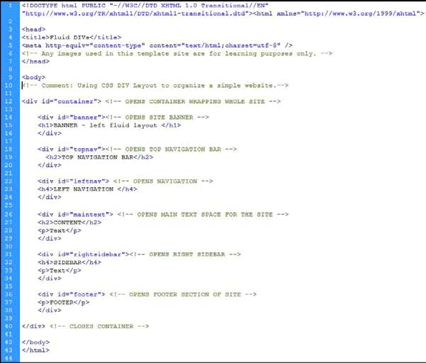
Converting Table Layout to Div Layout
Okay, so you have a web page with a table defining the layout structure, and you want to move to a div layout structure. This isn't too hard, if you are exacting about the segments of your layout table and how they would relate to div elements.
First, you want to use HTML commenting to describe the segments of your table layout:
<!--OPEN PAGE LAYOUT STRUCTURE TABLE -->
<table>
<!--OPEN BANNER SEGMENT ROW -->
<tr>
<td colspan=”2”>Banner segment</td>
<tr>
<!--CLOSE BANNER SEGMENT ROW -->
</table>
<!--CLOSE PAGE LAYOUT STRUCTURE TABLE --> Then, you can translate this into <div> elements:
<!--OPEN PAGE LAYOUT STRUCTURE TABLE -->
<div class=”container”>
<!--OPEN BANNER SEGMENT ROW -->
<div class=”banner”> Banner segment
</div>
<!--CLOSE BANNER SEGMENT ROW -->
</div>
<!--CLOSE PAGE LAYOUT STRUCTURE TABLE -->
HTML5 Preparation
HTML5 is still not standardized in many ways, including the new structural tags that will replace several repetitively used Div classes. However, you can use the names of structural tags in your Div class naming conventions so that when you can reliably convert XHTML1.0 markup to HTML5 structure tags, you will have a minimum of effort.
<header>
The header tag is a container for a web page or an introductory information about a section within the web page. You can use <div id=”header”> for now.
<nav>
The nav element is for navigation elements. You can use <div id=”nav”> .
<section>
The section is a thematic grouping of content, usually preceded by a header tag, and fol–lowed by a footer tag. You can use div id=”section” for your content blocks, and clarify by section type: sectionmain, sectionside, etc.
<footer>
The footer element can be used as a footer segment of a web page. You can use <div
id=”footer”> .
This can and does work with much more complex page layout structure tables, but you get the idea.
What We Learned
Here is a basic div layout:
Basic div layout in HTML