Chapter 7 Images
7.1 Responsive Images
Images in Bootstrap 3 can be made responsive-friendly via the addition of the .img-responsive class. This applies max-width: 100%; and height: auto; to the image so that it scales nicely to the parent element.
 In Internet Explorer 8-10, SVG images with .img-responsive are disproportionately sized. To fix this, add width: 100% \9;where necessary. Bootstrap doesn't apply this automatically as it causes complications to other image formats.

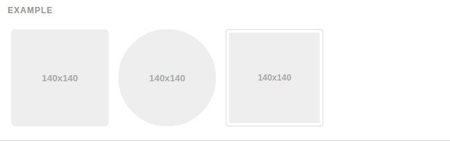
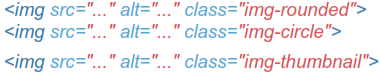
7.2 Image Shapes
Add classes to an <img> element to easily style images in any project.
Keep in mind that 1nternet Explorer 8 lacks support for rounded corners.
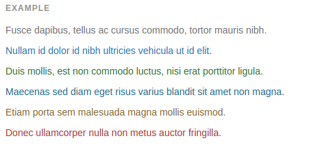
7.3 Helper Classes
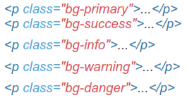
Contextual Colors
Convey meaning through color with a handful of emphasis utility classes. These may also be applied to links and will darken on hover just like our default link styles.
7.4 Contextual Background
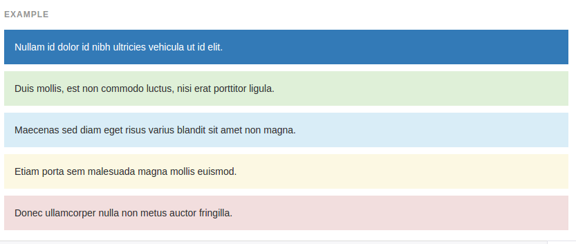
Similar to the contextual text color classes, easily set the background of an element to any contextual class. Anchor components will darken on hover, ust like the text classes.
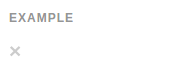
7.5 Close Icon
Use the generic close icon for dismissing content like modals and alerts.

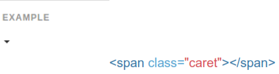
7.6 Caret Icon
Use carets to indicate dropdown functionality and direction. Note that the default caret will reverse automatically in dropup menus.
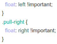
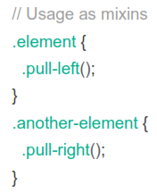
7.7 Quick Floats
Float an element to the left or right with a class. !important is included to avoid specificity issues. Classes can also be used as mixins
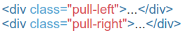

Not for use in navbars
To align components in navbars with utility classes, use .navbar-left or .navbar-right instead.
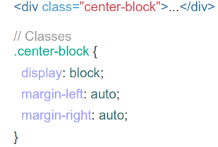
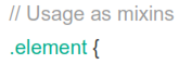
7.8 Center Content Blocks
Set an element to display: block and center via margin. Available as a mixin and class.
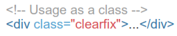
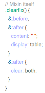
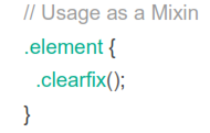
7.9 Clearfix
Easily clear float by adding .clearfix to the parent element. Utilizes the micro clearfix as popularized by Nicolas Gallagher. Can also be used as a mixin.
7.10 Showing And Hiding Content
Force an element to be shown or hidden tincluding for screen readers) with the use of .show and .hidden classes. These classes use !important to avoid specificity conflicts, just like the quick floats. They are only available f