Chapter 10 Button Groups
Group a series of buttons together on a single line with the button group. Add on optional JavaScript radio and checkbox style behavior with bootstrap buttons plugin.
10.1 Tooltips & popovers in button groups require special setting
 When using tooltips or popovers on elements within a .btn-group, you'll have to specify the option container: 'body' to avoid unwanted side effects tsuch as the element growing wider andfor losing its rounded corners when the tooltip or popover is triggered).
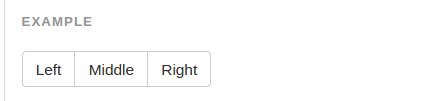
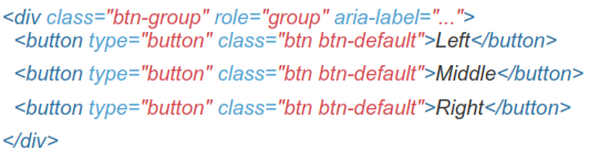
Wrap a series of button with .btn in .btn-group
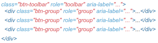
10.2 Button Toolbar
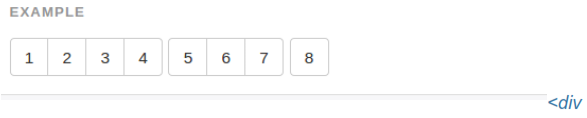
Combine sets of <div class="btn-group"> into a <div class="btn-toolbar"> for more complex components.
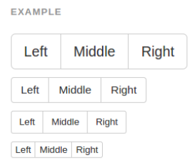
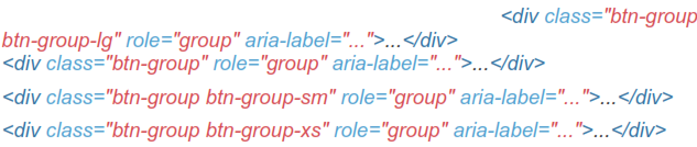
10.3 Sizing
Instead of applying button sizing classes to every button in a group, just add .btn-group-* to each .btn-group, including when nesting multiple groups.
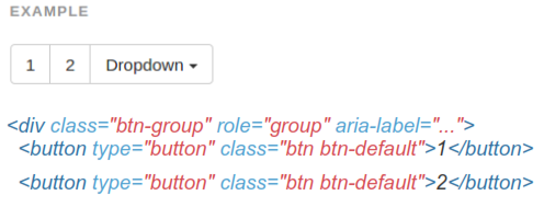
10.4 Nesting
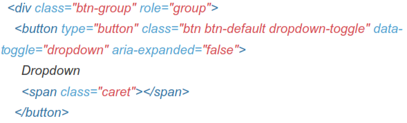
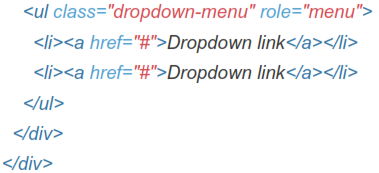
Place a .btn-group within another .btn-group when you want dropdown menus mixed with a series of buttons.
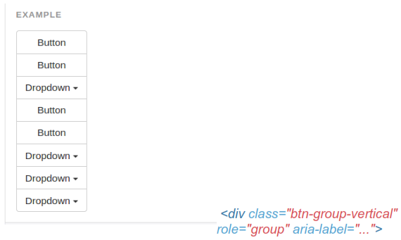
10.5 Vertical Variation
Make a set of buttons appear vertically stacked rather than horizontally.
Split button dropdowns are not supported here.