Chapter 13 Navbars
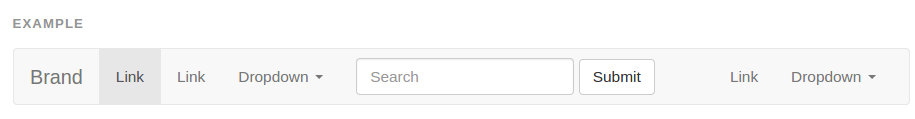
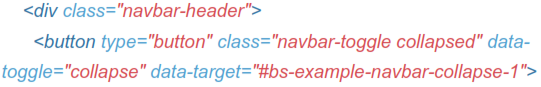
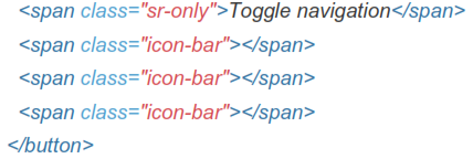
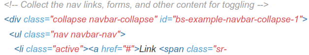
13.1 Default Navbar
Navbars are responsive meta components that serve as navigation headers for your application or site. They begin collapsed tand are toggleable) in mobile views and become horizontal as the available viewport width increases.
 Justified navbar nav links are currently not supported.
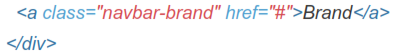


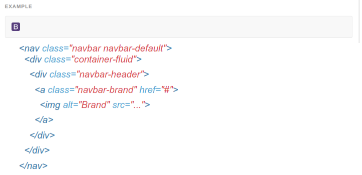
13.2 Brand Image
Replace the navbar brand with your own image by swapping the text for an <img>. Since the .navbar-brand has its own padding and height, you may need to override some CSS depending on your image.
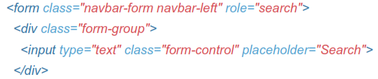
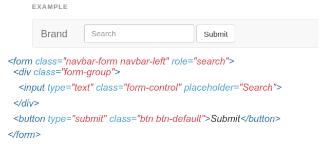
13.3 Forms
Place form content within .navbar-form for proper vertical alignment and collapsed behavior in narrow viewports. Use the alignment options to decide where it resides within the navbar content.
As a heads up, .navbar-form shares much of its code with .form-inline via mixin.
Some form controls, like input groups, may require fixed widths to be show up properly within a navbar.
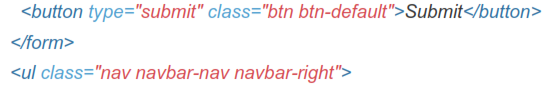
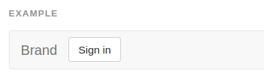
13.4 Buttons
Add the .navbar-btn class to <button> elements not residing in a <form> to vertically center them in the navbar.

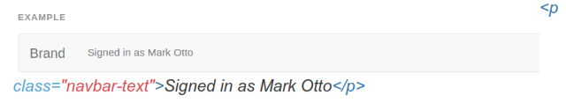
13.8 Text
Wrap strings of text in an element with .navbar-text, usually on a <p> tag for proper leading and color.
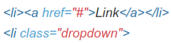
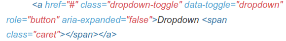
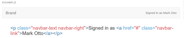
13.6 Non-Nav Links
For folks using standard links that are not within the regular navbar navigation component, use the .navbar-link class to add the proper colors for the default and inverse navbar options.
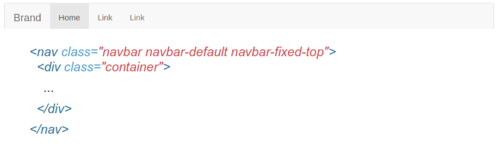
13.7 Fixed To Top
Add .navbar-fixed-top and include a .container or .container-fluid to center and pad navbar content.
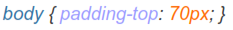
Body padding required
The fixed navbar will overlay your other content, unless you add padding to the top of the <body>. Try out your own values or use our snippet below. Tip:
By default, the navbar is 50px high.
Make sure to include this after the core Bootstrap CSS.
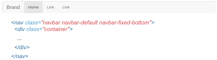
13.8 Fixed To bottom
Add .navbar-fixed-bottom and include a .container or .container-fluid to center and pad navbar content.
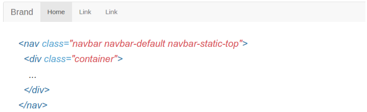
13.9 Static Top
Create a full-width navbar that scrolls away with the page by adding .navbar- static-top and include a .container or.container-fluid to center and pad navbar content.
Unlike the .navbar-fixed-* classes, you do not need to change any padding on the body.
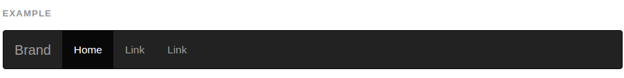
13.10lnverted Navbar
Modify the look of the navbar by adding .navbar-inverse.