Chapter 14 Breadcumbers, Pagination
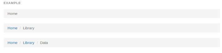
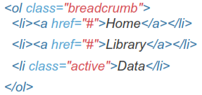
14.1 Breadcumbers
Indicate the current page's location within a navigational hierarchy. Separators are automatically added in CSS through :before and content.
14.2 Pagination
Provide pagination links for your site or app with the multi-page pagination component, or the simpler pager alternative.
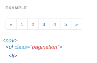
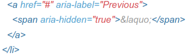
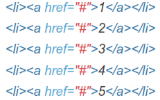
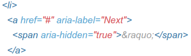
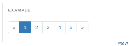
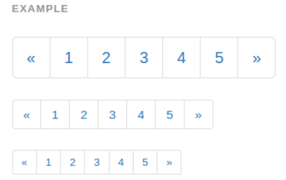
14.2.1 Default Pagination
Simple pagination inspired by Rdio, great for apps and search results. The large block is hard to miss, easily scalable, and provides large click areas.
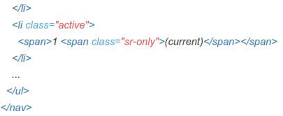
14.2.2 Disabled And Active State
Links are customizable for different circumstances. Use .disabled for unclickable links and .active to indicate the current page.
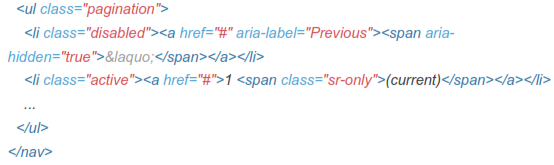
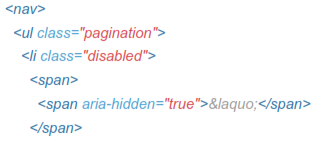
You can optionally swap out active or disabled anchors for <span>, or omit the anchor in the case of the previous/next arrows, to remove click functionality while retaining intended styles.
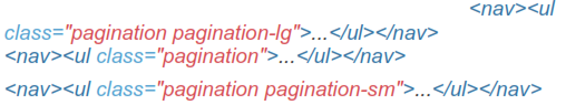
14.2.3 Sizing
Fancy larger or smaller pagination? Add .pagination-lg or .pagination-sm for additional sizes.
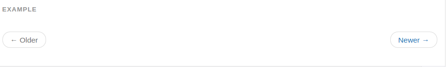
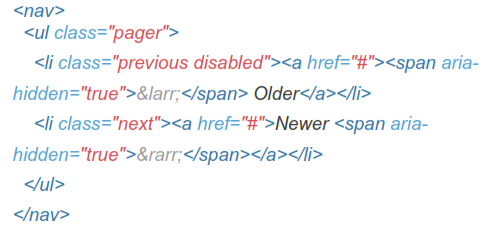
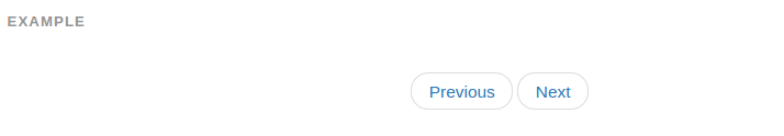
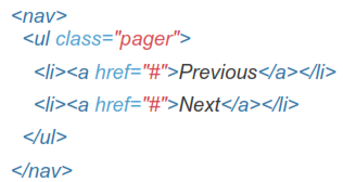
14.3 Pager
Quick previous and next links for simple pagination implementations with light markup and styles. It's great for simple sites like blogs or magazines.
14.3.1 Default Pager
By default, the pager centers links.
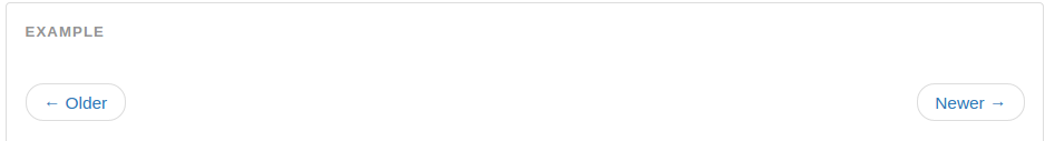
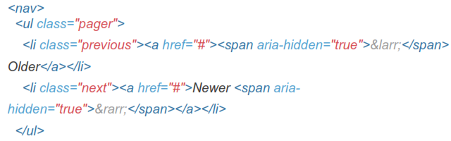
14.3.2 Aligned Links
Alternatively you can align each link to the sides:

14.3.3 Optional Disabled Link
Pager links also use the general .disabled utility class from the pagination.