Chapter 17 Advanced Classes
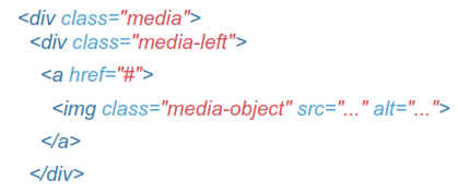
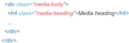
Media Object
Abstract object styles for building various types of components tlike blog comments, Tweets, etc) that feature a left- or right-aligned image alongside textual content.
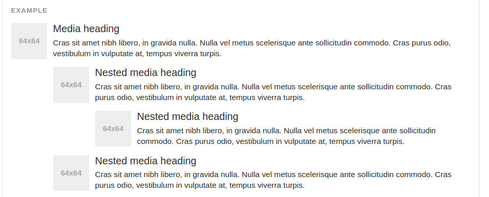
Default Media
The default media displays a media object timages, video, audio) to the left or right of a content block.
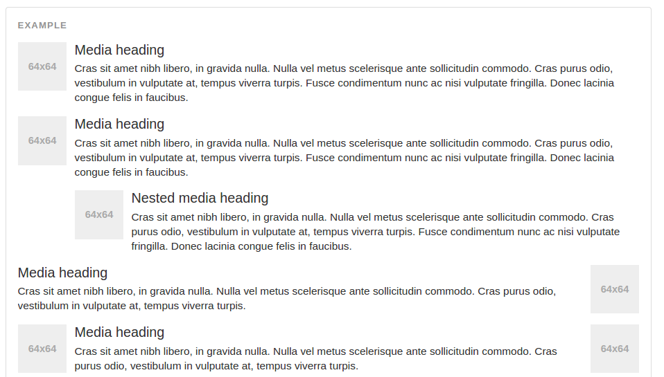
The classes .pull-left and .pull-right also exist and were previously used as part of the media component, but are deprecated for that use as of v3.3.0. They are approximately equivalent to .media-left and .media-right, except that .media-right should be placed after the .media-body in the html.
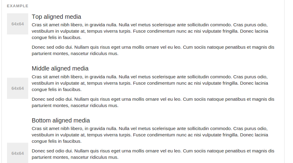
Media Alignment
The images or other media can be aligned top, middle, or bottom. The default is top aligned.

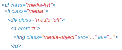
Media List
With a bit of extra markup, you can use media inside list tuseful for comment threads or articles lists).
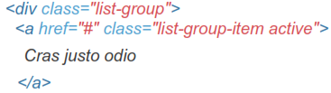
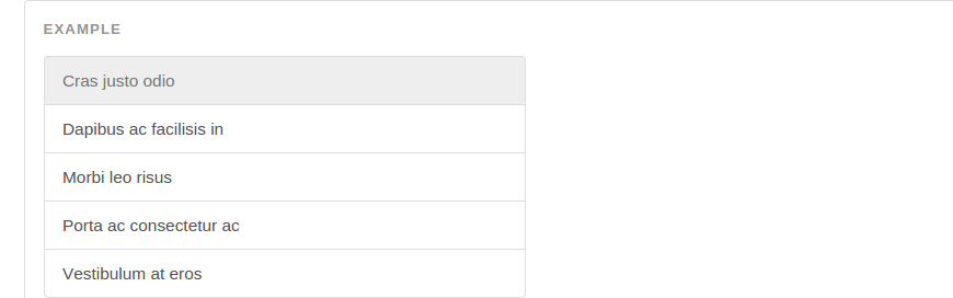
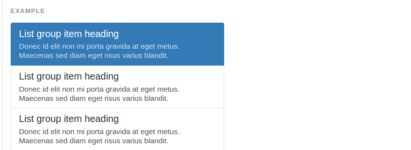
List Group
List groups are a flexible and powerful component for displaying not only simple lists of elements, but complex ones with custom content.
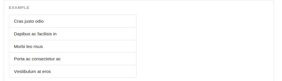
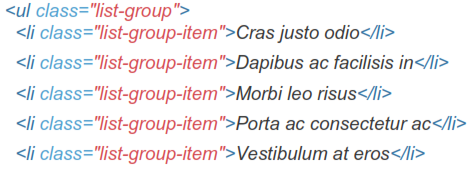
Defualt List Group
The most basic list group is simply an unordered list with list items, and the proper classes. Build upon it with the options that follow, or your own CSS as needed.

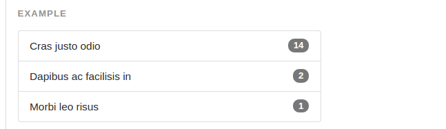
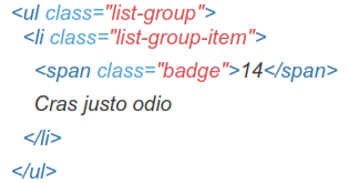
Badges
Add the badges component to any list group item and it will automatically be positioned on the right.
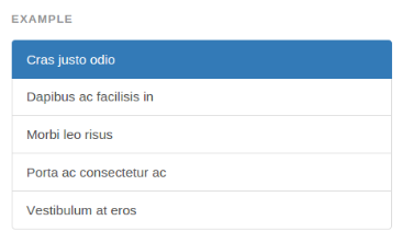
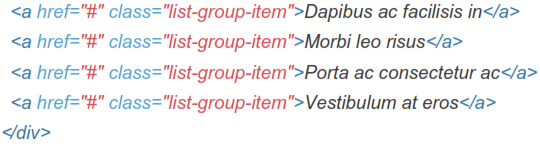
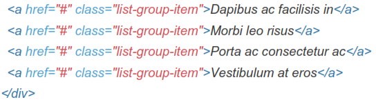
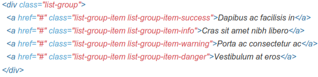
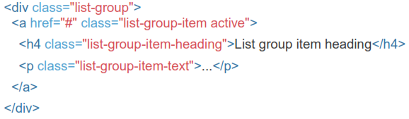
Linked Items
Linkify list group items by using anchor tags instead of list items tthat also means a parent <div> instead of an <ul>). No need for individual parents around each element.
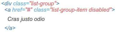
Disabled Item
Add .disabled to a .list-group-item to gray it out to appear disabled.
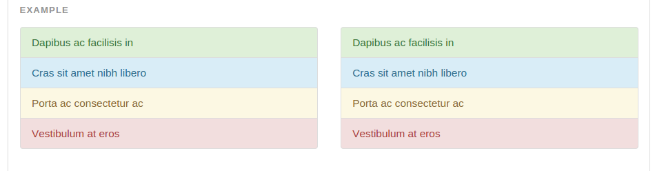
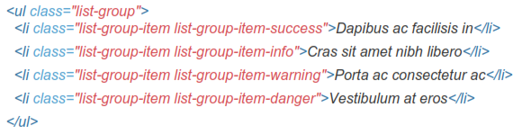
Contextual Classes
Use contextual classes to style list items, default or linked. Also includes .active state.
Custom Content
Add nearly any HTML within, even for linked list groups like the one below.
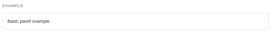
Panels
While not always necessary, sometimes you need to put your DOM in a box. For those situations, try the panel component.
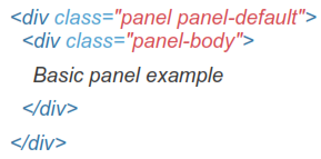
Basic Example
By default, all the .panel does is apply some basic border and padding to contain some content.
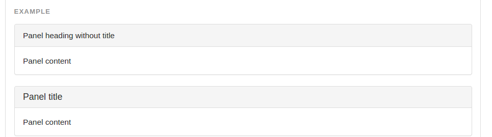
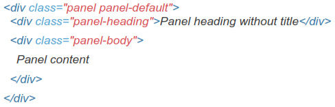
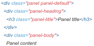
Panel With Heading
Easily add a heading container to your panel with .panel-heading. You may also include any <h1>-<h6> with a .panel-title class to add a pre-styled heading.
For proper link coloring, be sure to place links in headings within .panel-title.

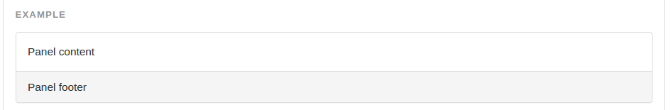
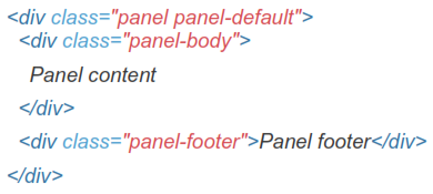
Panel With Footer
Wrap buttons or secondary text in .panel-footer. Note that panel footers do not inherit colors and borders when using contextual variations as they are not meant to be in the foreground.
Contextual Alternatives
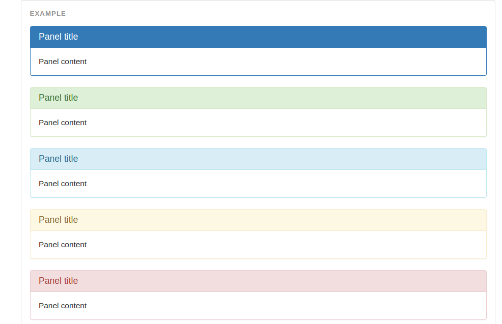
Like other components, easily make a panel more meaningful to a particular context by adding any of
Reads:
105
Pages:
127
Published:
Jan 2024
The process of writing algorithms or pseudo codes before feeding them into program structures and executing them to get desired outputs is very magical indeed...
Formats: PDF, Epub, Kindle, TXT
Reads:
194
Pages:
21
Published:
Jun 2023
Unlock the Power of Windows with Basic Keyboard Shortcut Keys for XP, 7, 8, 10, and 11. This comprehensive guide provides a curated list of essential keyboard...
Formats: PDF, Epub, Kindle, TXT

Reads:
285
Pages:
59
Published:
Jan 2022
Thanks to advances in technology and new ways that employees interact and meet with one another, virtual networking now makes it possible to reach others and ...
Formats: PDF, Epub, Kindle, TXT

Reads:
105
Pages:
170
Published:
Nov 2020
This is an advanced and completely descriptive book for the continuous Bernoulli distribution that is very important to deep learning and variational autoenco...
Formats: PDF