Chapter 16 Progress Bars
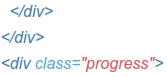
16.1 Progress Bars
Provide up-to-date feedback on the progress of a workflow or action with simple yet flexible progress bars.
Cross-browser compatibi/ity
 Progress bars use CSS3 transitions and animations to achieve some of their effects. These features are not supported in 1nternet Explorer 9 and below or older versions of Firefox. Opera 12 does not support animations.
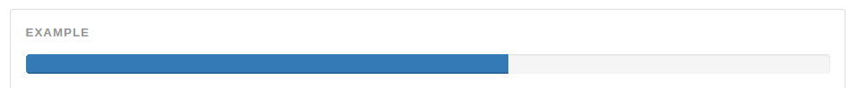
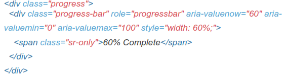
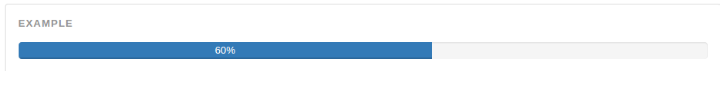
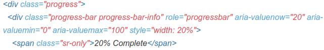
16.1.1 Default Progress Bar
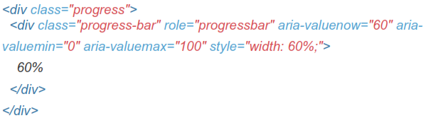
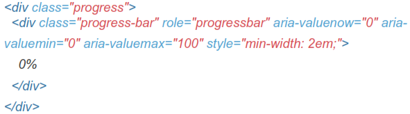
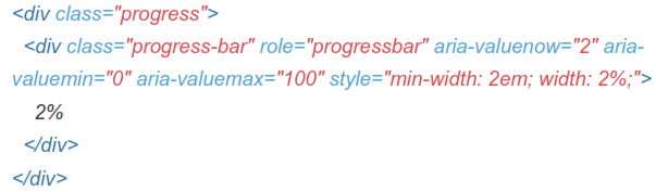
With Label
Remove the <span> with .sr-only class from within the progress bar to show a visible percentage.
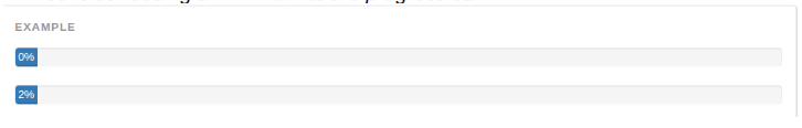
To ensure that the label text remains legible even for low percentages, consider adding a min-width to the progress bar.
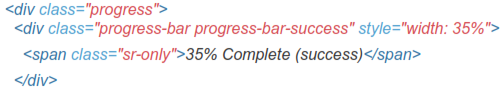
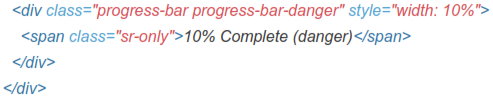
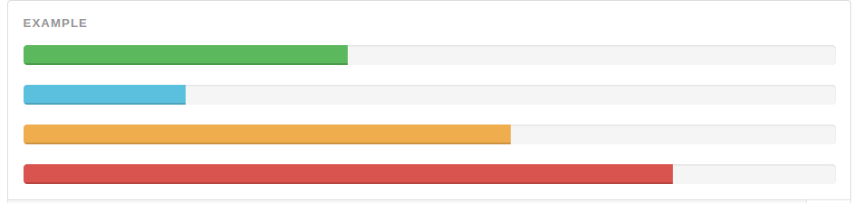
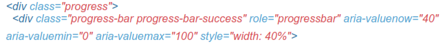
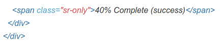
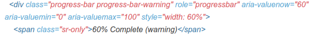
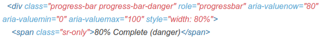
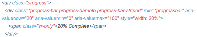
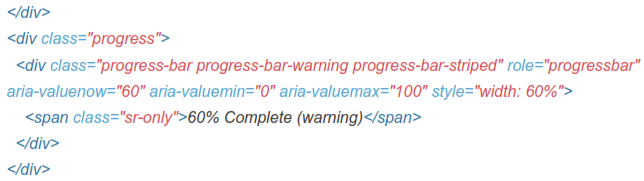
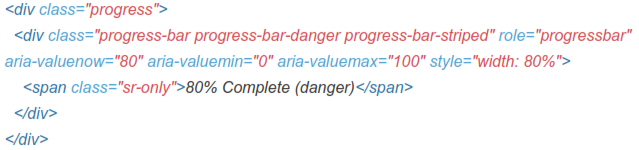
16.2 Contextual Alternatives
Progress bars use some of the same button and alert classes for consistent styles.

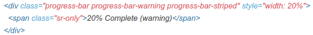
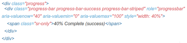
16.3 Striped
Uses a gradient to create a striped effect. Not available in IE8.
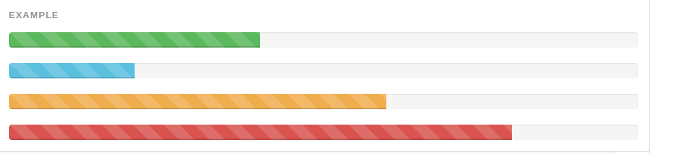
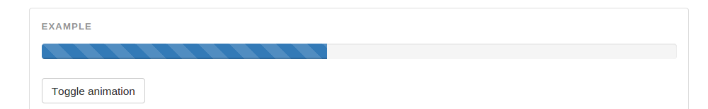
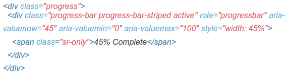
16.4 Animated
Add .active to .progress-bar-striped to animate the stripes right to left. Not available in lEg and below.
16.8 Stacked
Place multiple bars into the same .progress to stack them.