Chapter 1.3 Bootstrap Overview
Overview
Get the lowdown on the key pieces of Bootstrap's infrastructure, including our approach to better, faster, stronger web development. Before getting started we have to know little bit about bootstrap components.
HTML5 Doctype
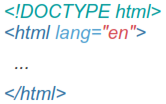
Bootstrap makes use of certain HTML elements and CSS properties that require the use of the HTML5 doctype. Include it at the beginning of all your projects.
Mobile First
With version 2, bootstrap added optional mobile friendly styles for key aspects of the framework. But in Bootstrap 3 they rewritten the project to be mobile friendly from the start. Instead of adding on optional mobile styles, they're baked right into the core. In fact, Bootstrap is mobile first. Mobile first styles can be found throughout the entire library instead of in separate files.
To ensure proper rendering and touch zooming, add the viewport meta tag to your <head>.

You can disable zooming capabilities on mobile devices by adding user- scalable=no to the viewport meta tag. This disables zooming, meaning users are only able to scroll, and results in your site feeling a bit more like a native application. Overall, we don't recommend this on every site, so use caution!


Typography and Links
Bootstrap sets basic global display, typography, and link styles. Specifically, we:
These styles can be found within scaffolding.less.
Normalize.css
For improved cross-browser rendering, bootstrap use Normalize.css, a project by Nicolas Gallagher and Jonathan Neal.
You can download it from http://necolas.github.io/normalize.css/ And place it in root of your bootstrap directory.
Containers
Bootstrap requires a containing element to wrap site contents and house our grid system. You may choose one of two containers to use in your projects. Note that, due to padding and more, neither container is nestable.
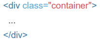
Use .container for a responsive fixed width container.
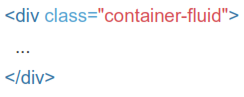
Use .container-fluid for a full width container, spanning the entire width of your viewport.