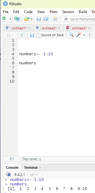

Generating sequenced vectors:
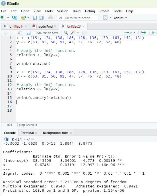
Vectors can be created with numerical values in a sequence using : operator.
Example:
numbers <- 1:10
numbers
In order to create stepwise increment / decrement to a sequence of numbers in a vector the function seq() can be used. This function has three parameters. :from is where the sequence starts, to where the sequence stops, and by is the interval of the sequence.
Image showing creation of sequenced vector
Prof. Dr Balasubramanian Thiagarajan
201


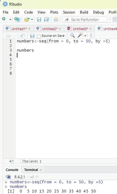

Example:
numbers<-seq(from = 0, to = 50, by =5)
numbers
Image showing creation of a sequance of numbers with a difference of 5
R Programming in Statistics


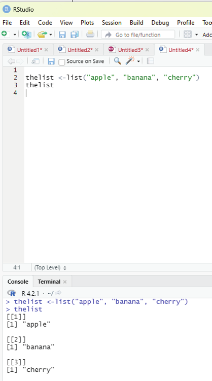

List function:
A list in R can contain different data types inside it. A list in R is a collection of data that is ordered and can be changed.
In order to create a list, list() function is used.
Example:
# This is a list of strings.
thelist <-list(“apple”, “banana”, “cherry”)
# Print the list.
thelist
Image showing list function
Prof. Dr Balasubramanian Thiagarajan
203


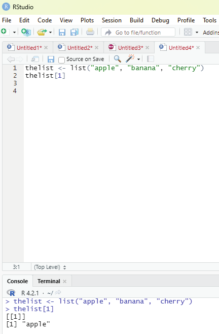

Function to Access lists:
The user can access the list items by referring to its index number, inside brackets. The firt item has an index number 1, the second has an index number of 2 and so on.
Example:
thelist <- list(“apple”, “banana”, “cherry”)
thelist[1]
Image showing how to access list items using its index number R Programming in Statistics


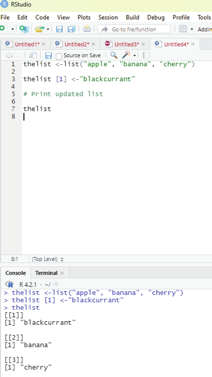

Changing item value:
In order to change the value of a specific item, it must be referred to by its index number.
Example:
Changing item value:
In order to change the value of a specific item, it must be referred to by its index number.
thelist <-list(“apple”, “banana”, “cherry”)
thelist [1] <-”blackcurrant”
# Print updated list
thelist
Image showing replacement of one item in the list with another Prof. Dr Balasubramanian Thiagarajan
205


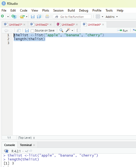

Function to ascertain the length of the list:
In order to find out how many items a list has, one has to use the length() function.
Example:
thelist <-list(“apple”, “banana”, “cherry”)
length(thelist)
Image showing code for ascertaining the length of the list
R Programming in Statistics


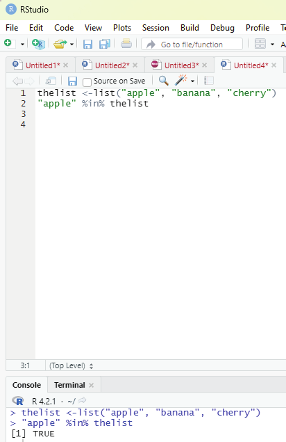

In order to check if an item exists in the list the following function is to be used.
Operator to be used: %in%
Example:
thelist <-list(“apple”, “banana”, “cherry”)
“apple” %in% thelist
Image showing the code for ascertaining whether an item is present in the list or not in action Prof. Dr Balasubramanian Thiagarajan
207


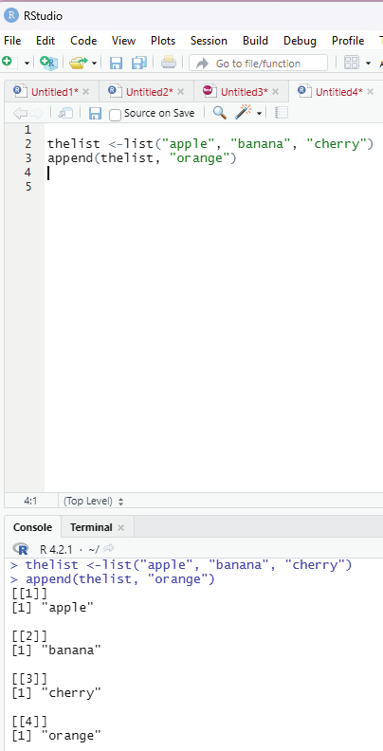

Adding list items:
To add an item to the end of the list, the user should use the append() function.
Example:
thelist <-list(“apple”, “banana”, “cherry”)
append(thelist, “orange”)
Image showing adding an item to the list
R Programming in Statistics


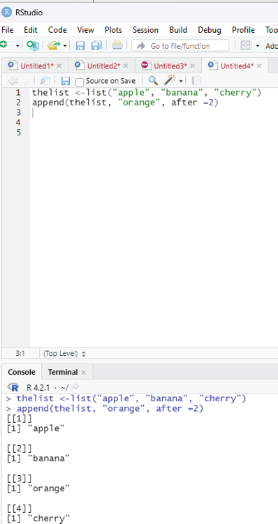

To add an item to the right of the specified index, add “after=index number” in the append() function.
Example:
To add “orange” to the list after “banana” (index2);
thelist <-list(“apple”, “banana”, “cherry”)
append(thelist, “orange”, after =2)
Image showing how to append an item after a specific item within a list Prof. Dr Balasubramanian Thiagarajan
209


Removing list items:
The user can remove items from the list. The example code creates a new, updated list without “apple” by removing it from the list.
thelist <-list(“apple”, “banana”, “cherry”)
thelist <-thelist[-1]
# print the new list
thelist
Image showing range of indexes being specified
R Programming in Statistics
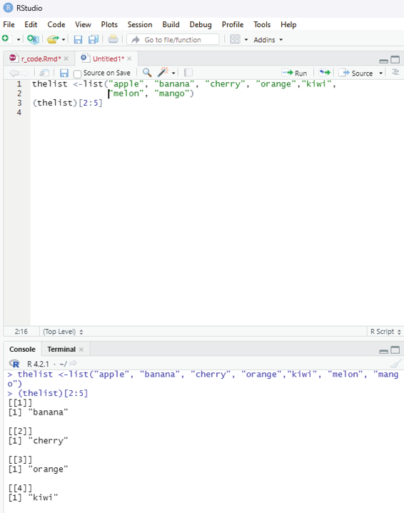
One can specify a range of indexes by specifying where to start and where to end the range by using : operator.
Example:
To return the second, third, fourth, and fifth item:
thelist <-list(“apple”, “banana”, “cherry”, “orange”,”kiwi”, “melon”, “mango”) (thelist)[2:5]
Output:
[[1]]
[1] “banana”
[[2]]
[1] “cherry”
[[3]]
[1] “orange”
[[4]]
[1] “kiwi”
Loop through the list:
One can loop through the list items by using for loop:
thelist <-list(“apple”, “banana”, “cherry”)
for (x in thelist){
print (x)
}
Prof. Dr Balasubramanian Thiagarajan
211


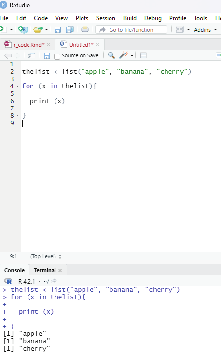

Image showing loop function
R Programming in Statistics
In order to perform loop in R programming it is useful to iterate over the elements of a list, dataframe, vector, matrix or any other object. The loop can be used to execute a group of statements repeatedly depending upon the number of elements in the object. Loop is always entry controlled, where the test condition is tested first, then the body of the loop is executed. The loop body will not be executed if the test condition is false.
Syntax:
for(var in vector){
statements(s)
}
In this syntax, var takes each value of the vector during the loop. In each iteration, the statements are evaluated.
Example for using for loop.
Iterating over a range in R - For loop.
# Use of for loop
for(i in 1:4)
{
print (i^2)
}
Output:
[1] 1
[1] 4
[1] 9
[1] 16
In the example above the ensures that the range of numbers between 1 to 4 inside a vector has been iterated and the resultant value displayed as the output.
Results demonstrate:
Multiplying each number by itself once:
1*1 = 1
2*2 = 2
3*3 = 9
4*4 = 16
These resultant values are displayed as output.
Prof. Dr Balasubramanian Thiagarajan
213


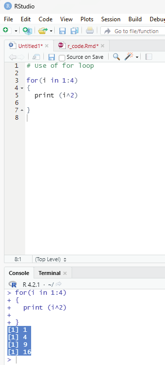

Image showing loop function
R Programming in Statistics


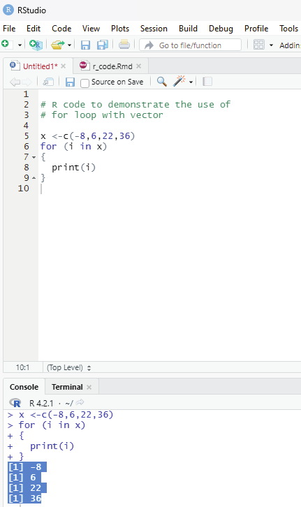

Example using concatenate function in R - For loop.
Using concatenate outside the loop R - For loop:
# R code to demonstrate the use of
# for loop with vector
x <-c(-8,6,22,36)
for (i in x)
{
print(i)
}
Output:
[1] -8
[1] 6
[1] 22
[1] 36
Image showing concatenate being used in loop function
Prof. Dr Balasubramanian Thiagarajan
215
R language allows the use of one loop inside another one. For example, a for loop can be inside a while loop or vice versa.
Example:
# R code to demonstrate the use of
# nested for loop
# R Program to demonstrate the use of
# nested for loop
for (i in 1:5)
{
for (j in 1:i)
{
print(i * j)
}}
Output:
[1] 1
[1] 2
[1] 4
[1] 3
[1] 6
[1] 9
[1] 4
[1] 8
[1] 12
[1] 16
[1] 5
[1] 10
[1] 15
[1] 20
[1] 25
R Programming in Statistics


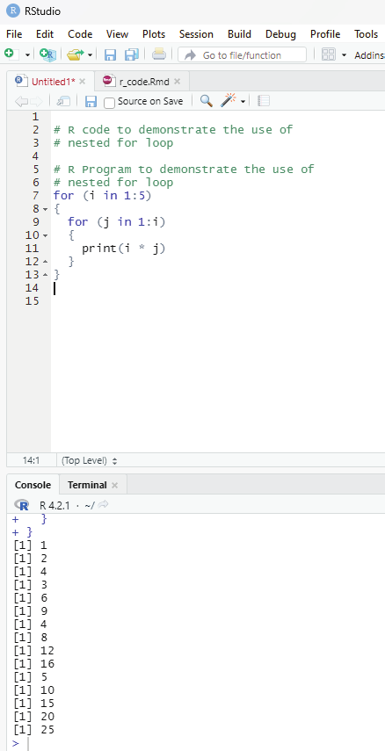

Image showing nested loop
Prof. Dr Balasubramanian Thiagarajan
217
One can use jump statements in loops to terminate the loop at a particular iteration or to skip a particular iteration in the loop. The two most commonly used jump statements are: Break statement:
This type of jump statement is used to terminate the loop at a particular iteration. The program then continues with the next statement outside the loop if any.
Example:
# This code is to demonstrate the use of break in for loop.
for (i in c(4,5,34,22,12,9))
{
if (i == 0)
{
break
}
print(i)
}
print(“Outside Loop”)
Output:
[1] 4
[1] 5
[1] 34
[1] 22
[1] 12
[1] 9
R Programming in Statistics


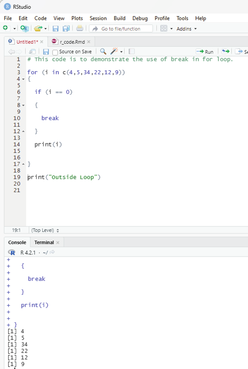

Image showing loop with break statement
Prof. Dr Balasubramanian Thiagarajan
219


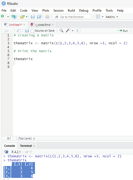

Matrices:
This is a two dimensional data set with columns and rows.
A column is a vertical representation of data, while a row is a horizontal representation of data.
A matrix can be treated with matrix() frunction. Specify the nrow and ncol parameters to get the amount of rows and columns:
# Creating a matrix
thematrix <- matrix(c(1,2,3,4,5,6), nrow =3, ncol = 2)
# Print the matrix
thematrix
Output:
[,1] [,2]
[1,] 1 4
[2,] 2 5
[3,] 3 6
Image showing matrix creation
R Programming in Statistics


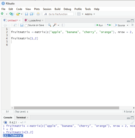

Accessing matrix items:
The user can access the items by using []. The first number”1” in the bracket specifies the row position, while the second number “2” specifices column position.
Example:
fruitmatrix <-matrix(c(“apple”, “banana”, “cherry”, “orange”), nrow = 2, ncol = 2) fruitmatrix[1,2]
Output:
[1] “cherry”
Image showing matrix items being accessed
Prof. Dr Balasubramanian Thiagarajan
221
The whole row can be accessed if the user specifies a comma after the number in the bracket.
fruitmatrix[ 2,]
the whole column can be accessed if the user specifies a comma before the number in the bracket.
fruitmatrix[,2]
In a matrix more than one row can be accessed using c() function.
Example:
fruitmatrix <-matrix (c (“apple”, “orange”, “Papaya”, “pineapple”, “pear”, “grapes”, “seetha”, “banana”, “sapota”), nrow =3, ncol=3)
fruitmatrix[c(1,2),]
More than one column can be accessed by using c() function.
fruitmatrix [,c(1,2)]
Adding rows and columns to a matrix:
For this purpose cbind() function can be used.
Example:
fruitmatrix <- matrix(c(“apple”, “banana”, “cherry”, “orange”, “grape”, “pineapple”, “pear”, “melon”, “fig”),
nrow =3, ncol=3)
newfruitmatrix <-cbind(fruitmatrix,c(“strawberry”, “blueberry”, “raspberry”))
#print the new matrix
newfruitmatrix
R Programming in Statistics
It should be noted that the new column should be of the same length as the existing matrix.
thismatrix <- matrix(c(“apple”, “banana”, “cherry”, “orange”,”grape”, “pineapple”, “pear”, “melon”, “fig”), nrow = 3, ncol = 3)
newmatrix <- rbind(thismatrix, c(“strawberry”, “blueberry”, “raspberry”))
# Print the new matrix
newmatrix
Removing rows and columns:
To remove rows and columns c() function can be used.
Example:
fruitmatrix <-matrix(c(“apple”,”banana”,”pear”,”orange”, “sapota”, “papaya”), nrow=3, ncol=2)
#Remove the first row and the first column.
fruitmatrix <-fruitmatrix[-c(1), -c(1)]
fruitmatrix
Checking if an item is present in the matrix. For this purpose %in% operator can be used.
Example:
This code is to check if “banana” is present in the matrix.
fruitmatrix <-matrix (c(“apple”, “cherry”, “orange”,”banana”), nrow =2, ncol=2)
“banana” %in% fruitmatrix
If it is present the output generated will state True.
Prof. Dr Balasubramanian Thiagarajan
223


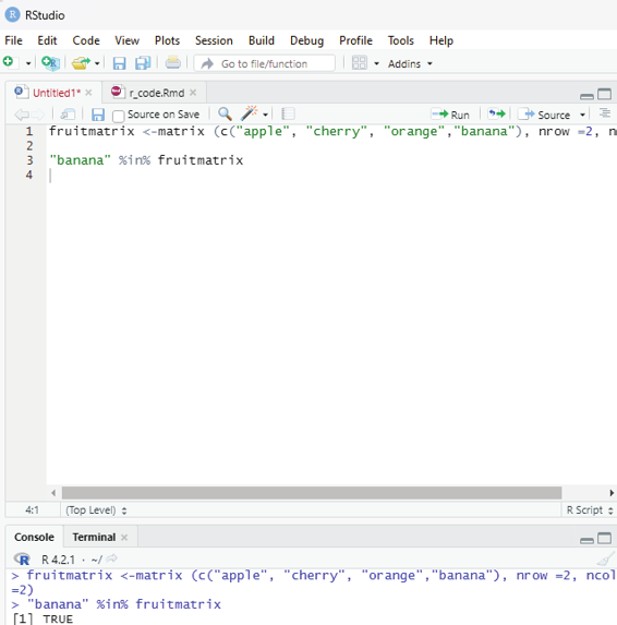

Image showing query for identifying whether banana is present in the matrix R Programming in Statistics
Number of rows and columns can be found by using dim() function.
fruitmatrix <-matrix(c(“apple”, “pear”, “banana”, “dragonfruit”), nrow =2, ncol=2) dim(fruitmatrix)
Length of the matrix.
length() function can be used to find the dimension of a matrix.
Example:
fruitmatrix <-matrix(c(“apple”, “pear”, “banana”, “dragonfruit”), nrow =2, ncol=2) length(fruitmatrix)
This value is actual y the total number of cel s in a matrix. (number of rows multiplied by the number of columns).
Loop through the matrix:
The user can loop through a matrix by using for loop. The loop starts at the first row, moves to the right.
Example:
thismatrix <- matrix(c(“apple”, “banana”, “cherry”, “orange”), nrow = 2, ncol = 2) for (rows in 1:nrow(thismatrix)) {
for (columns in 1:ncol(thismatrix)) {
print(thismatrix[rows, columns])
}}
Prof. Dr Balasubramanian Thiagarajan
225


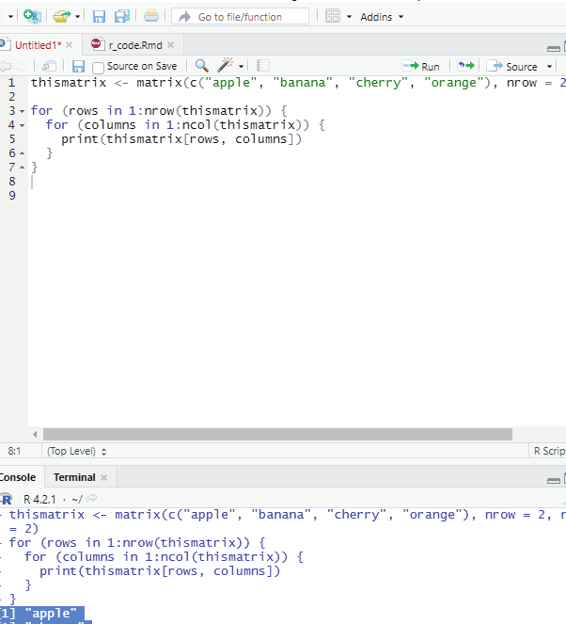

Output:
[1] “apple”
[1] “cherry”
[1] “banana”
[1] “orange”
Image showing loop function in matrix
R Programming in Statistics
# Combine matrices
Matrix1 <- matrix(c(“apple”, “banana”, “cherry”, “grape”), nrow = 2, ncol = 2) Matrix2 <- matrix(c(“orange”, “mango”, “pineapple”, “watermelon”), nrow = 2, ncol = 2)
# Adding it as a rows
Matrix_Combined <- rbind(Matrix1, Matrix2)
Matrix_Combined
# Adding it as a columns
Matrix_Combined <- cbind(Matrix1, Matrix2)
Matrix_Combined
Arrays:
Arrays can have more than two dimensions, this is the difference between matrix (one dimensonal array) and array.
One can usee the array() function to create an array, and the dim parameter to specify the dimensions.
Example:
# An array with one dimension with values ranging from 1 to 40.
myarray <- c (1:40)
myarray
Output:
[1] 1 2 3 4 5 6 7 8 9 10 11 12 13 14 15 16 17 18 19 20 21 22 23
[24] 24 25 26 27 28 29 30 31 32 33 34 35 36 37 38 39 40
Prof. Dr Balasubramanian Thiagarajan
227


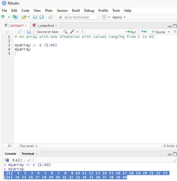

Image showing array formation
R Programming in Statistics
# An array with more than one dimension.
multiarray <-array(myarray,dim = c(4,3,2))
multiarray
In the above example code it creates an array with values from 1 to 40.
Explanation for dim=c(4,3,2). The first and second number specifies the the number of rows and colums and the last number within the bracket specifies the number of dimensions needed.
Note: Arrays can have only one data type.
Output:
[,1] [,2] [,3]
[1,] 1 5 9
[2,] 2 6 10
[3,] 3 7 11
[4,] 4 8 12
, , 2
[,1] [,2] [,3]
[1,] 13 17 21
[2,] 14 18 22
[3,] 15 19 23
[4,] 16 20 24
Access Array items:
The user can access the elements within an array by referring to their index position. One can use the []
brackets to access the desired elements in the array.
# Access all the items from the first row from matrix one.
multiarray <-array(myarray, dim = c(4,3,2))
multiarray [c(1),,1]
# Access all the items from the first column from matrix one.
multiarray <-array(myarray, dim=c(4,3,2))
multiarray [,c(1),1]
Prof. Dr Balasubramanian Thiagarajan
229


Output:
[1] 1 5 9
Explanation:
A comma (,) before c() means that the user wants to access the column.
A comma (,) after c() means that the user wants to access the row.
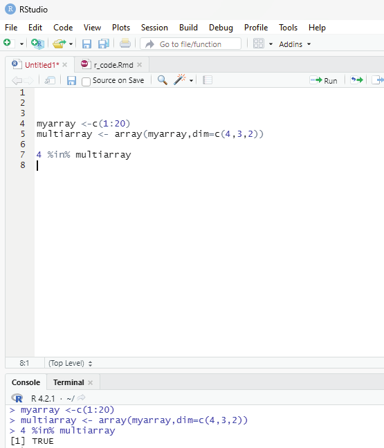
Code to check if an item exists in an array:
In order to find out if a specified item is present in an array one can use %in% operator.
# To check if the value of 4 is present in the array.
myarray <-c(1:20)
multiarray <- array(myarray,dim=c(4,3,2))
4 %in% multiarray
Image showing the code to verify if 4 is present in the array R Programming in Statistics


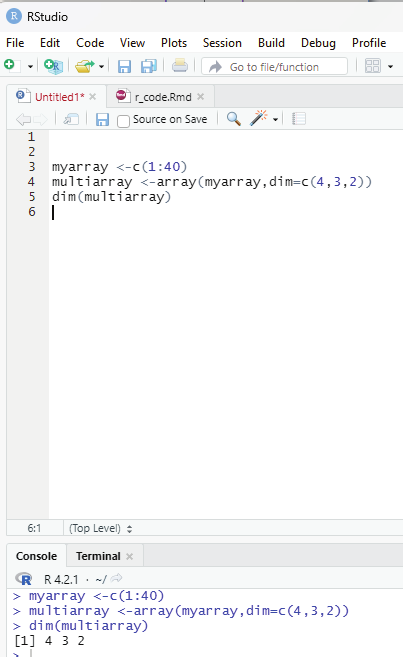

To calculate the number of Rows and columns dim() function can be used.
Example:
myarray <-c(1:40)
multiarray <-array(myarray,dim=c(4,3,2))
dim(multiarray)
Image showing code for calculating the number of rows and columns Prof. Dr Balasubramanian Thiagarajan
231
To calculate the length of the array length() function can be used.
length(multiarray)
Loop through an array:
One can loop through the array items by using a for loop: function.
Example:
myarray <-c(1:20)
multiarray <-array(myarray, dim = c(4,3,2))
for (x in multiarray){
print(x)
}
R Factors:
Factors are used to categorize data. Examples of factors include: Demography: Male/Female
Music: Rock, Pop, Classic
Training: Strength, Stamina
Example:
# Create a factor.
music_genre <-factor (c(“jazz”, “Rock”, “Classic”,”Hindustani”, “Carnatic”))
#Print the factor
music_genre
R Programming in Statistics
R or RStudio by default does not open up a spread sheet interface on execution. This is because in R one needs to approach data a little differently by writing out each step in code. R does have a spreadsheet like data entry tool.
Everything in R is an object and this is the basic difference between R and Excel. For this to happen the user needs to set up a blank data frame (similar to that of Excel table with rows and columns). If the user leaves the arguments blank in data.frame it would result in creation of an empty data frame.
Code:
myData <-data.frame()
This code on execution will create an empty data frame. This command will still not launch the viewer. For entering the data into the data frame the command to edit data in the viewer should be invoked.
Code:
myData <-edit(myData)
On running this command the Data Editor launches.
The default names of the column can be changed by clicking on top of it. While entering the data, the data editor gives the user the option of specifying the type of data entered. On closing the editor the data gets saved and the editor closes. The entered data can be checked by invoking the print data command.
One flip side of data editor is that it does not set the column to logical when logical values are entered. The entire column should be converted to logical using the following command in the scripting window.
myData # This command will open the data editor window.
is.logical(nameofdatafile&Isnameofthecolumn)
Data can be entered from within the scripting window using command functions.
Prof. Dr Balasubramanian Thiagarajan
233


Image showing data editor launched
Example:
# To create a sample data frame with 5 columns:
data_entry <-data.frame(One=1:5, Two=6:10, Three=11:15) data_entry
R Programming in Statistics


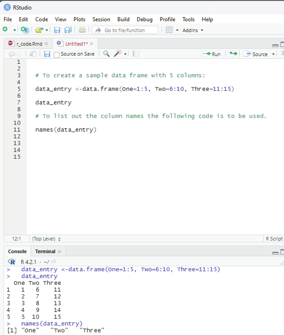

# To list out the column names the fol owing code is to be used.
names(data_entry)
# Renaming the column names.
# Library plyr should be loaded first.
library(plyr)
rename(data_entry, c(“One” = “1”, “Two” = “2”, “Three”=”3”)) Entering data into RStudio is a bit tricky for a beginner. The best way is to import data created from other data base software like Excel, SPSS etc which provide a convenient way of data entry because of their default column and row features. Imported data can be subjected to analysis within R environment. Data can be imported using the File menu - under which import data set is listed. The user can choose the data format to import data from. RStudio if needed will seek to download some libraries for seamless import of data set created in other software if connected to Internet.
Image showing names of columns listed
Prof. Dr Balasubramanian Thiagarajan
235


All along in this book the user would have been exposed to the code that creates “vectors” of data.
Example:
variable_1=c(1,2,3,4,5)
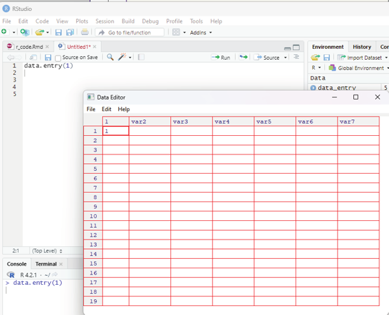
If the user prefers entering data in a spread sheet window R needs to be convinced to present the interface by using a code shown below:
data.entry(1)
This command opens up a data editor window with a column named 1 and the row is also named 1. This can easily be edited by clicking on the value. Up and down arrows can be used to navigate the worksheet. When data entry is complete then the user can choose file>close. This closes the data editor after saving its contents.
Image showing data entry window opening up after keying data.entry(1) R Programming in Statistics
The data entry window should be closed before entering new commands in the R console. Using the console window data values can be changed using the following command: data.entry(variablename)
The user can list any number of variables separated by a comma within the bracket.
The user can also open a dialog box to import data stored in csv format (comma separated values). Excels files can also be stored as .csv files.
The user can also open a dialog window to find the data file that needs to be imported into R.
testdata = read.table(path to the file that needs to be imported).
Taking input from user in R Programming.
This is an important feature in R. Like all programming languages in R also it is possible to take input from the user. This is an important aspect in data collection. This is made possible by using: readline() method
scan() method
Using readline() method:
In this method R takes input in a string format. If the user inputs an integer then it is inputted as a string.
If the user wants to input 320, then it will input as “320” like a string. The user hence will have to convert the inputted value into the format that is needed for data analysis. In the above example the string “320”
will have to be converted to integer 320. In order to convert the inputted value to the desired data type, the following functions can be used.
as.integer(n) - convert to integer
as.numeric(n) - convert to numeric (float, double etc)
as.complex(n) - convert to complex number (3+2i)
as.Date(n) - convert to date etc.
Syntax:
var =readline();
var=as.integer(var);
Example:
# Taking input from the user
# This is done using readline() method
# This command will prompt the user to input the desired value var = readline();
# Convert the inputted value to integer
Prof. Dr Balasubramanian Thiagarajan
237
# Print the value
print(var)
One can also show a message in the console window to inform the user, what to input the program with.
This can be done using an argument named prompt inside the readline() function.
Syntax:
var1 = readline(prompt=”Enter any number:”);
or
var1 = readline(“Enter any Number:”);
Code:
# Taking input with showing the message.
var = readline(prompt = “Enter any number : “);
# Convert the inputted value to an integer.
var = as.integer(var);
# Print the value
print(var)
Taking multiple inputs in T:
This action is similar to that of taking a single output, but it just needs multiple readline() inputs. One can use braces to define multiple readline() inside it.
Syntax:
var1=readline(“Enter 1st number:”);
var2=readline(“Enter 2nd number:”);
var3=readline(“Enter 3rd number:”);
or
R Programming in Statistics
# Taking multiple inputs from the user
{
var1 = readline(“Enter 1st number : “);
var2 = readline(“Enter 2nd number : “);
var3 = readline(“Enter 3rd number : “);
var4 = readline(“Enter 4th number : “);
}
# Converting each value to integer
var1 = as.integer(var1);
var2 = as.integer(var2);
var3 = as.integer(var3);
var4 = as.integer(var4);
# print the sum of the 4 numbers
print(var1+var2+var3+var4)
# R program to il ustrate taking input from the user
# string input
var1 = readline(prompt = “Enter your name : “);
# character input
var2 = readline(prompt = “Enter any character : “);
# convert to character
var2 = as.character(var2)
# printing values
print(var1)
print(var2)
Prof. Dr Balasubramanian Thiagarajan
239


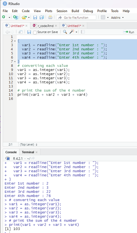

Image showing readline and converting as integer functions
R Programming in Statistics


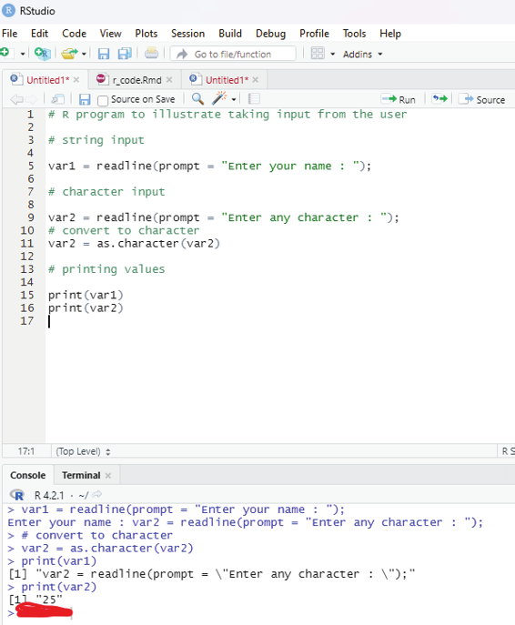

Image showing string input
Prof. Dr Balasubramanian Thiagarajan
241
Another method to take user input in R language is to use a method known as scan() method. This method takes input from the console. This is rather handy when inputs are needed to be taken quickly for any mathematical calculation or for any dataset. This method reads data int he form of a vector or list. This method can also be used to read input from a file also.
Syntax:
x=scan()
scan() method is taking input continuously. In order to terminate the input process one needs to press ENTER key 2 times on the console.
Example:
This code is to take input using scan() method, where some integer number is taken as input and the same value is printed in the next line of the console.
# R program to il ustrate
# taking input from the user
# taking input using scan()
x = scan()
# print the inputted values
print(x)
Scan function is used for scanning text files.
Example:
# create a data frame
data <- data.frame(x1 = c(4, 4, 1, 9),
x2 = c(1, 8, 4, 0),
x3 = c(5, 3, 5, 6))
data
#write data as text file to directory
write.table(data,
file = “data.txt”,
row.names = FALSE)
data1 <-scan(“data.txt”), what = “character”)
R Programming in Statistics
data1 <- scan(“data.txt”, what = “character”)
data1
This code has created a vector, that contains all values of the data in the data frame including the column names.
Scan command can also be used to read data into a list. The code below creates a list with three elements.
Each of the list elements contains one column of the original data frame. The data in the data file is scanned line by line.
# Read txt file into list
data2 <- scan(“data.txt”, what = list(“”, “”, “”))
# Print scan output to the console
data2
Skipping lines with scan function:
Scan function provides additional specifications. One of which is the skip function. This option allows the user to skip any line of the input file. Since the column names are usual y the first input lines of a file, one can skip them with the specification skip = 1.
# Skip first line of txt file
data3 <- scan(“data.txt”, skip = 1)
# Print scan output to the console
data3
Scanning Excel CSV file:
Scan function can also be used to scan CSV file created by Excel.
Example:
write.table(data,
file = “data.csv”,
row.names = FALSE)
Prof. Dr Balasubramanian Thiagarajan
243
data4 <-scan(“data.csv”, what = “character”) data4
Scanning RStudio console:
Another functionality of scan is that it can be used to read input from the RStudio console.
Example:
data5 <-scan(“”)
read function can also be used in lieu of scan function.
read.csv
read.table
readLines
n.readLines
read.csv function:
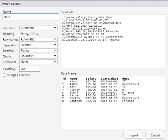
In order to import csv files the import function available under file menu of RStudio can be used.
As a first step using a notepad the user can create a small data base with details as shown below: id,name,salary,start_date,dept
1,simon,623.3,2012-01-01,IT
2,Ashok,515.2,2013-09-23,Operations
3,Adil,611,2014-11-15,IT
4,Murray,729,2014-05-11,HR
5,Sunil,843.25,2015-03-27,Finance
6,Naina,578,2013-05-21,IT
7,Seetha,632.8,2013-07-30,Operations
8,Gautham,722.5,2014-06-17,Finance
Every column should be separated by a comma that is the reason why it is called as comma separated values (.CSV).
R Programming in Statistics
Image showing the import screen. Before clicking on the import button the user should verify if all the settings are given as shown in the screenshot
Prof. Dr Balasubramanian Thiagarajan
245


Image showing the imported data displayed in the RStudio scripting window R Programming in Statistics


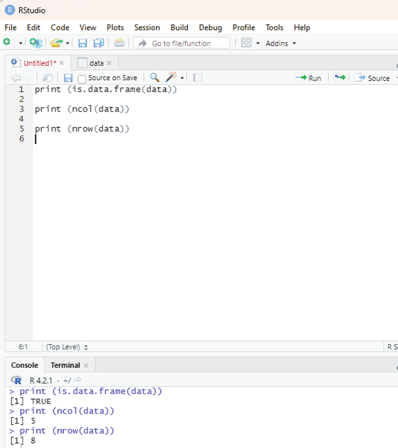

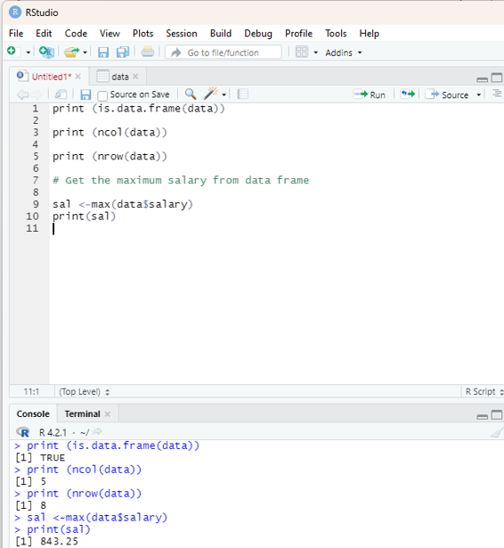
Analyzing the data imported:
Command to analyze the imported data.
print (is.data.frame(data))
print (ncol(data))
print (nrow(data))
Output:
print (is.data.frame(data))
[1] TRUE
> print (ncol(data))
[1] 5
> print (nrow(data))
[1] 8
Image showing the output when data analysis is performed
Prof. Dr Balasubramanian Thiagarajan
247
From the sample data the user is encouraged to get the maximum salary of the employee by using R code.
# Get the maximum salary from data frame
sal <-max(data$salary)
print(sal)
Output:
843.25.
Image showing the maximum salary displayed
R Programming in Statistics
In order to get the details of person drawing maximum salary the code used is:
# Retrieve value of the person detail having maximum salary.
retval <- subset(data, salary == max(salary))
print(retval)
To get details of all persons woking in IT department:
retval <-subset(data, dept == “IT”)
print(retval)
To get persons in IT department whose salary in greater than 600.
info <- subset(data, salary > 600 & dept == “IT”) print(info)
Given below is the entire sequential code for all the functions detailed above: print(is.data.frame(data))
print(ncol(data))
print(nrow(data))
# Get the max salary from data frame.
sal <- max(data$salary)
print(sal)
# Get the person detail having max salary.
retval <- subset(data, salary == max(salary))
print(retval)
# To get details of all persons woking in IT department:
retval <-subset(data, dept == “IT”)
print(retval)
# To get persons in IT department whose salary in greater than 600.
info <- subset(data, salary > 600 & dept == “IT”) print(info)
Prof. Dr Balasubramanian Thiagarajan
249


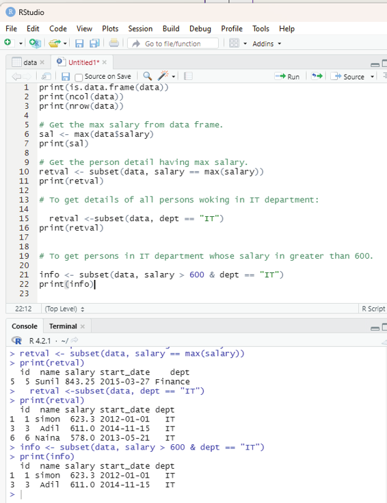

Image showing the sequential code for all the functions described above R Programming in Statistics


Importing data directly from Excel:
Excel is the most commonly used data base soft ware. In order to import data directly from Excel certain libraries need to b installed in RStudio.
These packages include:
XLConnect
xlsx
gdata
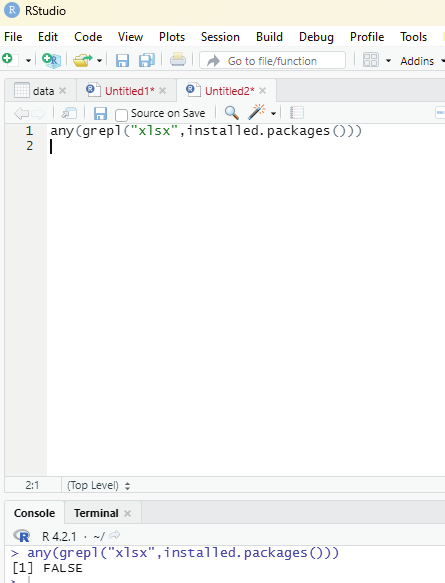
xlsx can be installed via package manager. Before that the user can verify whether the package is available within R environment by using the code:
any(grepl(“xlsx”,instal ed.packages()))
If the output displays the value TRUE it is installed. If FALSE is displayed then the package should be installed by the user.
Image showing that xlsx instal ation not available in the R package.
Prof. Dr Balasubramanian Thiagarajan
251


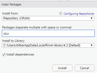


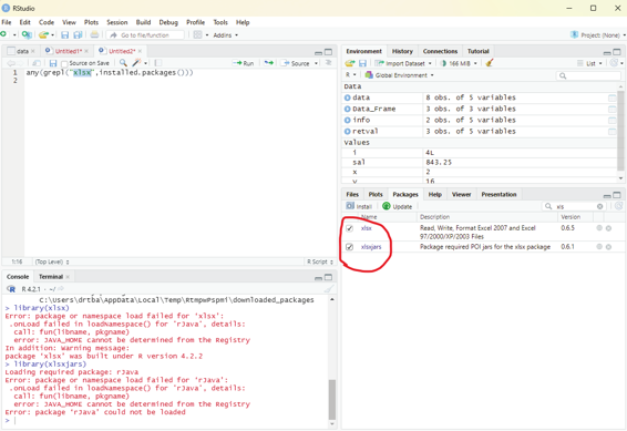

Image showing xlsx package being installed using package install manager xlsx package that has been installed should be enabled from the packages window found in the left bottom area of RStudio.
Image showing xlsx package enabled
R Programming in Statistics


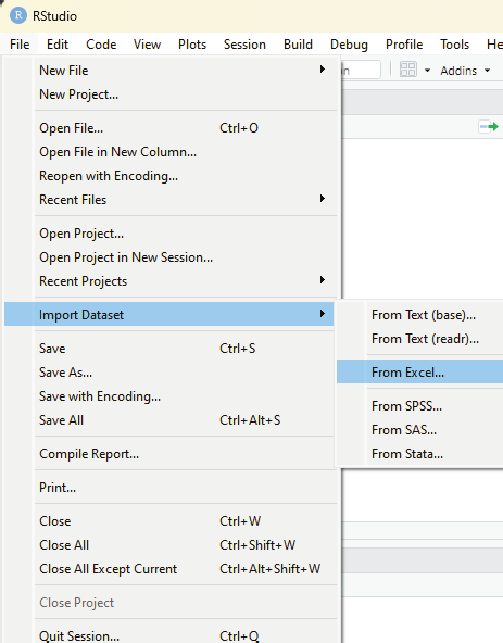

Image showing excel data set being imported to RStudio using the sub menu listed under import dataset.
Prof. Dr Balasubramanian Thiagarajan
253


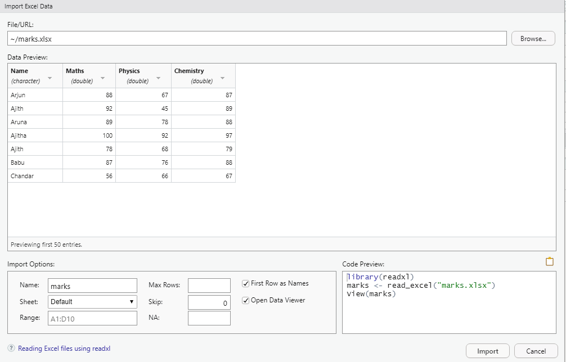

Image showing Excel data set import screen
# Read the first worksheet in the file input.xlsx.
data <- read.xlsx(“marks.xlsx”, sheetIndex = 1)
print(data)
R Programming in Statistics
Data Analysis in R Programming
First step in data analysis is to load the data in to R interface. This can be done by directly entering data directly into R using Data editor interface. Data from other data software like Excel can be directly imported into R.
Use of data string function
str(data_name)
This function helps in understanding the structure of data set, data type of each attribute and number of rows and columns present in the data.
In order to learn to analyze data using R programming titanic data base can be installed into R environment to facilitate learning the nuts and bolts of data analysis.
Code to install titanic data base.
In the scripting window the following code should be keyed and made to run.
install.packages(“titanic”)
After instal ation the package “titanic” should be initialized by selecting the box in front of titanic package name in the package window.
Prof. Dr Balasubramanian Thiagarajan
255


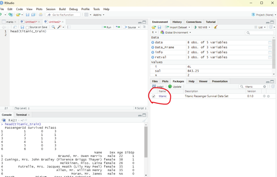

Image showing titanic data base enabled
R Programming in Statistics


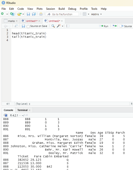

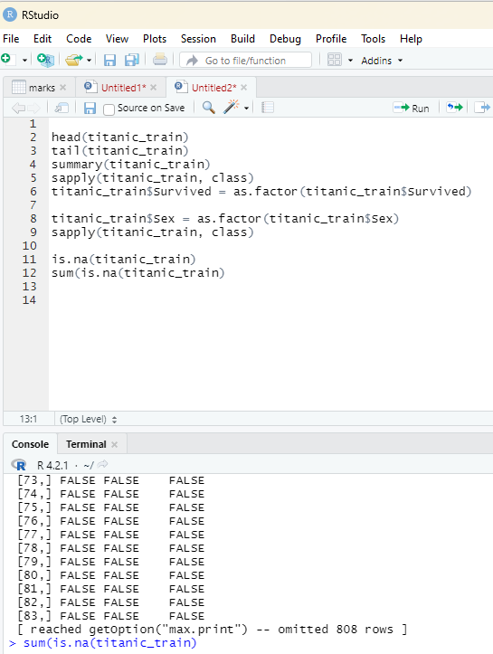
The first step in data analysis is basic exploration to see the data. Head and tail function is used to see how the data looks like. The head function reveals to the user the first six rows of the data and the tail function reveals the last six items. This will enable the user to spot the field of interest in the data set that is subjected to the study.
head(titanic_train)
tail(titanic_train)
Image showing data from data set “titanic” revealing the first and last 6 items Prof. Dr Balasubramanian Thiagarajan
257


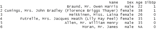

The basic exploration of the data set reveals the following interesting data: Sex
Age
SibSp (Number of Siblings/Spouses Abroad)
Image showing the interesting data columns as revealed by the head and tail command Summary of the data base containing the minimum values, maximum values, median, mode, first, second and third quartiles etc.
Code:
summary(titanic_train)
R Programming in Statistics


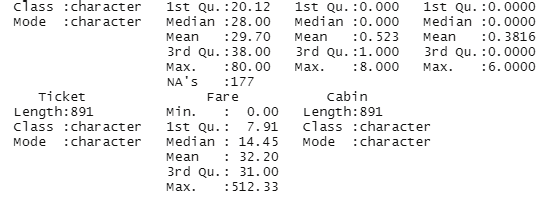


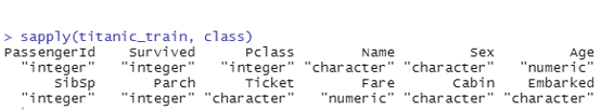

Image showing the display of summary of the data set
The class of each column can be studied using the apply function.
sapply(titanic_train, class)
This will help the user to identify the type of data in a particular column.
Image showing output from sapply function
This function is rather important because data summarization could be inaccurate if different classes of data are compared
Prof. Dr Balasubramanian Thiagarajan
259


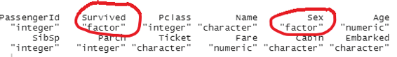

From the above summary it can be observed that data under “Survived” belongs to the class integer and data under “Sex” is character. In order to run a good summary, the classes need to be changed.
titanic_train$Survived = as.factor(titanic_train$Survived) titanic_train$Sex = as.factor(titanic_train$Sex)
This command will change the class of the column “survived” and “Sex” into factors that will also change the way in which data is summarized.
Image showing the results after conversion of data inside the columns “Survived” and “Sex” in to factors Preparing the data:
Before performing any other task on the data set the user should perform one important check. It is to ascertain if there are any missing data. This can be performed using the following code: is.na(titanic_train)
sum(is.na(titanic_train)
is.na will check if the data is NA or not and return the result as true or false. One can also use sum(is.na(#object) to count how many NA data there are.
R Programming in Statistics
Image showing the results containing NA in the data set
Prof. Dr Balasubramanian Thiagarajan
261
Since missing data might disturb some analysis, it is better if they could be excluded. Ideal y the entire row that has the missing data should be excluded.
titanic_train_dropedna = titanic_train[rowSums(is.na(titanic_train)) <=0,]
This script will dropout any row that has missing data on it. Using this method the u8ser can keep both the original dataset and also the modified dataset in the working environment.
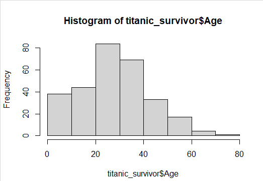
In the next step the reader should attempt to seperate survivor and nonsurvivor data from the modified dataset.
titanic_survivor = titanic_train_dropedna[titanic_train_dropedna$Survived ==1, ]
titanic_nonsurvivor = titanic_train_dropedna[titanic_train_dropedna$Survived == 0,]
This is the time for the user to generate some graphs from the data.
This is the time for the user to generate some graphs from the data.
Creating bar chart:
barplot(table(titanic_suvivor$Sex)
barplot(table(titanic_nonsurvivor$Sex)
Creating a Histogram:
hist(titanic_survivor$Age)
hist(titanic_nonsurvivor$Age)
R Programming in Statistics
Image showing Histogram created from survivor details displayed Exploratory data analysis:
This is a statistical technique used to analyze data sets in order to summarize their important main characteristics general y using visual aids. The following aspects of the data set can be studied using this approach: 1. Main characteristics or features of the data.
2. The variables and their relationships.
3. Finding out the important variables that can be used in the problem.
This is an interactive approach that includes:
Generating questions about the data.
Searching for answers using visualization, transformation, and modeling of the data.
Using the lessons that has been learnt in order to refine the set of questions or to generate a new set of questions.
Prof. Dr Balasubramanian Thiagarajan
263


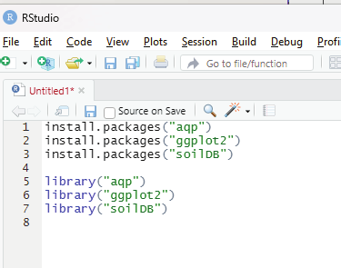

Before actual y using exploratory data analysis, one must perform a proper data inspection. In this example the author will be using loafercreek dataset from the soilDB package that can be installed as a library in R.
Most wonderful thing about R is that one can install various datasets in the form of libraries in order to create a learning environment that can be used for training purposes.
Before proceeding any further the user needs to install the following packages: aqp package
ggplot2 package
soilDB package
These packages can be installed from the R console using the instal .packages() command and can be loaded into the script by using the library() command.
install.packages(“aqp”)
install.packages(“ggplot2”)
install.packages(“soilDB”)
library(“aqp”)
library(“ggplot2”)
library(“soilDB”)
Image showing the codes for instal ation and loading the packages entered into scripting window R Programming in Statistics
# loading the required packages
library(aqp)
library(soilDB)
# Load from the loafercreek dataset
data(“loafercreek”)
# Construct generalized horizon designations
n < - c(“A”, “BAt”, “Bt1”, “Bt2”, “Cr”, “R”)
# REGEX rules
p < - c(“A”, “BA|AB”, “Bt|Bw”, “Bt3|Bt4|2B|C”,
“Cr”, “R”)
# Compute genhz labels and
# add to loafercreek dataset
loafercreek$genhz < - generalize.hz(
loafercreek$hzname,
n, p)
# Extract the horizon table
h < - horizons(loafercreek)
# Examine the matching of pairing of
# the genhz label to the hznames
table(h$genhz, h$hzname)
vars < - c(“genhz”, “clay”, “total_frags_pct”,
“phfield”, “effclass”)
summary(h[, vars])
sort(unique(h$hzname))
h$hzname < - ifelse(h$hzname == “BT”,
“Bt”,
h$hzname)
Prof. Dr Balasubramanian Thiagarajan
265
> table(h$genhz, h$hzname)
2BCt 2Bt1 2Bt2 2Bt3 2Bt4 2Bt5 2CB 2CBt 2Cr 2Crt 2R A A1 A2 AB ABt Ad Ap B BA BAt BC BCt Bt Bt1 Bt2 Bt3 Bt4 Bw Bw1 Bw2 Bw3 C
A 0 0 0 0 0 0 0 0 0 0 0 97 7 7 0 0 1 1 0 0 0 0 0 0 0 0 0 0 0 0 0 0 0
BAt 0 0 0 0 0 0 0 0 0 0 0 0 0 0 1 0 0 0 0 31 8 0 0 0 0 0 0 0 0 0 0 0 0
Bt1 0 0 0 0 0 0 0 0 0 0 0 0 0 0 0 2 0 0 0 0 0 0 0 8 94 89 0 0 10 2 2 1 0
Bt2 1 2 7 8 6 1 1 1 0 0 0 0 0 0 0 0 0 0 0 0 0 5 16 0 0 0 47 8 0 0 0 0 6
Cr 0 0 0 0 0 0 0 0 4 2 0 0 0 0 0 0 0 0 0 0 0 0 0 0 0 0 0 0 0 0 0 0 0
R 0 0 0 0 0 0 0 0 0 0 5 0 0 0 0 0 0 0 0 0 0 0 0 0 0 0 0 0 0 0 0 0 0
not-used 0 0 0 0 0 0 0 0 0 0 0 0 0 0 0 0 0 0 1 0 0 0 0 0 0 0 0 0 0 0 0 0 0
CBt Cd Cr Cr/R Crt H1 Oi R Rt
A 0 0 0 0 0 0 0 0 0
BAt 0 0 0 0 0 0 0 0 0
Bt1 0 0 0 0 0 0 0 0 0
Bt2 6 1 0 0 0 0 0 0 0
Cr 0 0 49 0 20 0 0 0 0
R 0 0 0 1 0 0 0 41 1
not-used 0 0 0 0 0 1 24 0 0
> summary(h[, vars])
genhz clay total_frags_pct phfield effclass A :113 Min. :10.00 Min. : 0.00 Min. :4.90 very slight: 0
BAt : 40 1st Qu.:18.00 1st Qu.: 0.00 1st Qu.:6.00 slight : 0
Bt1 :208 Median :22.00 Median : 5.00 Median :6.30 strong : 0
Bt2 :116 Mean :23.67 Mean :14.18 Mean :6.18 violent : 0
Cr : 75 3rd Qu.:28.00 3rd Qu.:20.00 3rd Qu.:6.50 none : 86
R : 48 Max. :60.00 Max. :95.00 Max. :7.00 NA’s :540
not-used: 26 NA’s :173 NA’s :381
> sort(unique(h$hzname))
[1] “2BCt” “2Bt1” “2Bt2” “2Bt3” “2Bt4” “2Bt5” “2CB” “2CBt” “2Cr” “2Crt” “2R” “A” “A1” “A2” “AB”
“ABt” “Ad” “Ap” “B”
[20] “BA” “BAt” “BC” “BCt” “Bt” “Bt1” “Bt2” “Bt3” “Bt4” “Bw” “Bw1” “Bw2” “Bw3” “C” “CBt”
“Cd” “Cr” “Cr/R” “Crt”
[39] “H1” “Oi” “R” “Rt”
Descriptive statistics:
Measures of central tendency
Measures of dispersion
Correlation
R Programming in Statistics
This is a feature of descriptive statistics. This tel s about how the group of data is clustered around the central value of the distribution. Central tendency performs the following measures: Arithmetic mean
Geometric mean
Harmonic mean
Median
Mode
Arithmetic mean can be calculated by mean() function.
syntax: mean(x, trim, na.rm=FALSE)
x = object
trim = specifies number of values to be removed from each side of the object before calculating the mean.
The value is between 0 to 0.5.
na.rm = If true it removes NA value from x.
# vector
x <- c(3,7,14,22,40,12,70,67)
#Print mean
print(mean(x))
Prof. Dr Balasubramanian Thiagarajan
267


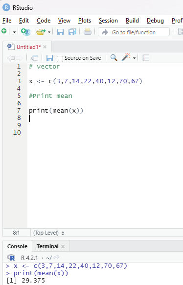

Image showing Arithmetic mean calculated for a vector
R Programming in Statistics


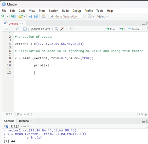

Using trim and na.rm function:
Trimmed mean is a dataset’s mean that is determined after deleting a certain percentage of the dataset’s smallest and greatest values. N.A value is also ignored.
# Creation of vector
vector1 <-c(12,34,NA,45,68,NA,98,43)
# Calculation of mean value ignoring NA value and using trim factor x = mean (vector1, trim=0.5,na.rm=(TRUE))
print(x)
Image showing the use of trim and na.rm functions
Prof. Dr Balasubramanian Thiagarajan
269


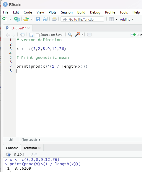

Geometric mean:
This type of mean is computed by multiplying all the data values and thus, shows the central tendency for given data distribution.
prod() and length() functions help in finding the geometric mean of a given set of numbers in a vector.
Syntax:
prod(x)^(1/length(x))
prod() function returns the product of all values present in vector x.
length() function returns the length of the vector x.
Code:
# Vector definition
x <- c(3,2,8,9,12,76)
# Print geometric mean
print(prod(x)^(1 / length(x)))
Image showing Arithmetic mean calculated
R Programming in Statistics


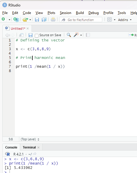

Harmonic mean:
This is another type of mean that is used as a measure of central tendency. It is computed as reciprocal of the arithmetic mean of reciprocals of the given set of values.
Code:
# Defining the vector
x <- c(3,6,8,9)
# Print harmonic mean
print(1 /mean(1 / x))
Image showing calculation of Harmonic mean
Prof. Dr Balasubramanian Thiagarajan
271


Median:
Median value in statistics is a measure of central tendency which represents the middle most value of a given set of values.
Syntax:
median(x, na.rm=FALSE)
Parameters:
x: It is the data vector
nar.rm: If TRUE then it removes the NA values from x.
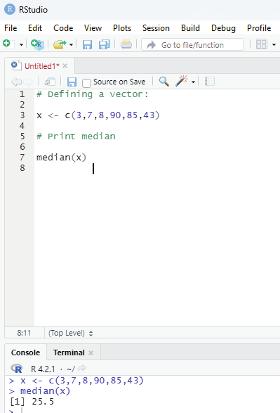
# Defining a vector:
x <- c(3,7,8,90,85,43)
# Print median
median(x)
Image showing median value calculation
R Programming in Statistics


Mode:
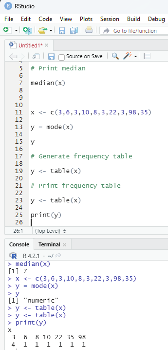
Mode of a given set of values is the value that is repeated the most in a dataset. There could be multiple mode values if there are two or more values with matching maximum frequency Single mode value:
# Defining vector
x <- c(3,6,3,10,8,3,22,3,98,35)
y = mode(x)
# Generate frequency table
y <- table(x)
# Print frequency table
y = <- table(x)
print(y)
Image showing frequency of the data within a vector
Prof. Dr Balasubramanian Thiagarajan
273
# Defining vector
x <- c(3,6,7,3,4,23,6,4,23,76,87,76,4,3,4)
# Generate frequency table
y <- table(x)
# Print frequency table
print(y)
# Mode of x
m <- names(y)[which(y == max(y))]
# Print mode
print(m)
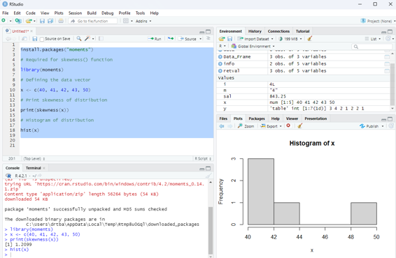
Skewness and Kurtosis in R Programming:
In statistical analysis, skewness and kurtosis are the measures that reveals the shape of the data distribution.
Both of these parameters are numerical methods to analyze the shape of the data set.
Skewness - This is a statistical numerical method to measure the asymmetry of the distribution of the data set. It reveals the position of the majority of data values in the distribution around the mean value.
Positive skew - If the coefficient of skewness is greater than 0, then the graph is said to be positively skewed with the majority of data values less than the mean. Most of the values are concentrated on the left side of the graph.
Package moments needs to be installed.
install.packages(“moments”)
# Required for skewness() function
library(moments)
# Defining the data vector
R Programming in Statistics


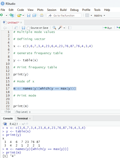

Image showing multiple modes calculation
Prof. Dr Balasubramanian Thiagarajan
275
x <- c(40, 41, 42, 43, 50)
# Print skewness of distribution
print(skewness(x))
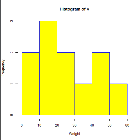
# Histogram of distribution
hist(x)
Image showing skewness calculated
R Programming in Statistics


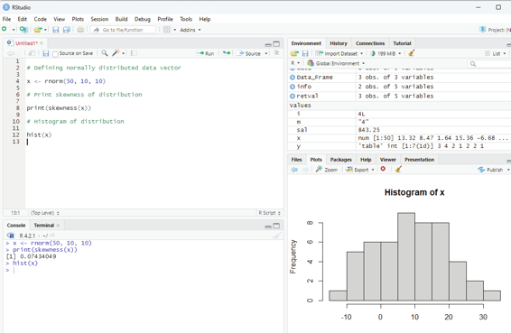

Zero skewness or symmetric:
If the coefficient of skewness is equal to 0 or close to 0 then the graph is symmetric and data is normal y distributed.
# Defining normal y distributed data vector
x <- rnorm(50, 10, 10)
# Print skewness of distribution
print(skewness(x))
# Histogram of distribution
hist(x)
Image showing zero skewness
Prof. Dr Balasubramanian Thiagarajan
277


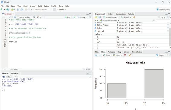

Negatively skewed:
If the coefficient of skewness is less than 0 then it is negatively skewed with the majority of data values greater than mean.
# Defining data vector
x <- c(10,11,21,22,23,25)
# Print skewness of distribution
print(skewness(x))
# Histogram of distribution
hist(x)
Image showing negatively skewed data
R Programming in Statistics
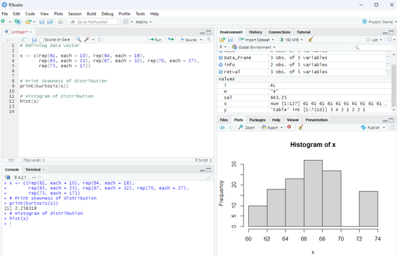
This is a numerical method in statistics that measure the sharpness of the peak in the data distribution.
There are three types of kurtosis:
Platykurtic - If the coefficient of kurtosis is less than 3 then the data distribution is platykurtic. Being platykurtic doesn’t mean that the graph is flat topped.
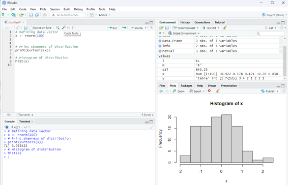
Mesokurtic - If the coefficient of kurtosis is equal to 3 or close to 3 then the data distribution is mesokurtic.
For normal distribution kurtosis value is approximately equal to 3.
Leptokurtic - If the coefficient is greater than 3 then the data distribution is leptokurtic and shows a sharp peak on the graph.
Example for platykurtic distribution
# Defining data vector
x <- c(rep(61, each = 10), rep(64, each = 18),
rep(65, each = 23), rep(67, each = 32), rep(70, each = 27), rep(73, each = 17))
# Print skewness of distribution
print(kurtosis(x))
# Histogram of distribution
hist(x)
Example for mesokurtic data set:
# Defining data vector
x <- rnorm(100)
# Print skewness of distribution
print(kurtosis(x))
# Histogram of distribution
hist(x)
Prof. Dr Balasubramanian Thiagarajan
279
Image showing platykurtic distribution
R Programming in Statistics
Image showing display of mesokurtic data
Leptokurtic distribution Example:
# Defining data vector
x <- c(rep(61, each = 2), rep(64, each = 5),
rep(65, each = 42), rep(67, each = 12), rep(70, each = 10))
# Print skewness of distribution
print(kurtosis(x))
# Histogram of distribution
hist(x)
Prof. Dr Balasubramanian Thiagarajan
281


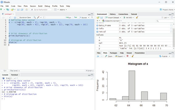

Image showing Leptokurtic distribution
R Programming in Statistics
Hypothesis Testing in R Programming
Hypothesis is made by the researchers about the data collected. Hypothesis is an assumption made by the researchers and it need not be true. R Programing can be used to test and validate the hypothesis of a researcher. Based on the results of calculation the hypothesis can be branded as true or can be rejected. This concept is known as Statistical Inference.
Hypothesis testing is a 4 step process:
State the hypothesis - This step is begun by stating the null and alternate hypothesis which is presumed to be true.
Formulate an analysis plain and set the criteria for decision - In this step the significance level of the test is set. The significance level is the probability of a false rejection of a hypothesis.
Analyze sample data - In this, a test statistic is used to formulate the statistical comparison between the sample mean and the mean of the population or standard deviation of the sample and standard deviation of the population.
Interpret decision - The value of test statistic is used to make the decision based on the significance level. For example, if the significance level is set to 0.1 probability, then the sample mean less than 10% will be rejected.
Otherwise the hypothesis is retained as true.
One Sample T-Testing:
This approach collects a huge amount of data and tests it on random samples. In order to perform T-Test in R, normal y distributed data is required. This test is used to ascertain the mean of the sample with the population. For example, the weight of persons living in an area is different or identical to other persons living in other areas.
Syntax:
t.test(x, mu)
x - represents the numeric vector of data.
mu - represents true value of the mean.
One can ascertain more optional parameters of t.test by the following command: help(“t.test”)
Prof. Dr Balasubramanian Thiagarajan
283


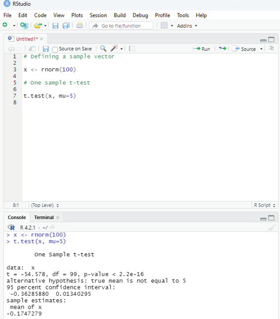

Example:
# Defining a sample vector
x <- rnorm(100)
# One sample t-test
t.test(x, mu=5)
Image showing one sample t-testing
R Programming in Statistics
The R function rnorm generates a vector of normal y distributed random numbers. rnorm can take up to 3 arguments:
n - the number of random variables to generate
mean - if not specified it takes a default value of 0.
sd - Standard deviation. If not specified it takes a default value of 1.
Example:
n <- rnorm(100000, mean = 100, sd = 36)
Two Sample T-Testing:
In two sample T-Testing, the sample vectors are compared. If var.equal = TRUE, the test assumes that the variances of both the samples are equal.
Syntax:
t.test(x,y)
Parameters:
x and y : numeric vectors
# Defining sample vector
x <- rnorm(100)
y <- rnorm(100)
# Two Sample T-Test
t.test(x, y)
Prof. Dr Balasubramanian Thiagarajan
285


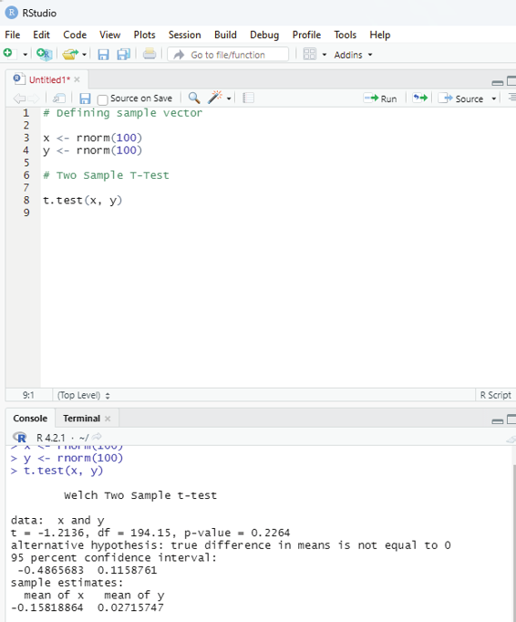

Image showing Two sample T-Testing
R Programming in Statistics


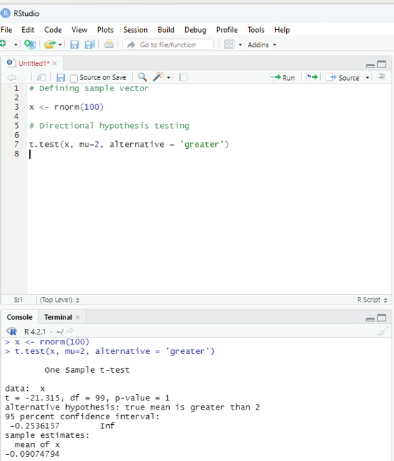

Directional Hypothesis:
This is used when the direction of the hypothesis can be specified. This is ideal if the user desires to know the sample mean is lower or greater than another mean of sample data.
Syntax:
t.test(x,mu,alternative)
Parameters:
x - represents numeric vector data
mu - represents mean against which sample data has to be tested alternative - Sets the alternative hypothesis.
Example:
# Defining sample vector
x <- rnorm(100)
# Directional hypothesis testing
t.test(x, mu=2, alternative = ‘greater’)
Image showing directional hypothesis testing
Prof. Dr Balasubramanian Thiagarajan
287


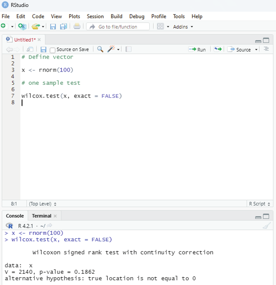

One Sample Mu test:
This test is used when comparison has to be computed on one sample and the data is non-parametric. It is performed using wilcox.test() function in R programming.
Syntax:
wilcox.test(x,y,exact=NULL)
x and y : represents numeric vector
exact: represents logical value which indicates whether p-value be computed.
Example:
# Define vector
x <- rnorm(100)
# one sample test
wilcox.test(x, exact = FALSE)
Image showing wilcox test
R Programming in Statistics
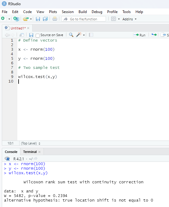
Two sample Mu-Test:
This test is performed to compare two samples of data.
# Define vectors
x <- rnorm(100)
y <- rnorm(100)
# Two sample test
wilcox.test(x,y)
Image showing two sample Mu test
Prof. Dr Balasubramanian Thiagarajan
289
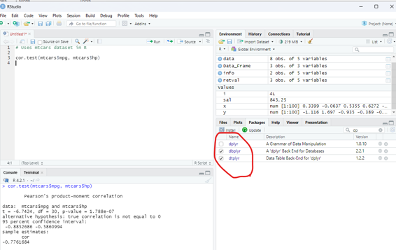
Correlation Test:
This test is used to compare the correlation of the two vectors provided in the function call or to test for the association between paired samples.
Syntax:
cor.test(x,y)
x and y are numeric vectors.
In the below example the dataset available with dplyr package is used. If not already installed it must be installed to make use of this database.
Example:
# Uses mtcars dataset in R
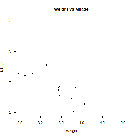
cor.test(mtcars$mpg, mtcars$hp)
Image showing the use of correlation
R Programming in Statistics
Bootstrapping in R Programming:
This technique is used in inferential statistics that work on building random samples of single datasets again and again. This method allows calculating measures such as mean, median, mode, confidence intervals etc.
of the sampling.
Process of bootstrapping in R language:
1. Selecting the number of bootstrap samples.
2. Select the size of each sample.
3. For each sample, if the size of the sample is less than the chosen sample, then select a random observation from the dataset and add it to the sample.
4. Measure the statistic on the sample.
5. Measure the mean of all calculated sample values.
Methods of Bootstrapping:
There are two methods of Bootstrapping:
Residual Resampling - This method is also known as model based resampling. This method assumes that the model is correct and errors are independent and distributed identical y. After each resampling, variables are redefined and new variables are used to measure the new dependent variables.
Bootstrap Pairs - In this method, dependent and independent variables are used together as pairs of sampling.
Types of confidence intervals in Bootstrapping:
This type of computational value calculated on sample data in statistics. It produces a range of values or interval where the true value lies for sure. There are 5 types of confidence intervals in bootstrapping as follows:
Basic - It is also known as Reverse percentile interval and is generated using quantiles of bootstrap data distribution.
Normal confidence interval.
Stud - In studentized CI, data is normalized with centre at 0 and standard deviation 1 correct-ing the skew of distribution.
Perc - Percentile CI is similar to basic CI but the formula is different.
Prof. Dr Balasubramanian Thiagarajan
291
boot(data,statistic,R)
data - represents dataset
statistic - represents statistic functions to be performed on dataset.
R - represents the number of samples.
Example:
# Instal ation of the libraries requried
install.packages(“boot”)
# Load the library
library(boot)
# Creating a function to pass into boot() function
bootFunc <- function(data, i){
df <- data[i, ]
c(cor(df[, 2], df[, 3]),
median(df[, 2]),
mean(df[, 1])
)}
b <- boot(mtcars, bootFunc, R = 100)
print(b)
# Show all CI values
boot.ci(b, index = 1)
R Programming in Statistics


Image showing Bootstrapping
Prof. Dr Balasubramanian Thiagarajan
293
Time Series in R is used to see how an object behaves over a period of time. This analysis can be performed using ts() function with some parameters. Time series takes the data vector and each data is connected with timestamp value as given by the user. This function can be used to learn and forecast the behavior of an asset during a period of time.
Syntax:
<- ts(data, start, end, frequency)
data - represents the data vector
start - represents the first observation in time series
end - represents the last observation in time series
frequency - represents number of observations per unit time. Example : frequency = 1 for monthly data.
Example:
Analysing total number of positive cases of COVID 19 on a weekly basis from 10th Jan to 30th April 2020.
# Weekly data of covid postive cases between 10th Jan to 30th April 2020.
x <- c(690, 6000, 18000, 67342, 79231, 89432, 129876, 138721, 149842, 169826, 187421, 192781, 208721)
# Library need to calculate decimal_date function
library(lubridate)
# creating time series object
# from datè10 January, 2020
mts <- ts(x, start = decimal_date(ymd(“2020-01-10”)), frequency = 365.25 / 7)
# plotting the graph
plot(mts, xlab =”Weekly Data”,
ylab =”Total Positive Cases”,
main =”COVID-19 Pandemic”,
col.main =”darkgreen”)
R Programming in Statistics


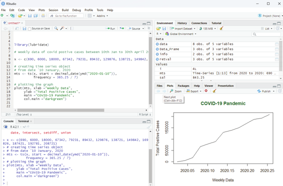

Image showing Time series analysis
Multivariate Time series:
This is used to create multiple time series in a single chart.
# Weekly data of Covid positive cases
# Weekly deaths from 10th Jan to 30 th April 2020
positiveCases <- c(780, 9823, 32256, 46267,
78743, 87820, 95314, 126214,
218843, 471497, 936851,
1508725, 2072113)
deaths <- c(17, 270, 565, 1261, 2126, 2800,
3285, 4628, 8951, 21283, 47210,
88480, 138475)
# creating multivariate time series object
# from date 10 January, 2020
Prof. Dr Balasubramanian Thiagarajan
295


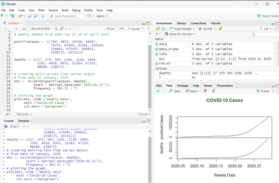

mts <- ts(cbind(positiveCases, deaths),
start = decimal_date(ymd(“2020-01-22”)),
frequency = 365.25 / 7)
# plotting the graph
plot(mts, xlab =”Weekly Data”,
main =”COVID-19 Cases”,
col.main =”darkgreen”)
Image showing multivariate time series
R Programming in Statistics
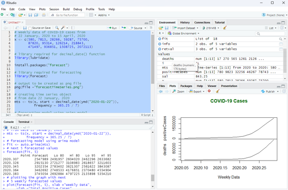
Forecasting can be done on time series using some models available in R. Arima automated model is commonly used.
# Weekly data of COVID-19 cases from
# 22 January, 2020 to 15 April, 2020
x <- c(580, 7813, 28266, 59287, 75700,
87820, 95314, 126214, 218843,
471497, 936851, 1508725, 2072113)
# library required for decimal_date() function
library(lubridate)
install.packages(“forecast”)
# library required for forecasting
library(forecast)
# output to be created as png file
png(file =”forecastTimeSeries.png”)
# creating time series object
# from date 22 January, 2020
mts <- ts(x, start = decimal_date(ymd(“2020-01-22”)), frequency = 365.25 / 7)
# forecasting model using arima model
fit <- auto.arima(mts)
# Next 5 forecasted values
forecast(fit, 5)
# plotting the graph with next
# 5 weekly forecasted values
plot(forecast(fit, 5), xlab =”Weekly Data”,
ylab =”Total Positive Cases”,
main =”COVID-19 Pandemic”, col.main =”darkgreen”)
Prof. Dr Balasubramanian Thiagarajan
297
Image showing data forecasting function in R programming
R Programming in Statistics
Though base R package includes many useful functions and data structures that can be used to accomplish a wide variety to data science tasks, the third party “tidyverse” package supports a comprehensive data science workflow. The tidyverse ecosystem includes many sub-packages designed to address specific components of the workflow. 80% of data analysis time is spent cleaning and preparing the data collected. The user should aim at creating a data standard to facilitate exploration and analysis. Tidyverse helps the user to cut down on data analysis time spent of cleaning and preparing the collected data.
Tidyverse is a coherent system of packages for importing, tidying, transforming, exploring and visualizing data. These packages are intended to make statisticians and data scientists more productive by guiding them through workflows that facilitate communication, and result in reproducible work products.
Core packages of tidyverse are:
readr - The main function of this package is to facilitate the import of file based data into a structured data format. The readr package includes seven functions for importing file-based datasets which include csv, tsv, delimited, fixed width, white space separated and web log files.
Data is imported into a structure called a tibble. Tibbles are nothing but the tidyverse implementation of a data frame. They are similar to data frames, but are basical y a newer and more advanced version. There are important differences between tibbles and data frames. Tibbles never converts data types of variables. They also dont change the names of variables or create row names. Tibbles also has a refined print method that shows only the first 10 rows, and all columns that will fit the screen. Tibbles also prints the column type along with the name. Tibbles are usual y considered as objects by R.
tidyr - Data tidying is a consistent way of organizing data in R. This is facilitated through tidyr package. There are three rules that one needs to follow to make a dataset tidy. Firstly, each variable should have its own column, second, each observation must have its own row, and final y each value must have its own cel .
dplyr - This package is a very important component of tidyverse. It includes 5 key functions for transforming the data in various ways. These functions include:
filter()
arrange()
select()
mutate()
summarize()
Prof. Dr Balasubramanian Thiagarajan
299
All these functions work similarly. The first argument is the data frame the user is operating on, the next N
number of arguments are the variables to include. The results of calling all 5 functions is the creation of a new data frame that is a transformed version of the data frame passed to the function.
ggplot2 - This package is a data visualization package for R. It is an implementation of the Grammar of Graphics which include data, aesthetic mapping, geometric objects, statistical transformations, scales, coordinate systems, position adjustments and faceting.
Using ggplot2 one can create many forms of charts, graphs including bar charts, box plots, violin plots, scatter plots, regression lines and more. This package offers a number of advantages when compared to other visualization techniques available in R. They include a consistent style for defining the graphics, a high level of ab-straction for specifying plots, flexibility, a built-in theming system for plot appearance, mature and complete graphics system and access to many ggplot2 users for support.
Other tidyverse ecosystem includes a number of other supporting packages including stringr, purr, forcats and others.
Instal ation of tidyverse:
This can be done by typing the following command in the scripting window.
install.packages(“tidyverse”)
Another way of installing packages:
Packages pane is located in the lower right portion of RStudio window. In order to install a new package using this pane, the install button should be clicked. In the packages textbox tidyverse which is the name of package that needs to be installed is typed. The user should ensure that install dependencies box is checked before clicking the install button. The install process will start as soon as the user clicks the install button.
Attaching tidyverse library and packages: This library along with tibble package that contains sample database should be attached to the R environment. This can be done by selecting and opening the Packages tab in the lower right portion of RStudio window. From the packages list tidyverse and tibble are chosen to be attached by placing a check in the check box in front of them.
To import a test database contained as tibble table the following code is used in the scripting window.
as_tibble(iris)
Tibble displays only 10 rows and column that fits into the screen.
Even though it displays only ten rows and the number of columns that could fit into the window the total number of rows and columns present in the data set is revealed. Above every column the following details can be seen:
<dbl> - double
<dbl> - double
<dbl> - double
<dbl> - double
R Programming in Statistics
Before embarking on cleaning up the data set the user should know the common problems with messy datasets:
1. Column headers are values, not variable names.
2. Observations are scattered across rows.
3. Variables are stored both in rows and columns.
4. Multiple variables are stored in one column.
5. Multiple types of observational units are stored in the same table.
6. A single observational unit is stored in multiple tables.
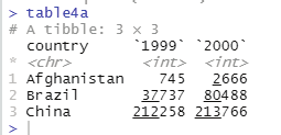
In the scripting window key in the following code:
table4a
On clicking the run button a table as shown below will be displayed in the console window.
>table4a
# A tibble: 3 × 3
country `1999` `2000`
* <chr> <int> <int>
1 Afghanistan 745 2666
2 Brazil 37737 80488
3 China 212258 213766
> table
The first line indicates the title of the table.
Next to the comment # sign is displayed the details of the tibble (table with 3x3 dimensions, 3 rows and 3
columns).
This tibble has one column for country and one column each for the year 1999 and 2000 as shown above. The column 1999 and column 2000 headers are actual y values of the variable year. Under the country column the following countries are listed along with observations for the year 1999 and 2000 respectively. The countries listed in the country column are Afghanistan, Brazil and China. These columns should be pivetted in to rows in order to make meaningful analysis of the dataset.
Code that is used to pivot columns into rows:
pivot_longer( table4a, c(‘1999’, ‘2000’),
names_to = ‘year’, values_to = ‘cases’)
Output as displayed in the console window:
country year cases
Prof. Dr Balasubramanian Thiagarajan
301


<chr> <chr> <int>
1 Afghanistan 1999 745
2 Afghanistan 2000 2666
3 Brazil 1999 37737
4 Brazil 2000 80488
5 China 1999 212258
6 China 2000 213766
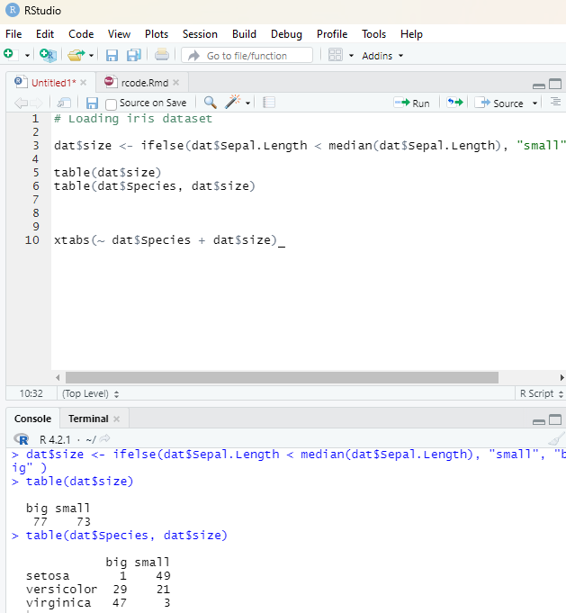
Image showing iris data base displayed as a tibble. Note the package tidyr has been enabled in the package screen.
Table 4a on display
R Programming in Statistics


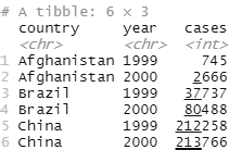

Image showing the result of pivot_longer() function
If the following code is typed into the scripting window and run a table will open up in the console window.
Code:
table2
Output:
# A tibble: 12 × 4
country year type count
<chr> <int> <chr> <int>
1 Afghanistan 1999 cases 745
2 Afghanistan 1999 population 19987071
3 Afghanistan 2000 cases 2666
4 Afghanistan 2000 population 20595360
5 Brazil 1999 cases 37737
6 Brazil 1999 population 172006362
7 Brazil 2000 cases 80488
8 Brazil 2000 population 174504898
9 China 1999 cases 212258
10 China 1999 population 1272915272
11 China 2000 cases 213766
12 China 2000 population 1280428583
Prof. Dr Balasubramanian Thiagarajan
303


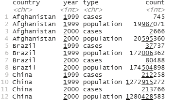

Image showing the result of table2 command in the scripting window Observations are spread across rows. One observation is spread across two rows. One can note that there are two entries for 1999 as far as Afghanistan is concerned. The same scenario is observed for other countries also. Data needs to be pivot the data wider.
Code for pivoting the data wider:
pivot_wider( table2,
names_from = ‘type’, values_from = count)
output:
A tibble: 6 × 4
country year cases population
<chr> <int> <int> <int>
1 Afghanistan 1999 745 19987071
2 Afghanistan 2000 2666 20595360
3 Brazil 1999 37737 172006362
4 Brazil 2000 80488 174504898
5 China 1999 212258 1272915272
6 China 2000 213766 1280428583
R Programming in Statistics
Pivot wider and pivot longer are otherwise called as spread and gather.
Tidyverse has other tools for importing data of various formats and manipulating the same.
Tools that take tidy datasets as input and return tidy datasets as output.
Pipe operator is another tool in tidyverse that is real y useful.
%>% the pipe operator.
Default behavior of pipe operator is to place the left hand side as the first argument for the function on the right side.
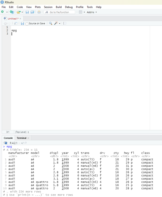
If the user keys in mpg and executes the code in scripting window a data frame would open in the console window. This data frame contains observations collected by US environmental protection agency in 38 models of car.
Image showing the result of keying mpg in scripting window
Prof. Dr Balasubramanian Thiagarajan
305
# A tibble: 234 × 11
manufacturer model displ year cyl trans drv cty hwy fl class
<chr> <chr> <dbl> <int> <int> <chr> <chr> <int> <int> <chr> <chr> 1 audi a4 1.8 1999 4 auto(l5) f 18 29 p comp…
2 audi a4 1.8 1999 4 manual(m… f 21 29 p comp…
3 audi a4 2 2008 4 manual(m… f 20 31 p comp…
4 audi a4 2 2008 4 auto(av) f 21 30 p comp…
5 audi a4 2.8 1999 6 auto(l5) f 16 26 p comp…
6 audi a4 2.8 1999 6 manual(m… f 18 26 p comp…
7 audi a4 3.1 2008 6 auto(av) f 18 27 p comp…
8 audi a4 quattro 1.8 1999 4 manual(m… 4 18 26 p comp…
9 audi a4 quattro 1.8 1999 4 auto(l5) 4 16 25 p comp…
10 audi a4 quattro 2 2008 4 manual(m… 4 20 28 p comp…
# … with 224 more rows
# i Usèprint(n = ...)` to see more rows
In the above database (which is also known as tibble in tidyverse) only 10 rows are visible. The number of columns are restricted by the screen space. A command “print(n=...) is used to see more rows.
Among the variables in mpg are:
1. displ - car’s engine size in litres
2. hwy - car’s fuel efficiency on the highway. A car with low fuel efficiency consumes more fuel than a car with high fuel efficiency when they travel the same distance.
Creating a ggplot:
In order to plot mpg the following code should be run.
Code:
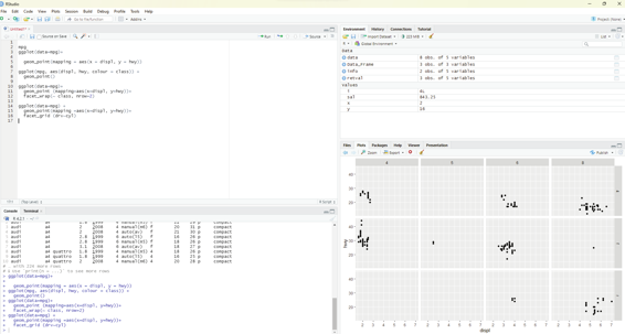
ggplot(data=mpg)+
geom_point(mapping = aes(x = displ, y = hwy))
This plot clearly shows a negative relationship between engine size (displ) and fuel efficiency (hwy). Cars with big engines use more fuel.
R Programming in Statistics


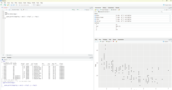

Image showing ggplot being used to create graphs
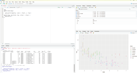
Aesthetic mappings:
Great value of a picture is that it forces the viewer to notice what was not expected.
In the scatter plot created from the database mpg one can see a group of points that are outside of the linear trend indicating that these cars demonstrated a higher mileage than what is expected. How can these outliers be explained? One hypothesis could be that these cars could be hybrid variety. The tibble titled mpg has a variable titled class. The class variable classifies car into groups such as compact, mid-size and SUV. The user can add a third variable class, to a two dimensional scatter plot by mapping it to an aesthetic. Aesthetic is described as a visual property of the objects in the plot. One can display a point in different ways by changing the values of its aesthetic properties.
Aesthetics including the following parameters:
1. Size
2. Shape
3. Color of the points
Information about the data can be conveyed by mapping the aesthetics in the plot to the variables in the dataset. In this example one can map the colors of the points to the class variable to reveal the type of each car.
In order to map an aesthetic to a variable, the name of the aesthetic is associated to the name of the variable inside aes(). ggplot2 will automatical y assign a unique level of the aesthetic by assigning it an unique color.
This process is known as scaling. ggplot2 will also add a legend that explains the levels corresponding to the Prof. Dr Balasubramanian Thiagarajan
307


values.
Code for using aesthetics:
ggplot(mpg, aes(displ, hwy, colour = class)) +
geom_point()
Common errors in R coding:
R is extremely fussy about code syntax. A misplaced character can be a cause of problems. The user should make sure that ever ( is matched with a) and every “is paired with another”. Sometimes when the code is run from the scripting window if nothing happens in the console window lookout for the + sign. If it is displayed it indicates the expression is incomplete and R is waiting for the user to complete it.
One other common problem that can occur during creation of ggplog2 graphics is to put the + in the wrong place: it has to occur at the end of the line, not at the beginning.
In R help is around the corner. Help can be assess by running ? function name in the console, or selecting the function name and pressing F1 in R studio.
Image showing the effects of aesthetics code
R Programming in Statistics


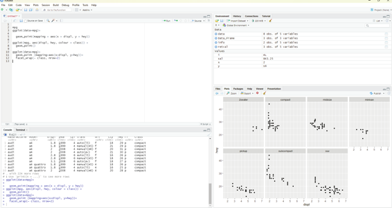

Facets:
One way of adding additional variables is with aesthetics. Another useful way for adding categorical variables is to split the plot into facets, subplots that each display one subset of the data.
In order to facet the plot by a single variable, the facet_wRAP() function is used. The first argument of the facet_wrap() should be a formula, which is created with ~ followed by a variable name. (Formula is the name of the data structure in R and not a synonym for equation). The variable that is passed to the facet_wrap() should be discrete.
Code:
ggplot(data=mpg)+
geom_point (mapping=aes(x=displ, y=hwy))+
facet_wrap(~ class, nrow=2)
Image showing the result of Facets code
Prof. Dr Balasubramanian Thiagarajan
309


In order to facet the plot on the combination of two variables, facet_grid() is added to the plot cal . The first argument of facet_grid() is also a formula. The formula this time should contain two variable names separated by a ~.
ggplot(data=mpg) +
geom_point(mapping =aes(x=displ, y=hwy))+
facet_grid (drv~cyl)
Image showing facet grid
R Programming in Statistics


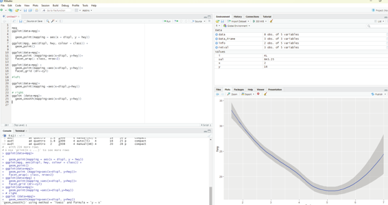

Geom:
A geom is the geometrical object that a plot uses to represent data. People often describe plots by the type of geom that the plot uses. Bar charts use bar geoms, line charts use line geoms, boxplots use boxplot geoms and so on. On the other hand scatterplots use the poing geom. Different geoms can be used to plot the same data.
To change the geom in the plot, the geom function is added to ggplot().
#left
ggplot(data=mpg)+
geom_point(mapping =aes(x=displ,y=hwy))
# right
ggplot (data=mpg)+
geom_smooth(mapping=aes(x=displ, y=hwy))
Image showing the use of Geom
Prof. Dr Balasubramanian Thiagarajan
311
Bar charts could appear simple. They could reveal some details that could be interesting to the user. In the example below the chart displays total number of diamonds in the diamonds dataset, grouped by cut. This dataset comes along with ggplot2 package. The user should ensure that ggplot12 package is selected by tick-ing the box in-front of the package name in the packages window.
This dataset contains information of about 54,000 diamonds which include price, carat, color, clarity and cut for each diamond. The bar chart shows that more diamonds are available with high quality cuts than with low quality cuts.
Code:
ggplot(data=diamonds)+
geom_bar(mapping=aes(x=cut))
On the x-axis the chart displays cut, a variable from diamonds. On the y-axis, it displays count. It should be pointed out that count is not a variable in diamonds.
1. Bar charts, histograms and frequency polygons bin the data and plot bin counts, the number of points that fall in each bin.
2. Smoothers fit a model to the data and then plot predictions from the model 3. Box plot compute a robust summary of the distribution and then displays them in a special y formatted box.
The algorithm used to calculate new values for a graph is called a stat. (Short form for statistical transformation).
The term geoms and stats can be used interchangeably.
R Programming in Statistics


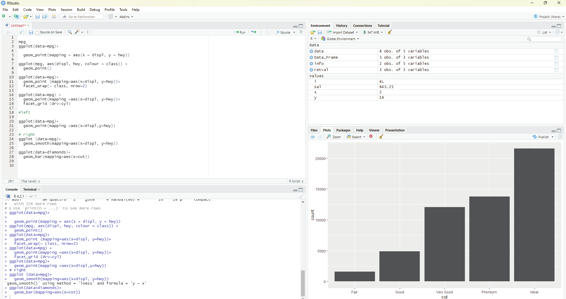

Image showing creation of bar charts
Code:
ggplot(data= diamonds)+
stat_count(mapping =aes(x=cut)
This code works because every geom has a default stat; and every stat has a default geom. Geoms can be used without worrying about the underlying statistical formation.
If the intention is to override the default mapping from transformed variables to aesthetics like display a bar chart of proportion rather then the count then the following code need to be used.
ggplot(data = diamonds) +
geom_bar(mapping = aes(x = cut, y = stat(prop), group = 1)) One can summarize the y values for each unique x value.
The following code should be used:
ggplot(data = diamonds) +
stat_summary(
mapping = aes(x = cut, y = depth),
fun.min = min,
fun.max = max,
fun = median
)
Prof. Dr Balasubramanian Thiagarajan
313


Image showing data summary as demonstrated by bar chart
Position adjustments:
One can color a bar chart using a color aesthetic or fil . Of these two fill is ideal.
ggplot(data = diamonds) +
geom_bar(mapping = aes(x = cut, colour = cut))
ggplot(data = diamonds) +
geom_bar(mapping = aes(x = cut, fill = cut))
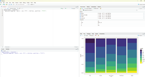
Clarity can be used to stack the bars automatical y. Each colored rectangle represents a combination of cut and clarity.
ggplot(data = diamonds) +
geom_bar(mapping = aes(x = cut, fill = clarity))
R Programming in Statistics


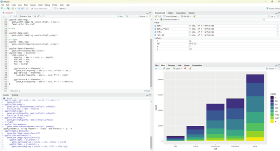

Image showing colors added to bar chart
The stacking is performed automatical y by the position adjustment specified by the position argument. If the user does not desire stacked bar chart then one of these three options can be used: identity - This will place each object exactly where it fal s in the context of the graph. This may not be useful for bars, because it overlaps them. In order to see the overlapping one should make the bars slightly transparent by setting alpha to a small value or use a completely transparent setting fill = NA.
dodge - This places overlapping objects directly beside one another. This makes it easier to compare individual values.
Code:
ggplot(data = diamonds) +
geom_bar(mapping = aes(x = cut, fill = clarity), position = “dodge”) fill - works like stacking. It makes each set of stacked bars the same height. This makes it easier to compare proportions across groups.
Prof. Dr Balasubramanian Thiagarajan
315


Code:
ggplot(data = diamonds) +
geom_bar(mapping = aes(x = cut, fill = clarity), position = “fil ”) Another type of adjustment that would be useful for scatter plots and not in bar charts. It should be noted that not all observations can be plotted inside the graph. The values of the variables hwy and displ are rounded so the points appear on the grid and many point overlap each other. This problem goes by the term Over plotting. This makes it difficult to see where the mass of the data is. The user can avoid this over plotting by setting the position adjustment to “jitter”. position=”jitter”. This function adds a small amount of random noise to each point. This results in points being spread out and no two points are likely to receive the same amount of random noise.
Image showing the use of fill function
Another type of adjustment that would be useful for scatter plots and not in bar charts. It should be noted that not all observations can be plotted inside the graph. The values of the variables hwy and displ are rounded so the points appear on the grid and many point overlap each other. This problem goes by the term Over plotting. This makes it difficult to see where the mass of the data is. The user can avoid this over plotting by setting the position adjustment to “jitter”. position=”jitter”. This function adds a small amount of random noise to each point. This results in points being spread out and no two points are likely to receive the same amount of random noise.
R Programming in Statistics
ggplot(data = mpg) +
geom_point(mapping = aes(x = displ, y = hwy), position = “jitter”) Adding randomness to the plot is a strange way of improving the accuracy of the graph. The graph could be less accurate at small scales.
dplyr Package in R:
This package provides tools for data manipulation in R. The dplyr package is part of the tidyverse environment. dplyr can be installed using the package installer within Rstudio. This package needs to be enabled by placing a tick inside the box in front of the package name in the packages environment of RStudio.
Alternate ways of installing and enabling dplyr package:
The following commands can be used in the scripting window and executed.
# command for instal ing the package
install.packages(“dplyr”)
# command for loading the package.
library(‘dplyr”)
This package performs the steps in data analysis in a quicker and easy fashion.
1. It limits the choices, thereby focussing
2. There are uncomplicated “verbs”, functions present for tackling every common data manipulation and the thoughts can be translated into codes faster.
3. There are valuable back ends and hence waiting time for computer reduces.
Various functions provided by dplyr package include: 5 functions.
filter() function: Used for choosing cases and using their values as a base for doing so.
mutate() function: creates new variables.
select() function: Picks columns by name.
summarise() function: calculates summary statistics
arrange() function: Sorts the rows.
In dplyr the syntax of all the functions are very similar and they all work in a coherent manner. If the user masters these 5 functions, it will be easy for them to handle any data wrangling task. It should be remembered that data wrangling tasks should be performed one at a time.
Prof. Dr Balasubramanian Thiagarajan
317
This is the first step in any data analysis. There are many example datasets available in R package. In this example diamonds dataset which is built into ggplot package is used. The first dplyr function filter() will be used.
# Loading required libraries.
library(dplyr)
l ibrary(ggplot)
diamonds
If ggplot is not loaded then it should be installed from the package installer.
The database could be seen open in the console window of RStudio.
Code:
filter(diamonds,cut==’ideal’)
This command filters and displays the list of diamonds under the ideal cut category.
In dplyr the function “filter” takes 2 arguments:
1. The dataframe the user is operating on
2. A conditinal expression that evaluates to TRUE or FALSE.
In the above example, diamonds has been specified as the dataframe, and cut==’ideal’ as the conditional expression. For each row in the data frame, dplyr has checked whether the column cut was set to ‘ideal’, and returned only those rows where cut==ideal evaluted to true.
Other relational operators that can be used to compare values:
== (Equal to)
!= (Not equal to)
< (Less than)
<= (Less than or equal to)
> ( Greater than)
>= (Greater than or equal to)
Note: Always use == sign to indicate equal to as single = sign is used along with assignment operator.
R Programming in Statistics
dplyr can also make use of the following logical operators to string together multiple different conditions in a single dplyr filter cal .
! (logical not)
& (Logical and)
| (Logical or)
There are also two additional operators that could be useful when working with dplyr to filter:
%in% (Checks if a value is in an array of multiple values)
is.na (Checks whether the value is NA)
By default, dplyr performs the operations ordered and then prints the result to the screen. If the user prefers to store the result in a variable then it can be assigned as follows: e_diamonds <-filter(diamonds, color ==”E”)
E_diamonds
If the user wants to overwrite the dataset (assign the result back to the diamonds dataframe) and if the user does not want to retain the unfiltered data. If the user wants to keep the original dataset then this result can be stored in e_diamonds.
Filtering Numeric values:
Numeric values are quantitative variables in a dataset. In the diamonds dataset, this includes the following variables:
Carat
Price
While working with numeric variables, it is easy to filter based on ranges of values. For example, if the user desires to get any diamonds priced between 1000 and 1500, then it can easily be filtered.
Code:
filter(diamonds, price >= 1000 & price <= 1500) filter(diamonds,price >=1500)
It is not advisable to use == when working with numerical variables unless the data consists of integers only and no decimals.
Prof. Dr Balasubramanian Thiagarajan
319
ANOVA also known as Analysis of Variance is a statistical test used to determine whether two or more population means are different. Simply put it is used to compare two or more groups to see if they are significantly different.
Student t-test is used to compare 2 groups, while Anova is used to compare 3 or more groups. There are several versions of ANOVA ( one-way Anova, two-way ANOVA, mixed ANOVA, repeated measures ANOVA etc.
ANOVA not only compares the “between” variance (variance between the different groups) but also the variance within each group. If the between variance is significantly larger than the within variance, the group means are declared to be different.
In this chapter author will be using penguins dataset. This dataset is available in palmerpenguins package which needs to be installed first.
# installing palmerpenguins package
install.packages(“palmerpenguins”)
# Cal ing the dataset
library(palmerpenguins)
In the next step to analyse the dataset package named tidyverse should be called into action. As described in previous chapter it should be installed first.
library(tidyverse)
In the example dataset penguins there are data for 344 penguins belonging to three different species. The dataset contains 8 variables, but the focus is only on the flipper length and the species. Only these two variables are taken up for comparison.
dat <-penguins %>%
select(species, flipper_length_mm)
summary(dat)
R Programming in Statistics


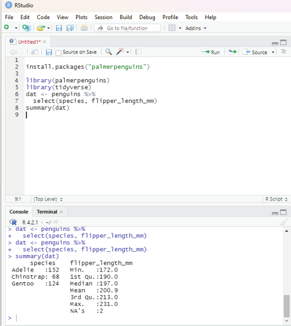

Image showing the response to command summary(dat) being displayed Prof. Dr Balasubramanian Thiagarajan
321


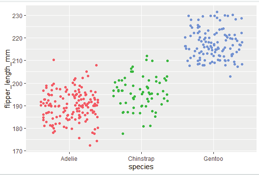

Summary statistic reveals:
Flipper lengths varies from 172 to 231 mm, with a mean of 200.9 mm.
There are 152 Adelie penguins
68 Chinstrap penguins and
124 Gentoo penguins.
Visual representation of the summary:
# library ggplot should be cal ed up
library(ggplot)
ggplot(dat) +
aes(x = species, y = flipper_length_mm, color = species) + geom_jitter() + theme(legend.position
= “none”)
Image showing scatter plot displaying the summary
R Programming in Statistics
The aim of the analysis is to use ANOVA to answer the question “Is the length of the flippers different between the 3 species of penguins?”
Null hypothesis:
The three species are equal in terms of flipper length.
Alternate hypothesis:
At least one species is different from the other 2 in terms of flipper length.
In the database under discussion, the dependent variable is flipper_length_mm and the independent variable happens to be species. Species is a qualitative variable with 3 levels corresponding to the 3 species. Since there is a mix of two variables the basic assumption of ANOVA is met.
Independence of the observations is assumed as the data have been collected from a randomly selected portion of the population and measurements within and between the samples are not related.
res_aov <- aov(flipper_length_mm ~ species,
data = dat
)
Normality of data can be checked for visual y:
par(mfrow = c(1, 2)) # combine plots
# histogram
hist(res_aov$residuals)
# QQ-plot
library(car)
qqPlot(res_aov$residuals,
id = FALSE # id = FALSE to remove point identification
)
Prof. Dr Balasubramanian Thiagarajan
323


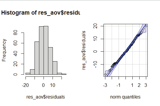

Image showing Graph generated that can be used to check the normality of the dataset From the histogram and QQ-plot above, one can see that the normality assumption of the data seems to have been met. Histogram roughly forms the bell shaped curve.
Normality test:
This includes visual test that has been described above and statistical normality tests. Some researchers insist that normality should be tested both visual y and statistical y.
Anova tests are very robust to small deviations from normality. It can be quite conservative, in rejecting the null hypothesis. This is evident while testing large sample size.
Shapiro test can be used to ascertain the normality of the data. Shapiro function is usual y written as shapiro.
test().
shapiro.test(res_ano$residuals)
If the p-value of Shapiro-Wick test on the residuals is larger than the usual significance level of alpha = 5%
the null hypothesis is not rejected.
R Programming in Statistics


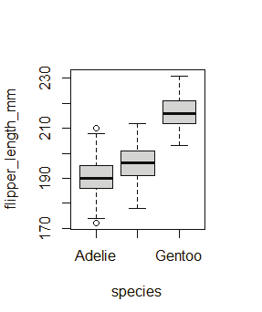

Tests for equality of variances (homogeneity):
Assuming that residuals follow normal distributions, one should check whether the variances are equal across species or not. The result will help the user to decide whether to use ANOVA or Welch ANOVA. Visual y this can be verified via a boxplot or dotplot or by a statistical test (Levene’s test).
# Boxplot
boxplot(flipper_length_mm ~ species,
data = dat
)
# Dotplot
library(“lattice”)
dotplot(flipper_length_mm ~ species,
data = dat
)
Image showing Boxplot generated
Prof. Dr Balasubramanian Thiagarajan
325


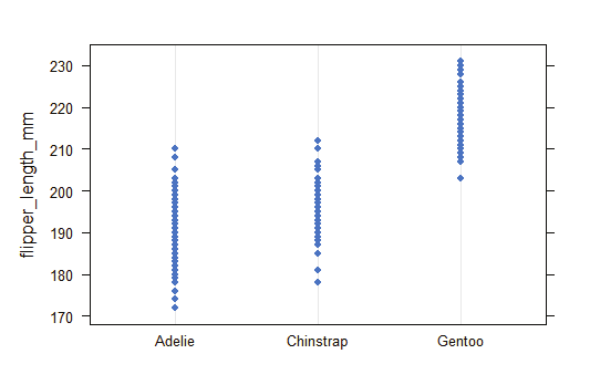

Image showing dotplot generated
In R Levene’s test canbe performed using leveneTest() function from the {car} package.
# Levene’s test
library(car)
leveneTest(flipper_length_mm ~ species,
data = dat
)
R Programming in Statistics


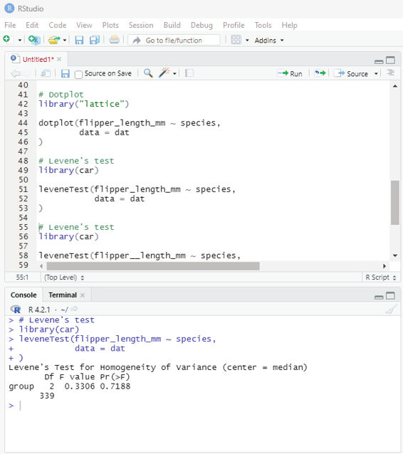

Image showing Levene’s test
Levene’s test reveals that the p-value is larger than the significance level of 0.05 the null hypothesis is not rejected. The null hypothesis states that the variances are equal between species (p-value = 0.719).
Prof. Dr Balasubramanian Thiagarajan
327


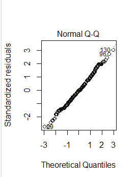


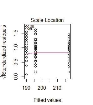

Graph showing Theoretical Quantiles
Graph showing fitted values
R Programming in Statistics


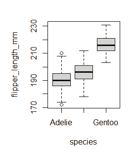

plot() function is another method that can be used to test normality and homogeneity of dataset.
par(mfrow = c(1, 2)) # combine plots
# 1. Homogeneity of variances
plot(res_aov, which = 3)
# 2. Normality
plot(res_aov, which = 2)
Outliers:
There are several techniques available to detect outliers. Boxplot is an useful visual approach for the same.
boxplot(flipper_length_mm ~ species,
data = dat
)
Image showing boxplot
Prof. Dr Balasubramanian Thiagarajan
329


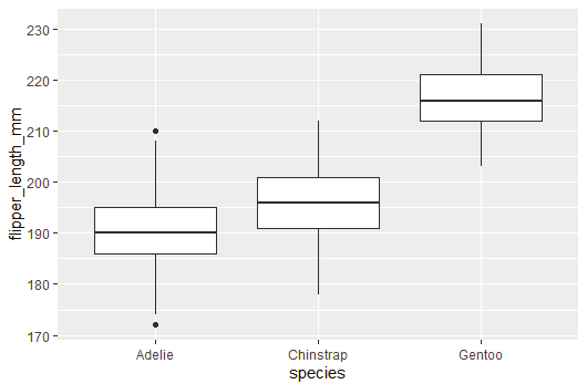

ggplot package can also be used for this purpose.
library(ggplot2)
ggplot(dat) +
aes(x = species, y = flipper_length_mm) +
geom_boxplot()
Image showing ggplot constructed
R Programming in Statistics


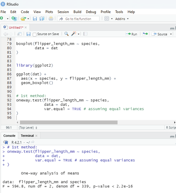

Using ANOVA to answer the question “Is the length of the fippers different between the 3 species of penguins?”
oneway.test() function can be used.
# 1st method:
oneway.test(flipper_length_mm ~ species,
data = dat,
var.equal = TRUE # assuming equal variances
)
Image showing first method being performed
Prof. Dr Balasubramanian Thiagarajan
331


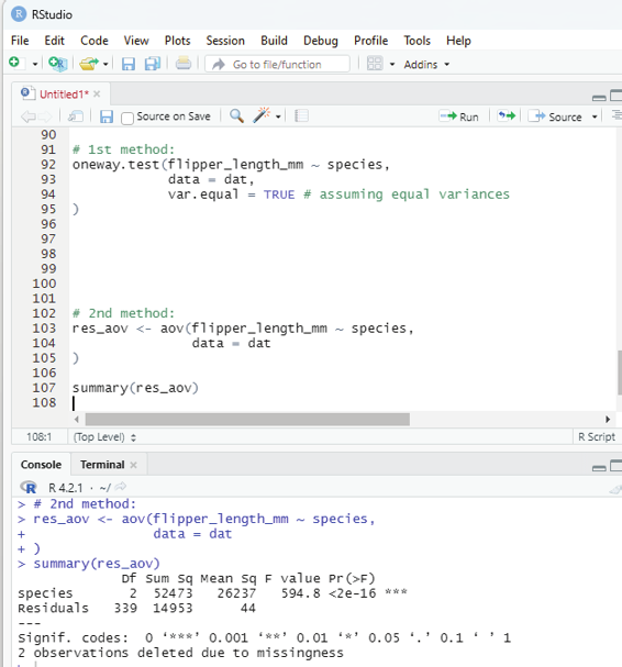

2nd method:
This method uses summary() and aov() functions.
# 2nd method:
res_aov <- aov(flipper_length_mm ~ species,
data = dat
)
summary(res_aov)
Image showing second method performed
R Programming in Statistics
As can be seen from the two outputs above, the test statistic (F = in the first method and F value in the second one) and the p-value (p-value in the first method and Pr(>F) in the second one) are exactly the same for both methods, which means that in case of equal variances, results and conclusions will be unchanged.
Interpretation of ANOVA results:
If the p-value is smaller than 0.05 the null hypothesis which assumes that all means are equal stands rejected.
It can hence be concluded that at least one species is different than the others in terms of flippers length.
If the p-value is greater than 0.05 then the null hypothesis is not rejected. It can now be assumed that all groups are equal.
Post-hoc tests in R:
These are a battery of tests performed to deal with the problem when null hypothesis has been rejected after performing ANOVA. As the number of groups increase, the number of comparisons also increases and the probability of having a significant result simply due to chance keeps increasing. Post-hoc tests take into ac-count this scenario by adjusting the alpha value in some way, so that the probability of observing at least one significant result due to chance remains below the selected or desired significance level.
Common Post-hoc tests used include:
1. Tukey HSD - This test is used to comapre all groups to each other (it delivers comparative values of all possible 2 groups).
2. Dunnett test - This test is used to make comparisons with a reference group. The reference group can also be called as a control group.
3. Bonferroni correction - This can be used if there is a set of planned comparisons to do.
Tukey HSD test:
library(multcomp)
# Tukey HSD test:
post_test <-glht(res_aov, linfct = mcp(species = “Tukey”)) summary(post_test)
Library multcomp needs to be installed.
Prof. Dr Balasubramanian Thiagarajan
333
Example code for running Dunnett’s test:
library(multcomp)
# Dunnett’s test:
post_test <- glht(res_aov,
linfct = mcp(species = “Dunnett”)
)
summary(post_test)
R Programming in Statistics
Descriptive statistics aims at summarizing, describing and presenting a series of values or a dataset. This is often the first step and a very important one in any statistical analysis.
1. It allows the user to check the quality of the data.
2. It helps the user to have a clear understanding of the dataset.
3. If performed well it serves as a starting point for further data analysis.
Measures used to summarize the dataset are of two types:
1. Location measures
2. Dispersion measures
Location measures give an understanding about the central tendency of the data, while the dispersion measures give an understanding about the spread of the data.
Dataset used in this chapter is iris which is inbuilt and available within R environment. This dataset can be loaded by running iris:
Code:
# Loading iris dataset
dat <- iris
# Getting a preview of the dataset and its structure.
# The command below reveals the first 6 observations.
head(dat)
# Next is getting the structure of the dataset
str(dat)
The dataset iris contains 150 observations and 5 variables, representing the length and width of the sepal and petal and the species of 150 flowers. The length and the width of the sepal and petal are numeric variables Prof. Dr Balasubramanian Thiagarajan
335


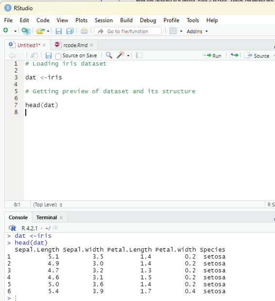

and the species is a factor with 3 levels. These variables are indicated ny (num) and (Factor w/ 3 levels) after the name of the variables.
Image showing iris dataset loaded
Minimum and maximum:
These values can be ascertained using min() and max() functions: min(dat$Sepal.Length)
max(dat$Sepal.Length)
R Programming in Statistics


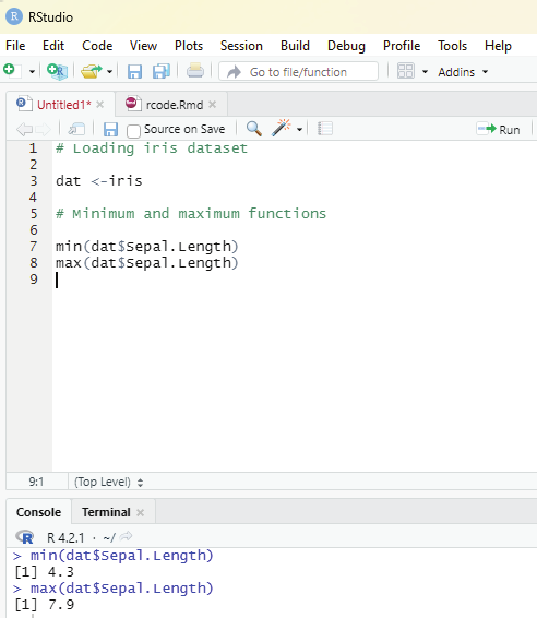

Alternatively range() function can also be used:
rng <- range(dat$Sepal.Length)
rng
The function range gives the minimum and maximum directly in that order.
Using range() function one can access the minimum with the following code: rng[1]
Using range() function one can access the maximum with the following code: rng[2]
Image showing calculation of minimum and maximum values
Prof. Dr Balasubramanian Thiagarajan
337


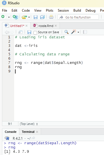

Image showing calculation of range
R Programming in Statistics


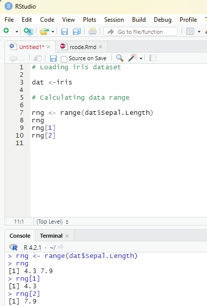

Image showing rng[1] and rng[2] command result
Prof. Dr Balasubramanian Thiagarajan
339


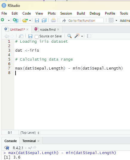

Range can also be computed by subtracting the minimum from the maximum: max(dat$Sepal.Length) - min(dat$Sepal.Length)
Image showing calculation of range between maximum and minimum values R Programming in Statistics


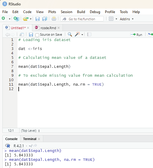

Mean:
Mean value of a dataset can be computed using mean() function.
code:
mean(dat$Sepal.Length)
If there is even one missing value in the dataset then it needs to be excluded while calculating the mean. The following code should be used:
mean(dat$Sepal.Length, na.rm = TRUE)
In order to get a truncated mean value then the following code should be used: Image showing calculation of mean
Prof. Dr Balasubramanian Thiagarajan
341


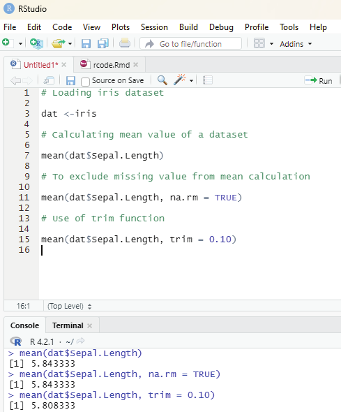

mean(dat$Sepal.Length, trim = 0.10)
The trim argument can be tweaked as per needs.
Image showing execution of trim function
R Programming in Statistics


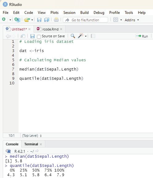

Median:
Median value of a dataset can be arrived at by using median() function.
median(dat$Sepal.Length)
Median value can also be arrived at by using quantile() function.
quantile(dat$Sepal.Length, 0.5)
Calculating First and third quartile:
Median and quantile calculations
Prof. Dr Balasubramanian Thiagarajan
343
This can be calculated using quantile() function and setting the second argument to 0.25 or 0.75.
# First quartile
quantile(dat$Sepal.Length, 0.25)
# Third quartile
quantile(dat$Sepal.Length, 0.75)
Code to generate 98th percentile:
quantile(dat$Sepal.Length, 0.98)
Interquartile range:
The interquartile range (i.e., the difference between the first and third quartile) can be computed with IQR() function.
IQR(dat$Sepal.Length)
Alternatively interquartile range can be calculated by using quantile() function also.
quantile(dat$Sepal.Length, 0.75) - quantile(dat$Sepal.Length, 0.25) Standard deviation and variance:
These values can be computed by using sd() and var() functions.
# Calculation of standard deviation
sd(dat$Sepal.Length)
# Calculation of variance
var(dat$Sepal.Length)
R Programming in Statistics


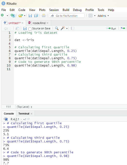

Image showing quartiles calculations
Prof. Dr Balasubramanian Thiagarajan
345


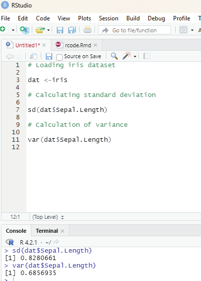

Image showing calculation of standard deviation and variance values of a dataset R Programming in Statistics
To compute the standard deviation (or variance) of multiple variables at the same time, one can use lapply() function with appropriate statistics as second argument.
lapply(dat[, 1:4], sd)
Summary:
The user can compute the minimum, quartile, median, mean, and the maximum for all numerical variables of dataset using summary() function.
summary(dat)
If the user needs descriptive statistics by the group then by() function can be used.
by(dat, dat$Species, summary)
Coefficient of variation:
For this purpose the package pastecs needs to be installed and loaded.
install.packages(“pastecs”)
library(pastecs)
stat.desc(dat)
Manual calculation of coefficient of variation:
sd(dat$Sepal.Length) / mean(dat$Sepal.Length)
Mode:
R does not contain a function to find the mode of a variable. But, they can be found using functions table() and sort().
# Number of occurrences of each unique value
tab <- table(dat$Sepal.Length)
# Sort highest to lowest.
sort(tab, decreasing=TRUE)
Mode can also be calculated for qualitative variables like Species in this case.
Prof. Dr Balasubramanian Thiagarajan
347


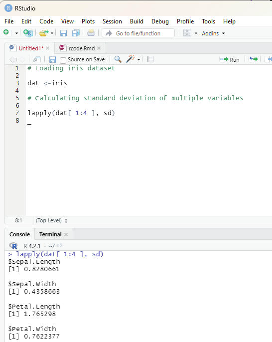

Image showing calculation of variance of multiple variables R Programming in Statistics


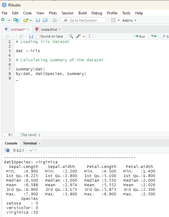

Image showing summary of the dataset iris
Prof. Dr Balasubramanian Thiagarajan
349


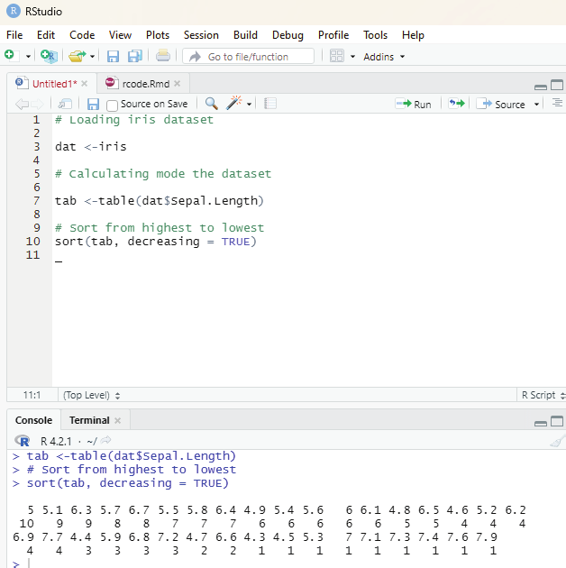

Image showing mode of a dataset being calculated
R Programming in Statistics


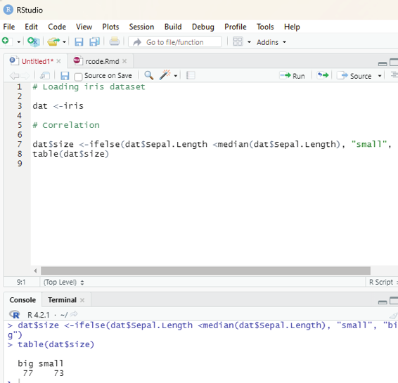

summary(dat$Species)
Correlation:
This is another descriptive statistics. This value measures the linear relationship between two variables.
the table() function can be used on two qualitative variables to create a contingency table. The dataset iris has only one qualitative variable so the user needs to create a new qualitative variable for this example. The user can create the variable size which corresponds to small and big.
dat$size <- ifelse(dat$Sepal.Length < median(dat$Sepal.Length), “smal ”, “big” ) table(dat$size)
Image showing table function in use
Prof. Dr Balasubramanian Thiagarajan
351
One can now create contingency table of two variables Species and size with the table() function.
dat$size <- ifelse(dat$Sepal.Length < median(dat$Sepal.Length), “smal ”, “big” ) table(dat$size)
table(dat$Species, dat$size)
xtabs(~ dat$Species + dat$size)
Instead of having the frequencies (the actual number of cases) one can also use the relative frequencies (proportions) in each subgroup by adding the table() function inside the prop.table() function.
Image showing xtab function in use
R Programming in Statistics
Instead of having the frequencies (the actual number of cases) one can also use the relative frequencies (proportions) in each subgroup by adding the table() function inside the prop.table() function.
prop.table(table(dat$Species, dat$size))
Calculating percentages by row:
# Round to two digits with round
round(prop.table(table(dat$Species, dat$size), 1), 2)
# Calculating percentages by column:
round(prop.table(table(dat$Species, dat$size), 2), 2)
Mosaic plot:
This allows the user to visualize a contingency table of two qualitative variables.
mosaicplot(table(dat$Species, dat$size),
color = TRUE,
xlab = “Species”,
ylan = “Size”)
Bar plot:
Bar plots can only be done on qualitative variables. A bar plot is a tool to visualize the distribution of qualitative variable.
barplot(table(dat$size))
The user can also draw a bar plot of relative frequencies instead of the frequencies by adding prop.table().
barplot(prop.table(table(dat$size)))
Prof. Dr Balasubramanian Thiagarajan
353


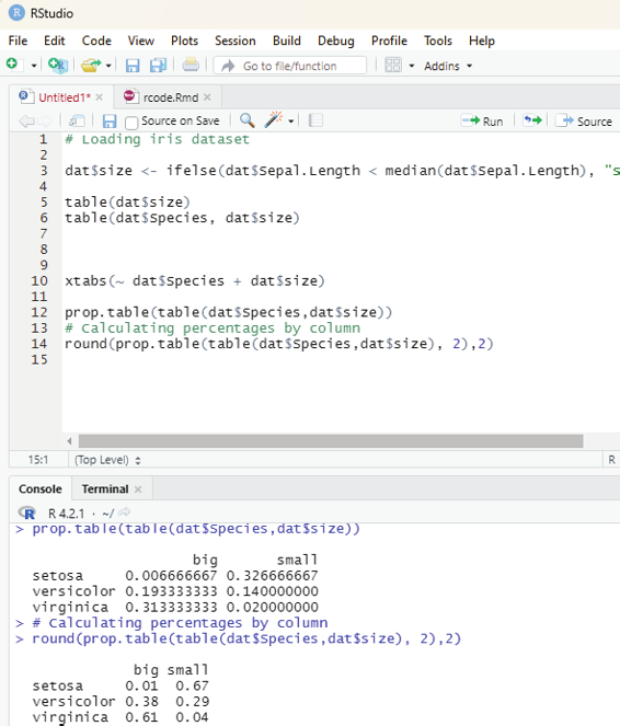

Image showing prop table function in use
R Programming in Statistics


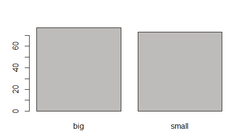

Image showing bar plot
Histogram:
This gives an idea about the distribution of a quantitative variable. The basic idea is to break the ranges of values into intervals and count how many observations fall into each interval.
hist()
hist(dat$Sepal.Length)
If the user wants to change the number of bins then the argument breaks = is added inside the hist(). As a rule of thumb the number of bins should be the rounded value of the square root of the number of observations. This dataset contains 150 observations the number of bins can be set to 12.
ggplot(dat) +
aes(x = Sepal.Length) +
geom_histogram()
Prof. Dr Balasubramanian Thiagarajan
355


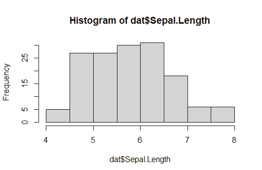


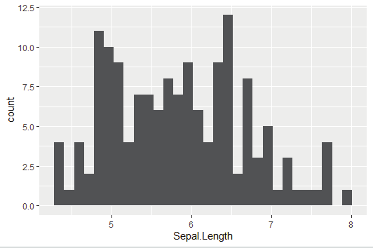

Image showing Histogram created
Image showing histogram generated by ggplot
R Programming in Statistics


Box plot:
These plots are useful in descriptive statistics. It graphical y represents the distribution of a quantitative variable by visual y displaying five common location summary (minimum, median, first/third quartiles and maximum) and any observation that was classified as a suspected outlier using the interquartile range criterion.
boxplot(dat$Sepal.Length)
Dot plot:
This is more or less similar to boxplox except for the fact that observations are represented as points and there is no summary statistics presented on the plot.
library(lattice)
dotplot(dat$Sepal.Length ~ dat$Species)
Scatter plot:
This allows the user to check whether there is a potential link between two quantitaive variables.
plot(dat$Sepal.Length, dat$Petal.Length)
Image showing Box plot generated
Prof. Dr Balasubramanian Thiagarajan
357


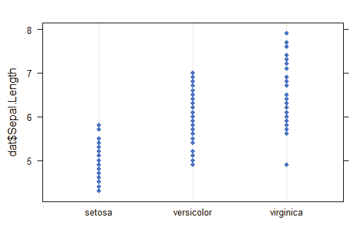


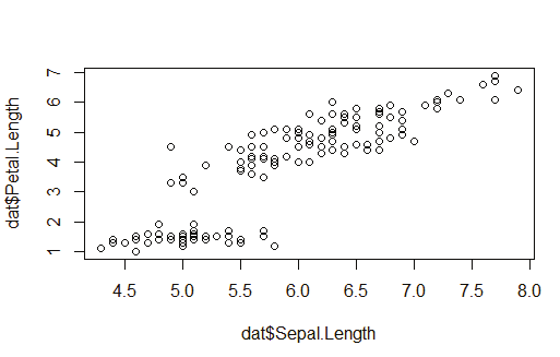

Image showing dot plot generated
Image showing scatter plot generated
R Programming in Statistics
This is actualy the very first step in a data project. Exploratory data analysis (EDA) consists of univariate (1-variable) and bivariate (2-variables) analysis. Ideal y certain steps need to be followed to lead to the analytic pathway.
Step 1 - First approach to data
Step 2 - Analyzing categorical variables
Step 3 - Analyzing numerical variables
Step 4 - Analyzing numerical and categorical variables at the same time.
Some of the points that are part of basic EDA:
1. Data types
2. Outliers
3. Missing values
4. Distributions ( numerical y & graphical y) for both numerical and categorical variables.
Types of Results EDA provides:
Informative - Plots are classic examples for this type of result. If delivered numerical y it would be a long variable summary. Data cannot be filtered out of this summary, but the user can derive lots of information from it.
Operative - The results can be used to take action directly on the data workflow ( for example, selecting any variables whose percentage of missing values are below 20%). This type of result is used in the Data Prepara-tion stage.
R packages that are needed to be installed for performing EDA: 1. tidyverse
2. funModeling
3. Hmisc
Prof. Dr Balasubramanian Thiagarajan
359
Code for installing these libraries:
install.packages(“tidyverse”)
install.packages(“funModeling”)
install.packages(“Hmisc”)
The above installed libraries should be loaded first.
Code for loading the libraries:
library(funModeling)
library(tidyverse)
library(Hmisc)
For this purpose the heart_disease data from the funModeling package is used.
Code:
data=heart_disease %>% select(age, max_heart_rate, thal, has_heart_disease) tl:dr (code)
basic_eda <- function(data)
{
glimpse(data)
df_status(data)
freq(data)
profiling_num(data)
plot_num(data)
describe(data)
}
basic_eda(data)
Step 1 - First approach to studying data
Number of observations (rows) and variables, and a head of the first cases are displayed.
R Programming in Statistics
Image showing relevant libraries installed and loaded
Prof. Dr Balasubramanian Thiagarajan
361
glimpse(data)
In order to get the metrics about data types, zeros, infinite numbers, and missing values: df_status(data)
This code returns a table, so it is easy to keep with variables that match certain conditions like: Having at least 80% of non-NA values (p_na <20).
Having less than 50 unique values (unique <= 50).
Important of these metrics:
Zeros: Variables containing a large number of zeros may not be useful for modeling and, in some cases they may dramatical y bias the model.
NA: Several models automatical y exclude rows with NA. Presence of NA in variables would mislead the analysis.
Inf: Infinite values may lead to an unexpected behavior in some R functions.
Type: Some variables are encoded as numbers, but they are codes or categories and the models don’t handle them in the same way.
Unique - Factor or categorical variables with a high number of different values tend to do overfitting thereby prevent proper data analysis.
Step 2 - Analyzing categorical variables.
The freq function runs for all factor or character variables automatical y.
code:
freq(data)
Step 3 - Analyzing numerical variables
This can be done graphical y.
R Programming in Statistics
plot_num(data)
Code to analyze variables quantitatively.
data_prof=profiling_num(data)
The user should bear in mind the following points:
1. Each variable should be described based on their distribution.
2. Attention should be paid to variables with high standard deviation.
3. Selection of metrics that the user is most familiar with.
Analyzing numerical and categorical variables at the same time: This can be done using Hmisc package.
library(Hmisc)
describe(data)
Prof. Dr Balasubramanian Thiagarajan
363
This is a widely used statistical tool to establish a relationship model between two variables. One of these variables if called the predictor variable whose value is gathered through experiments. The other variable is known as the response variable whose value is derived from the predictor variable.
In Linear Regression these two variables are related through an equation, whose exponent (power) of both these variables is 1. Mathematical y, a linear relationship represents a straight line when plotted as a graph.
A non-linear relationship is the one in which the exponent of any variable is not equal to 1 and it creates a curve.
General mathematical equation for a linear regression is:
y = ax + b
y - is the response variable
x - is the predictor variable
a & b - are constants which are also called as coefficients.
Steps to establish a Regression model:
One model that can be considered is attempting to predict weight of a person when the height has been measured. In order to perform this calculation one needs to have a relationship between the height and the weight of the person.
Steps that needs to be followed to create the relationship: 1. Experiment to carry out gathering a sample of observed values of height and corresponding weight.
2. Create a relationship model using the lm() functions in R.
3. Find the coefficients from the model created and create a mathematical equation using these.
4. Getting a summary of the relationship model to know the average error in prediction. This is also known as residuals.
5. To predict the weight of new persons, using the predict() function in R.
Example:
R Programming in Statistics
# values of height
151, 174, 138, 186, 128, 136, 179, 163, 152, 131
# Values in weight
63, 81, 56, 91, 47, 57, 76, 72, 62, 48
Using lm() Function - This function creates a relationship model between the predictor and the response variable.
Syntax:
lm(formula,data)
Formula is a symbol representing the relationship between x and y.
Data is the vector on which the formula will be applied.
Creating relationship model and calculating coefficients:
x <- c(151, 174, 138, 186, 128, 136, 179, 163, 152, 131) y <- c(63, 81, 56, 91, 47, 57, 76, 72, 62, 48)
# Apply the lm() function.
relation <- lm(y~x)
print(relation)
Getting the summary of the relationship:
x <- c(151, 174, 138, 186, 128, 136, 179, 163, 152, 131) y <- c(63, 81, 56, 91, 47, 57, 76, 72, 62, 48)
# Apply the lm() function.
relation <- lm(y~x)
print(summary(relation))
Predict function:
Syntax:
predict(object, newdata)
Prof. Dr Balasubramanian Thiagarajan
365


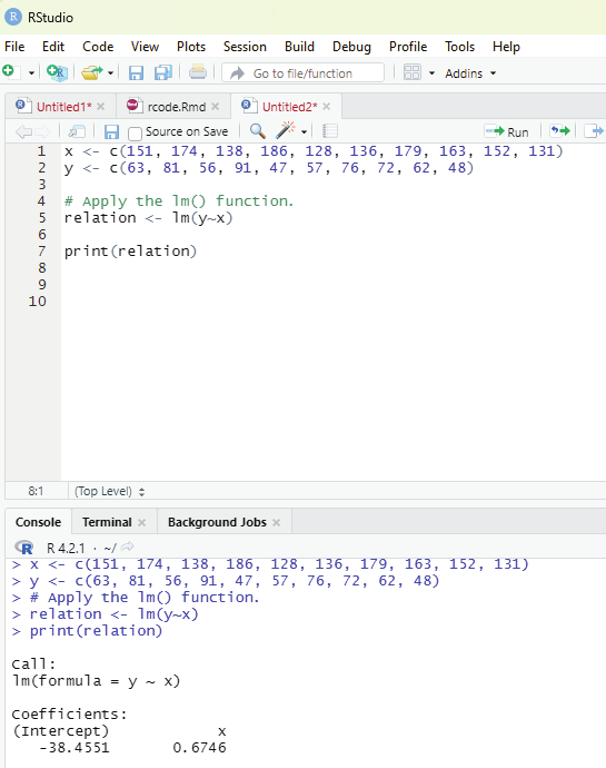

Image showing calculation of coefficients
R Programming in Statistics
Image showing summary of relationships calculated
Prof. Dr Balasubramanian Thiagarajan
367
Object is the formula that has been created using lm() function.
newdata is the vector containing the new vale for predictor variable.
# The predictor vector.
x <- c(151, 174, 138, 186, 128, 136, 179, 163, 152, 131)
# The resposne vector.
y <- c(63, 81, 56, 91, 47, 57, 76, 72, 62, 48)
# Apply the lm() function.
relation <- lm(y~x)
# Find weight of a person with height 170.
a <- data.frame(x = 170)
result <- predict(relation,a)
print(result)
Visualizing the regression graphical y:
# Create the predictor and response variable.
x <- c(151, 174, 138, 186, 128, 136, 179, 163, 152, 131) y <- c(63, 81, 56, 91, 47, 57, 76, 72, 62, 48)
relation <- lm(y~x)
# Give the chart file a name.
png(file = “linearregression.png”)
# Plot the chart.
plot(y,x,col = “blue”,main = “Height & Weight Regression”, abline(lm(x~y)),cex = 1.3,pch = 16,xlab = “Weight in Kg”,ylab = “Height in cm”)
# Save the file.
dev.off()
Multiple regression using R:
This is an extension of linear regression into relationship between more than two variables. In linear regression there is one predictor and one response variable. In multiple regression there can be more than one predictor variable and one response variable.
In the example database below the comparison should be made between different car models in terms of mileage per gallon (mpg), cylinder displacement (“disp”), horse power (“hp”), weight of the car (“wt”), and some other parameters. The goal should be to establish a relationsip between “mpg” as a response to variables like ‘disp”, “hp’, and “wt” as predictor variables.
R Programming in Statistics


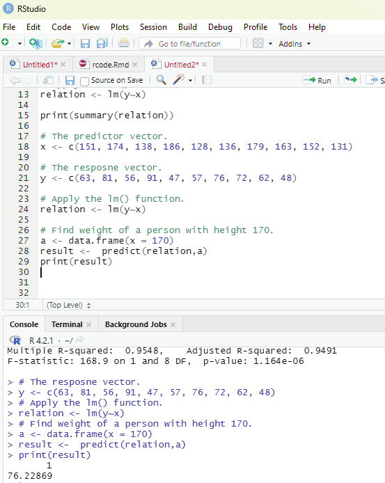

Image showing lm function
Prof. Dr Balasubramanian Thiagarajan
369
Equation for multiple regression:
y = a + b1*2 + ...bnxn
y - response variable
a, b1, b2...bn are coefficients
x1, x2, ...xn are predictor variables
Regression model can be created using lm() function in R.
lm() function creates a relationship model between the predictor and response variable.
Syntax:
lm(y ~ x1+x2+x3..., data)
Using mtcars database:
input <- mtcars[,c(“mpg”,”disp”,”hp”,”wt”)]
print(head(input))
Creating a relationship model and get coefficients:
input <- mtcars[,c(“mpg”,”disp”,”hp”,”wt”)]
# Create the relationship model.
model <- lm(mpg~disp+hp+wt, data = input)
# Show the model.
print(model)
# Get the Intercept and coefficients as vector elements.
cat(“# # # # The Coefficient Values # # # “,”\n”)
a <- coef(model)[1]
print(a)
Xdisp <- coef(model)[2]
Xhp <- coef(model)[3]
Xwt <- coef(model)[4]
print(Xdisp)
print(Xhp)
print(Xwt)
R Programming in Statistics


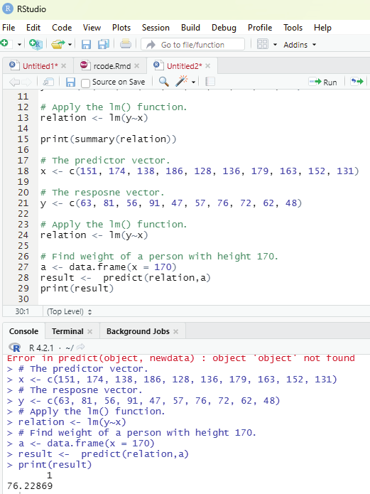

Creating equation for Regression Model:
Based on the above intercept and coefficient values a mathematical equation can be created.
Y = a+Xdisp.x1+Xhp.x2+Xwt.x3
or
Y = 37.15+(-0.000937)*x1+(-0.0311)*x2+(-3.8008)*x3
Applying Equation for predicting new values:
One can use the Regression equation created above to predict the mileage when a new set of values for displacement, horse power and weight is provided.
For a car with disp = 300, hp = 100, and wt = 3 the predicted mileage is _____.
Y = 37.15+(-0.000937)*300+(-0.0311)*100+(-3.8008)*3 = 22.7104
Image showing the results of predict function
Prof. Dr Balasubramanian Thiagarajan
371


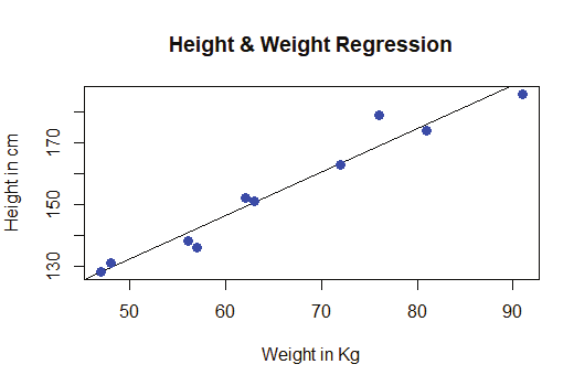

Image showing regression chart
R Programming in Statistics
R language has a number of libraries that can be used to create charts and graphs. Charts and graphs are integral parts of data analysis.
Pie chart:
This is a representation of values as slices of a circle with different colors. The slices are labeled and the numbers corresponding to each slice is also represented in the chart. Pie chart can be created using pie() function. Additional parameters can be used to control labels, color title etc.
Syntax:
pie(x, labels, radius, main, col, clockwise)
x - Is a vector containing the numeric values used in the pie chart.
Labels - Is used to give description to the slices.
Radius - Indicates the radius of the circle of the pie chart (value between -1 and +1).
Main - Indicates the title of the chart.
Col - Indicates the color palette.
Clockwise - Is a logical value indicating if the slices are drawn clockwise or anticlockwise.
Example:
# Create data for the graph
x <- c(24, 45, 18,56)
labels <- c(“Chennai”, “Calcutta”, “Trivandrum”, “Delhi”)
# Give the chart file a name
png(file = “city.png”)
# Plot the chart.
pie(x,labels)
Prof. Dr Balasubramanian Thiagarajan
373


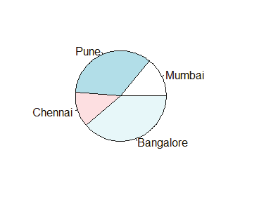


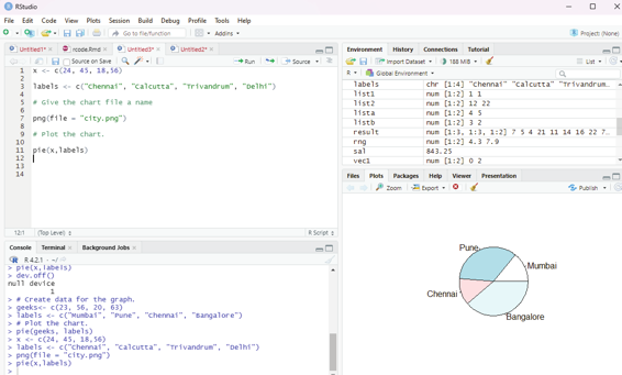

Image showing pie chart generated
R Programming in Statistics

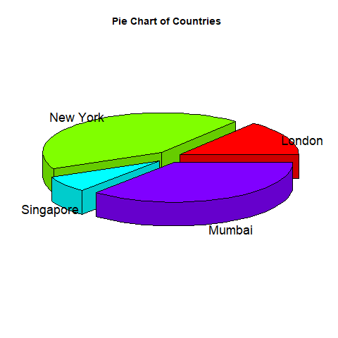

Pie Chart Title and colors:
The user can expand the features of the chart by adding more parameters to the function. The parameter main is used to add a title to the chart and another parameter col will use rainbow color pallet while drawing the chart. The length of the pallet should ideal y be the same as the number of values the user has for the chart and hence length(x) is used.
Example:
# Create data for the graph
x <- c(32, 45,76,52)
labels <- c(“Mumbai”, “Delhi”, “Chennai”, “Calcutta”)
# Giving the chart a name
png(file= “city_title_colours.jpg)
# Plotting the chart wiht title and rainbow pal et.
pie(x, labels, main = “City pie chart”, col = rainbow(length(x))) Prof. Dr Balasubramanian Thiagarajan
375
# Create data for the graph.
x <- c(21, 62, 10,53)
labels <- c(“London”,”New York”,”Singapore”,”Mumbai”) piepercent<- round(100*x/sum(x), 1)
# Give the chart file a name.
png(file = “city_percentage_legends.jpg”)
# Plot the chart.
pie(x, labels = piepercent, main = “City pie chart”,col = rainbow(length(x))) legend(“topright”, c(“London”,”New York”,”Singapore”,”Mumbai”), cex = 0.8, fill = rainbow(length(x)))
# Save the file.
dev.off()
Image showing pie chart with rainbow colors created
R Programming in Statistics
The user should bear in mind that the pie chart created will be stored within the working folder.
Bar plot:
This chart represents data in rectangular bars with length of the bar proportional to the value of the variable.
R uses the function barplot() to create bar charts. R can display both vertical and horizontal bars in the bar chart. In bar chart each of the bars can be given different colors.
Basic syntax to create bar-chart:
barplot(H,xlab,ylab,main, names.arg,col)
H - vector or matrix containing numeric values used in the bar chart.
xlab - is the label for x axis.
ylab - is the label for y axis.
main - is the title of the bar chart.
names.arg - is a vector of names appearing under each bar.
col - is used to give colors to the bars in the graph.
Example:
# Creating data for the chart
S <- c(14,28,62,83,90)
# Providing the chart file with a name
png(file = “barchart.png”)
# Plot the chart
barplot(S)
# Saving the file
dev.off()
Prof. Dr Balasubramanian Thiagarajan
377
Image showing bar-chart
R Programming in Statistics


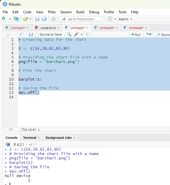

Image showing code executed to create a bar chart
Prof. Dr Balasubramanian Thiagarajan
379
Adding labels, colors and Titles to bar charts:
Example:
# Create the data for the chart
H <- c(7,12,28,3,41)
M <- c(“Mar”,”Apr”,”May”,”Jun”,”Jul”)
# Give the chart file a name
png(file = “barchart_months_revenue.png”)
# Plot the bar chart
barplot(H,names.arg=M,xlab=”Month”,ylab=”Revenue”,col=”blue”, main=”Revenue chart”,border=”red”)
# Save the file
dev.off()
Bar chart colored created
R Programming in Statistics
Group bar chart and stacked bar chart:
One can create bar chart with groups of bars and stacks in each bar by using a matrix of input values.
# Create the input vectors.
colors = c(“green”,”orange”,”brown”)
months <- c(“Mar”,”Apr”,”May”,”Jun”,”Jul”)
regions <- c(“East”,”West”,”North”)
# Create the matrix of the values.
Values <- matrix(c(2,9,3,11,9,4,8,7,3,12,5,2,8,10,11), nrow = 3, ncol = 5, byrow = TRUE)
# Give the chart file a name
png(file = “barchart_stacked.png”)
# Create the bar chart
barplot(Values, main = “total revenue”, names.arg = months, xlab = “month”, ylab = “revenue”, col = colors)
# Add the legend to the chart
legend(“topleft”, regions, cex = 1.3, fill = colors)
# Save the file
dev.off()
Image showing stacked bar chart
Prof. Dr Balasubramanian Thiagarajan
381
This is a measure of how well distributed the data in a dataset is. It divides the dataset into three quartiles.
The graph represents the minimum, maximum, median, first quartile, the third quartile in the dataset. It is also useful in comparing the distribution of data across datasets by drawing boxplots for each of them.
Boxplots are created using boxplot() function.
Syntax:
boxplot(x, data, notch, varwidth, names, main)
x - is a vector or a formula
data - is the data frame
notch - is a logical value. SEt as TRUE to draw a notch.
varwidth - is a logical value. Set as TRUE to draw width of the box proportionate to the sample size.
names - are the group labels which will be printed under each boxplot.
main - is used to give the title of the graph
Example:
Dataset “mtcars” which is available in R environment is used.
input <- mtcars[,c(‘mpg’,’cyl’)]
print(head(input))
This code on execution produces the following output:
mpg cyl
Mazda RX4 21.0 6
Mazda RX4 Wag 21.0 6
Datsun 710 22.8 4
Hornet 4 Drive 21.4 6
Hornet Sportabout 18.7 8
Valiant 18.1 6
R Programming in Statistics


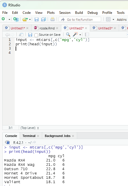

Image showing result of input command
Prof. Dr Balasubramanian Thiagarajan
383


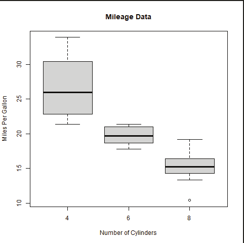

Image showing boxplot generated
Creating the boxplot:
# Give the chart file a name.
png(file = “boxplot.png”)
# Plot the chart.
boxplot(mpg ~ cyl, data = mtcars, xlab = “Number of Cylinders”, ylab = “Miles Per Gal on”, main = “Mileage Data”)
# Save the file.
dev.off()
R Programming in Statistics
Creating boxplot with notch:
This type of boxplot helps the user to find out how the medians of different data groups match with each other.
# Give the chart file a name.
png(file = “boxplot_with_notch.png”)
# Plot the chart.
boxplot(mpg ~ cyl, data = mtcars,
xlab = “Number of Cylinders”,
ylab = “Miles Per Gal on”,
main = “Mileage Data”,
notch = TRUE,
varwidth = TRUE,
col = c(“green”,”yel ow”,”purple”),
names = c(“High”,”Medium”,”Low”)
)
# Save the file.
dev.off()
Image showing boxplot with notch created
Prof. Dr Balasubramanian Thiagarajan
385
This represents the frequencies of values of a variable bucketed into ranges. This is similar to that of bar chart, but the difference being that it groups values into continuous ranges. Each bar in histogram represents the height of the number of values present in that range.
Histogram can be generated in R using hist() function. It takes the vector as an input and uses some more parameters to plot it.
Syntax:
hist(v,main,xlab,xlim,ylim,breaks,col, border)
v - is a vector containing numeric values used in histogram.
main - indicates the title of the chart.
col - is used to set color of the bars.
border - is used to set border color of each bar.
xlab - is used to give description of x-axis.
xlim - is used to specify the range of values on the x-axis.
ylim - is used to specify the range of values on the y-axis.
breaks - is used to mention the width of each bar.
Example:
# Create data for the graph
v <- c(8,18,28,7,42,28,18,56,38,43,18)
# Give the chart file a name.
png(file = “histogram.png”)
# Create the histogram
hist(v,xlab = “Weight”,col = “yel ow”,border = “blue”)
# Save the file
dev.off()
R Programming in Statistics
Image showing the histogram generated. This will be saved in the working folder. The user needs to open up the working folder to access this file.
Prof. Dr Balasubramanian Thiagarajan
387


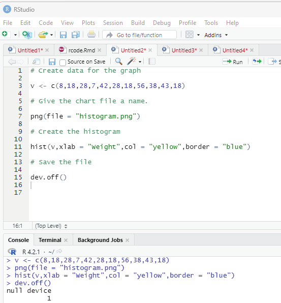

Image showing code to generate histogram
R Programming in Statistics
A line chart is a graph that connects a series of points by drawing line segments between them. These points are ordered in one of their coordinate (usual y the x-coordinate) value. This type of chart is usual y used in identifying trends in data.
Syntax:
plot(v,type,col,xlab,ylab)
v - vector containing numerical values
type - takes the value “p” to draw only the points, “|” to draw only the lines and “o” to draw both points and lines.
xlab - is the label for x axis.
ylab - is the label for y axis.
main - is the Title of the chart.
col - is used to give colors to both the points and lines.
Example:
# creating the data for the chart
v <- c(9,15,22,4,83)
# Providing a name for the chart file
png(file = “line_chart.jpg”)
# Plot the chart
plot(v,type = “o”)
# Save the file.
dev.off()
Prof. Dr Balasubramanian Thiagarajan
389


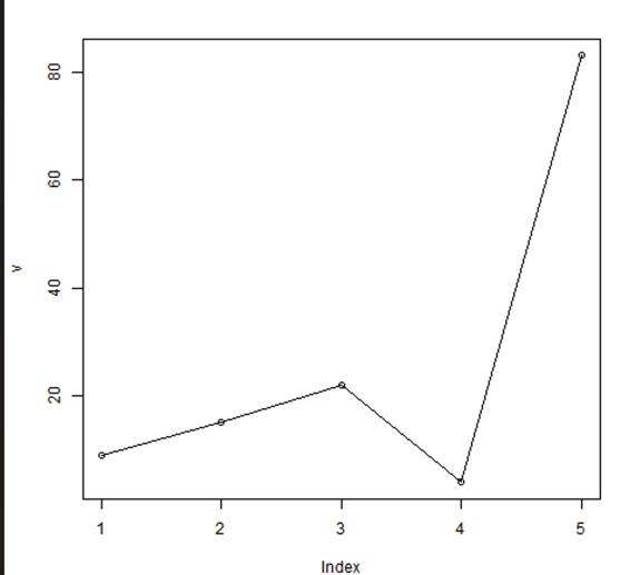

Image showing line graph generated
R Programming in Statistics


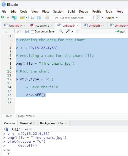

Image showing the code to generate line graph
Prof. Dr Balasubramanian Thiagarajan
391


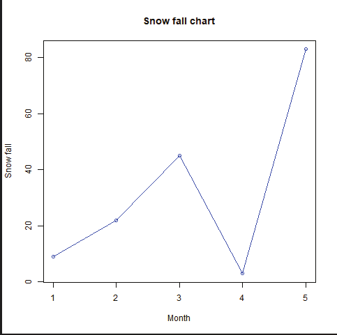

Line chart with Title, color and labels:
The features of the line chart can be extended using additional parameters. Colors can be added to the points, line etc.
Example:
# Create the data for the chart
v <- c(9,22,45,3,83)
# Give the chart file a name
png(file = “line_chart_colored.jpg”)
# plot the line graph
plot(v,type = “o”, col = “yel ow”, xlab = “Month”, ylab = “Snow fal ”, main = “Snow fall chart”)
# Save the file
dev.off()
Line chart (colored)
R Programming in Statistics


Multiple lines in a line chart:
More than one line can be drawn on the same chart using the lines() function.
Example:
# Create the data for the chart.
v <- c(7,12,28,3,41)
t <- c(14,7,6,19,3)
# Give the chart file a name.
png(file = “line_chart_2_lines.jpg”)
# Plot the bar chart.
plot(v,type = “o”,col = “red”, xlab = “Month”, ylab = “Rain fal ”, main = “Rain fall chart”)
lines(t, type = “o”, col = “blue”)
# Save the file.
dev.off()
Image showing two line graph
Prof. Dr Balasubramanian Thiagarajan
393


Image showing code used to generate two line chart
R Programming in Statistics
Scatterplots show many points plotted in the cartesian plane. Each point represents the values of two variables. One variable is chose in the horizontal axis and the other in vertical axis.
Syntax:
plot(x, y, main, xlab, ylab, xlim, ylim, axes)
x - is the dataset whose values are the horizontal co-ordinates y - is the dataset whose values are the vertical co-ordinates main - is the title of the graph
xlab - is the label in the horizontal axis
ylab - is the label in the vertical axis
xlim - is the limits of the values of x used for plotting
ylim - is the limits of the values of y used for plotting
axes - indicates whether both axes should be drawn on the plot Example:
The dataset “mtcars is used. The columns “wt” and “mpg” are used for this purpose.
data(mtcars)
input <- mtcars[,c(‘wt’,’mpg’)]
print(head(input))
On executing the code the following will be displayed:
wt mpg
Mazda RX4 2.620 21.0
Mazda RX4 Wag 2.875 21.0
Datsun 710 2.320 22.8
Hornet 4 Drive 3.215 21.4
Hornet Sportabout 3.440 18.7
Valiant 3.460 18.1
Prof. Dr Balasubramanian Thiagarajan
395
Creating the scatterplot:
The below script will create a scatterplot graph for the relation between wt(weight) and mpg(miles per gallon).
# Get the input values.
input <- mtcars[,c(‘wt’,’mpg’)]
# Give the chart file a name.
png(file = “scatterplot.png”)
# Plot the chart for cars with weight between 2.5 to 5 and mileage between 15 and 30.
plot(x = input$wt,y = input$mpg,
xlab = “Weight”,
ylab = “Milage”,
xlim = c(2.5,5),
ylim = c(15,30),
main = “Weight vs Milage”
)
# Save the file.
dev.off()
Image showing scatterplot
R Programming in Statistics
When there are two variables and the user desires to find the correlation between one variable versus the remaining ones scatterplot can be used. pairs() function to create matrices of scatterplots.
Syntax:
pairs(formula, data)
formula - represents the series of variable used in pairs.
data - represents the data set from which the variables will be taken.
Example:
# Give the chart file a name.
png(file = “scatterplot_matrices.png”)
# Plot the matrices between 4 variables giving 12 plots.
# One variable with 3 others and total 4 variables.
pairs(~wt+mpg+disp+cyl,data = mtcars,
main = “Scatterplot Matrix”)
# Save the file.
dev.off()
Prof. Dr Balasubramanian Thiagarajan
397
Image showing scatterplot of a matrix
R Programming in Statistics
Prof. Dr Balasubramanian Thiagarajan
399
Prof. Dr Balasubramanian Thiagarajan
401

Reads:
764
Pages:
29
Published:
Oct 2024
Introduction: Product Management EssentialsIn the fast-paced world of technology and business, product management is often considered the bridge between strat...
Formats: PDF, Epub, Kindle, TXT

Reads:
42
Pages:
22
Published:
Sep 2024
"Programming Essentials for Artificial Intelligence" equips readers with the fundamental programming skills needed to create AI applications. The book covers ...
Formats: PDF, Epub, Kindle, TXT

Reads:
13
Pages:
64
Published:
Jul 2024
C Programming Language for Beginners is a book for those who want to learn the fundamentals of C programming. It explains difficult concepts in an easy-to-und...
Formats: PDF, Epub, Kindle, TXT

Reads:
15
Pages:
114
Published:
May 2024
Java in AdTech by Vadym SemeniukISBN: 9789662898484 / 978-966-289-848-4Discover a new level of AdTech (Advertising Technology) with the article Java in AdTech...
Formats: PDF, Epub, Kindle, TXT