Step 1. Access graphing mode.
, ❬❙❚❆❚ P▲❖❚❪
Step 2. Select <✶✿♣❧♦t ✶> To access plotting - first graph.
Step 3. Use the arrows navigate go to <❖◆> to turn on Plot 1.
<❖◆> ,
Step 4. Use the arrows to go to the histogram picture and select the histogram.
Step 5. Use the arrows to navigate to <❳❧✐st>
Step 6. If "L1" is not selected, select it.
, ❬▲✶❪ ,
Step 7. Use the arrows to navigate to <❋r❡q>.
Step 8. Assign the frequencies to ❬▲✷❪.
, ❬▲✷❪ ,
Step 9. Go back to access other graphs.
, ❬❙❚❆❚ P▲❖❚❪
Step 10. Use the arrows to turn off the remaining plots.
Step 11. Be sure to deselect or clear all equations before graphing.
To deselect equations:
Step 1. Access the list of equations.
Step 2. Select each equal sign (=).
Step 3. Continue, until all equations are deselected.
To clear equations:
Available for free at Connexions <http://cnx.org/content/col10522/1.40>


APPENDIX
661
Step 1. Access the list of equations.
Step 2. Use the arrow keys to navigate to the right of each equal sign (=) and clear them.
Step 3. Repeat until all equations are deleted.
To draw default histogram:
Step 1. Access the ZOOM menu.
Step 2. Select <✾✿❩♦♦♠❙t❛t>
Step 3. The histogram will show with a window automatically set.
To draw custom histogram:
Step 1. Access
to set the graph parameters.
Step 2.
• Xmin = −2.5
• Xmax = 3.5
• Xscl = 1 (width of bars)
• Ymin = 0
• Ymax = 10
• Yscl = 1 (spacing of tick marks on y-axis)
• Xres = 1
Step 3. Access
to see the histogram.
To draw box plots:
Step 1. Access graphing mode.
, ❬❙❚❆❚ P▲❖❚❪
Step 2. Select <✶✿P❧♦t ✶> to access the first graph.
Step 3. Use the arrows to select <❖◆> and turn on Plot 1.
Step 4. Use the arrows to select the box plot picture and enable it.
Step 5. Use the arrows to navigate to <❳❧✐st>
Step 6. If "L1" is not selected, select it.
, ❬▲✶❪ ,
Step 7. Use the arrows to navigate to <❋r❡q>.
Step 8. Indicate that the frequencies are in ❬▲✷❪.
, ❬▲✷❪ ,
Step 9. Go back to access other graphs.
, ❬❙❚❆❚ P▲❖❚❪
Step 10. Be sure to deselect or clear all equations before graphing using the method mentioned above.
Step 11. View the box plot.
, ❬❙❚❆❚ P▲❖❚❪
Available for free at Connexions <http://cnx.org/content/col10522/1.40>
662
APPENDIX
14.9.4 Linear Regression
14.9.4.1 Sample Data
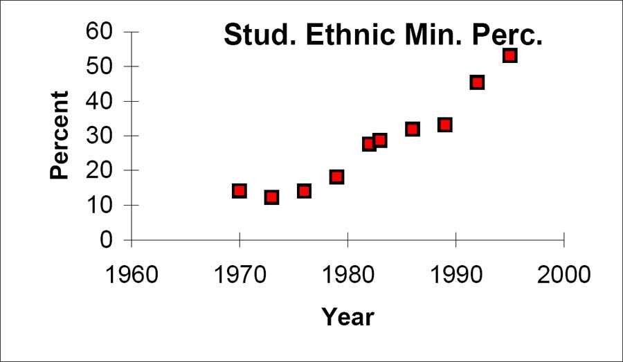
The following data is real. The percent of declared ethnic minority students at De Anza College for selected
years from 1970 - 1995 was:
Year
Student Ethnic Minority Percentage
1970
14.13
1973
12.27
1976
14.08
1979
18.16
1982
27.64
1983
28.72
1986
31.86
1989
33.14
1992
45.37
1995
53.1
Table 14.19: The independent variable is "Year," while the independent variable is "Student Ethnic Minority
Percent."
Student Ethnic Minority Percentage
Figure 14.6: By hand, verify the scatterplot above.
Available for free at Connexions <http://cnx.org/content/col10522/1.40>


APPENDIX
663
NOTE: The TI-83 has a built-in linear regression feature, which allows the data to be edited.The
x-values will be in ❬▲✶❪; the y-values in ❬▲✷❪.
To enter data and do linear regression:
Step 1. ON Turns calculator on
Step 2. Before accessing this program, be sure to turn off all plots.
• Access graphing mode.
, ❬❙❚❆❚ P▲❖❚❪
• Turn off all plots.
,
Step 3. Round to 3 decimal places. To do so:
• Access the mode menu.
, ❬❙❚❆❚ P▲❖❚❪
• Navigate to <❋❧♦❛t> and then to the right to <✸>.
• All numbers will be rounded to 3 decimal places until changed.
Step 4. Enter statistics mode and clear lists ❬▲✶❪ and ❬▲✷❪, as describe above.
,
Step 5. Enter editing mode to insert values for x and y.
,
Step 6. Enter each value. Press
to continue.
To display the correlation coefficient:
Step 1. Access the catalog.
, ❬❈❆❚❆▲❖●❪
Step 2. Arrow down and select <❉✐❛❣♥♦st✐❝❖♥>
... ,
,
Step 3. r and r2 will be displayed during regression calculations.
Step 4. Access linear regression.
Step 5. Select the form of y = a + bx
,
The display will show:
LinReg
• y = a + bx
• a = −3176.909
• b = 1.617
• r2 = 0.924
• r = 0.961
Available for free at Connexions <http://cnx.org/content/col10522/1.40>


664
APPENDIX
This means the Line of Best Fit (Least Squares Line) is:
• y = −3176.909 + 1.617x
• Percent = −3176.909 + 1.617(year #)
The correlation coefficient r = 0.961
To see the scatter plot:
Step 1. Access graphing mode.
, ❬❙❚❆❚ P▲❖❚❪
Step 2. Select <✶✿♣❧♦t ✶> To access plotting - first graph.
Step 3. Navigate and select <❖◆> to turn on Plot 1.
<❖◆>
Step 4. Navigate to the first picture.
Step 5. Select the scatter plot.
Step 6. Navigate to <❳❧✐st>
Step 7. If ❬▲✶❪ is not selected, press
, ❬▲✶❪ to select it.
Step 8. Confirm that the data values are in ❬▲✶❪.
<❖◆>
Step 9. Navigate to <❨❧✐st>
Step 10. Select that the frequencies are in ❬▲✷❪.
, ❬▲✷❪ ,
Step 11. Go back to access other graphs.
, ❬❙❚❆❚ P▲❖❚❪
Step 12. Use the arrows to turn off the remaining plots.
Step 13. Access
to set the graph parameters.
• Xmin = 1970
• Xmax = 2000
• Xscl = 10 (spacing of tick marks on x-axis)
• Ymin = −0.05
• Ymax = 60
• Yscl = 10 (spacing of tick marks on y-axis)
• Xres = 1
Step 14. Be sure to deselect or clear all equations before graphing, using the instructions above.
Step 15. Press
to see the scatter plot.
To see the regression graph:
Step 1. Access the equation menu. The regression equation will be put into Y1.
Step 2. Access the vars menu and navigate to <✺✿ ❙t❛t✐st✐❝s>
,
Step 3. Navigate to <❊◗>.
Step 4. <✶✿ ❘❡❣❊◗> contains the regression equation which will be entered in Y1.
Available for free at Connexions <http://cnx.org/content/col10522/1.40>