2.1 Descriptive Statistics1
2.1.1 Student Learning Outcomes
By the end of this chapter, the student should be able to:
• Display data graphically and interpret graphs: stemplots, histograms and boxplots.
• Recognize, describe, and calculate the measures of location of data: quartiles and percentiles.
• Recognize, describe, and calculate the measures of the center of data: mean, median, and mode.
• Recognize, describe, and calculate the measures of the spread of data: variance, standard deviation,
and range.
2.1.2 Introduction
Once you have collected data, what will you do with it? Data can be described and presented in many
different formats. For example, suppose you are interested in buying a house in a particular area. You may
have no clue about the house prices, so you might ask your real estate agent to give you a sample data set
of prices. Looking at all the prices in the sample often is overwhelming. A better way might be to look
at the median price and the variation of prices. The median and variation are just two ways that you will
learn to describe data. Your agent might also provide you with a graph of the data.
In this chapter, you will study numerical and graphical ways to describe and display your data. This area
of statistics is called "Descriptive Statistics" . You will learn to calculate, and even more importantly, to
interpret these measurements and graphs.
2.2 Displaying Data2
A statistical graph is a tool that helps you learn about the shape or distribution of a sample. The graph can
be a more effective way of presenting data than a mass of numbers because we can see where data clusters
and where there are only a few data values. Newspapers and the Internet use graphs to show trends and
to enable readers to compare facts and figures quickly.
Statisticians often graph data first to get a picture of the data. Then, more formal tools may be applied.
1This content is available online at <http://cnx.org/content/m16300/1.9/>.
2This content is available online at <http://cnx.org/content/m16297/1.9/>.
Available for free at Connexions <http://cnx.org/content/col10522/1.40>
59
60
CHAPTER 2. DESCRIPTIVE STATISTICS
Some of the types of graphs that are used to summarize and organize data are the dot plot, the bar chart,
the histogram, the stem-and-leaf plot, the frequency polygon (a type of broken line graph), pie charts, and
the boxplot. In this chapter, we will briefly look at stem-and-leaf plots, line graphs and bar graphs. Our
emphasis will be on histograms and boxplots.
2.3 Stem and Leaf Graphs (Stemplots), Line Graphs and Bar Graphs3
One simple graph, the stem-and-leaf graph or stem plot, comes from the field of exploratory data analy-
sis.It is a good choice when the data sets are small. To create the plot, divide each observation of data into
a stem and a leaf. The leaf consists of a final significant digit. For example, 23 has stem 2 and leaf 3. Four
hundred thirty-two (432) has stem 43 and leaf 2. Five thousand four hundred thirty-two (5,432) has stem
543 and leaf 2. The decimal 9.3 has stem 9 and leaf 3. Write the stems in a vertical line from smallest the
largest. Draw a vertical line to the right of the stems. Then write the leaves in increasing order next to their
corresponding stem.
Example 2.1
For Susan Dean’s spring pre-calculus class, scores for the first exam were as follows (smallest to
largest):
33; 42; 49; 49; 53; 55; 55; 61; 63; 67; 68; 68; 69; 69; 72; 73; 74; 78; 80; 83; 88; 88; 88; 90; 92; 94; 94; 94; 94;
96; 100
Stem-and-Leaf Diagram
Stem
Leaf
3
3
4
299
5
355
6
1378899
7
2348
8
03888
9
0244446
10
0
Table 2.1
The stem plot shows that most scores fell in the 60s, 70s, 80s, and 90s. Eight out of the 31 scores or
approximately 26% of the scores were in the 90’s or 100, a fairly high number of As.
The stem plot is a quick way to graph and gives an exact picture of the data. You want to look for an overall
pattern and any outliers. An outlier is an observation of data that does not fit the rest of the data. It is
sometimes called an extreme value. When you graph an outlier, it will appear not to fit the pattern of the
graph. Some outliers are due to mistakes (for example, writing down 50 instead of 500) while others may
indicate that something unusual is happening. It takes some background information to explain outliers.
In the example above, there were no outliers.
Example 2.2
Create a stem plot using the data:
3This content is available online at <http://cnx.org/content/m16849/1.17/>.
Available for free at Connexions <http://cnx.org/content/col10522/1.40>
61
1.1; 1.5; 2.3; 2.5; 2.7; 3.2; 3.3; 3.3; 3.5; 3.8; 4.0; 4.2; 4.5; 4.5; 4.7; 4.8; 5.5; 5.6; 6.5; 6.7; 12.3
The data are the distance (in kilometers) from a home to the nearest supermarket.
Problem
(Solution on p. 114.)
1. Are there any values that might possibly be outliers?
2. Do the data seem to have any concentration of values?
HINT: The leaves are to the right of the decimal.
Another type of graph that is useful for specific data values is a line graph. In the particular line graph
shown in the example, the x-axis consists of data values and the y-axis consists of frequency points. The
frequency points are connected.
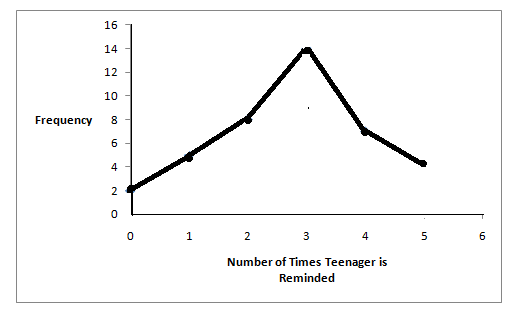
Example 2.3
In a survey, 40 mothers were asked how many times per week a teenager must be reminded to do
his/her chores. The results are shown in the table and the line graph.
Number of times teenager is reminded
Frequency
0
2
1
5
2
8
3
14
4
7
5
4
Table 2.2
Bar graphs consist of bars that are separated from each other. The bars can be rectangles or they can be
rectangular boxes and they can be vertical or horizontal.
The bar graph shown in Example 4 has age groups represented on the x-axis and proportions on the y-axis.
Available for free at Connexions <http://cnx.org/content/col10522/1.40>
62
CHAPTER 2. DESCRIPTIVE STATISTICS
Example 2.4
By the end of 2011, in the United States, Facebook had over 146 million users.
The table
shows three age groups, the number of users in each age group and the proportion (%) of
users in each age group. Source: http://www.kenburbary.com/2011/03/facebook-demographics-
revisited-2011-statistics-2/
Age groups
Number of Facebook users
Proportion (%) of Facebook users
13 - 25
65,082,280
45%
26 - 44
53,300,200
36%
45 - 64
27,885,100
19%
Table 2.3
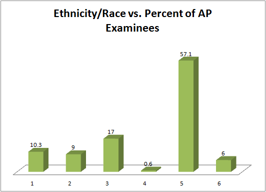
Example 2.5
The columns in the table below contain the race/ethnicity of U.S. Public Schools: High School
Class of 2011, percentages for the Advanced Placement Examinee Population for that class
and percentages for the Overall Student Population.
The 3-dimensional graph shows the
Race/Ethnicity of U.S. Public Schools (qualitative data) on the x-axis and Advanced Placement
Examinee Population percentages on the y-axis. (Source: http://www.collegeboard.com and
Source: http://apreport.collegeboard.org/goals-and-findings/promoting-equity)
Race/Ethnicity
AP Examinee Population
Overall Student Population
1 = Asian, Asian American or Pa-
10.3%
5.7%
cific Islander
continued on next page
Available for free at Connexions <http://cnx.org/content/col10522/1.40>
63
2 = Black or African American
9.0%
14.7%
3 = Hispanic or Latino
17.0%
17.6%
4 = American Indian or Alaska
0.6%
1.1%
Native
5 = White
57.1%
59.2%
6 = Not reported/other
6.0%
1.7%
Table 2.4
Go to Outcomes of Education Figure 224 for an example of a bar graph that shows unemployment rates of
persons 25 years and older for 2009.
NOTE: This book contains instructions for constructing a histogram and a box plot for the TI-83+
and TI-84 calculators. You can find additional instructions for using these calculators on the Texas
Instruments (TI) website5 .
2.4 Histograms6
For most of the work you do in this book, you will use a histogram to display the data. One advantage of a
histogram is that it can readily display large data sets. A rule of thumb is to use a histogram when the data
set consists of 100 values or more.
A histogram consists of contiguous boxes. It has both a horizontal axis and a vertical axis. The horizontal
axis is labeled with what the data represents (for instance, distance from your home to school). The vertical
axis is labeled either Frequency or relative frequency. The graph will have the same shape with either
label. The histogram (like the stemplot) can give you the shape of the data, the center, and the spread of the
data. (The next section tells you how to calculate the center and the spread.)
4http://nces.ed.gov/pubs2011/2011015_5.pdf
5http://education.ti.com/educationportal/sites/US/sectionHome/support.html
6This content is available online at <http://cnx.org/content/m16298/1.14/>.
Available for free at Connexions <http://cnx.org/content/col10522/1.40>
64
CHAPTER 2. DESCRIPTIVE STATISTICS
The relative frequency is equal to the frequency for an observed value of the data divided by the total
number of data values in the sample. (In the chapter on Sampling and Data (Section 1.1), we defined
frequency as the number of times an answer occurs.) If:
• f = frequency
• n = total number of data values (or the sum of the individual frequencies), and
• RF = relative frequency,
then:
f
RF =
(2.1)
n
For example, if 3 students in Mr. Ahab’s English class of 40 students received from 90% to 100%, then,
f = 3 , n = 40 , and RF = f = 3 = 0.075
n
40
Seven and a half percent of the students received 90% to 100%. Ninety percent to 100 % are quantitative
measures.
To construct a histogram, first decide how many bars or intervals, also called classes, represent the data.
Many histograms consist of from 5 to 15 bars or classes for clarity. Choose a starting point for the first
interval to be less than the smallest data value. A convenient starting point is a lower value carried out
to one more decimal place than the value with the most decimal places. For example, if the value with the
most decimal places is 6.1 and this is the smallest value, a convenient starting point is 6.05 (6.1 - 0.05 = 6.05).
We say that 6.05 has more precision. If the value with the most decimal places is 2.23 and the lowest value
is 1.5, a convenient starting point is 1.495 (1.5 - 0.005 = 1.495). If the value with the most decimal places is
3.234 and the lowest value is 1.0, a convenient starting point is 0.9995 (1.0 - .0005 = 0.9995). If all the data
happen to be integers and the smallest value is 2, then a convenient starting point is 1.5 (2 - 0.5 = 1.5). Also,
when the starting point and other boundaries are carried to one additional decimal place, no data value
will fall on a boundary.
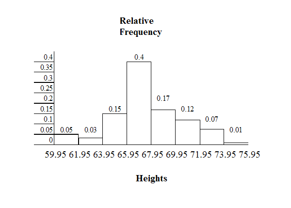
Example 2.6
The following data are the heights (in inches to the nearest half inch) of 100 male semiprofessional
soccer players. The heights are continuous data since height is measured.
60; 60.5; 61; 61; 61.5
63.5; 63.5; 63.5
64; 64; 64; 64; 64; 64; 64; 64.5; 64.5; 64.5; 64.5; 64.5; 64.5; 64.5; 64.5
66; 66; 66; 66; 66; 66; 66; 66; 66; 66; 66.5; 66.5; 66.5; 66.5; 66.5; 66.5; 66.5; 66.5; 66.5; 66.5; 66.5; 67; 67;
67; 67; 67; 67; 67; 67; 67; 67; 67; 67; 67.5; 67.5; 67.5; 67.5; 67.5; 67.5; 67.5
68; 68; 69; 69; 69; 69; 69; 69; 69; 69; 69; 69; 69.5; 69.5; 69.5; 69.5; 69.5
70; 70; 70; 70; 70; 70; 70.5; 70.5; 70.5; 71; 71; 71
72; 72; 72; 72.5; 72.5; 73; 73.5
74
The smallest data value is 60. Since the data with the most decimal places has one decimal (for
instance, 61.5), we want our starting point to have two decimal places. Since the numbers 0.5,
0.05, 0.005, etc. are convenient numbers, use 0.05 and subtract it from 60, the smallest value, for
the convenient starting point.
Available for free at Connexions <http://cnx.org/content/col10522/1.40>
65
60 - 0.05 = 59.95 which is more precise than, say, 61.5 by one decimal place. The starting point is,
then, 59.95.
The largest value is 74. 74+ 0.05 = 74.05 is the ending value.
Next, calculate the width of each bar or class interval. To calculate this width, subtract the starting
point from the ending value and divide by the number of bars (you must choose the number of
bars you desire). Suppose you choose 8 bars.
74.05 − 59.95 = 1.76
(2.2)
8
NOTE: We will round up to 2 and make each bar or class interval 2 units wide. Rounding up to 2 is
one way to prevent a value from falling on a boundary. Rounding to the next number is necessary
even if it goes against the standard rules of rounding. For this example, using 1.76 as the width
would also work.
The boundaries are:
• 59.95
• 59.95 + 2 = 61.95
• 61.95 + 2 = 63.95
• 63.95 + 2 = 65.95
• 65.95 + 2 = 67.95
• 67.95 + 2 = 69.95
• 69.95 + 2 = 71.95
• 71.95 + 2 = 73.95
• 73.95 + 2 = 75.95
The heights 60 through 61.5 inches are in the interval 59.95 - 61.95. The heights that are 63.5 are
in the interval 61.95 - 63.95. The heights that are 64 through 64.5 are in the interval 63.95 - 65.95.
The heights 66 through 67.5 are in the interval 65.95 - 67.95. The heights 68 through 69.5 are in the
interval 67.95 - 69.95. The heights 70 through 71 are in the interval 69.95 - 71.95. The heights 72
through 73.5 are in the interval 71.95 - 73.95. The height 74 is in the interval 73.95 - 75.95.
The following histogram displays the heights on the x-axis and relative frequency on the y-axis.
Available for free at Connexions <http://cnx.org/content/col10522/1.40>
66
CHAPTER 2. DESCRIPTIVE STATISTICS
Example 2.7
The following data are the number of books bought by 50 part-time college students at ABC
College. The number of books is discrete data since books are counted.
1; 1; 1; 1; 1; 1; 1; 1; 1; 1; 1
2; 2; 2; 2; 2; 2; 2; 2; 2; 2
3; 3; 3; 3; 3; 3; 3; 3; 3; 3; 3; 3; 3; 3; 3; 3
4; 4; 4; 4; 4; 4
5; 5; 5; 5; 5
6; 6
Eleven students buy 1 book. Ten students buy 2 books. Sixteen students buy 3 books. Six students
buy 4 books. Five students buy 5 books. Two students buy 6 books.
Because the data are integers, subtract 0.5 from 1, the smallest data value and add 0.5 to 6, the
largest data value. Then the starting point is 0.5 and the ending value is 6.5.
Problem
(Solution on p. 114.)
Next, calculate the width of each bar or class interval. If the data are discrete and there are not too
many different values, a width that places the data values in the middle of the bar or class interval
is the most convenient. Since the data consist of the numbers 1, 2, 3, 4, 5, 6 and the starting point is
0.5, a width of one places the 1 in the middle of the interval from 0.5 to 1.5, the 2 in the middle of
the interval from 1.5 to 2.5, the 3 in the middle of the interval from 2.5 to 3.5, the 4 in the middle of
the interval from _______ to _______, the 5 in the middle of the interval from _______ to _______,
and the _______ in the middle of the interval from _______ to _______ .
Available for free at Connexions <http://cnx.org/content/col10522/1.40>
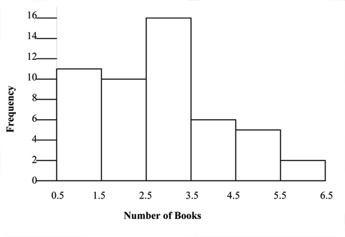
67
Calculate the number of bars as follows:
6.5 − 0.5 = 1
(2.3)
bars
where 1 is the width of a bar. Therefore, bars = 6.
The following histogram displays the number of books on the x-axis and the frequency on the
y-axis.
Using the TI-83, 83+, 84, 84+ Calculator Instructions
Go to the Appendix (14:Appendix) in the menu on the left. There are calculator instructions for entering
data and for creating a customized histogram. Create the histogram for Example 2.
• Press Y=. Press CLEAR to clear out any equations.
• Press STAT 1:EDIT. If L1 has data in it, arrow up into the name L1, press CLEAR and arrow down. If
necessary, do the same for L2.
• Into L1, enter 1, 2, 3, 4, 5, 6
• Into L2, enter 11, 10, 16, 6, 5, 2
• Press WINDOW. Make Xmin = .5, Xmax = 6.5, Xscl = (6.5 - .5)/6, Ymin = -1, Ymax = 20, Yscl = 1, Xres
= 1
• Press 2nd Y=. Start by pressing 4:Plotsoff ENTER.
• Press 2nd Y=. Press 1:Plot1. Press ENTER. Arrow down to TYPE. Arrow to the 3rd picture (his-
togram). Press ENTER.
• Arrow down to Xlist: Enter L1 (2nd 1). Arrow down to Freq. Enter L2 (2nd 2).
• Press GRAPH
• Use the TRACE key and the arrow keys to examine the histogram.
2.4.1 Optional Collaborative Exercise
Count the money (bills and change) in your pocket or purse. Your instructor will record the amounts. As a
class, construct a histogram displaying the data. Discuss how many intervals you think is appropriate. You
may want to experiment with the number of intervals. Discuss, also, the shape of the histogram.
Record the data, in dollars (for example, 1.25 dollars).
Construct a histogram.
Available for free at Connexions <http://cnx.org/content/col10522/1.40>
68
CHAPTER 2. DESCRIPTIVE STATISTICS
2.5 Box Plots7
Box plots or box-whisker plots give a good graphical image of the concentration of the data. They also
show how far from most of the data the extreme values are. The box plot is constructed from five values:
the smallest value, the first quartile, the median, the third quartile, and the largest value. The median, the
first quartile, and the third quartile will be discussed here, and then again in the section on measuring data
in this chapter. We use these values to compare how close other data values are to them.
The median, a number, is a way of measuring the "center" of the data. You can think of the median as the
"middle value," although it does not actually have to be one of the observed values. It is a number that
separates ordered data into halves. Half the values are the same number or smaller than the median and
half the values are the same number or larger. For example, consider the following data:
1; 11.5; 6; 7.2; 4; 8; 9; 10; 6.8; 8.3; 2; 2; 10; 1
Ordered from smallest to largest:
1; 1; 2; 2; 4; 6; 6.8; 7.2; 8; 8.3; 9; 10; 10; 11.5
The median is between the 7th value, 6.8, and the 8th value 7.2. To find the median, add the two values
together and divide by 2.
6.8 + 7.2 = 7
(2.4)
2
The median is 7. Half of the values are smaller than 7 and half of the values are larger than 7.
Quartiles are numbers that separate the data into quarters. Quartiles may or may not be part of the data.
To find the quartiles, first find the median or second quartile. The first quartile is the middle value of the
lower half of the data and the third quartile is the middle value of the upper half of the data. To get the
idea, consider the same data set shown above:
1; 1; 2; 2; 4; 6; 6.8; 7.2; 8; 8.3; 9; 10; 10; 11.5
The median or second quartile is 7. The lower half of the data is 1, 1, 2, 2, 4, 6, 6.8. The middle value of the
lower half is 2.
1; 1; 2; 2; 4; 6; 6.8
The number 2, which is part of the data, is the first quartile. One-fourth of the values are the same or less
than 2 and three-fourths of the values are more than 2.
The upper half of the data is 7.2, 8, 8.3, 9, 10, 10, 11.5. The middle value of the upper half is 9.
7.2; 8; 8.3; 9; 10; 10; 11.5
The number 9, which is part of the data, is the third quartile. Three-fourths of the values are less than 9
and one-fourth of the values are more than 9.
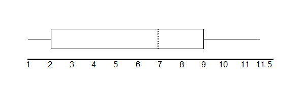
To construct a box plot, use a horizontal number line and a rectangular box. The smallest and largest data
values label the endpoints of the axis. The first quartile marks one end of the box and the third quartile
marks the other end of the box. The middle fifty percent of the data fall inside the box. The "whiskers"
extend from the ends of the box to the smallest and largest data values. The box plot gives a good quick
picture of the data.
7This content is available online at <http://cnx.org/content/m16296/1.13/>.
Available for free at Connexions <http://cnx.org/content/col10522/1.40>
69
NOTE: You may encounter box and whisker plots that have dots marking outlier values. In those
cases, the whiskers are not extending to the minimum and maximum values.
Consider the following data:
1; 1; 2; 2; 4; 6; 6.8 ; 7.2; 8; 8.3; 9; 10; 10; 11.5
The first quartile is 2, the median is 7, and the third quartile is 9. The smallest value is 1 and the largest
value is 11.5. The box plot is constructed as follows (see calculator instructions in the back of this book or
on the TI web site8 ):
The two whiskers extend from the first quartile to the smallest value and from the third quartile to the
largest value. The median is shown with a dashed line.
Example 2.8
The following data are the heights of 40 students in a statistics class.
59; 60; 61; 62; 62; 63; 63; 64; 64; 64; 65; 65; 65; 65; 65; 65; 65; 65; 65; 66; 66; 67; 67; 68; 68; 69; 70; 70; 70;
70; 70; 71; 71; 72; 72; 73; 74; 74; 75; 77
Construct a box plot:
Using the TI-83, 83+, 84, 84+ Calculator
• Enter data into the list editor (Press STAT 1:EDIT). If you need to clear the list, arrow up to
the name L1, press CLEAR, arrow down.
• Put the data values in list L1.
• Press STAT and arrow to CALC. Press 1:1-VarStats. Enter L1.
• Press ENTER
• Use the down and up arrow keys to scroll.