3.1. What is a Chart?
In technical analysis a chart is a graphical representation of price movements over a certain time frame. It can show security’s price movement over a month or a year period.
The chart below will help to understand how charts reflect price changes and how to read them.
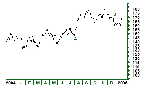
Figure 3.1
Figure 3.1 represents price movements of a security over a year period. The horizontal x-axis at the bottom of the chart shows the date or time scale. The vertical y-axis shows the price scale. Thus, in the given example it is shown that in July 2004 (A) the price of security was around $150, but in December 2004 (B) its price reached around $170. This data tells us that the price of the security has risen between July 2004 and December 2004.
• The Time Scale
The time scale shows the range of dates which can vary from seconds to decades. Most widely used time scales are intraday, daily, weekly, monthly, quarterly and annual y. Intraday charts, as the name implies, plot price movement within a particular day ranging from several minutes to the whole trading day. In the same way, weekly, monthly or yearly time scales cover both intermediate and short–term trends in price movement and are mainly used to analyze longer term trends.
• The Price Scale (Arithmetic and Logarithmic scales)
The price scale on the right side of the chart shows security’s current price and compares it to past data. The structure of the scale can be either arithmetic (linear) or logarithmic.
Linear scale means that the space between each price point is separated by an equal amount (see figure 3.2).
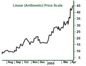
Figure 3.2
In this figure it is shown that each point on the linear scale is equidistant; each price point increases by $5. In this case the price scale does not show the effects of percent change and measures movements in absolute terms.
Logarithmic price scale shows that the distance between points will be equal in terms of percent change (see figure 3.3). Though price changes from 10 to 20 and from 40 to 50 are shown by the same distance on a linear scale, the percent change is different; a price change from 10 to 20 is a 100% change, while a price change from 40 to 50 is only a 25% increase. Thus, the 100% increase is represented by a larger space on the chart, while the 25% increase is shown by a smaller space.
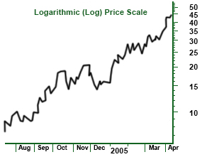
Figure 3.3
Usual y stock market chart analysts use log charts, whereas futures chart analysts give preference to arithmetic charts. The opportunity of using each of them is great since charting software packages allow both types of scaling.
3.2. Types of Charts
Depending on what information traders search for and what skills they master, they can use certain types of charts. The main types of charts are: the bar chart, the line chart, the candlestick chart and the point and figure chart.
Line charts
The line chart is considered the most basic chart, since it plots only the closing price over a set period of time. It does not provide such information like high, low and opening prices and is formed by connecting closing prices (see figure 3.4). Most chartists consider the line chart a valid measure of price activity because they believe that closing is the most essential price in trading data.
In the following example and in other examples as well (figures 3.4, 3.5, 3.6) the price data of S&P 500 Index between January 2006 and May 2006 are presented. What is important here to notice is that the data are identical on all charts but the way they are plotted and represented is quite different.
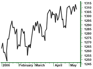
Figure 3.4 A line chart: T his type of chart creates a solid line connecting the successive closing prices.
Bar Charts
The bar chart is a more expanded version of the line chart with additional information. It is called bar chart because it consists of a series of vertical bars that show each datum. The bar chart aside from closing prices also plots the open, high and low prices.
The closing and opening prices are shown on the bar by a horizontal dash either on its left or right sides. The opening price is represented by the dash on the left of the bar. The closing price, herein, is shown by the dash on the right of the vertical bar. Usual y, if the left dash is lower than the right dash this means that the security has gained value. If the right dash is lower than the left dash, it means that the security has decreased in value. In such cases bars are colored red once more showing the low value of security over that set time (see figure 3.5).
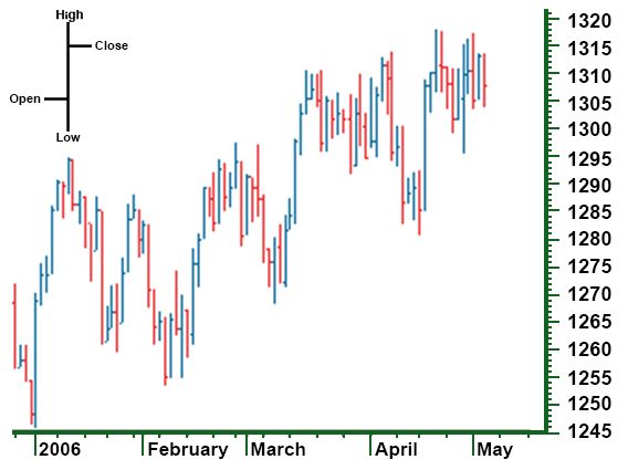
Figure 3.5 A bar chart: each vertical bar represents one action
Candlestick Charts
The candlestick chart is the Japanese version of the bar chart and plots the same four prices as the bar chart (high, low, opening and closing prices), however the visual presentation differs. The difference mainly lies in the formation of a wide bar on the vertical line which shows the difference between the opening and closing prices.
On the candlestick chart the thin line, also called shadow, shows the price change from the high to the low. A wider portion of the bar, also called real body, shows the distance between the opening and closing prices.
The colors as in the bar charts, here also are used to explain the price performance over the trading period. Though different sites use different standards for candlestick color configuration, there are two color constructs for showing days when price goes up and one for days when the price goes down (see figure 3.6). The candlestick will be white or clear if the security price is up and closes above the opening trade. But if the price is low, the candlestick will usually be red. In other words, if the closing price is higher than the opening price, the real body will be white (positive), and if the closing price is lower than the opening price, the real body will be red (negative).
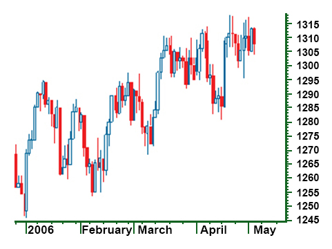
Figure 3.6 A C andlestick chart
Point and Figure Charts
The point and figure chart though not so well known and widely used by an average investor, has a long history and goes back to the first technical traders. This type of chart shows the same price action in a quite compressed format; it simply reflects price movements and is not concerned about time and volume and insignificant price movements. Besides this, on the point and figure chart it is much easier to spot the buy and sell signals than on the bar chart.
The numbers and letters on the chart represent months through which traders can make an idea of the date (see fig. 3.7).
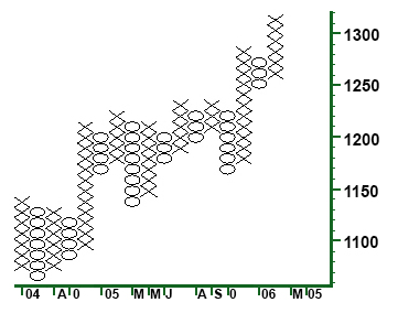
Figure 3.7 The point and figure chart: The X column shows rising prices and the O column shows falling prices.
The boxes on the chart represent the price scale based on the price of the security. This means that the higher the security price, the more each box represents.
Another important aspect on this chart is its reversal criterion. This indicates how much the price is to move away from the low to the high to create a new trend. In other words, it shows how much the price has to move for an X column to become an O column and vice versa.
3.3. Chart Patterns
Price patterns are certain formations that appear on charts creating a sign of future price movements. They have predictive value and are used by chartists to identify current trends and trigger buy and sell signals.
The theory of chart patterns is based on the basic assumption of technical analysis that history repeats itself. The main premise is that certain patterns appear many times on the chart and signal movements in a security based on the historical trend of a chart pattern.
Though each chart pattern has its own components and shows a certain movement, there is no chart that will tell for 100% how the security is about to move. This always arouses debates as what patterns are good and reliable, and this is why charting in most cases is referred to as rather an art than a science.
There are two major categories of price chart patterns: reversal and continuation. Reversal patterns indicate that an important reversal in trend will take place upon completion of the pattern. The continuation pattern, conversely, indicates a temporary pause in a market after which the existing trend will continue.
3.2.1. Reversal Chart Patterns
Reversal chart patterns are formed after the price level has reached the maximum value in the current trend. They signal the end of the current trend and the start of a new one.
A pattern which is formed during an uptrend signals that the price will soon decline. Conversely, the pattern formed during a downtrend, signals that the price is about to go up.
It is important to know where in the primary trend the pattern is most likely to appear. Patterns that appear at the market top are called distribution patterns, where traders can sell the instrument. On the other hand, patterns that appear at the market bottom, known as accumulation patterns, indicate the most efficient period of buying an instrument.
While discussing reversal chart patterns it is important to consider some common and essential points that form their basis.
1. Existence of a prior trend
There must be a prior trend for the formation of a reversal pattern; if it is not preceded by a trend, there can be nothing to reverse.
2. Breaking of important trendlines
Though the violation of a major trendline does not always indicate a trend reversal, it often signals the beginning of a sideways price pattern, which then can be identified as a reversal or a continuation type.
3. Greater potential with larger pattern
Patterns with greater sizes, that is, with high volatility and long duration of building, are more important and the potential for ensuring price move becomes greater.
4. Difference between top and bottom patterns
Top patterns usually take less time to build, they are shorter in duration and are more volatile. The volatility within bottom patterns is lower and it takes longer time to build a bottom pattern. In top patterns the prices tend to decline faster than they go up, herein, traders can more quickly make money by trading the short side of bear market, than by trading the long side of a bull market.
5. Volume is more significant on the upside
Being a confirming factor in the completion of all price patterns, volume usually increases in the direction of trend. The completion of each pattern should be accompanied by certain increase in volume. At market tops in the early stages of trend reversal volume is not so important. On the other hand, at bottoms the volume increase is quite essential.
Major Reversal Patterns
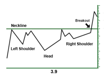
The Head and Shoulders Pattern: This pattern, also known as head and shoulders top, is considered the most reliable of al other reversal patterns. Being formed in an uptrend head and shoulders pattern signals that the price is going to move in a downward direction.
It is a chart formation where price moves in the following way:
1. Rises to a peak and declines
2. Rises again, this time higher than the first peak, and declines
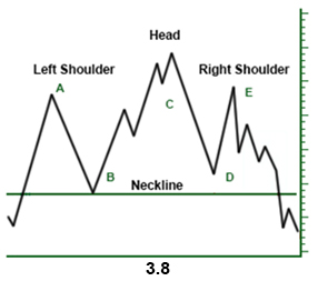
3. Rises but not so high as the second peak, and declines.
The highest peak is called head and the left and right peaks which are at about the same height are called shoulders. A flatter trendline can be drawn under reaction lows (B and D), called neckline. If the price falls below the neckline a sell signal arises. The pattern is complete if the neckline is broken; only in that case the trend is considered reversed, and the asset can head a new direction.
The Inverse Head and Shoulders: This type of pattern is also called head and shoulders bottom and is exactly the opposite of head and shoulders top, discussed above. It signals that the security is going to make an upward move. Here again there are four steps to form the pattern starting from the left shoulder which is formed when the price declines and rises. Then follows the formation of head, when the price declines lower than the previous low accompanied by a return to the previous high. The third step is the formation of the right shoulder which is higher than the previous low and is followed by a return to the neckline. This pattern is considered complete when the price breaks above the neckline.
Triple Tops and Bottoms: The triple top and bottom patterns are just slight variations of head and shoulders patterns. The main difference is that three highs or lows in triple tops and bottoms respectively are at the same level.
Triple tops are bearish reversal patterns formed when the security which is trending upward tests the same resistance level without breaking it through and each time falls to a similar support area. The pattern is considered complete when after the third decline the security falls through the support level. Thus, the price is expected to move in a downward direction indicating a sell signal. Triple bottoms are bullish reversal patterns that share all the features of the triple top, but they only signal a reversal of downward trend. They indicate that a security that is trading in a downtrend and tries to fall through the support 30 level for three times, each time moves back to the resistance level. The pattern is complete when the price moves above the resistance level and begins trading in an upward trend.
Double Tops and Bottoms: The double tops and double bottoms are again well known chart patterns which show a security’s attempt to continue an existing trend. After a few attempts to continue the direction, trend is reversed. By their formation these patterns often resemble the letter W (in case of double bottom) or the letter M (in case of double top).
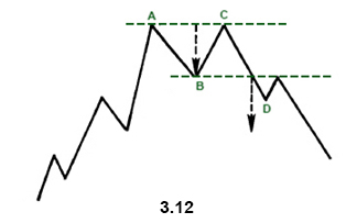
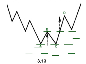
The double-top pattern signals the weakening of the preceding upward trend. It has two peaks at about the same level (points A and C). The market sets a new high on increased volume (A), then declines (B) on declining volume. The next high (C) is formed and again begins to fall back. The double – top pattern is formed but it is not complete unless the security breaks down the support level (D) signaling the beginning of a downward trend.
The double bottom is the opposite pattern of the double top and signals a reversal of the downtrend.
It is formed by setting a new low in the price movement (point A). After finding support the price rises to the resistance level (B) and then declines down to the previous low (C). These two lows (A and C) form the two bottoms on the pattern. But after forming the bottoms the price goes up. It is important to note that the security should break through the support level for trend reversal to take place (here changing from a downtrend into an uptrend).
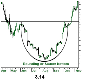
Saucer Bottom: Saucer bottom, also called a rounding bottom, is a long term pattern which signals a gradual and very slow shift from a downtrend to an uptrend. It is referred to as a long term pattern, since it can last from several months to several years. It is rather difficult to tell when the pattern has been completed and calculate how prices will move in the opposite direction. The formation of a saucer bottom starts form a downward movement which gradual y becomes lower and then is followed by a rise to the initial level of the downward movement creating a pattern which looks like a rounding bottom.
It is not necessary for the pattern to be followed only by a downtrend; it may also proceeded by a sideways movement formed after a downtrend.
The distance from the initial high to the lowest level is considered the half of the distance of the saucer bottom. This helps chartists make an idea when the pattern will be complete; if the first half of the pattern lasts a year, the signal is not expected to be formed until a year.
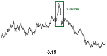
V-patterns or Spikes: Spikes are the most difficult patterns to deal with, since they happen very quickly with little or no transition period. They appear when the market has become so overextended in one direction that a sudden event can cause the market change its direction very abruptly.
Unfortunately, these sudden turns are difficult to spot in advance. The only way to know what to expect is to use certain technical indicators that help to determine when market have gotten overextended.
3.3.2.
Continuation Chart Patterns
Continuation patterns indicate that the sideways price movement on the chart is just a pause in the prior trend and that the next movement will be the continuation of the direction preceding the formation. When these patterns appear on the chart they indicate that the trend is likely to resume after the completion of the pattern. And the pattern is considered complete when after its formation the trend ''breaks out' of the pattern and continues with the former trend. This is the main feature that distinguishes continuation patterns form reversal patterns.
Another factor that differs between these two types of patterns is the time duration. Reversal patterns take longer times to be formed and represent major trend changes. On the other hand, continuation patterns are classified as intermediate patterns and usually take shorter time to build. They can appear on all time frames, from a tick chart to a weekly chart.
Major Continuation Patterns
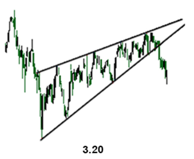
Triangles: Triangle patterns can be defined as a converging of the price range, with lower highs and higher lows. The converging price action creates a triangle formation. If the price goes on to converge, it will reach the apex of the triangle and the closer the price gets to the apex, the tighter the price action becomes.
There are three types of triangles: ascending, descending and symmetrical. Both ascending and descending triangles are variations of symmetrical triangle and differ from it in a very important sense.
The ascending triangle is bullish and the descending triangle is bearish, while the symmetrical triangle is a neutral pattern. But this does not mean that symmetrical triangle is aimless and has no forecasting value. Since it is a continuation pattern, it helps analysts to make predictions based on the previous trend and assume that the latter will continue.
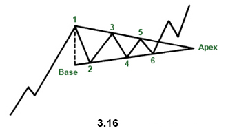
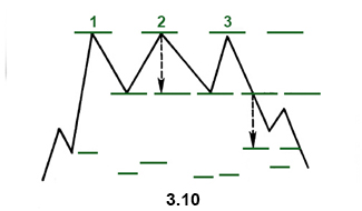
Symmetrical triangle: The symmetrical triangle, also called coil, shows two converging trendlines, with the lower line ascending and the upper line descending. The dotted line at the left measures the height of the pattern and is called the base. The point where two lines intersect is called the apex.
Because of these features, symmetrical triangle is also called a coil. The essential requirements for the formation of this triangle pattern are 4 reversal points (points 1, 2, 3, 4). Thus, while drawing the converging trendlines, each line must be touched at least twice.
A symmetrical triangle is usually referred to as a period of consolidation before the price breaks out the trendlines. If the break is above the upper trendline this signals the beginning of an upward movement. On the other hand, a break below the lower trendline signals the beginning of a downward trend.
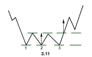
Ascending triangle: As we already mentioned ascending triangle is a bullish pattern which indicates that the price of the security will go higher upon the completion.
The pattern is formed by two trendlines: a flat or a horizontal line and a rising lower line. The price of the security moves between these two trendlines until it breaks out to the upside. The breaking of the upper line indicates the completion of the base and signals a bullish trend.
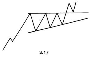
Though the ascending triangle usually appears in an uptrend and is considered a continuation pattern, sometimes it may appear in a downtrend. Therefore it is not unexpected to see an ascending pattern to develop at the end of a downtrend.
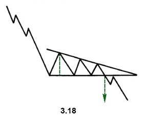
Descending Triangle: Descending triangle is a bearish pattern and is generally considered the opposite of the ascending pattern. It is formed by a declining upper line and a flat bottom line.
Here again, though it is a continuation pattern and is found in a downtrend, sometimes the descending triangle can be found in an uptrend. The downside signal is made when the price breaks out the lower trendline and shows the continuation of downside trend.
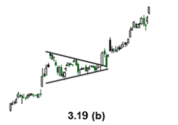
Flags and Pennants: The formations of the flag and pennant patterns are quite common and since they are very similar in appearance they are treated together. They represent brief pauses in the dynamic market move. What is required for flags and pennants to be formed is a sharp and straight line move followed by a brief pause in the trend.

The flag pattern looks like a rectangle which is formed by two parallel trendlines one of them acting as support and the other resistance (see figure 3.19a)
The pennant is constructed by two converging trendlines and looks like a small horizontal symmetrical triangle (see figure 3.19b). Both patterns are short term; in downtrend they tend to take less time to develop and may last maximum two weeks.
The Wedge: The wedge signals a reverse of the trend which is formed within the wedge. It is similar to a symmetrical triangle and consists of two trendlines (support and resistance). It is, however, a longer-term pattern and usually lasts till six months.
There are two types of wedges-falling and rising. A falling wedge slopes downward against the prevailing trend, while a rising wedge slants upward. In other words, a rising wedge is bearish, and a falling wedge is bullish.
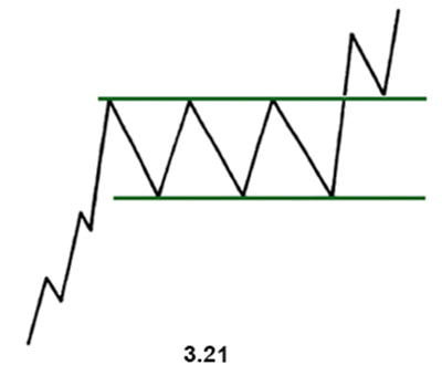
The Rectangle Pattern: The rectangle pattern represents a pause in the trend during which prices move sideways between two parallel lines. It is sometimes considered a consolidation zone or a congestion area.
By its forecasting value it is similar to the symmetrical triangle but with flat trendlines instead of converging trendlines.
There are two types of rectangle patterns— bullish and bearish. Bullish rectangle (see figure 3.21) is usually formed in an uptrend and signals trend’s upward direction. Bearish rectangle is formed in a downtrend and signals trend’s downward direction.
3.4. The Importance of Volume
Volume shows the number of stocks or contracts that trade over a particular time. Higher volume indicates higher degree of intensity or pressure. Being one of the most important factors in trade it is always analyzed and estimated by chartists. In order to determine the upward or downward movement of the volume, they look at the volume bars usually presented at the bottom of the chart. These bars show the quantity of stocks being traded within a certain period.
Volume plays a very important role in technical analysis since it is used to confirm trends and chart patterns. Any price movement is of more significance if accompanied by a relatively high volume than if accompanied by a weak volume. Thus, while considering a large price movement it is also important to examine the volume.
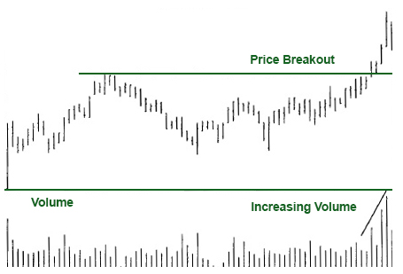
Figure 3.22
Volume and Trend
Volume should correspond to the trend. If the trend is upward and prices are moving up, volume should increase, and conversely, in a downtrend volume should decrease. By viewing the trend and volume together, technicians use two different tools to measure the pressure. If prices are trending higher, it becomes obvious that there is more buying than selling pressure. Technicians think that volume precedes price, which means that the loss of downside pressure in a downtrend or upside pressure in an uptrend show up in the volume figures before it is manifested in a reversal of the price trend. Volume is used by technicians to make an idea in the upcoming trend reversals. If the volume starts to decease during an uptrend, it signals that the upward trend is about to end.
Volume and Chart Patterns
Chart patterns, such as flags, triangles, head and shoulders, can be confirmed with volume. In most patterns there are some pivotal points essential for chartists to see what the chart is able to convey. If the volume lacks and does not confirm the pivotal moments on a chart, the importance of the signal formed by the pattern is weakened.
Conclusion
In this chapter we discussed the main types of charts-line, bar, candlestick, point and figure. As well as we covered the most commonly used reversal and continuation patterns which signal important trend reversals or trend continuation. There are other technical analysis tools which help to identify the trend. Let's look at this type of tools in our next chapter.