Chapter 9: Additional Web Page Creation
Software
If you’re skittish of what TE and TH create and MetaWebs
just isn’t in your budget, here are a few other options. These tools
don’t break the search engines’ SEO rules as long as you use them
right.
In a larger sense, this advice applies to most any content
creation tool. You can use those tools in an honest and ethical
way—which is what we recommend—to create very interesting and
compelling content, or you can use them in an unethical way to lure
users to a site that turns out to be not what they thought it was.
Even though the latter approach will draw more traffic, we
don’t recommend it. And not just because it’s wrong, either. Think
about it: if you went to a site and it wasn’t what it had claimed to be,
you’d suspect the site owner cheated the search engines. And then
you wouldn’t stick around long enough to click on any of the ads,
would you?
Nope, neither would we. It’s called “backlash.”
And now, on to the wonderful tools that represent some of
our top picks for compelling keyword-rich content creation.
Download Your Free SEO Software that Literally Shoots
Your Website to Google Page #1 Now!
http://bit.ly/XlK4vm


9.1 Directory Generator
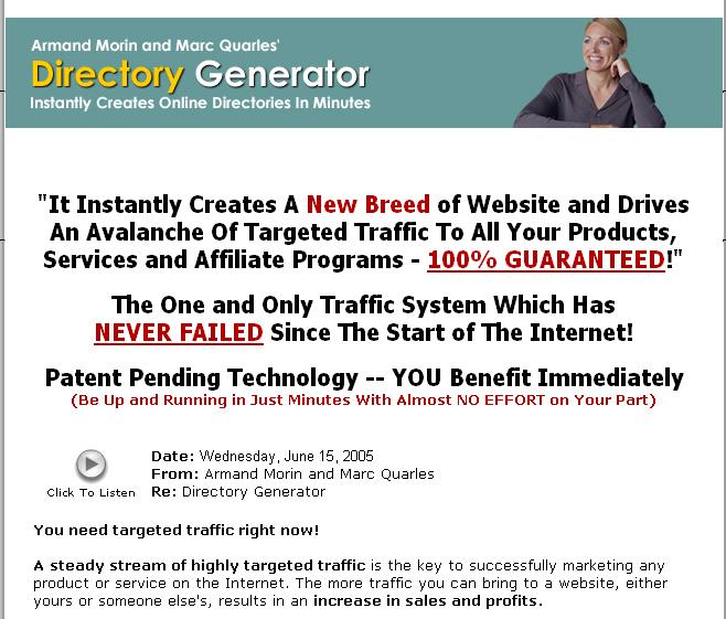
As the name implies, Directory Generator
DirectoryGenerator.com works on directories, also know as portals.
The creator of DG noticed that many of these directories and
Download Your Free SEO Software that Literally Shoots
Your Website to Google Page #1 Now!
http://bit.ly/XlK4vm

portals have been quietly driving thousands upon thousands of
visitors to their own sites on a daily basis year after year.
To appreciate how DG works, you have to know a bit about
directories—there are two types.
1. General Directory - A General Directory contains
listings of just about anything on the planet. It is not
targeted in any way, shape or form.
2. Specific Niche Directory - These directories are
vertical in nature and they focus on just one industry
or topic. Everything on this type of site is about one
topic, so it’s all very relevant.
DG focuses on the specific niche directory. However, it
wasn’t easy. Creating a directory has always been a tough job: time
consuming, complicated, and frustrating. The big online directories
contain thousands of links and resources which can take a live
person thousands of hours to create. If one person did it, it would
take years. But DG’s found a way to automate the process.
Some of their features include:
Photo Shots of Websites - Each resource Directory Generator
creates contains a Photo Shot of the Website itself. This gives
users a preview of the website before you look at it.
RSS Equalizer Integration - This feeds real news content into
your websites.
Download Your Free SEO Software that Literally Shoots
Your Website to Google Page #1 Now!
http://bit.ly/XlK4vm

Amazon.com Integration - Amazon sells thousands of
products and services and you can now integrate these
products into your new Directory Generator sites with a
simple copy and paste mechanism. If you can copy and
paste you can instantly start making extra revenue from
Amazon.
Google AdSense Integration – Since it’s what this book is
about, it’s great that Directory Generator has an easy way for
you to integrate Google's AdSense into your directory.
Google Websearch Integration - Google recently released an
add-on for AdSense that is called Websearch. It allows you
to put a Google search box on your site and get paid for any
AdSense click it creates. Now this feature is in Directory
Generator.
Built In Classified Ads - Making a directory is not enough.
You need to be able to funnel the traffic to where you want.
So the DG people created a way to for you to create Classified
Ads in Directory Generator that let you promote and drive
targeted traffic to any site you want, even if it is an affiliate
program.
Step Creation Wizard – Makes it easy to create DG pages. 8
simple steps, it’s done. Seriously, you can probably complete
Download Your Free SEO Software that Literally Shoots
Your Website to Google Page #1 Now!
http://bit.ly/XlK4vm

the whole process in just a few minutes. Can be done by an
8-year-old.
Pre-Made Templates – OK, so not everyone’s a webmaster
and you don’t have to be one to make money with Google
AdSense and DG with this feature. There are pre-made
templates for you to use. Just select one, fill some stuff in,
you’re done.
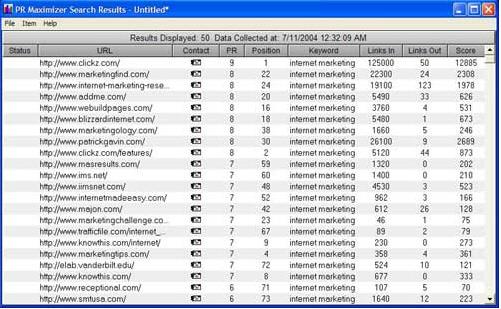
DG also features PR Maximizer, which lets you search and
find relevant and high quality sites for you to exchange links with.
This software does all the work automatically for you, including
telling you the site's PR, PageRank before you even contact them to
talk about trading links.
Download Your Free SEO Software that Literally Shoots
Your Website to Google Page #1 Now!
http://bit.ly/XlK4vm


PR Maximizer’s output looks like this:
9.2 Traffic TurboCharger
Traffic TurboCharger (TTC) www.TrafficTurboCharger.com
advertises itself as a “next generation SEO software” tool. Their
biggest claim is that they optimize RSS feeds. The good things
about having RSS feeds are:
RSS feeds provide dynamically changing content so
that every time the spiders come crawling to you page,
it has new content. They really like that.
Download Your Free SEO Software that Literally Shoots
Your Website to Google Page #1 Now!
http://bit.ly/XlK4vm

RSS feeds give you instant theme-related content.
Google, in particular, really loves this.
RSS feeds provide content that is readable by search
engines because the content is part of your page,
unlike JavaScript feeds which offer no advantage
because the little spiderbots can’t read them.
Your pages get indexed faster, since your content
changes daily, so you get more visits from the
Googlebot. That’s a very good thing.
One of the big advantages of RSS feeds is that you get
content that looks like it’s yours. You don’t have to create it or pay a
writer to write it. Best of all, you won’t get in trouble with the
search engines. Why not? Because RSS feeds are completely
legitimate from the point of view of search engines.
They’re also useful to your visitors, who are looking for
information related to the theme of your site. And with RSS feeds,
your site is constantly updated and fresh, because the feeds update
as soon as new articles or content is added to the source you pull
your content from. With big sources, this can happen every single
hour.
Better yet, RSS feeds are completely automated so you don’t
have to do anything to keep your pages fresh and updated.
Download Your Free SEO Software that Literally Shoots
Your Website to Google Page #1 Now!
http://bit.ly/XlK4vm

Chapter 10: The Eyes Have it—So Where are
They?
When you’re running a website, whoever is surfing it is
staring at the screen…but where? One of the biggest questions for
website designers is, “Where are the user’s eyes looking?” Where
do your eyes go when you read articles on the Web? What do you
notice and what do you miss?
Well, we’ve got some answers for you, because this topic has
been studied. Turns out that the upper left quarter of the screen
gets the most attention, according to the Eyetrack III research of
The Poynter Institute, the Estlow Center for Journalism & New
Media, and Eyetools. But that’s not all. There’s more to it than that.
People’s eyes have some very common behavior patterns. It
probably has to do with our hunter-gatherer ancestry.
First, we do reconnaissance, or “recon” as the military calls
it. Users’ eyes flick over the entire screen at whatever draws their
attention. And what draws it most? Well, the first hot spots are
headlines, photo captions, subheadings, links, menu items and the
logo on the page—doesn’t matter if it’s a good logo or a bad one,
people look at logos.
Then the upper left corner of the screen gets special
attention, probably because that's where people expect to find the
very best stuff. And the right-hand and lower part of the page
almost always gets less attention.
Download Your Free SEO Software that Literally Shoots
Your Website to Google Page #1 Now!
http://bit.ly/XlK4vm

This is info that site developers must know: when you put
your most important, vital content outside that critical upper left
corner, that important content might as well be invisible when
people are making the big decision: whether to stay on your site and
read more or go somewhere else.
Yes, people scan a page quickly. But scanning has a purpose:
it quickly identifies to a user what they really want to read. The
good news is that if you can hook them right off the bat, when they
start actually reading a news story on the Web, they read a larger
proportion than if they were reading that very same story in the
newspaper.
10.1 Frontloading
Frontloading means that you start headlines, paragraphs and
links with the most important words. The first words should
communicate the subject of the headline, paragraph or link. This is
not like writing a novel or a story, where you have time to be coy
and not get to the point for awhile. You’ve got about a quarter of a
second to grab that user’s attention or he won’t read the rest of the
sentence. Make the most of that opportunity.
If you do this, and you frontload your writing, especially at
the top of the page, user’s eyes will easily catch the most important
info, and they’ll keep reading.
Here are some examples of good frontloading:
Foo Fighters release new cd
Barbeque beef ribs recipes everyone will like
Download Your Free SEO Software that Literally Shoots
Your Website to Google Page #1 Now!
http://bit.ly/XlK4vm

Tom Cruise stars in a new movie
Here are some bad examples that are not frontloaded:
New cd is being released, it’s by the Foo Fighters
Everyone will love these great new recipes for barbeque beef
ribs
New movie is coming out and it’ll star Tom Cruise
10.2 Don’t Nest, Just List
Remember back in school when the teacher asked you to
make an outline and you went nuts making all sorts of nested sub-
headings that looked like this?
1. The United States
a. Texas
i. Austin
1. South Austin
a. The 78704 zip code
i. My house
Don’t do that.
Why? Because the last few items could be out of sight for
many people when they skim-read. A straight margin is a whole lot
easier to scan quickly on the Web.
Nested dot-points and numbers are often used in business
and government policy documents and management plans, and
you’re not making those, you’re just writing content. Find another
Download Your Free SEO Software that Literally Shoots
Your Website to Google Page #1 Now!
http://bit.ly/XlK4vm

way to show the hierarchy of ideas. Web users do not like to try to
read through a whole bunch of indentations, and you will lose some
people before they even start reading.
10.3 Put web links where people will see them
If you’re putting web links in, make sure they’re where
people will see them—not in that bottom right-hand Corner of
Death! Yes, people notice links in web content. They’re usually
bright blue and underlined, so people notice them. Many people
even read links before they look at headlines.
Now that you know that, make it easy for them to get to your
links by consistently presenting them in list form or by slamming
them right up against the left-hand margin.
Don't put your links in a sentence or they might end up in
the invisible right-hand area of the content. Yes, this means you
can’t use the old "click here" convention, but for a good reason: it
never worked very well anyway.
Here’s an example of a good way to put in links:
“There are several cool skateboarding sites you might want to check
out. They really rock and they’ve got some great gear you can pick
up for not a lot of bucks.
Skateboard.com
Skatefreak.net
Liv2skat.biz
Download Your Free SEO Software that Literally Shoots
Your Website to Google Page #1 Now!
http://bit.ly/XlK4vm

Here’s an example of a bad way to use links:
If you want to read about the latest in cool tricks, check out
skateboard.com. For the lowdown on which pro skaters are doing
what and dating who, you want to see skatefreak.net. And one of
my very favorite places to read blog is liv2skat.com.
10.4 Never Hide Headers
Remember how I said people look to the upper left? If
you’ve been centering your headlines and subheadings, do you still
think that’s a good idea? Well, it’s not. Yeah, I know newspapers,
magazines and books do it. So do lots of other sites. But that’s just
not where people want to look first.
They’ve tested this. Believe it or not, about 10-20 percent of
people just literally do not see centered headlines, particularly if
they’re in a hurry (and who isn’t these days?) They look in the top
left hand corner of the content. And when they do, they see empty
space, because the centered headline starts off to the right.
So what do they do? Instead of scanning right, they move
their eyes down. And they miss the headlines.
Centered headlines are wasted headlines. If you center them,
you’ve hidden them from 10-20% of your readers. Might as well not
have them at all. And don’t even think about right-justifying them.
Just left-justify them and don’t ever worry about it again!
A word about tables: the ideal table for online is short,
narrow, and only used for data. When a table is too wide or too
Download Your Free SEO Software that Literally Shoots
Your Website to Google Page #1 Now!
http://bit.ly/XlK4vm

long, part of it is out of the reader’s natural field of vision. When
they scan fast, they won’t see all of it.
10.5 Maximize your Click-Throughs with Placement
Yeah, size matters, but so does placement…particularly as far
as Google AdSense ads are concerned. Remember how I said to use
the skyscraper format for ads, putting them in the margins as
opposed to banner ads across the top or bottom?
Well, guess how much difference that can make. Go on,
guess. OK, I’ll tell you. Poorly placed ads, such as banner ads down
at the very bottom of the page, might have a click-through rate of
about 2.3% on a good day.
But well-placed ads, such as a nice skyscraper ad in that
critical upper-left quadrant we talked about, can have a click-
through rate as high as 40%.
And that’s for the same ad. Yes, the very same ad can have a
click-through rate of an abysmal 2.3% or an awesome 40%. It has
nothing to do with the ad itself and everything to do with where you
put it.
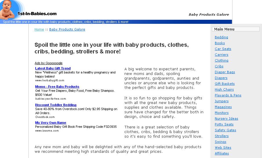
Another neat trick to maximize click-through is to massage
the colors of the ads so that they fit in with the colors of your site.
Ads that are seen as “fitting in” get more clicks than ads that clash.
Download Your Free SEO Software that Literally Shoots
Your Website to Google Page #1 Now!
http://bit.ly/XlK4vm


Here’s an example of some ads that look like part of the site:
Download Your Free SEO Software that Literally Shoots
Your Website to Google Page #1 Now!
http://bit.ly/XlK4vm

Chapter 11: Building a Virtual Content Empire
to Display Ads On
So now you’re ready to build your content-rich empire and
start raking in the bucks, right? Sure you are! You don’t have to be
<


