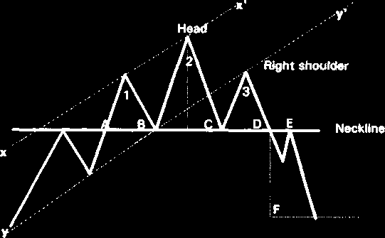
Figure 4.4. Diagram of the bearish market reversal.
Figure 4.5. Diagram of the bullish trend structure: the left side – the major trend with intermediate trends, the bottom part of the left side – minor trends of the encircled secondary trend.
2001 by Royal Forex. All right reserved. www.royalforex.com
25
Percentage measures of price reversals. The price of a foreign currency even on the strongest trends is never moving constantly up or down. Traders watch possible reversals (a change in the
movement direction) at certain points of charts.
There are three following typical points of a possible reversal that can be marked on a chart in
percents against the preceded movements (percentage retrenchments):
1. Along Charles Dow a reversal up traditionally is occurring after the price has passed
down 1/3 (33%), ½ (50%) or 2/3 (66%) of the latest rise up. The reversal after 66%
is considered as a trend correction.
2. Using Fibonacci constants (See Chapter 5) one may wait for a reversal up at the
downtrend points at 0.382 (38%), 0.5 (50%) and 0.618 (62%) of the latest rise up.
3. Along Gann one has to wait for a reversal up after each 1/8 of the latest rise up on
the path down.
4.2. Charts for the technical analysis
Kinds of prices and time units. Charts for the technical analysis are being constructed in coordinates “price (the vertical axis) – time (the horizontal axis)”. The following kinds of currency prices represented on charts are being distinguished on Forex:
• open – a price at the beginning of a trade period (year, month, day, week, hour, minute or a certain amount of one from these units);
• close - a price at the end of a trade period;
• high – the highest from prices observed during a trade period;
• low – the lowest from prices observed during a trade period.
Providing the technical analysis one uses charts for different time units – from 1 year or more
till 1 minute. For instance, the computer program RoyalForex allows to analyze price movements charts for 1 day, 4 hours, 30 minutes, 15 minutes, 5 minutes and 1 minute. The bigger is a time unit
applied for the chart plotting the bigger is a time span to analyze price movements and to determine
the major trend by means of the chart. For the short trading charts for less time units are more
suitable.
Line chart. The line chart is plotted connecting single prices for a selected time period. The most popular line chart is the daily chart. Although any point in the day can be plotted, most traders focus on the closing price, which they perceive as the most important. (See Figure 4.6). But an immediate problem with the daily line chart is the fact that it is impossible to see the price activity for the balance of the period as well as gaps (See chapter 4.6) – breakups in prices at joints of trade periods. Nevertheless, line charts are easier to visualize. Also, technical analysis goes well beyond chart formation; in order to execute certain models and techniques, line charts are better suited than any of the other charts.
Bar chart. The bar chart consists from separate histograms (See figure 4.7). To plot a histogram in coordinates price – time the points responding to high, low, open and close prices for a time period analyzed should be marked on the one vertical bar. The opening price usually is marked
with a little horizontal line to the left of the bar; and the closing price is marked with a little horizontal line to the right of the bar.
Bar charts have the obvious advantage of displaying the currency range for the period selected.
An advantage of this chart is that, unlike line charts, the bar chart is able to plot price gaps. Hence, it is impossible to see on a bar chart absolutely all price movements during the period.
2001 by Royal Forex. All right reserved. www.royalforex.com
26
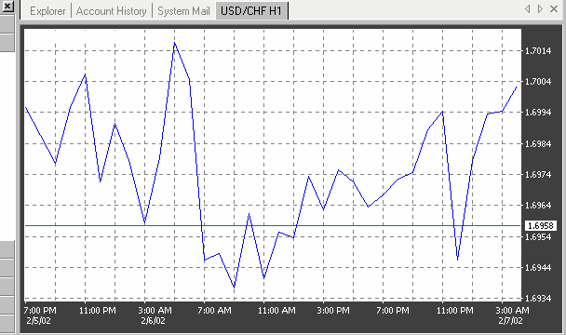
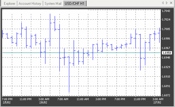
Figure 4.6. Example of a line chart of the Swiss franc.
Figure 4.7. Example of histograms plotted in the Swiss franc chart.
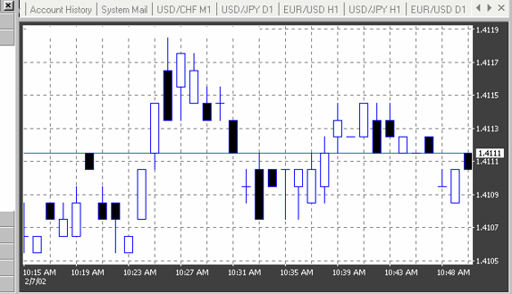
Candlestick chart. The candlestick chart is closely related to the bar chart. It also consists of four major prices: high, low, open, and close (See Figure 4.8). In addition to the common readings, the candlestick chart has a set of particular interpretations. The latter is possible thanks to the convenient visual observation of that chart.
2001 by Royal Forex. All right reserved. www.royalforex.com
27
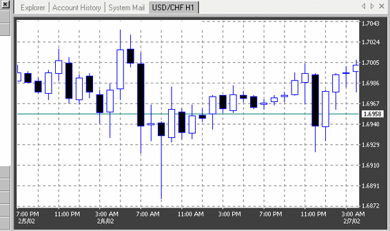
Figure 4.8. Example of a candlesticks plotted in the Swiss franc chart.
The opening and closing prices form the body (jittai) of the candlestick. To indicate that the opening was lower than the closing, the body of the bar is left blank. Current standard electronic displays allow you to keep it blank or select a color of your choice. If the currency closes below its opening, the body is filled. In its original form, the body was colored black, but the electronic displays allow you to keep it filled or to select a color of your choice.
The intraday (or weekly) direction on a candlestick chart can be traced by means of two "shadows": the upper shadow (uwakage) and the lower shadow (shitakage). Just as with a bar chart, the candlestick chart is unable to trace every price movement during a period's activity.
4.3. Lines of trends, support and resistance
The trendline. A trendline is a main initial element for the price chart analysis. While the market moves in any direction not along a straight line but along a zigzag, the mutual placement of upper and bottom points of those zigzags permits to plot a line connecting the significant highs (peaks) or the significant lows (troughs) of an appropriate zigzag using technical tools of the computer program (See Figures 4.1 – 4.3). To draw a trendline only two points are necessary and the third one is the contact point confirmation . On a bullish trend chart it should be drawn using troughs, on a bearish – using peaks. The trendline and a line which is about parallel to it and drawn on the opposite side (through peaks on a dullish trend and through troughs on a bearish) form the trade channel. Both lines are then channel’s borders.
Examples of trade channels are shown on Figures 4.9, 4.10.
2001 by Royal Forex. All right reserved. www.royalforex.com
28
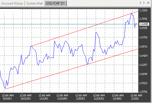
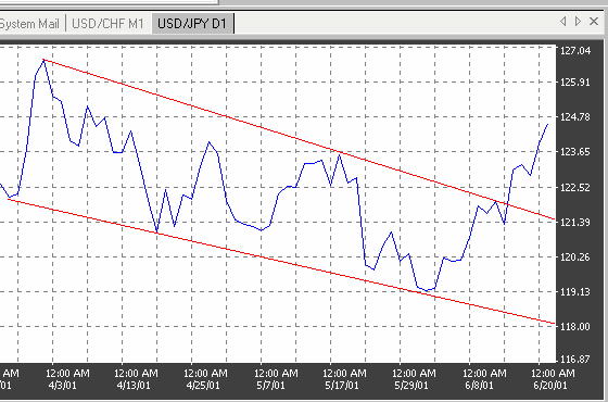
Figure 4.9. Example of a bullish trade channel plotted in the Swiss franc chart.
Lines of support and resistance. The upper and the bottom borders of trade channels are called accordingly support and resistance lines. The peaks represent the price levels at which the selling pressure exceeds the buying pressure. They are known as resistance levels. The troughs, on the other hand, represent the levels at which the selling pressure succumbs to the buying pressure. They are called support levels. In an uptrend, the consecutive support and resistance levels must exceed each other respectively.
The reverse is true in a downtrend. Although minor exceptions are acceptable, these failures should be considered as warning signals for trend changing.
Figure 4.10. Example of a bearish channel and his break plotted in the Japanese yen chart.
The significance of trends is a function of time and volume. The longer the prices bounce off the
support and resistance levels, the more significant the trend becomes. Trading volume is also very
important, especially at the critical support and resistance levels. When the currency bounces off these levels under heavy volume, the significance of the trend increases.
The importance of support and resistance levels goes beyond their original functions. If these
levels are convincingly penetrated, they tend to turn into just the opposite. A firm support level, once it is
2001 by Royal Forex. All right reserved. www.royalforex.com
29
penetrated on heavy volume, will likely turn into a strong resistance level. (See Figure 4.11). Conversely, a strong resistance turns into a firm support after being penetrated. (See Figure 4.2).
In general, to evaluate the reliability (that is the possibility of a break) of the trade channel borders taking a decision to close or to save an existing position one should govern himself with following rules: 1. A channel is the more reliable the longer it exists. Hence, the “solidity” of very old channels (e.g.
existing more than 1 year) decreased sharply.
2. A channel is the more reliable the more is his width (“It takes time to break channel”).
3. The resistance may be broken if it is bounced on the background of a growing volume (“It takes volume to break resistance”).
4. A steep channel is less reliable in compare to a gentle one.
5. The support may be broken independent on the volume (“under own weight”).
Figure 4.11. Example of resistance turned into support in the Pound Sterling chart.
Figure 4. 12. Example of support turned into resistance in the Japanese yen chart.
2001 by Royal Forex. All right reserved. www.royalforex.com
30