The Slideshow on PowerPoint
PowerPoint is the most widely used software that provides all the tools to design professional-looking presentations. PowerPoint is just a powerful tool in your hands nevertheless you will decide how the presentation will look like.
There are a few simple rules that will make your presentation more professional and will enable the audience to concentrate on the messages you want to convey
-
Use bullet points appropriately. Use not more than six words in each one and not more than six bullet points per slide.
-
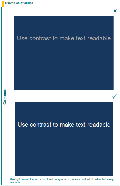
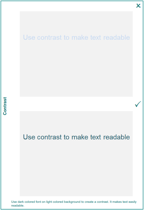
Use dark colored fonts on light colored background or vice versa. Make sure that the contrast is enough to make the text readable.
-
Use automations and timings only if you feel confident that you can handle them.
-
Proof read your slides and check the spelling, the grammar and the syntax.
-
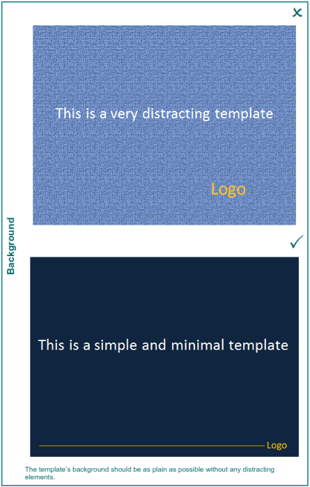
Avoid the use of the pre-designed templates available in PowerPoint. They have been widely used and your audience might have seen them too many times!
-
Avoid the use of distracting elements like flashy transitions, excessive animation and sounds.
-
Do not use all capital letters.
-
Do not clutter the screen with logos and useless design elements. An uncluttered slide makes your visual message stronger. You can add the logo of your company in the corner.
-
Do not move back and forth in your slide presentation. You look disorganized and eventually the audience will not be following.
-
Do not read directly from your slides. The audience can read them too!
-
Do not use more than 2 colors for the fonts on the slides.
-
Use ‘builds’ (lines of text appearing one after the other each time you click the mouse or based on timings), when they support your message.
-
Make sure that ‘builds’ appear one at a time so that you have time to make your point and that they run each time in the same order, for example top to bottom. Do not use any flashy animation.
Numbers, tables and graphs
-
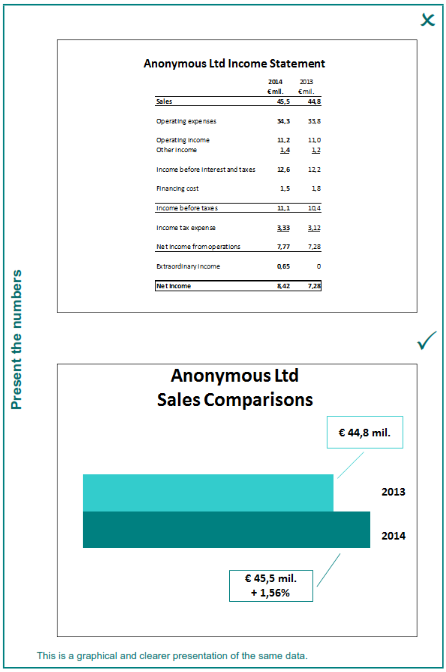
Use tables and graphs to present the most important and relevant information that can be easily understood.
-
Check the colors you use for fonts and graphs. Make sure that are readable on the chosen background. Bright colors are sometimes difficult to read.
-
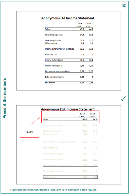
Numbers should support your message but should not be the main focus. It does not make sense to flood the screen with numbers which will be unreadable anyway.
-
Present the summary or the conclusions you draw from numbers, do not present the full details. A slide with a table full of numbers is useless.
-
Do not use complicated diagrams, tables or graphs. They add nothing to the information you want to convey!
Fonts
-
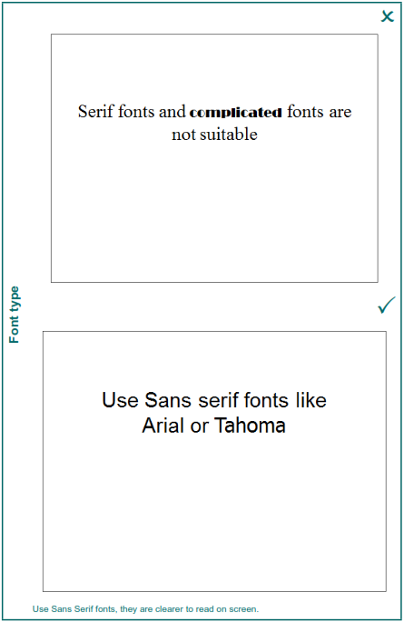
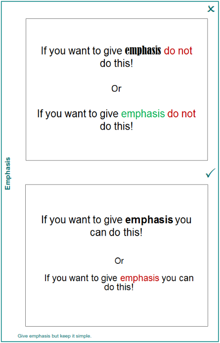
Use a simple Sans Serif font throughout the presentation, using no more than two complementary fonts (for example Arial and Arial Black). You can add emphasis by using bold. Check the appropriateness of italics for your presentation as sometimes they can be difficult to read.
-
Do not use Serif or complicated fonts.
-
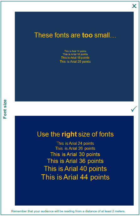
Font size should not be less than 24 points. Make sure that the font size is appropriate so that the text is readable from the back of the presentation room, without being too ‘loud’.
-
Vary the font size for headings and subheadings.
-
Select one of the standard fonts or embed the selected fonts in your presentation. If the fonts you have used are not installed on the presentation PC or laptop, the fonts will be substituted and this might change the appearance of your presentation. The same holds for words written in other languages whose fonts may not be supported on the presentation PC or laptop.