Purpose and Definition
Process performance baselines are established to provide information to the new projects and the organization on performance of processes in terms of central tendency, variation, stability and capability, which helps the new projects and the Organization to manage the current and future Performance quantitatively.
Process-performance baselines are derived by analysing the collected measures to establish a distribution and range of results that characterize the expected performance for selected processes when used on any individual project in the organization.
A documented characterization of process performance, which can include central tendency and variation. They are results achieved by following a process. ( CMMI v1.3 Glossary)
Process Performance Baseline in CMMI Context
-As part of Organizational Process Performance Process Area at Level 4, the specific practice 1.4 expects ,”Analyse process performance and establish process performance baseline”. As the basic underlying principle in CMMI High Maturity is by managing the process performance the project results can be achieved, hence its important to know how good is the performance of process, so that it can be monitored, improved and controlled. Its not necessary to think only at level 4, as needed the practices of level 5 can be used for better results in an organization.
-The Process Performance Baselines are collection of data on multiple measures which could be Business objectives, Quantitative Process and Product objectives , Process Measures, controllable factors and uncontrollable factors coming from internal needs, client needs, process understanding needs, process performance modelling needs, etc. So in normal scenario we don’t stop only with process performance measures in a PPB.
-Process Capability is a range of expected results while using a process, to establish this, we might be using past performance with stability assessment (ex: control chart) , which provides information on how the population of process parameter will result in future, from the sample data. However its not mandatory to have process capability established for all the measures in a baseline, in fact in some cases we might be using unstable processes to establish performance baseline (with a note on uncertainty) to help the projects understand the process behaviour. Hence we don’t call the baselines as Process Capability Baselines (PCB) instead we call them as “ Process Performance Baseline” (PPB). Here we are not referring to Cpk or Cp values, which provides the Capability index of a process by comparing the Specification limits. In Service/project oriented IT organizations, the usage of Capability index is very limited.
Note: Only a stable process, can be considered for checking Capability and achieving the state of Capable Process.
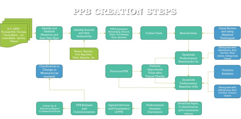
Contents in a Process Performance Baseline
*Objective – To Reflect why it’s needed
*Period – Which period the data for Performance measures reflects
*Scope inclusion and exclusion – From usage point of view, the domain, business, technology covered, etc
*B.O, QPPO Measures in a tabular format with Specification limits, Performance (Central tendency, Dispersion), Confidence Interval within Specification limit (Yes/No), Trend (up/down/no change), data type
*B.O vs QPPO relationship establishment (using regression or other modelling techniques, or simple arithmetic relationship)
*Common Measures from projects which includes Intermediate measures ( End of phase/ activity), Sub process measures, Controllable factors, uncontrollable factors, client given measures, etc
*These measures may have table with data type, Specification limits, Control Limits or Confidence Interval, Stability Indication (as applicable), Trend of performance, Indicator for performance within the specification limits (Yes/No)
*Each of the measures given above can be explained with applicable Histogram, Control chart, Box Plot, Dot Plot, Hypothesis Test, etc and outlier Analysis.
*Measures can also be related to % distribution of any value of interest.
*Management Group and Software Engineering Process Group or its assigned arm, can study the performance and provide Corrective actions , where required to improve the process results.
*The PPB Can have segmentation based on technology, domain, type of business, etc. Hence Every PPB can have reference to the other and any related information.
How Many PPB’s needed
Let’s first discuss what is the frequency of PPBs should be – It depends on the following factors,
*Adequate data generation from processes, which can contribute in determining a statistical characterization and changes in process
*Actionable Period in which changes/improvements can be demonstrated, so that the next PPB is a needful reference point
*Cost/Resource/Time involved in making the PPB
*Considering Business Decisions are taken and Projects’ fixes targets based on PPB, the reference point shouldn’t vary too frequently, as it could unsettle the decisions.
*Too frequent baselines can be impacted by seasonal variations
Considering these either and organization can go with quarterly or half yearly and in rare cases by yearly. As the interval between PPB crosses beyond a year, the Organization would miss the opportunities to study and improve the process and/or ignore time based variations.
How many are good from appraisal point of view from CMMI – Many of us ask this questions to a consultant, the answer is minimum 2 (one PPB to show first reference and second PPB for changed/Improved Processes). However, it’s pretty difficult to achieve improvements in one go and also the purpose of PPB is not for appraisal, hence a minimum of 3 would provide relevant guidance for process teams to improve performance by studying the process performance. More is always welcome, as you are really sure that your system is working fine in terms of quantitative continual improvement.
Benchmarking vs. Performance Baseline
Benchmark – is the peak performance achieved for any measure. It is a comparative study reporting, which involves units/organizations which is part of the Industry. Benchmarking is an activity of collecting, analysing, establishing comparative results in an Industry or within units/products.
Performance Baseline – is a reference point, in which past performance of process is baselined / freezed for reference. It is internal to the unit in which processes are studied. Baselining is an activity of collecting, analysing and establishing statistical characterization of process performance.
Benchmarking may use Baselines as inputs to establish a Benchmark report to compare performances.
Baselines along with Benchmark report may be used to establish goals for its future performance, considering current performance in an unit.
Charts/Techniques to Know for use in PPB:
Histogram
The histogram displays the distribution of the data by summarizing the frequency of data values within each interval (the interval/bin is derived value and it should be typically more than 8). To have more than 20 points to give meaningful interpretation and more than 27 data points to see visual normality check. It helps in understanding the Skewness. Continuous data can be presented in histogram format.
Boxplot
The boxplot displays the center, quartiles, and spread of the data. We can’t use box plot when the data points are less than 8. It’s useful to compare values across group and what is their central and range values. Height of the box and line indicates, how much the data spread across. The boxes represent the 26th percentile to 50th percentile (Quartile 2) and 51st percentile to 75th percentile
Dot Plot
The individual value (Dot) plot shows the distribution of the data by displaying a symbol for each data point. The smaller the data points, it’s easier interpret and see the spreads and peak. The Dot plots are useful to compare multiple group/category data, where if we don’t find the spreads are overlapping which means the hypothesis test may fail, which warrants for separate performance analysis for each group.
Pareto Chart
The Pareto chart is a specialized bar chart that shows occurrences arranged in order of decreasing frequency. Minimum of 8 category/bins are required when we plot in Pareto chart. Typically 80% of occurrences could happen by 20% of categories, however it need not be exactly the same ratio, and it could be anywhere nearer to the same. Less occurrence categories can be combined.
Hypothesis Testing:
Hypothesis testing refers to the process of choosing between competing hypotheses about a probability distribution, based on observed data from the distribution. Hypothesis Testing is the key part of inferential statistics, which helps in understanding any given data is part of same population of where the standard/another sample/set of sample belongs. By knowing the confidence intervals of given samples and their overlapping values also the quick conclusion about failure of hypothesis test can be understood. The hypothesis testing is also known as significant testing. Hypothesis test can reject or not to reject hypothesis, but it’s not about accepting a Hypothesis. The basics of Hypothesis are there is no difference in sample data vs standard or another sample data, and all of them part of same population. When a hypothesis fails mean that the sample is different from the reference. So based on Normality, the parametric and non-parametric tests can be selected.
I-MR Chart:
The I-MR chart monitors the mean and the variation of a process.
*Data to plotted in time sequence
*Time Intervals to be maintained
*Minimum of 27 data points necessary to determine the preliminary control limits. If more than 100 data point then you can be more confident on the control limits. Minimum availability of 27 data points helps to find distribution of data.
*When data is slightly skewed also the I-MR control chart can be used.
*Check MR chart before checking the I chart, as this will let us understand process variation and if it’s not meeting the stability rules then I chart may not valid to look.
X bar-R Chart
The X bar-R chart monitors the mean and the variation of a process.
*Data plotted in Time Sequence
*Each Sub group to have same number of data points and it shouldn’t vary.
*Use this chart when less than 10 points are there in each sub group.
*Data within Sub Group should be normal, as the chart is sensitive to non-normal data
Variation for Data across sub group to be checked before plotting.
*Check the Range chart before using X bar chart, as the range should be in control before interpreting the X bar Chart.
*Perform Western Electric rule based stability tests, which depicts out of control points of special causes and shift/Trend indicators
*Wide variations can be because of stratified data
X bar-S Chart
The X bar-S chart monitors the mean and the variation of a process.
*Data plotted in Time Sequence
*Each Sub group to have same number of data points and it shouldn’t vary. The Conditions of Data Collection also should be similar for each sub group.
*Use this chart when more than or equal to 10 points are in each sub group
*Data need not be following normal distribution as the tests show less variation.
*Check the Standard Deviation chart before using X bar chart, as the range should be in control before interpreting the X bar Chart.
*Perform Western Electric rule based stability tests, which depicts out of control points of special causes and shift/Trend indicators
The P, nP chart and U, C chart are not explained here in this book.
Confidence Level and Confidence Interval:
Confidence Interval:
A confidence interval gives an estimated range of values which is likely to include an unknown population parameter, the estimated range being calculated from a given set of sample data.
If independent samples are taken repeatedly from the same population, and a confidence interval calculated for each sample, then a certain percentage (confidence level) of the intervals will include the unknown population parameter. Confidence intervals are usually calculated so that this percentage is 95%, but we can produce 90%, 99%, 99.9% (or whatever) confidence intervals for the unknown parameter.
Confidence Level:
The confidence level is the probability value (1-alpha) associated with a confidence interval.
It is often expressed as a percentage. For example, say alpha=0.05, then the confidence level is equal to (1-0.05) = 0.95, i.e. a 95% confidence level.
When we use confidence intervals to estimate a population parameter range, we can also estimate just how accurate our estimate is. The likelihood that our confidence interval will contain the population parameter is called the confidence level. For example, how confident are we that our confidence interval of 32.7 to 38.1 hrs of TAT contains the mean TAT of our population? If this range of TAT was calculated with a 95% confidence level, we could say that we are 95% confident that the mean TAT of our population is between 32.7 to 38.1 hrs . Remember if we can’t take the values from a sample, to population then we don’t need statistics and there is a huge risk of using sample data.
In other words, if we take 100 different samples from the population and calculated their confidence interval for mean, out of that 95 times the population means would lie within those confidence Intervals and 5 times not.
The Confidence interval increases in range when the sample size is less and variation in data is more. Also if the confidence level is more, the confidence interval increases in order to ensure that the estimate of population parameter lies within the range is maintained with relevant probability.
Flow of Statistical Analysis in PPB for X’s and Y’s:
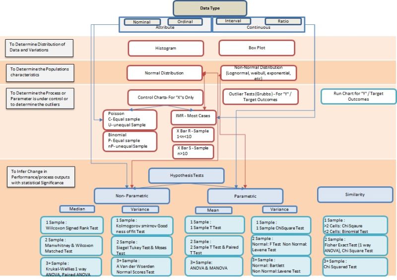
Step 1: Know the Data Type
Data Type determines the entire selection of statistical tools for characterization and inferential purpose. Hence list down the data type for all the measures to be presented in PPB. For Example : Continuous data type is best suited with Histogram to understand the characteristics of distribution and central values.
Step 2: Understand the Data spread and central Values
The characterization of any measure is described with the Spread (range, variance, Std. Deviation) and Central Values (Mean, Median, and Mode). Typically for Attribute data the box plot is well suited by describing the Median and Quartile Ranges and for Continuous data the Histogram (graphical distribution function- if we use minitab) is the better option to show the mean, standard deviation, confidence interval, etc.
Step 3: Determine Population Characteristics by shape (Normality or not)
The distribution shape of data plays a key role in describing the measure statistically and its useful in simulation conditions and in further analysis of data (inferential Statistics). Hence check the normality of the data and when the P value is less than 0.05 (when 95% confidence is selected) then the data distribution shape matches with standard normal distribution shape to a very less extent, which means if we decide that the shape is Normal Distribution, then it could be a wrong choice or error. Hence we will find other distributions when a P value is less than 0.05 in Normality test. A tool like minitab has distribution identification function, where it compares multiple standard shapes with the given data and gives us the P value and where the P value is higher, we select that distribution to characterize the data. In addition the higher the Anderson Darling value the better the selection is.
Step 4: Determine the Process/parameter is in Control
Here is the difference between a study on X factor (process outcome/influencing factor – controllable, influencing factor – uncontrollable) and Y factor ( QPPO, BO, etc). The controllable X factors are typically plotted with control charts and uncontrollable factors of X and Y factor is plotted with Run Chart. The question comes then how do we identify outliers for uncontrollable X and Y factor, then you can use Grubbs outlier test. Many a times, people tend to use control charts for all measures to identify the outliers, which is a wrong practice as the purpose of control chart is to find process are in control by understanding is there any special causes to address.
For most cases in IT Industry we use I MR chart, even when the distribution is not exactly normal. This is considering the Process outcome frequency is higher and each of the process outcomes has its unique condition also. Hence I MR is accepted in many conditions in IT Industry. Whereas X bar R or X bar S is very useful when we have huge data for analysis. For example, when we are analyzing Incidents reported in a Application Maintenance Engagement the volume of incidents can be huge based on number of applications taken care by the center, then X bar R or X bar S charts are really helpful to do analysis. In addition we have the Binomial charts (P and nP) and Poisson charts ( C and U ) whereas the first set is useful for defective type of data (attribute) and second set is for Defects type of data(attribute). However somehow I MR charts has taken precedence in statistics as the error margin/false alarms or not that alarming when used in other type of data also.
The control limits are arrived as trial limits when its less than 27 data points, after that when you have greater than 27 data points the natural limits are derived. The control limits are continued from previous PPB as it is without revising it, unless there is many violations of stability rules and many outliers are visible. When it’s not, the control limits are extended and the new data is plotted with the same old control limits. When the outliers are seen more and stability fails, we need to perform hypothesis test to prove that the performance of this PPB is different from the past. If the hypothesis test fails, then using staging method or as separate control chart with new limits the control charts are plotted. Also when the causes for change are not planned one, then root cause analysis is warranted. For the Y factors its expected to see the number of data in a single run (up or down) and understand the extreme point and indication of improvement.
While identifying natural control limits in the first instance, we may eliminate the outlier points which has specific reason and can be arrested with corrective actions. In such cases, the control limits are recomputed without the eliminated data points. However when there is no special reason and stability issues noted, the points should not be eliminated and control limits to be announced with a caution note, that the process is unstable.
Step 5: To infer change in Performance or Conformance to standards – Hypothesis Test
To perform hypothesis test the data type is an important factor. Typically the attribute data will have to go with Non Parametric Tests and similarly non normal data from continuous data type also has to select Non parametric tests. If we are trying to see the conformance to exiting standard value/target value then we will take 1 Sample Tests and if we are trying to see if the data characteristics are same or change in performance for 2 samples taken either from different period of same process/parameter or two sets of data categorized in the same period then we take 2 sample Tests. If its more than 2 samples then we take 3+ samples test. In addition if we are trying to understand that performance results of different categories or stratification are the same or different, then we may ANOVA test and Chi Square Test.
First we need to select the test of Parametric and Non Parametric then we should always do the variance tests first and then perform the Mean or Median tests. When the P value is less than 0.05 which indicates the samples are not from same population or the sample and the target value may not be part of same population. This indicates there is high chance of error, if we decide that they are from same population.
Before coming into Hypothesis test, it’s expected that we plot relevant charts (ex: Box plot) and see visual difference then if it warrants go for hypothesis tests.
Step 6: Analyze the data and document Actions
Understand the results and document the characteristics and see if there any change in performance is observed. Under extreme outliers or abnormal behavior or change in performance, it’s expected to document relevant actions. Some points to consider,
*When High Variations and many peaks found in data, perform segmentation and Analyze.
*All segmentation and stratification to be verified with Hypothesis Test to ensure their need.
*Don’t remove more than 10% of outliers and don’t remove outliers more than one time.
*When Statistical distributions doesn’t fit your data, which means you have to remove the noise and do gauge R&R. However in extreme cases, use the nearest possible visual distributions.
*Triangular distributions can be used only at the initial stages and/or when the data is uncontrollable and external in nature.
*Control limits are typically formed with 3sigma limits, however if the organization wants to be sensitive to changes they may chose 90% data ie, 1.65 Sigma limits.
*Don’t re-compute control limits with shorter span of time, though there are outliers observed. The Time span should be largr than the process execution time for a minimum of one cycle and should consider the seasonal variation (day/week/month). Hence large number of data point alone is insufficient to re-baseline control limits, as the centering error plays a role.
*Document all actions and get approval from SEPG and relevant groups. Similarly communicate to relevant stakeholders in the organization on the performance of process and parameters of Interest.
Consolidated Presentation of Metrics Data in Baseline:
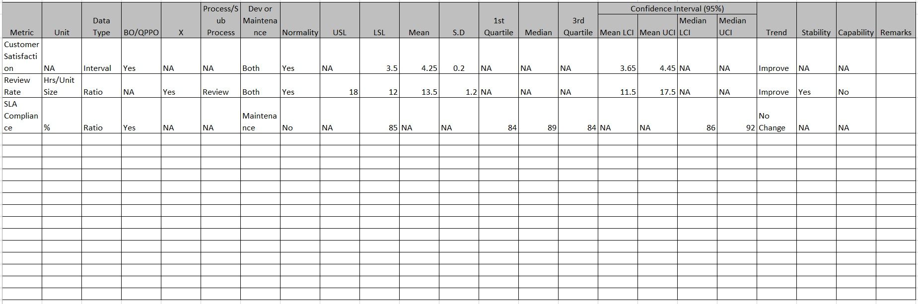
PPB Sample Analysis:
Considering we have Defect Density and SLA Compliance as QPPOs (Y factor) and Few X factors like Review Rate, etc the following could be the sample charts to be part of PPB.
Defect Density (QPPO – Y):
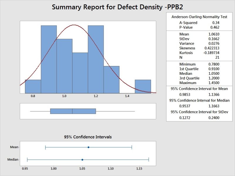
Histogram Depicts the Spread and Central Tendency of Defect Density, along with confidence Intervals. P value refers to Normal Distribution.
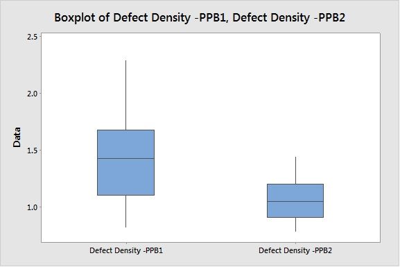
Box Plot helps to compare the current PPB2 with previous PPB1 for change in performance.
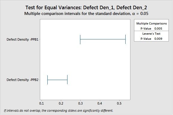
Levene’s Test concludes the variation is statistically significant in terms of variation.
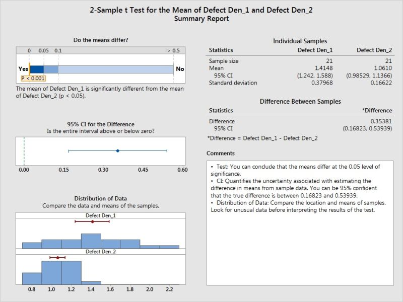
2 Sample T Test confirms even the mean has difference which is statistically significant.
SLA Compliance (QPPO - Y):
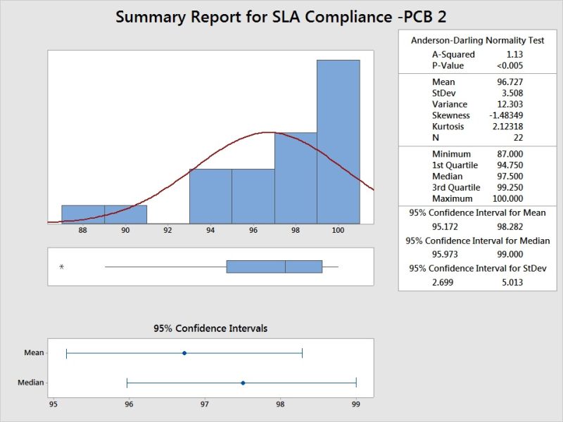
Histogram shows the spread and central tendency, also the data is left skewed. P value indicates its not normal distribution.
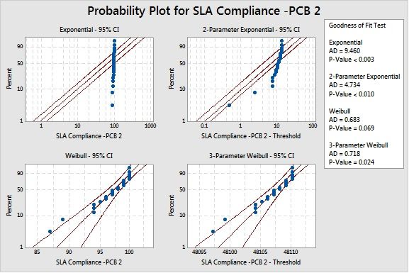
Distribution Identification shows the P value is high for Weibull distribution and AD value is acceptable.
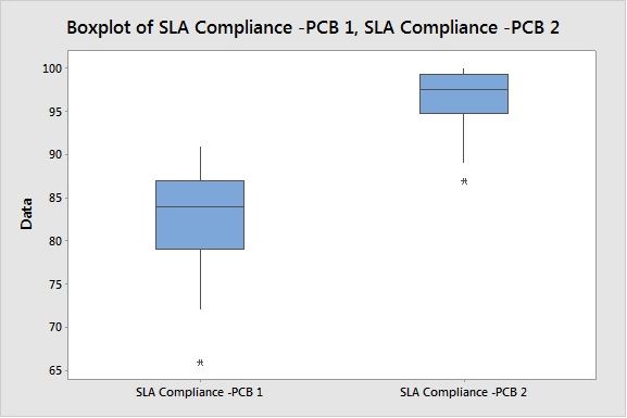
Visible Performance Difference in Box Plot for current Period and Previous Period.
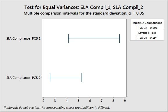
No difference in variance as per Levene’s Test (used for non-parametric conditions also, considering it can tolerate certain level of distribution variation)
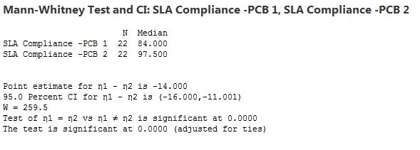
Mann-Whitney 2 sample Non Parametric test concludes the sample have different central tendency based on median test.
Review Rate (Review Sub Process Measure – X factor) :
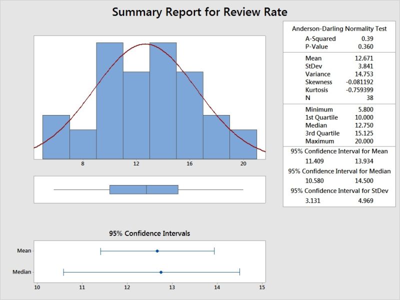
Histogram shows the distribution, Spread and Central Tendency. Greater than 0.05 P value indicates its normal distribution. (Not all software unlike minitab may show this value, and you may need to conduct separate normality test)
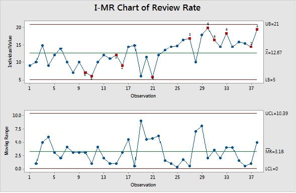
Control Chart shows many points as outlier against stability check rules and there is an upward trend visible.
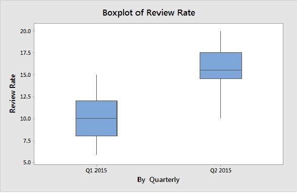
Visible Performance difference in Quarter 2 of 2015 in review rate, using Box Plot.
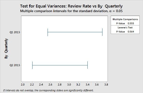
No Significant difference in Variance.
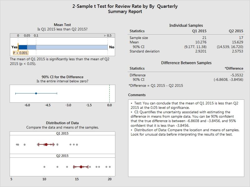
Mean of Review Rate in Q2 is different than of Q1 with statistical significance is proved using 2 sample T Test.
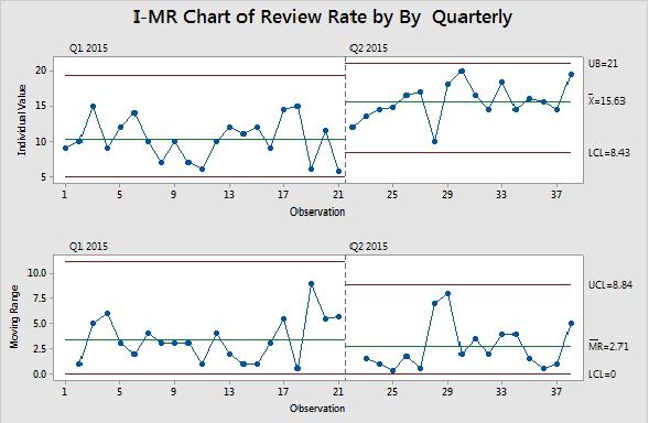
Staged Control chart with new Control limits for Q2 period data is plotted in control chart.
Dot Plot Usage Sample:
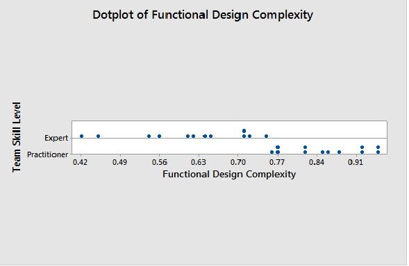
Sample Dot Plot for Skill based Performance in Functional Design Complexity explains there high increase in complexity based on Skill.
Remember not to use Control charts for plotting Y’s.
What We Covered:
Organizational Process Performance
SP1.4 Analyze Process Performance and Establish Process Performance Baselines