Chapter 15 Advanced Elements
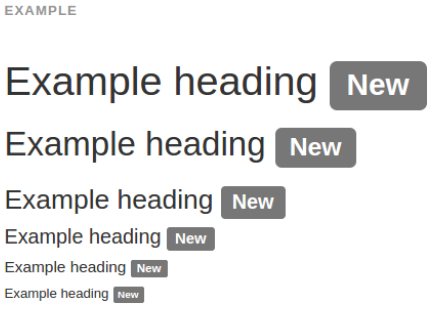
15.1 Labels
Example

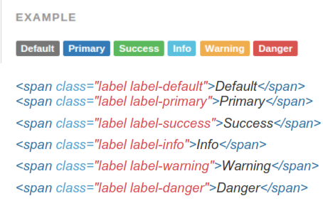
15.1.1 Available Variations
Add any of the below mentioned modifier classes to change the appearance of a label.
Have tons of labels?
 Rendering problems can arise when you have dozens of inline labels within a narrow container, each containing its own inline-block element tlike an icon).
The way around this is setting display: inline-block;
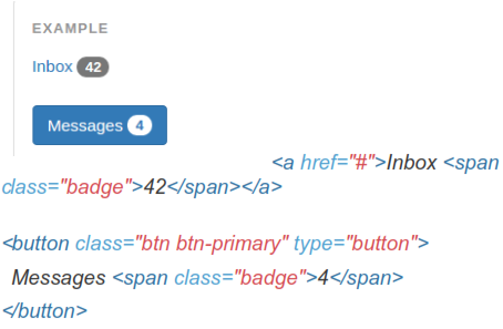
15.2 Badges
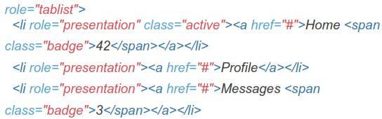
Easily highlight new or unread items by adding a <span class="badge"> to links, Bootstrap navs, and more.
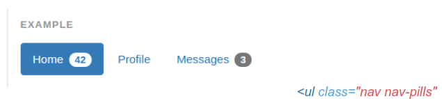
15.2.1 Adapts to Active Nav States
Built-in styles are included for placing badges in active states in pill navigations.

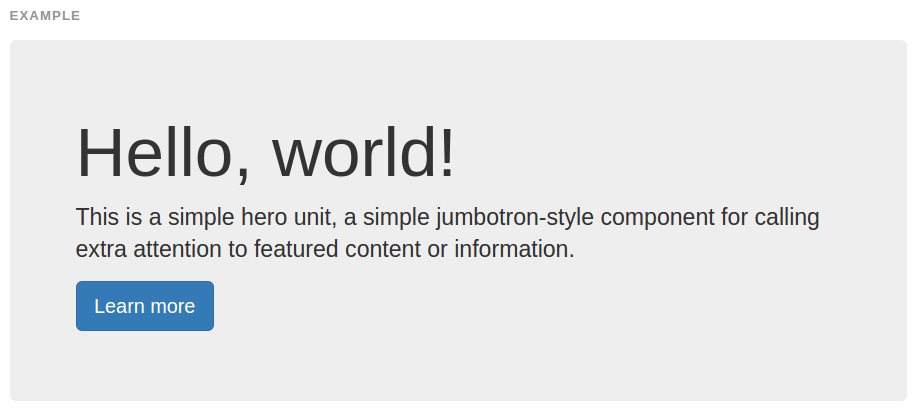
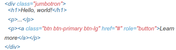
15.3 Jumbotron
A lightweight, flexible component that can optionally extend the entire viewport to showcase key content on your site.
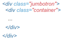
To make the jumbotron full width, and without rounded corners, place it outside all .container and instead add a .container within.
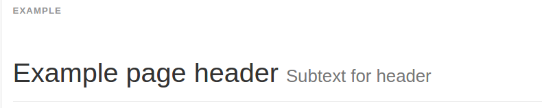
15.4 Page Header
A simple shell for an h1 to appropriately space out and segment sections of content on a page. It can utilize the h1's default small element, as well as most other components twith additional styles).
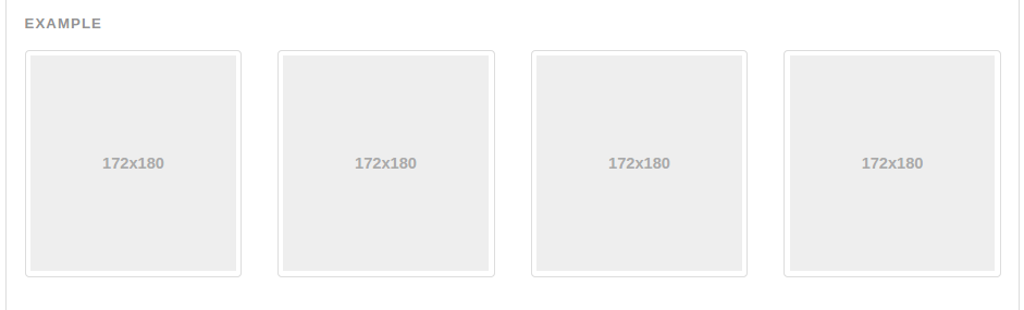
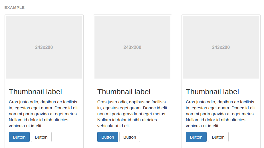
15.5 Thumbnails
Extend Bootstrap's grid system with the thumbnail component to easily display grids of images, videos, text, and more.
If you're looking for Pinterest-like presentation of thumbnails of varying heights andfor widths, you'll need to use a third-party plugin such as Masonry, Isotope, or Salvattore.
15.5.1 Default Thumbnails
By default, Bootstrap's thumbnails are designed to showcase linked images with minimal required markup.
15.5.2 Custom Content
With a bit of extra mark-up, it's possible to add any kind of HTML content like headings, paragraphs, or buttons into thumbnails.
15.6 Alerts
Provide contextual feedback messages for typical user actions with the handful of available and flexible alert messages.
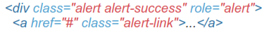
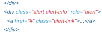
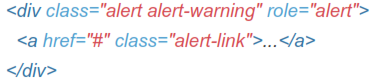
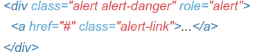
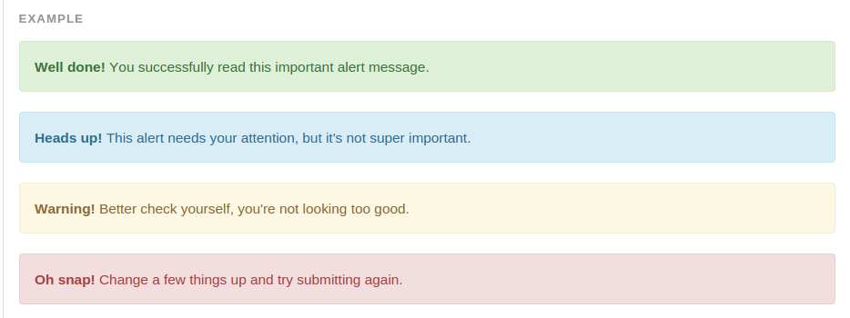
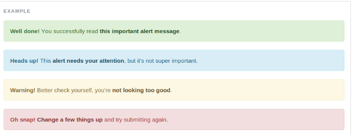
Example
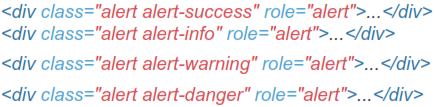
Wrap any text and an optional dismiss button in .alert and one of the four contextual classes te.g., .alert-success) for basic alert messages.
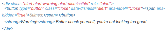
15.6.1 Dismissable Alert
Build on any alert by adding an optional .alert-dismissible and close button.
Ensure prOper behaviOr acrOss all devices
Be sure tO use the <buttOn> element with the data-dismiss="alert" data attribute.
15.6.2 Links In Alerts
Use the .alert-link utility class to quickly provide matching colored links within any alert.