Plotting basics.
A picture is worth a thousand words, particularly visual representation of data in engineering is very useful. MATLAB has powerful graphics tools and there is a very helpful section devoted to graphics in MATLAB Help: Graphics. Students are encouraged to study that section; what follows is a brief summary of the main plotting features.
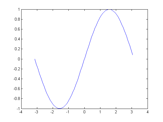
plot Statement Probably the most common method for creating a plot is by issuing plot(x, y) statement where function y is plotted against x.
Type in the following statement at the MATLAB prompt:
x=[-pi:.1:pi]; y=sin(x); plot(x,y);
After we executed the statement above, a plot named Figure1 is generated:
Having variables assigned in the Workspace, x and y=sin(x) in our case, we can also select x and y, and right click on the selected variables. This opens a menu from which we choose plot(x,y). See the figure below.

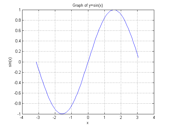
Graphs without labels are incomplete and labeling elements such as plot title, labels for x and y axes, and legend should be included. Using up arrow, recall the statement above and add the annotation commands as shown below.
x=[-pi:.1:pi];y=sin(x);plot(x,y);title('Graph of y=sin(x)');xlabel('x');ylabel('sin(x)');grid onRun the file and compare your result with the first one.
Type in the following at the MATLAB prompt and learn additional commands to annotate plots:
help gtext
help legend
help zlabel
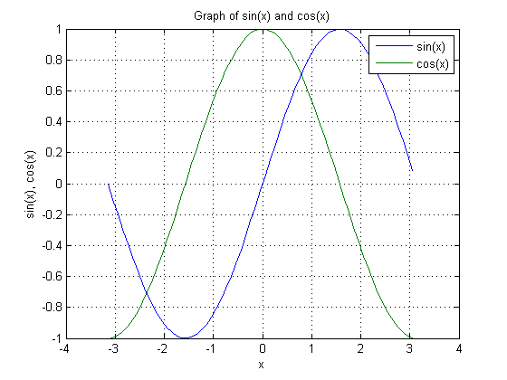
If you want to merge data from two graphs, rather than create a new graph from scratch, you can superimpose the two using a simple trick:
% This script generates sin(x) and cos(x) plot on the same graph
% initialize variables
x=[-pi:.1:pi];      %create a row vector from -pi to +pi with .1 increments
y0=sin(x);          %calculate sine value for each x
y1=cos(x);          %calculate cosine value for each x
% Plot sin(x) and cos(x) on the same graph
plot(x,y0,x,y1);
title('Graph of sin(x) and cos(x)'); %Title of graph
xlabel('x');                %Label of x axis
ylabel('sin(x), cos(x)');   %Label of y axis
legend('sin(x)','cos(x)');  %Insert legend in the same order as y0 and y1 calculated
grid on                     %Graph grid is turned
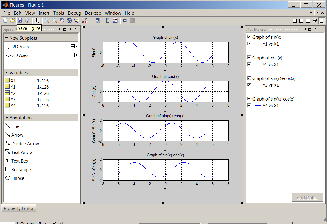
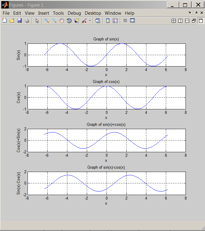
Multiple plots in a single figure can be generated with subplot in the Command Window. However, this time we will use the built-in Plot Tools. Before we initialize that tool set, let us create the necessary variables using the following script:
% This script generates sin(x) and cos(x) variables
clc                 %Clears command window
clear all           %Clears the variable space
close all           %Closes all figures
X1=[-2*pi:.1:2*pi];  %Creates a row vector from -2*pi to 2*pi with .1 increments
Y1=sin(X1);          %Calculates sine value for each x
Y2=cos(X1);          %Calculates cosine value for each x
Y3=Y1+Y2;            %Calculates sin(x)+cos(x)
Y4=Y1-Y2;            %Calculates sin(x)-cos(x)
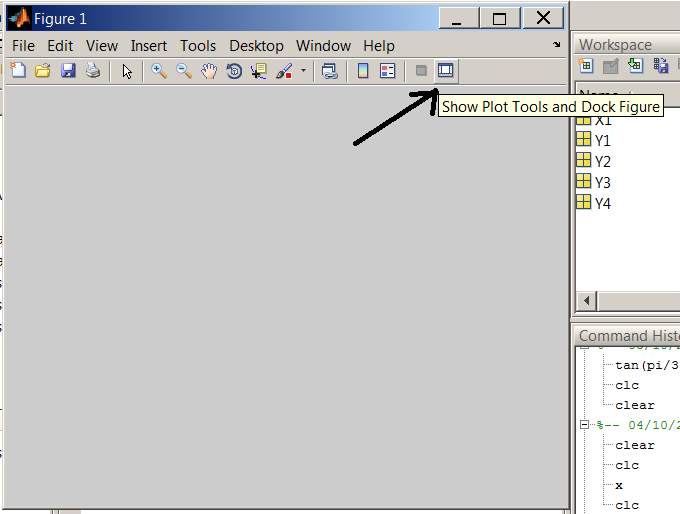
Note that the above script clears the command window and variable workspace. It also closes any open Figures. After running the script, we will have X1, Y1, Y2, Y3 and Y4 loaded in the workspace. Next, select File > New > Figure, a new Figure window will open. Click "Show Plot Tools and Dock Figure" on the tool bar.
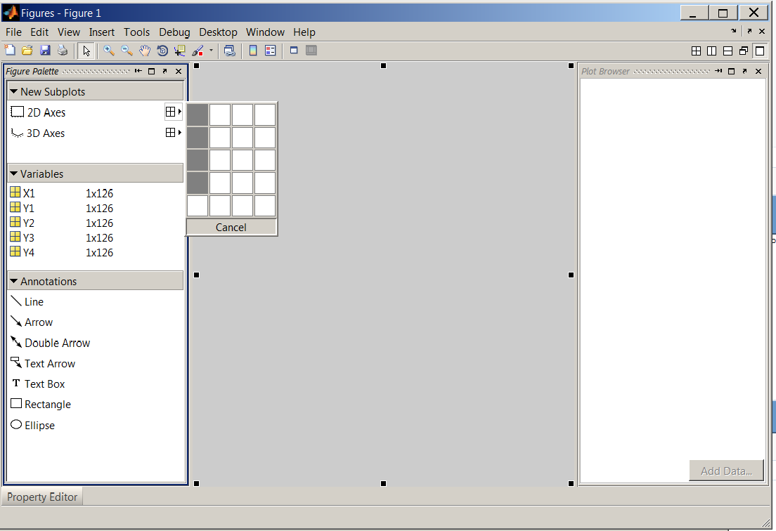
Under New Subplots > 2D Axes, select four vertical boxes that will create four subplots in one figure. Also notice, the five variables we created earlier are listed under Variables.
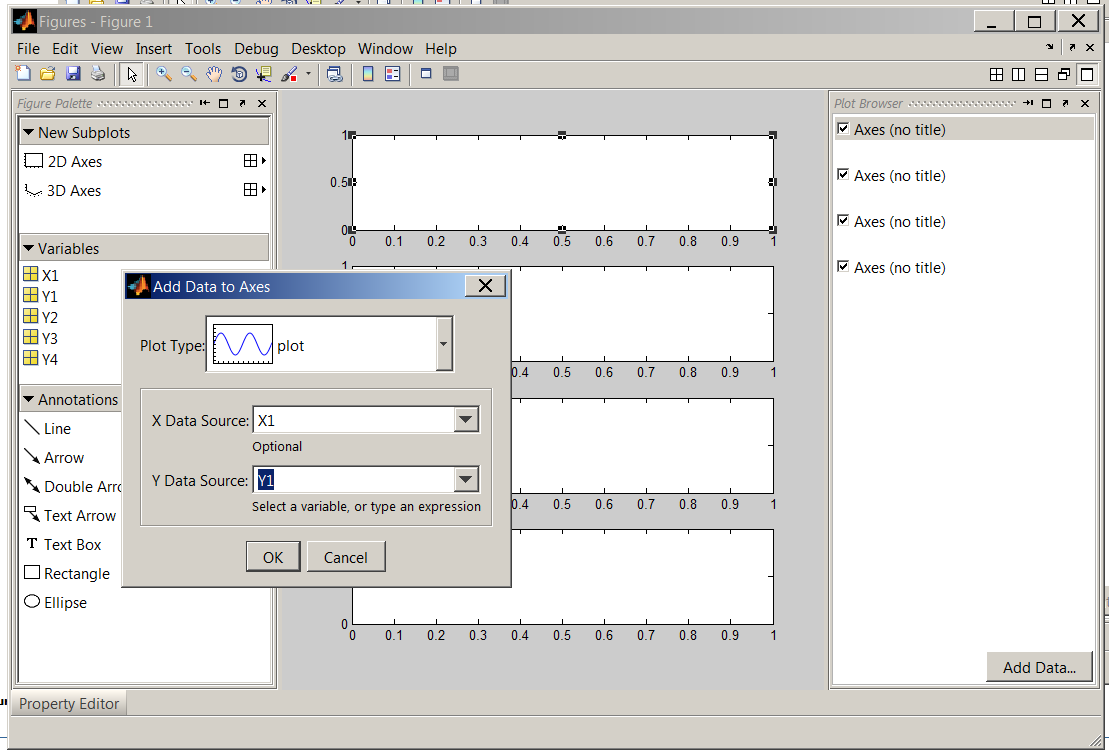
After the subplots have been created, select the first supblot and click on "Add Data". In the dialog box, set X Data Source to X1 and Y Data Source to Y1. Repeat this step for the remaining subplots paying attention to Y Data Source (Y2, Y3 and Y4 need to be selected in the subsequent steps while X1 is always the X Data Source).
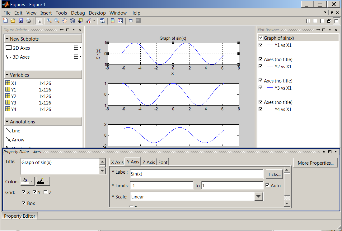
Next, select the first item in "Plot Browser" and activate the "Property Editor". Fill out the fields as shown in the figure below. Repeat this step for all subplots.
Save the figure as sinxcosx.fig in the current directory.
3D plots can be generated from the Command Window as well as by GUI alternatives. This time, we will go back to the Command Window.
plot3 Statement With the X1,Y1,Y2 and Y2 variables still in the workspace, type in plot3(X1,Y1,Y2) at the MATLAB prompt. A figure will be generated, click "Show Plot Tools and Dock Figure".
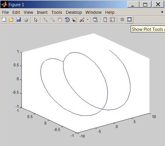
plot3.
Use the property editor to make the following changes.
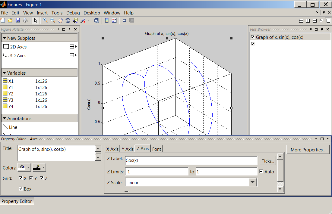
The final result should look like this:
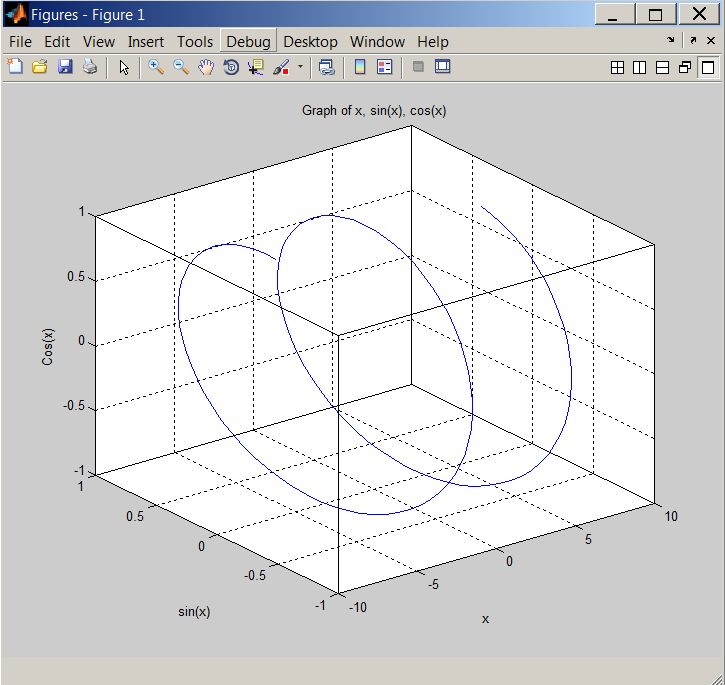
Use help or doc commands to learn more about 3D plots, for example, image(x), surf(x) and mesh(x).
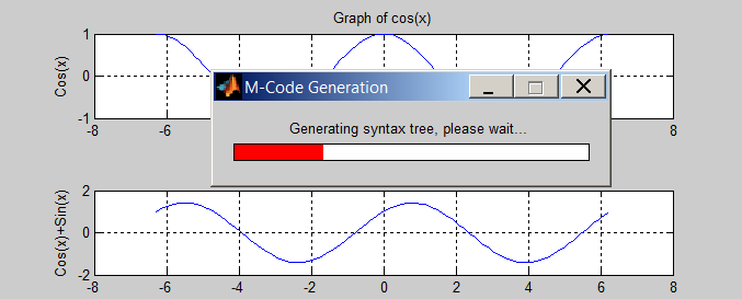
A code can be generated to reproduce the plots. To initialize this process, recall sinxcosx.fig and select File > Generate Code.
function createfigure2(X1, Y1, Y2, Y3, Y4)
%CREATEFIGURE2(X1,Y1,Y2,Y3,Y4)
%  X1:  vector of x data
%  Y1:  vector of y data
%  Y2:  vector of y data
%  Y3:  vector of y data
%  Y4:  vector of y data

%  Auto-generated by MATLAB on 05-Oct-2011 12:43:49

% Create figure
figure1 = figure;

% Create axes
axes1 = axes('Parent',figure1,'YGrid','on','XGrid','on',...
    'Position',[0.13 0.791155913978495 0.775 0.11741935483871]);
box(axes1,'on');
hold(axes1,'all');

% Create title
title('Graph of sin(x)');

% Create xlabel
xlabel('x');

% Create ylabel
ylabel('Sin(x)');

% Create plot
plot(X1,Y1,'Parent',axes1,'DisplayName','Y1 vs X1');

% Create axes
axes2 = axes('Parent',figure1,'YGrid','on','XGrid','on',...
    'Position',[0.13 0.572069892473118 0.775 0.11741935483871]);
box(axes2,'on');
hold(axes2,'all');

% Create title
title('Graph of cos(x)');

% Create xlabel
xlabel('x');

% Create ylabel
ylabel('Cos(x)');

% Create plot
plot(X1,Y2,'Parent',axes2,'DisplayName','Y2 vs X1');

% Create axes
axes3 = axes('Parent',figure1,'YGrid','on','XGrid','on',...
    'Position',[0.13 0.352983870967742 0.775 0.11741935483871]);
box(axes3,'on');
hold(axes3,'all');

% Create title
title('Graph of sin(x)+cos(x)');

% Create xlabel
xlabel('x');

% Create ylabel
ylabel('Cos(x)+Sin(x)');

% Create plot
plot(X1,Y3,'Parent',axes3,'DisplayName','Y3 vs X1');

% Create axes
axes4 = axes('Parent',figure1,'YGrid','on','XGrid','on',...
    'Position',[0.13 0.133897849462366 0.775 0.11741935483871]);
box(axes4,'on');
hold(axes4,'all');

% Create title
title('Graph of sin(x)-cos(x)');

% Create xlabel
xlabel('x');

% Create ylabel
ylabel('Sin(x)-Cos(x)');

% Create plot
plot(X1,Y4,'Parent',axes4,'DisplayName','Y4 vs X1');
As you can see, the file assumes you are using the same variables originally used to create the graph, therefore the variables need to be passed as arguments in the future executions of the generated code.
plot(x, y) and plot3(X1,Y1,Y2) statements create 2- and 3-D graphs respectively,
Plots at minimum should contain the following elements: title, xlabel, ylabel and legend,
Annotated plots can be easily generated with GUI Plot Tools,
MATLAB can generate code to reproduce plots.
Problem Set for Graphing with MATLAB
Plot y=a+bx , using the specified coefficients and ranges (use increments of 0.1):
a=2 , b=0.3 for 0≤x≤5
a=3 , b=0 for 0≤x≤10
a=4 , b=-0.3 for 0≤x≤15
a=2; b=.3; x=[0:.1:5]; y=a+b*x;
plot(x,y),title('Graph of y=a+bx'),xlabel('x'),ylabel('y'),grid
a=3; b=.0; x=[0:.1:10]; y=a+b*x;
plot(x,y),title('Graph of y=a+bx'),xlabel('x'),ylabel('y'),grid
a=2; b=.3; x=[0:.1:5]; y=a+b*x;
plot(x,y),title('Graph of y=a+bx'),xlabel('x'),ylabel('y'),grid
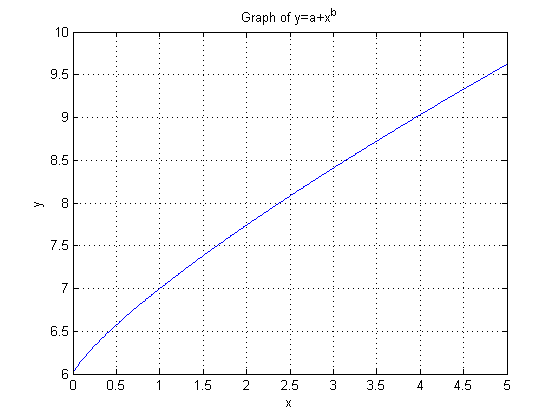
Plot the following functions, using increments of 0.01 and a=6 , b=0.8 , 0≤x≤5 :
y=a+xb
y=axb
y=asin(x)
a=6; b=.8; x=[0:.01:5]; y=a+x.^b;
plot(x,y),title('Graph of y=a+x^b'),xlabel('x'),ylabel('y'),grid
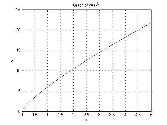
a=6; b=.8; x=[0:.01:5]; y=a*x.^b;
plot(x,y),title('Graph of y=ax^b'),xlabel('x'),ylabel('y'),grid
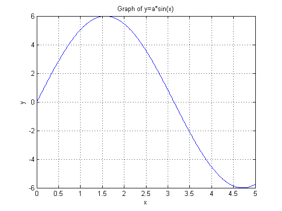
a=6; x=[0:.01:5]; y=a*sin(x);
plot(x,y),title('Graph of y=a*sin(x)'),xlabel('x'),ylabel('y'),grid
Plot function
 for
for
 using increments of

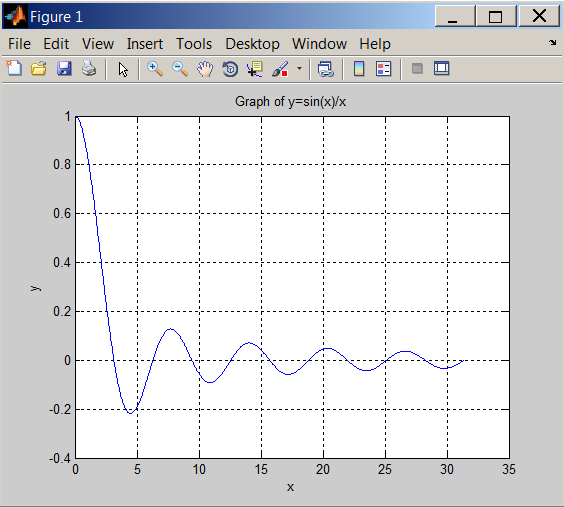
x = pi/100:pi/100:10*pi;
y = sin(x)./x;
plot(x,y),title('Graph of y=sin(x)/x'),xlabel('x'),ylabel('y'),grid

Data collected from Boyle's Law experiment are as follows: (Data available for download.)
| Volume [cm^3] | Pressure [Pa] |
|---|---|
| 7.34 | 100330 |
| 7.24 | 102200 |
| 7.14 | 103930 |
| 7.04 | 105270 |
| 6.89 | 107400 |
| 6.84 | 108470 |
| 6.79 | 109400 |
| 6.69 |
|